
Примеры брендбуков / evotec-oai
.pdf
Evotec OAI |
Design Guidelines |

2

1 The logo
1Formal derivation
2Symbol and logo-type
3Variations in the use of colour
4Logo sizes
5Don’ts—inadmissible applications and special applications
6Special applications

1.2 Symbol and logo-type |
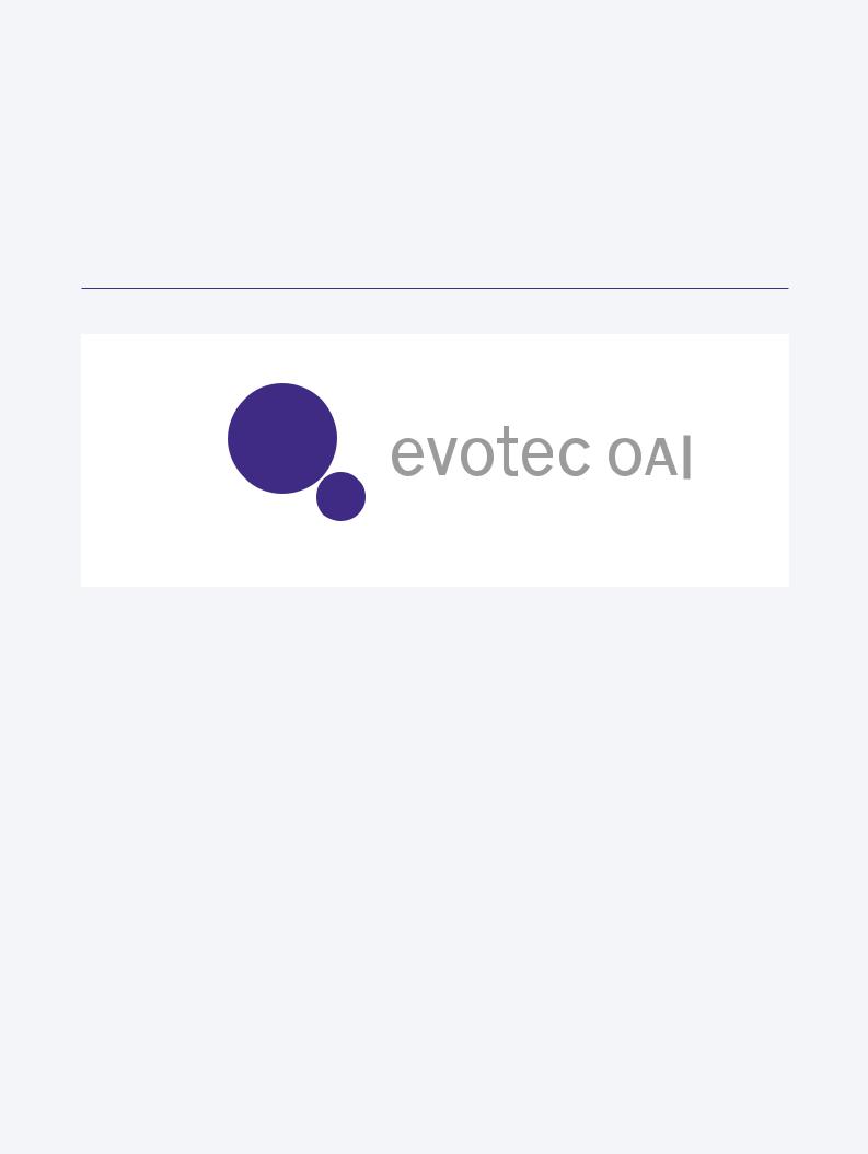
The combination of the interstitial motif and the circular form resulted in a |
Symbol |
symbol consisting of two circles of different sizes that nearly touch each other. |
|
The symbol unites the regularity of the circle with a dynamic asymmetry, |
|
resulting from the difference in size and the diagonal arrangement. |
|
The formal reduction confers succinctness, while the unusual combination of |
|
slanting axis, spatial proportion and distance ensures distinctiveness. |
|
By virtue of its geometric simplicity and abstraction, the symbol suggests |
|
precision, while at the same time conveying a sense of liberality and time- |
|
lessness. |
Symbol
04
1.2 Symbol and logo-type |
The logo-type consists of components of the name ‘evotec’ (lowercase letters) |
The logo |
and ‘OAI’ (capitals). The capitals of ‘OAI’ were reduced to the x-height of the |
|
preceding lowercase letters. |
|
The lettering was specially developed on the basis of Monotype News Gothic |
|
and must not be typeset. The symbol and the logo-type always appear in |
|
conjunction and as such are referred to below as the “logo”. |
The logo
05
1.2 Symbol and logo-type |
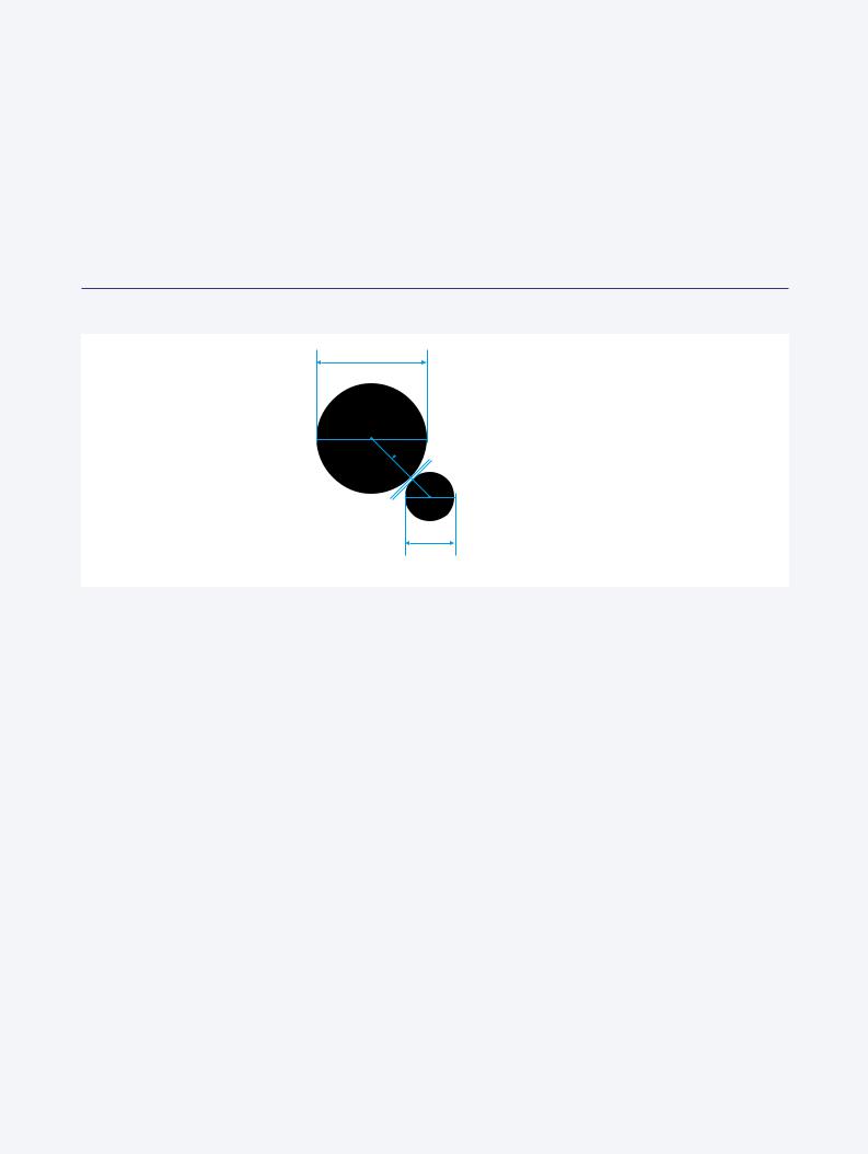
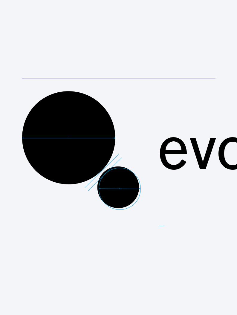
The two circles of different sizes that make up the symbol are arranged at a |
Construction of the symbol |
45º angle in such a way that they nearly touch. In the positive version, the |
|
distance measures 1|40 of the diameter (d1) of the larger circle. The smaller |
|
circle (d2) is positioned on the lower right. The proportion of the diameters |
|
is 1:0.45 (d2 = d1 x 0.45). In order to ensure a uniform appearance, a construc- |
|
tion is to be permitted only in necessary cases. The appropriate digital sam- |
|
ples are to be used instead. |
Construction of the symbol
d1
45°
d1|40
d2
= d1 x 0.45
06
1.2 Symbol and logo-type |
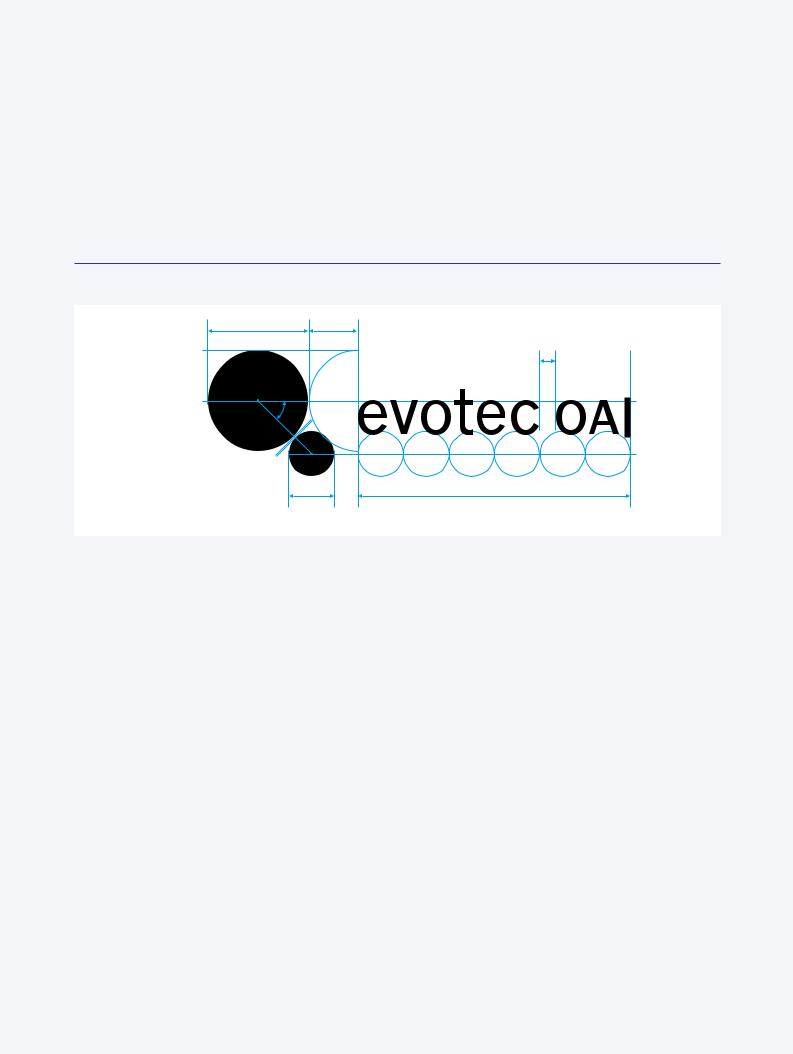
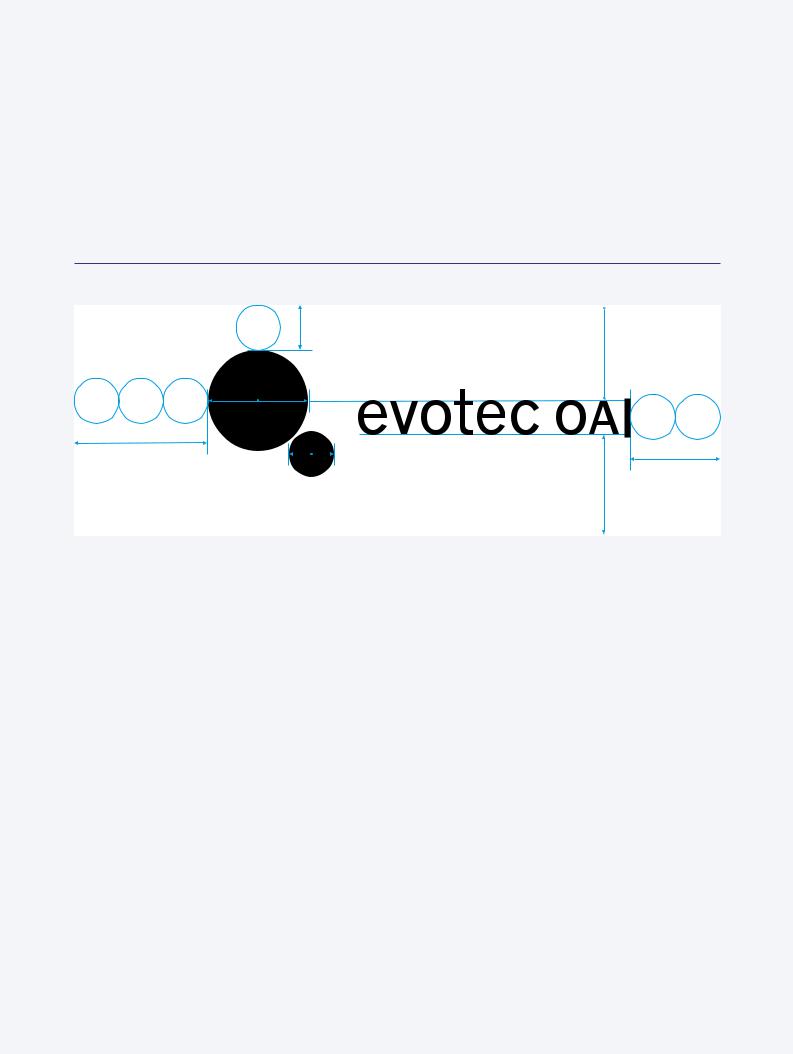
Symbol and logo-type are positioned in such a way that the distance between |
Logo dimensions |
the large circle (vertical tangent) and the left character of the logo-type meas- |
|
ures exactly 1|2 of d1. The logo-type is always arranged on a single line and |
|
as wide as 6 times the diameter of the small circle (6 x d2). |
|
The x-height lies at the level of the horizontal middle axis of the large circle. |
|
Between the elements of the name ‘evotec’ and ‘OAI’ a distance of d1|6 must |
|
be maintained. |
|
Here too, only the samples authorised by Evotec OAI should be used. A con- |
|
struction should be carried out only in exceptional cases, where samples are |
|
not available. |
Logo dimensions
d1 |
d1|2 |
|
d1|6 |
45° |
|
d1|40 |
|
d2 |
6 x d2 |
= d1 x 0.45 |
|
07
1.2 Symbol and logo-type |
The defined minimum area is an integral part of the logo and must be main- |
Defined minimum margin |
tained to achieve the optimum visual impact. It represents an absolute mini- |
|
mum demarcation and should be larger in dimension if possible. |
|
The basic unit for the construction of this exclusion zone is the diameter of d2. |
|
It defines the distance to the left, the upper and the right margins (3 x, 1 x and |
|
2 x respectively). To define the bottom margin, add the distance a2 (= a1) to |
|
the baseline of the logo-type. |
Exclusion zone
d2
a1
d1
3 x d2 |
d2 |
|
2 x d2
a2
08
1.3 Variations in the use |
The positive and negative versions of the graphical element are not identical. |
of colours |
In order to offset the visual eclipse occurring in the negative version, the dis- |
Positive and negative |
tance between the two circles was somewhat increased (d1|30 instead of |
versions |
d1|40). Hence, recolouring the digital samples from positive to negative or |
|
vice versa is not permitted. |
Positive and negative versions
d1
d2
d1|30
 Positive version (d1|40)

 Negative version (d1|30)
09
1.3 Variations in the use |
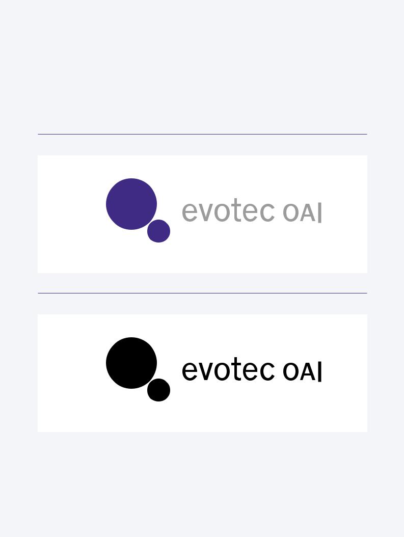
The symbol appears in blue (PANTONE 2738) and the logo-type in gray |
of colour |
(PANTONE Cool Gray 10) against a white background. In positive black and |
Positive versions |
white applications, the symbol and the logo-type are rendered in 100 % |
|
black. |
|
The positive version of the logo is used for stationery and signage. In addition |
|
to this, the positive version is applied to all means of information, that is pro- |
|
duced in-house or information which has to be transferred quickly via email or |
|
fax. The ready-made digital logo-samples can be retrieved via the indicated |
|
code. |
Positive version|colour: PANTONE 2738 and PANTONE Cool Gray 10 (Code 10100)
Positive version|black and white (Code 10150)
10
