

Data Summary and Descriptive Statistics 13
Dependent Variable
10
9
8
7
6
5
4
3
2
1
0
Box and Whisker Plot
Q3
Q2
Q1
1
Category
FIGURE 3.3: Illustration of a box-and-whisker plot for the data set listed. The first (Q1), second (Q2), and third (Q3) quartiles are shown. In addition, the whiskers extend to the minimum and maximum values of the sample set.
3.4.4 Histogram
The histogram is defined as a frequency distribution. Given N samples or measurements, xi, which range from Xmin to Xmax, the samples are grouped into nonoverlapping intervals (bins), usually of equal width (Figure 3.4). Typically, the number of bins is on the order of 7–14, depending on the nature of the data. In addition, we typically expect to have at least three samples per bin [7]. Sturgess’ rule [6] may also be used to estimate the number of bins and is given by
k = 1 + 3.3 log(n).
where k is the number of bins and n is the number of samples.
Each bin of the histogram has a lower boundary, upper boundary, and midpoint. The histogram is constructed by plotting the number of samples in each bin. Figure 3.5 illustrates a histogram for 1000 samples drawn from a normal distribution with mean (µ) = 0 and standard deviation (σ) = 1.0. On the horizontal axis, we have the sample value, and on the vertical axis, we have the number of occurrences of samples that fall within a bin.
Two measures that we find useful in describing a histogram are the absolute frequency and relative frequency in one or more bins. These quantities are defined as
a)fi = absolute frequency in ith bin;
b)fi /n = relative frequency in ith bin, where n is the total number of samples being summarized
in the histogram.

14 introduction to statistics for bioMEDical engineers
Lower Bound |
Midpoint |
Upper Bound |
|
|
|
|
|
FIGURE 3.4: One bin of a histogram plot. The bin is defined by a lower bound, a midpoint, and an upper bound.
A number of algorithms used by biomedical instruments for diagnosing or detecting abnormalities in biological function make use of the histogram of collected data and the associated relative frequencies of selected bins [8]. Often times, normal and abnormal physiological functions (breath sounds, heart rate variability, frequency content of electrophysiological signals) may be differentiated by comparing the relative frequencies in targeted bins of the histograms of data representing these biological processes.
Frequency
20
10
0
-2 |
-1 |
0 |
1 |
2 |
3 |
Normalized Value
FIGURE 3.5: Example of a histogram plot. The value of the measure or sample is plotted on the horizontal axis, whereas the frequency of occurrence of that measure or sample is plotted along the vertical axis.

Data Summary and Descriptive Statistics 15
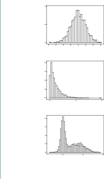
The histogram can exhibit several shapes. The shapes, illustrated in Figure 3.6, are referred to as symmetric, skewed, or bimodal.
A skewed histogram may be attributed to the following [9]:
1.mechanisms of interest that generate the data (e.g., the physiological mechanisms that determine the beat-to-beat intervals in the heart);
2.an artifact of the measurement process or a shift in the underlying mechanism over time (e.g., there may be time-varying changes in a manufacturing process that lead to a change in the statistics of the manufacturing process over time);
3.a mixing of populations from which samples are drawn (this is typically the source of a bimodal histogram).
The histogram is important because it serves as a rough estimate of the true probability density function or probability distribution of the underlying random process from which the samples are being collected.
The probability density function or probability distribution is a function that quantifies the probability of a random event, x, occurring. When the underlying random event is discrete in nature, we refer to the probability density function as the probability mass function [10]. In either case, the function describes the probabilistic nature of the underlying random variable or event and allows us to predict the probability of observing a specific outcome, x (represented by the random variable), of an experiment. The cumulative distribution function is simply the sum of the probabilities for a group of outcomes, where the outcome is less than or equal to some value, x.
Let us consider a random variable for which the probability density function is well defined (for most real-world phenomenon, such a probability model is not known.) The random variable is the outcome of a single toss of a dice. Given a single fair dice with six sides, the probability of rolling a six on the throw of a dice is 1 of 6. In fact, the probability of throwing a one is also 1 of 6. If we consider all possible outcomes of the toss of a dice and plot the probability of observing any one of those six outcomes in a single toss, we would have a plot such as that shown in Figure 3.7.
This plot shows the probability density or probability mass function for the toss of a dice. This type of probability model is known as a uniform distribution because each outcome has the exact same probability of occurring (1/6 in this case).
For the toss of a dice, we know the true probability distribution. However, for most realworld random processes, especially biological processes, we do not know what the true probability density or mass function looks like. As a consequence, we have to use the histogram, created from a small sample, to try to estimate the best probability distribution or probability model to describe the real-world phenomenon. If we return to the example of the toss of a dice, we can actually toss the dice a number of times and see how close the histogram, obtained from experimental data, matches
16 introduction to statistics for bioMEDical engineers
Symmetric
200
Frequency
100
0
-4 |
-3 |
-2 |
-1 |
0 |
1 |
2 |
3 |
Measure
Frequency
Skewed
400
300
200
100
0
0 |
5 |
10 |
Measure
Frequency
Bimodal
400
300
200
100
0
0 |
10 |
20 |
Measure
FIGURE 3.6: Examples of a symmetric (top), skewed (middle), and bimodal (bottom) histogram. In each case, 2000 sampled were drawn from the underlying populations.