

Introduction to Windows Presentation Foundation
Windows Presentation Foundation (WPF) is a next-generation presentation system for building Windows client applications with visually stunning user experiences. With WPF, you can create a wide range of both standalone and browser-hosted applications. Some examples are Yahoo! Messenger and the New York Times Reader, as well as the Contoso Healthcare Sample Application that is shown in the following figure.

The core of WPF is a resolution-independent and vector-based rendering engine that is built to take advantage of modern graphics hardware. WPF extends the core with a comprehensive set of application-development features that include Extensible Application Markup Language (XAML), controls, data binding, layout, 2-D and 3-D graphics, animation, styles, templates, documents, media, text, and typography. WPF is included in the Microsoft .NET Framework, so you can build applications that incorporate other elements of the .NET Framework class library.
To create a wpf application
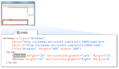
The purpose of this topic is to show you how to create a simple Windows Presentation Foundation (WPF) application and become familiar with the Visual C# Express Edition integrated development environment (IDE). Like Windows Forms applications, WPF applications can be designed by dragging controls from the Toolbox to a design surface. In addition to having a designer, Properties window, and Toolbox, the IDE in WPF projects has a window that contains XAML. XAML is an acronym for Extensible Application Markup Language, which is used to create a user interface. The following illustration shows the location of the XAML editor.
XAML editor

This example shows you how to create your own Ink application, which enables you to draw pictures.
In this section, you'll learn how to:
Create a WPF application.
Toggle between Code view and Designer view.
Change the WPF window's properties.
Создание приложения wpf c#
Целью этого раздела является демонстрация создания простого приложения Windows Presentation Foundation (WPF) и знакомство с интегрированной средой разработки Visual C#, экспресс-выпуск. Как и приложения Windows Forms, приложения WPF можно создавать путем перетаскивания элементов управления с панели элементов на поверхность разработки. В дополнение к конструктору, окну Свойства и панели элементов IDE в проектах WPF располагает окном XAML. XAML — это акроним от Extensible Application Markup Language, языка XAML, который используется для создания пользовательского интерфейса. На следующем рисунке изображено расположение редактора XAML.
В этом примере показано создание собственного приложения для рукописного ввода, позволяющего рисовать.
В этом разделе рассматривается выполнение следующих задач.
Создание приложения WPF.
Переключение между представлением Код и представлением Конструктор.
Изменение свойств окна WPF.
Use the XAML editor.
Add an System.Windows.Controls.InkCanvas control.
Add a System.Windows.Controls.Button control.
Create event handlers for controls.
On the File menu, click New Project.
The New Project dialog box appears. This dialog box lists the different default application types that Visual C# Express Edition can create.
Click WPF Application.
Change the name of your application to Ink Pad.
Click OK.
Visual C# Express Edition creates a new folder for your project that is named after the project title, and then displays your new WPF window, titled Window1, in Designer view. You can change to Code view at any time by right-clicking the designer surface or code window and selecting View Code. By default, the XAML editor is displayed under the designer, but you can see the XAML markup in full-screen mode by right-clicking the designer surface and clicking View XAML.
The WPF window you see in Designer view is a visual representation of the window that will open when your application is started. In Designer view, you can drag various controls from the Toolbox onto the WPF window. After you have dropped a control onto the WPF window, Visual C# automatically creates code that will cause the control to be positioned appropriately when the program is run.
If you cannot see the Properties window, on the View menu, click PropertiesWindow. This window lists the properties of the currently selected WPF window or control, and it's here that you can change the existing values.
Change the size of the WPF window by setting the Height property to 550 and the Width property to 370 in the Properties window.
Change the title of the WPF window to Ink Pad.
Использование редактора XAML.
Добавление элемента управления System.Windows.Controls.InkCanvas.
Добавление элемента управления System.Windows.Controls.Button.
Создание обработчиков событий для элементов управления.
В меню Файл выберите команду Создать проект.
Откроется диалоговое окно Создание проекта. В этом диалоговом окне выводится список различных типов приложений по умолчанию, которые можно создавать с помощью Visual C#, экспресс-выпуск.
Выберите Приложение WPF.
Измените имя приложения на Ink Pad.
Нажмите кнопку ОК.
Visual C#, экспресс-выпуск создаст для проекта новую папку с таким же именем, как у проекта, и затем отобразит новое окно Windows с именем Window1 в представлении Конструктор. Можно в любое время переключиться в представление Код, щелкнув правой кнопкой мыши поверхность разработки или окно кода и выбрав пункт Просмотр кода. По умолчанию редактор XAML отображается под конструктором, но разметку XAML можно просматривать и в полноэкранном режиме. Для этого правой кнопкой мыши нужно щелкнуть поверхность разработки и выбрать пункт Просмотр XAML.
Форма WPF в представлении Конструктор — это визуальное представление окна, которое открывается при запуске приложения. В представлении Конструктор можно перетаскивать различные элементы управления из панели элементов в окно WPF. После расположения элемента управления в окне WPF Visual C# автоматически создаст код для правильного размещения элемента управления при выполнении программы.
Если окно Свойства не отображается, в меню Вид выберите пункт Окно свойств. В этом окне перечислены свойства текущего выбранного окна WPF или элемента управления, здесь же можно менять существующие значения.
Измените размеры окна WPF, установив в окне Свойства значение 550 для свойства Height и значение 370 для свойства Width.
Измените заголовок окна WPF на Ink Pad.
Change the Background property of the WPF window to the color brown by clicking Brown in the drop-down box, and then pressing Enter.
You can alternatively modify the XAML markup directly by adding a Background attribute and setting its value to
Background="Brown".To open the Toolbox, click the View menu, and then click Toolbox.
Right-click the Toolbox, and then click Choose Items.
The Choose Toolbox Items dialog box opens.
In the WPF Components tab of the Choose Toolbox Items dialog box, scroll down to InkCanvas, and select it so that a check appears in the check box.
Click OK to add the InkCanvas control to the Toolbox.
Drag an InkCanvas control from the Toolbox to the WPF window.
Set the following properties of the InkCanvas control in the Properties window:
Property
Value
Width
Auto
Height
Auto
HorizontalAlignment
Stretch
VerticalAlignment
Stretch
Margin
9, 9, 9, 68
Change the color of the InkCanvas control to yellow by setting its Background property to LightYellow.
The background color of the InkCanvas control will appear light yellow at run-time.
Drag two Button controls to the WPF Window under the InkCanvas. Position
button1to the left andbutton2to the right.
Измените свойство Background окна WPF на коричневый цвет, щелкнув Brown в раскрывающемся списке и нажав клавишу ВВОД.
Можно также непосредственно изменить разметку XAML, добавив атрибут Background и установив его значение равным
Background="Brown".Чтобы открыть панель элементов, в меню Вид выберите пункт Панель элементов.
Щелкните правой кнопкой мыши панель элементов и выберите пункт Выбрать элементы.1
Откроется диалоговое окно Выбор элементов панели элементов.
На вкладке Компоненты WPF диалогового окна Выбор элементов панели элементов прокрутите список вниз до варианта InkCanvas и выберите его, установив флажок.
Нажмите кнопку ОК для добавления элемента управления InkCanvas на панель элементов.
Из панели элементов перетащите в окно WPF элемент управления InkCanvas.
В окне Свойства задайте следующие свойства элемента управления InkCanvas.
Свойство
Значение
Width
Автоматически
Height
Автоматически
HorizontalAlignment
Растяжение
VerticalAlignment
Растяжение
Margin
9, 9, 9, 68
Измените цвет элемента управления InkCanvas на желтый, задав его свойству Background значение LightYellow.
Фон элемента управления "InkCanvas" во время выполнения будет светло-желтым.
Перетащите два элемента управления Button в окно WPF под элемент управления InkCanvas. Расположите
button1слева, аbutton2— справа.
Select
button1and change the XAML markup in XAML view as shown in the following markup. This markup sets the text toClear.<Button Height="23" HorizontalAlignment="Left" Margin="85,0,0,24"
Name="button1" VerticalAlignment="Bottom"
Width="75">Clear</Button>
Select
button2and change the XAML markup as shown in the following markup. This markup sets the text toClose.<Button Height="23" HorizontalAlignment="Right" Margin="0,0,72,24"
Name="button2" VerticalAlignment="Bottom" Width="75"
Click="ButtonCloseClicked">Close</Button>
The WPF application should resemble the Ink Pad application in the following illustration.
Выберите
button1и измените разметку XAML в режиме просмотра XAML, как показано ниже. Эта разметка устанавливает для текста значениеClear.
<Button Height="23" HorizontalAlignment="Left" Margin="85,0,0,24" Name="button1" VerticalAlignment="Bottom" Width="75">Clear</Button>
Выберите
button2и измените разметку XAML, как показано ниже. Эта разметка устанавливает для текста значениеClose.
<Button Height="23" HorizontalAlignment="Right" Margin="0,0,72,24" Name="button2" VerticalAlignment="Bottom" Width="75"
Click="ButtonCloseClicked">Close</Button>
Приложение WPF должно напоминать приложение Ink Pad на следующем рисунке.
WPF
Ink Application
