

Encyclopedia of Sociology Vol
.5.pdfSTATISTICAL GRAPHICS
POSITION |
|
POSITION NON- |
|
LENGTH |
||||||||||
COMMON SCALE |
|
ALIGNED SCALE |
|
|
|
|
||||||||
10 |
|
|
|
|
10 |
|
10 |
|
|
|
|
|
|
|
5 |
|
|
|
|
|
|
|
|
|
|
|
|
||
|
|
|
|
0 |
|
|
|
|
|
|
|
|
||
|
|
|
|
|
|
|
|
|
|
|
|
|
||
|
|
|
|
|
|
|
|
|
|
|
|
|
|
|
|
|
|
|
|
|
|
|
|
|
|
|
|
|
|
0 |
|
|
|
|
0 |
|
|
|
|
|
|
|
||
|
|
|
|
|
|
|
|
|
|
|
||||
|
|
|
|
|
|
|
|
|
|
|
|
|
|
|
|
|
|
|
|
|
|
|
|
|
|
|
|
|
|
|
|
|
|
|
|
|
|
|
|
|
|
|
|
|
DIRECTION |
|
ANGLE |
|
AREA |
||||||||||
|
|
|
|
|
|
|
|
|
|
|
|
|
|
|
VOLUME |
CURVATURE |
SHADING |
COLOR SATURATION
Figure 6. Ten elementary perceptual tasks for decoding quantitative information from statistical graphs.
SOURCE: Reprinted from Cleveland and McGill (1984) with the permission of the American Statistical Association.
actually is constant (cf., Playfair’s time series graph in Figure 2a). The source of the illusion is the tendency to attend to the least distance between the two curves rather than to the vertical distance. Thus, an alternative is to graph the difference between the two curves—the balance of trade— directly (cf. Figure 12, b and c, below), exploiting the relatively accurate judgment of position along a common scale, or to show vertical lines between the import and export curves, employing the somewhat less accurate judgment of position along nonaligned scales.
GRAPHS IN DATA ANALYSIS
Statistical graphs should play a central role in the analysis of data, a common prescription that is most often honored in the breach. Graphs, unlike numerical summaries of data, facilitate the perception of general patterns and often reveal unusual, anomalous, or unexpected features of the data—characteristics that might compromise a numerical summary.
(a)
1.0
0.5
Y 0.0
–0.5
–1.0
0 |
20 |
40 |
60 |
80 |
X
(b)
1.0
Y
–1.0
0 |
20 |
40 |
60 |
80 |
X
Figure 7. Two scatterplots of the same data. Five hundred X-values were randomly generated in the interval [0,25π], and Y=sin X. The periodic pattern of the data is clear in (b), where the aspect ratio of the plot is adjusted so that the average slope of the curve is not too steep, but not in panel (a).
The four simple data sets in Figure 10, from Anscombe (1973) and dubbed ‘‘Anscombe’s quartet’’ by Tufte (1983), illustrate this point well. All four data sets yield the same linear least-squares outputs when regression lines are fitted to the data, including the regression intercept and slope, coefficient standard errors, the standard error of the regression (i.e., the standard deviation of the residuals), and the correlation, but—significantly—not residuals. Although the data are contrived, the four graphs tell very different imaginary stories: The least-squares regression line accurately summarizes the tendency of y to increase with x in Figure 10a. In contrast, the data in Figure 10b clearly indicate a curvilinear relationship between y and x, a relationship the linear regression does not capture. In Figure 10c, one point is out of line with the rest and distorts the regression. Perhaps the outlying point represents an error in recording the data or a y-value that is influenced by factors other than x. In Figure 10d, the ability to fit a line
3011

STATISTICAL GRAPHICS
|
|
|
|
|
Murder Rates, 1978 |
Five representative |
|
|
|||
|
shadings |
|
|
|
|
1.2 |
4.9 |
8.5 |
12.1 |
15.8 |
|
Rates per 100,000 population |
|
||||
= 0 |
|
= 4 |
= 8 |
= 12 |
= 16 |
Figure 8. Statistical maps of state murder rates in 1978 employing (a) shading and (b) framed rectangles.
SOURCE: Reprinted from Cleveland and McGill (1984) with the permission of the American Statistical Association.
3012

STATISTICAL GRAPHICS
Trade |
Imports |
Exports |
Time |
Figure 9. Despite appearances, the vertical separation between the curves for imports and exports is constant. The ‘‘data’’ are contrived.
and the line’s specific location depend on the presence of a single point.
Diverse graphical forms are adapted to different purposes in data analysis. Many important applications appear in the figures below, roughly in order of increasing complexity, including graphs for displaying univariate distributions, bivariate relationships, diagnostic quantities in regression analysis, and multivariate data.
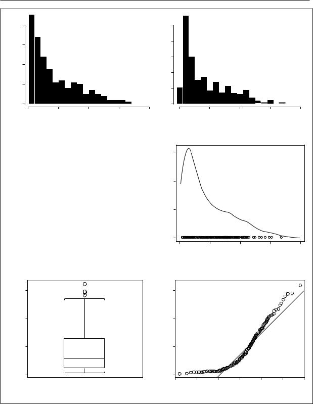
Particularly useful for graphically screening data are methods for displaying the distributions of quantitative variables. Several univariate displays of the distribution of infant mortality rates for 201 countries are shown in Figure 11, using data compiled by the United Nations.
Figure 11a is a traditional histogram of the infant mortality data, a frequency bar graph formed by dissecting the range of infant mortality into class intervals or ‘‘bins’’ and then counting the number of observations in each bin; the vertical axis of the histogram is scaled in percent. Figure 11b shows an alternative histogram that differs from Figure 11a only in the origin of the bin system (the bars are shifted five units to the left). These graphs demonstrate that the impression conveyed by a histogram depends partly on the
15 |
|
|
|
|
15 |
|
|
|
|
10 |
|
|
|
|
10 |
|
|
|
|
y |
|
|
|
|
|
|
|
|
|
5 |
|
|
|
|
5 |
|
|
|
|
0 |
|
|
|
|
0 |
|
|
|
|
0 |
5 |
10 |
15 |
20 |
0 |
5 |
10 |
15 |
20 |
(a) |
|
x |
|
|
(b) |
|
x |
|
|
15 |
|
|
|
|
15 |
|
|
|
|
10 |
|
|
|
|
10 |
|
|
|
|
y |
|
|
|
|
|
|
|
|
|
5 |
|
|
|
|
5 |
|
|
|
|
0 |
|
|
|
|
0 |
|
|
|
|
0 |
5 |
10 |
15 |
20 |
0 |
5 |
10 |
15 |
20 |
(c) |
|
|
|
|
(d) |
|
|
|
|
Figure 10. The four data sets have the same linear least-squares regression, including the regression coefficients, their standard errors, the correlation between the variables, and the standard error of the regression.
SOURCE: Redrawn from Anscombe (1973) with the permission of the American Statistical Association.
arbitrary location of the bins. Figure 11c is a stem- and-leaf display, a type of histogram (from Tukey) that records the data values directly in the bars of the graph, thus permitting the recovery of the original data. Here, for example, the values given as 1:2 represent infant mortality rates of 12 per 1,000.
Figure 11d is a kernel density estimate, or smoothed histogram, a display that corrects both the roughness of the traditional histogram and its dependence on the arbitrary choice of bin location. For any value x of infant mortality, the height of the kernel estimate is
ˆ |
= |
1 |
n |
|
x − xi |
|
|
|
|
||||||
f (x) |
nh |
∑K |
h |
|
(1) |
||
|
i =1 |
|
|
|
|||
where n is the number of observations (here, 201); the observations themselves are χ1, χ2,. . . ,χn, h is the ‘‘window’’ half-width for the kernel estimate, analogous to bin width for a histogram; and K is
3013
Percent of Nations
|
|
|
STATISTICAL GRAPHICS |
|
|
|
|
|||
40 |
|
|
|
|
|
50 |
|
|
|
|
20 |
|
|
|
|
Nationsof |
40 |
|
|
|
|
30 |
|
|
|
|
|
|
|
|
|
|
|
|
|
|
|
Percent |
30 |
|
|
|
|
|
|
|
|
|
20 |
|
|
|
|
|
|
|
|
|
|
|
|
|
|
|
|
10 |
|
|
|
|
|
10 |
|
|
|
|
|
|
|
|
|
|
|
|
|
|
|
0 |
|
|
|
|
|
0 |
|
|
|
|
0 |
50 |
100 |
150 |
200 |
|
0 |
50 |
100 |
150 |
200 |
Infant Mortality per 1,000 |
Infant Mortality per 1,000 |
(a) |
(b) |
(c)
Infant Mortality per 1,000
(e)
0 : 23455555556666666677777777777788888999999
1 : 000011222222333344444555566778888999
2 : 00112223333444455556669
3 : 00012334455777889999
4 : 012344456889
5 : 11246667888
6 : 012455568
7 : 122347788
8 : 00222456669
9 : 025678
10 : 234677
11 : 023445
12 : 2445
13 : 25
14 : 29
15 : 34
16 : 9
Sierra Leone
150 Liberia Afghanistan
Mali
100
50
0.0
0.015
0.010
Density
0.005
|
0.0 |
|
|
|
|
|
|
|
0 |
50 |
|
100 |
|
150 |
200 |
(d) |
Infant Mortality per 1,000 |
|
|||||
|
|
|
|
|
|
||
|
150 |
|
|
|
|
|
|
per 1,000 |
100 |
|
|
|
|
|
|
Mortality |
50 |
|
|
|
|
|
|
Infant |
|
|
|
|
|
|
|
|
|
|
|
|
|
|
|
|
0.0 |
|
|
|
|
|
|
|
–3 |
–2 |
–1 |
0 |
1 |
2 |
3 |
|
(f) |
|
Normal Quantiles |
|
|
||
|
|
|
|
|
|
|
|
Figure 11. Six univariate displays of the distribution of infant mortality rates in 201 nations. The histograms (a) and (b) both have bins of width ten, but the bars of (b) are five units to the left of those of (a). A stem-and-leaf display is shown in (c), a kernel density estimate in (d), a boxplot in (e), and a normal quantile comparision
plot in (f).
SOURCE: United Nations, http://www.un.org/Depts/unsd/social/main.htm.

STATISTICAL GRAPHICS
some probability–density function, such as the unit-normal density, ensuring that the total area under the kernel estimate is one. A univariate scatterplot — another form of distributional display giving the location of each observation — is shown at the bottom of Figure 11d.
Figure 11e, a ‘‘boxplot’’ of the infant mortality data (a graphic form also from Tukey), summarizes a variety of important distributional information. The box is drawn between the first and third quartiles and therefore encloses the central half of the data. A line within the box marks the position of the median. The whiskers extend either to the most extreme data value (as on the bottom) or to the most extreme nonoutlying data value (as on the top). Four outlying data values are represented individually. The compactness of the boxplot suggests its use as a component of more complex displays; boxplots may be drawn in the margins of a scatterplot to show the distribution of each variable, for example.
Figure 11f shows a normal quantile comparison plot for the infant mortality data. As the name implies, this graph compares the ordered data with corresponding quantiles of the unit-normal distribution. By convention, the ith largest infant mortality rate, denoted χ(i), has Pi = (i - 1/2)/n proportion of the data below it. The corresponding normal quantile is zi, located so that Pr (Z ≤ zi) = Pi, where Z follows the unit-normal distribution. If X is normally distributed with mean µ and standard deviation σ, then within the bounds of sampling error, x(i) > µ + σzi. Departure from a linear pattern therefore indicates nonnormality. The line shown in Figure 11f passes through the quartiles of X and Z. The positive skew of the infant mortality rates is reflected in the tendency of the plotted points to lie above the fitted line in both tails of the distribution.
While the skewness of the infant mortality data is apparent in all the displays, the possibly multimodal grouping of the data is clearest in the kernel density estimate. The normal quantile comparison plot, in contrast, retains the greatest resolution in the tails of the distribution, where data are sparse; these are the regions that often are problematic for numerical summaries of data such as means and regression surfaces.
Many useful graphs display relationships between variables, including several forms that ap-
peared earlier in this article: bar graphs (Figure 2b), dot graphs (Figure 1), and line graphs such as time series plots (Figures 2a and 4). Parallel boxplots are often informative in comparing the distribution of a quantitative variable across several categories. Scatterplots (as in Figure 10) are invaluable for examining the relationship between two quantitative variables. Other data-analytic graphs adapt these forms.
In graphing quantitative data, it is sometimes advantageous to transform variables. Logarithms, the most common form of transformation, often clarify data that extend over two or more orders of magnitude (i.e., a factor of 100 or more) and are natural for problems in which ratios of data values, rather than their differences, are of central interest.
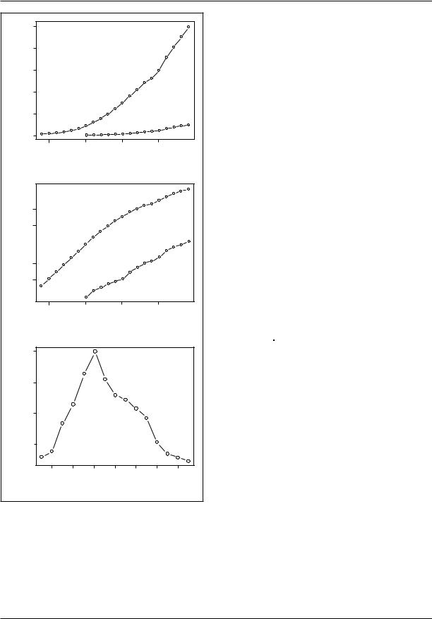
Consider Figure 12, which shows the size of the Canadian and U.S. populations for census years between 1790 and 1990 in the United States and between 1851 and 1991 in Canada. The data are graphed on the original scale in Figure 12a and on the log scale in Figure 12b. Because the Canadian population is much smaller than that of the United States, it is difficult to discern the Canadian data in Figure 12a. Moreover, Figure 12b shows more clearly departures from a constant rate of population growth, represented by linear increase on the log scale, and permits a direct comparison of the growth rates in the two countries. These rates were quite similar, with the U.S. population roughly ten times as large as the Canadian population throughout the past century and a half. Figure 10c, however, which graphs the difference between the two curves in Figure 10b (i.e., the log population ratio), reveals that the United States was growing more rapidly than Canada was before 1900 and more slowly afterward.
Graphs also can assist in statistical modeling. Least-squares regression analysis, for example, which fits the model
Y |
i |
= β + β x |
+ β x |
+ ... + β x |
+ ε |
i |
(2) |
|
0 1 1i |
2 2i |
k ki |
|
|
makes strong assumptions about the structure of the data, including assumptions of linearity, equal error variance, normality of errors, and independence. Here Yi is the dependent variable score for the ith of n observations; χ1i, χ2i,. . . ,χki, are independent variables; εi, is an unobserved error that is assumed to be normally distributed with zero ex-
3015
STATISTICAL GRAPHICS
|
250 |
|
|
|
|
|
(millions) |
200 |
|
|
|
|
U.S. |
150 |
|
|
|
|
|
|
|
|
|
|
|
|
|
Population |
100 |
|
|
|
|
|
50 |
|
|
|
|
Canada |
|
|
|
|
|
|
|
|
|
0 |
|
|
|
|
|
|
1800 |
1850 |
1900 |
1950 |
||
(a) |
|
|
|
Year |
|
|
|
|
|
|
|
|
|
|
|
|
|
|
U.S. |
|
(millions) |
100 |
|
|
|
|
|
50 |
|
|
|
|
|
|
|
|
|
|
|
|
|
Population |
|
|
|
|
Canada |
|
10 |
|
|
|
|
|
|
5 |
|
|
|
|
|
|
|
|
|
|
|
|
|
|
1800 |
1850 |
1900 |
1950 |
||
(b) |
|
|
|
Year |
|
|
|
|
|
|
|
|
|
|
1.15 |
|
|
|
|
|
(millions) |
1.10 |
|
|
|
|
|
|
|
|
|
|
|
|
Population |
1.05 |
|
|
|
|
|
1.00 |
|
|
|
|
|
|
|
|
|
|
|
|
|
|
1860 |
1880 |
1900 |
1920 |
1940 |
1960 1980 |
(c) |
|
|
|
Year |
|
|
|
|
|
|
|
|
|
Figure 12. Canadian and U.S. population figures are plotted directly in (a) and on a log scale in (b). The difference between the two log series is
shown in (c).
SOURCE: Canada Yearbook 1994 and Statistical Abstract of the United States: 1994.
pectation and constant variance σ2, independent of the x’s and the other errors; and the ß’s are regression parameters, which are to be estimated along with the error variance from the data.
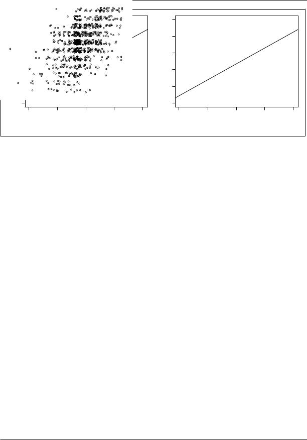
Graphs of quantities derived from the fitted regression model often prove crucial in determining the adequacy of the model. Figure 13, for example, plots a measure of leverage in the regression (the ‘‘hat values’’ hi) against a measure of discrepancy (the ‘‘studentized residuals’’ ti). Leverage represents the degree to which individual observations can affect the fitted regression, while discrepancy represents the degree to which each observation departs from the pattern suggested by the rest of the data. Actual influence on the estimated regression coefficients is a product of leverage and discrepancy and is displayed on the graph by Cook’s Dii, represented by the areas of the plotted circles. The data for this graph are drawn from Duncan’s (1961) regression of the rated prestige of forty-five occupations on the educational and income levels of the occupations. The plot suggests that two of the data points (the occupations ‘‘minister’’ and ‘‘conductor’’) may unduly affect the fitted regression.
Figure 14 is a scatterplot of residuals against fitted Y-values,
ˆ |
= b0 + b1x1i + b2 x2i + |
K |
+ bkxk i |
(3) |
Yi |
|
|
where the b’s are sample estimates of the corresponding ß’s. If the error variance is constant as assumed, the variation of the residuals should not change systematically with the fitted values. The data for Figure 14 are drawn from work by Ornstein (1976) relating the number of interlocking directorate and executive positions maintained by 248 dominant Canadian corporations to characteristics of the firms. The plot reveals that the variation of the residuals appears to increase with the level of the fitted values, casting doubt on the assumption of constant error variance.
Figure 15 shows a partial residual (also called a component plus residual) plot for the relationship between occupational prestige and income, a diagnostic useful for detecting nonlinearity in regression. The plot is for a regression of the rated prestige of 102 Canadian occupations on the gender composition, income level, and educational level of the occupations (see Fox and Suschnigg
3016

|
|
|
|
|
STATISTICAL GRAPHICS |
|
|
|
|
||
|
3 |
|
|
minister |
|
|
30 |
|
|
|
|
|
|
|
|
|
|
|
|
|
|
|
|
StudentizedResidual |
2 |
|
|
|
|
|
20 |
|
|
|
|
|
|
|
|
|
|
|
|
|
|
||
1 |
|
|
conductor |
Residuals |
10 |
|
|
|
|
||
|
|
–20 |
|
|
|
|
|||||
|
|
|
RR_engineer |
|
0 |
|
|
|
|
||
|
0 |
|
|
|
|
|
|
|
|
|
|
|
–1 |
|
|
|
|
|
–10 |
|
|
|
|
|
|
|
|
|
|
|
|
|
|
|
|
|
–2 |
reporter |
|
|
|
|
|
|
|
|
|
|
|
|
|
|
|
–30 |
|
|
|
|
|
|
|
|
|
|
|
|
|
|
|
|
|
|
0.05 |
0.10 |
0.15 |
0.20 |
0.25 |
|
0 |
20 |
40 |
60 |
80 |
|
|
|
|
Fitted Values |
|
|
|||||
|
|
|
Hat Value |
|
|
|
|
|
|
|
|
|
|
|
|
|
|
|
|
|
|
|
|
Figure 13. Influence plot for Duncan’s regression of the rated prestige of forty-five occupations on their income and educational levels. The hat values measure the leverage of the observations in the regression, while the studentized residuals measure their discrepancy. The plotted circles have area proportional to Cook’s D,
a summary measure of influence on the regression coefficients. Horizontal lines are drawn at plus and minus 2; in well-behaved data, only about 5 percent of studentized residuals should be outside these lines. Vertical lines are drawn at two and three times the average hat value; hat values greater than two or three times the average are noteworthy. Observations that have relatively large residuals or leverages are identified on the plot.
1989). The partial residuals are formed as e1i = b1χ1i + ei, where b1 is the fitted income coefficient in the linear regression, χ1i is the average income of incumbents of occupation i, and ei is the regression residual. The nonlinear pattern of the data, which is apparent in the graph, suggests modification of the regression model. Similar displays are available for generalized linear models such as logistic regression. Further information on the role of graphics in regression diagnostics can be found in Atkinson (1985), Fox (1991, 1997), and Cook and Weisberg (1994).
Scatterplots are sometimes difficult to interpret because of visual noise, uneven distribution of the data, or discreteness of the data values. Visually ambiguous plots often can be enhanced by smoothing the relationship between the variables, as in Figure 15. The curve drawn through this plot was determined by a procedure from
Figure 14. Plot of residuals by fitted values for Ornstein’s regression on interlocks maintained by 248 dominant Canadian corporations on the characteristics of the firms. The manner in which the points line up diagonally at the lower left of the graph is due to the lower limit of zero for the dependent variable.
SOURCE: Personal communication from M. Ornstein.
Cleveland (1994) called locally weighted scatterplot smoothing (‘‘lowess’’). Lowess (also called ‘‘loess,’’ for local regression) fits n robust regression lines to the data, with the ith such line emphasizing observations whose χ-values are closest to χi. The lowess fitted value for the ith observation, ŷi, comes from the ith such regression. Here x and y simply denote the horizontal and vertical variables in the plot. The curve plotted on Figure 15 connects the points (χi,ŷi). Lowess is one of many methods of nonparametric regression analysis, including methods for multiple regression, described, for example, in Hastie and Tibshirani (1990) and Fox (forthcoming a and b). Because there is no explicit equation for a nonparametric regression, the results are most naturally displayed graphically.
Scatterplots for discrete data may be enhanced by paradoxically adding a small amount of random noise to the data to separate the points in the plot. Cleveland (1994) calls this process ‘‘jittering.’’ An example is shown in Figure 16a, which plots scores on a vocabulary test against years of education; the corresponding jittered plot (Figure 16b) reduces the overplotting of points, making the relationship much clearer and revealing other characteristics
3017

STATISTICAL GRAPHICS
Residual |
20 |
0 |
|
|
10 |
Partial |
–10 |
|
|
|
–20 |
05,000 10,000 15,000 20,000 25,000
Average Income
Figure 15. Partial residual (component+residual) plot for income in the regression of occupational prestige on the gender composition and income and education levels of 102 Canadian occupations in 1971. The broken line gives the linear leastsquares fit, while the solid line shows the lowess (nonparametric regression) fit to the data.
SOURCE: Fox and Suschnigg (1989).
of the data, such as the concentration of points at twelve years of education.
Because graphs commonly are drawn on twodimensional media such as paper and computer screens, the display of multivariate data is intrinsically more difficult than that of univariate or bivariate data. One solution to the problems posed by multivariate graphic representation is to record additional information on a two-dimensional plot. Symbols such as letters, shapes, degrees of fill, and color may be used to encode categorical information on a scatterplot, for example (see Figure 19, below). Similarly, there are many schemes for representing additional quantitative information, as shown in Figures 8 and 13.
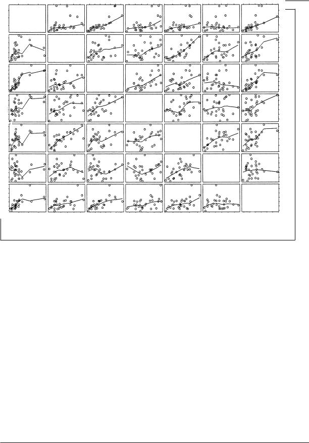
A scatterplot matrix is the direct graphic analogue of a correlation matrix, displaying the bivariate relationship between each pair of a set of quantitative variables and thus providing a quick overview of the data. In contrast to a correlation matrix, however, a scatterplot matrix can reveal nonlinear relationships, outlying data, and so on. The scatterpiot matrix in Figure 17 is for rates of seven different categories of crime in the thirty largest U.S. cities (excluding Chicago) in 1996.
The regression curve shown in each scatterplot was determined by the lowess procedure described above.
A limitation of the scatterplot matrix is that it displays only the marginal relationships between the variables, while conditional (or partial) relationships are more often the focus of multivariate statistical analysis. This limitation sometimes can be overcome, however, by highlighting individual observations or groups of observations and following them across the several plots (see the discussion of ‘‘brushing’’ in Cleveland 1994). These methods are most effective when they are implemented as part of an interactive computer system for graphic data analysis.
One approach to displaying conditional relationships is to focus on the relationship between the dependent variable and each independent variable fixing the other independent variable (or variables) to particular, possibly overlapping ranges of values. A nonparametric regression smooth then can be fitted to each partial scatterplot. Cleveland (1993) calls this kind of display a ‘‘conditioning plot’’ or ‘‘coplot.’’ The strategy breaks down, however, when there are more than two or three independent variables, or when the number of observations is small.
Many of the most useful graphical techniques for multivariate data rely on two-dimensional projections of the multivariate scatterplot of the data. A statistical model fitted to the data often determines these projections. An example of a display employing projection of higher-dimensional data is the partial residual plot shown in Figure 15. Another common application of this principle is the similarly named but distinct partial regression (or added-variable) plot. Here the dependent variable (Y) and one independent variable in the multiple regression model (say, x1) are each regressed on the other independent variables in the model (i.e., χ2, . . . , χk), producing two sets of residuals (which may be denoted y(1) and χ(1)). A scatterplot of the residuals (that is, y(1) versus χ(1)) is frequently useful in revealing high-leverage and influential observations. Implementation on modern desktop computers, which can exploit color, shading, perspective, motion, and interactivity, permits the effective extension of projections to three dimensions (see Monette 1990; Cook and Weisberg 1994; Cook 1998).
3018
STATISTICAL GRAPHICS
|
10 |
|
|
|
|
|
10 |
|
|
|
|
|
8 |
|
|
|
|
|
8 |
|
|
|
|
Correct |
6 |
|
|
|
|
Correct |
6 |
|
|
|
|
|
|
|
|
|
|
|
|
|
|
||
Words |
4 |
|
|
|
|
Words |
4 |
|
|
|
|
|
|
|
|
|
|
|
|
|
|
||
|
2 |
|
|
|
|
|
2 |
|
|
|
|
|
0 |
|
|
|
|
|
0 |
|
|
|
|
|
0 |
5 |
10 |
15 |
20 |
|
0 |
5 |
10 |
15 |
20 |
(a) |
|
|
Education (years) |
|
|
(b) |
|
|
Education (years) |
|
|
|
|
|
|
|
|
|
|
|
|
Figure 16. Randomly ‘‘jittering’’ a scatterplot to clarify discrete data. The original plot in (a) shows the relationship between score on a ten-item vocabulary test and years of education. The same data are graphed in
(b) with a small random quantity added the each horizontal and vertical coordinate. Both graphs show the leastsquares regression line.
SOURCE: 1989 General Social Survey, National Opinion Research Center.
When there are relatively few observations and each is of separate interest, it is possible to display multivariate data by constructing parallel geometric figures for the individual observations. Some feature of the figure encodes the value of each variable. One such display, called a ‘‘star plot,’’ is shown in Figure 18 for the U.S. cities crime rate data. The cities are arranged in order of increasing general crime rate.
Other common and essentially similar schemes include ‘‘trees’’ (the branches of which represent the variables), faces (whose features encode the variables), and small bar graphs (in which each bar displays a variable). None of these graphs is particularly easy to read, but judicious ordering of observations and encoding of variables sometimes can suggest natural clusterings of the data or similarities between observations. Note in Figure 18, for example, that Oklahoma City and Jacksonville have roughly similar ‘‘patterns’’ of crime, even though the rates for Oklahoma City are generally higher. If similarities among the observations are of central interest, however, it may be better to address the issue directly by means of clustering or ordination (also called multidimensional scaling); see, e.g., Hartigan (1975), and Kruskal and Wish (1978).
THE PRESENT AND FUTURE OF
STATISTICAL GRAPHICS
Computers have revolutionized the practice of statistical graphics much as they earlier revolutionized numerical statistics. Computers relieve the data analyst of the tedium of drawing graphs by hand and make possible displays—such as lowess scatterplot smoothing, kernel density estimation, and dynamic graphs—that previously were impractical or impossible. All the graphs in this article, with the exception of several from other sources, were prepared with widely available statistical software (most with S-Plus, the graphical and other capabilities of which are ably described by Venables and Ripley 1997). Virtually all general statistical computer packages provide facilities for drawing standard statistical graphs, and many provide specialized forms as well.
Dynamic and interactive statistical graphics, only a decade ago the province of high-perform- ance graphics workstations and specialized software, are now available on inexpensive desktop computers. Figure 19 illustrates the application of Cook and Weisberg’s (1999) state-of-the-art Arc package to Duncan’s occupational prestige data.
3019
STATISTICAL GRAPHICS
40 80 120
200 600 1200
2000 5000
|
|
40 60 80 |
120 |
|
|
200 |
600 |
1000 |
|
2000 |
4000 |
6000 |
|
|
|
|
|
|
|
|
|
|
|
|
|
|
|
|
60 |
Murder |
|
|
|
|
|
|
|
|
|
|
|
40 |
||
|
|
|
|
|
|
|
|
|
|
|
|
|
|
20 |
|
|
Rape |
|
|
|
|
|
|
|
|
|
|
|
|
|
|
|
|
|
|
|
|
|
|
|
|
|
|
1400 |
|
|
|
|
Robbery |
|
|
|
|
|
|
|
|
800 |
|
|
|
|
|
|
|
|
|
|
|
|
|
|
||
|
|
|
|
|
|
|
|
|
|
|
|
|
|
200 |
|
|
|
|
|
|
|
Assault |
|
|
|
|
|
|
|
|
|
|
|
|
|
|
|
|
|
|
|
|
|
2500 |
|
|
|
|
|
|
|
|
|
Burglary |
|
|
|
1500 |
|
|
|
|
|
|
|
|
|
|
|
|
|
|
||
|
|
|
|
|
|
|
|
|
|
|
|
|
|
500 |
|
|
|
|
|
|
|
|
|
|
|
Larceny |
|
|
|
|
|
|
|
|
|
|
|
|
|
|
|
|
|
3500 |
|
|
|
|
|
|
|
|
|
|
|
|
|
Auto Theft |
2000 |
|
|
|
|
|
|
|
|
|
|
|
|
|
|
|
20 |
40 |
60 |
200 |
600 |
1000 |
|
|
500 |
1500 |
2500 |
|
500 |
|
500 |
|
|
|
1500 2500 3500 |
|||||||||||
Figure 17. Scatterplot matrix for the rates of seven categories of crime in the thirty largest U.S. cities in 1996 (Chicago is omitted because of missing data). The rate labeled ‘‘Murder’’ represents both murder and manslaughter. The line shown in each panel is a lowess scatterplot smooth.
SOURCE: Statistical Abstract of the United States: 1998.
Arc, programmed in Tierney’s (1990) Lisp-Stat statistical computing environment, is freely available software that runs on Windows computers, Macintoshes, and Unix workstations. Standard statistical packages such as SAS and SPSS are gradually acquiring these capabilities as well.
The other edge of the computing sword cuts in the direction of ugly, poorly constructed graphs that obfuscate rather than clarify data: Modern software facilitates the production of competent (if not beautiful) statistical graphs. Nevertheless, a data analyst armed with a ‘‘presentation graphics’’ package can, with little effort or thought and less taste, produce elaborate, difficult to read, and misleading graphs.
REFERENCES
Anscombe, Frank J. 1973 ‘‘Graphs in Statistical Analysis.’’ American Statistician 27:17–22.
Atkinson, A. C. 1985 Plots, Transformations, and Regression: An Introduction to Graphical Methods of Diagnostic Regression Analysis. Oxford, UK: Clarendon Press.
Beninger, James R., and Dorothy L. Robyn 1978 ‘‘Quantitative Graphics in Statistics: A Brief History.’’ American Statistician 32:1–11.
Bertin, Jacques 1973 Semiologie graphique, 2nd ed. Paris: Mouton.
Chambers, J. M., William S. Cleveland, Beat Kleiner, and Paul A. Tukey 1983 Graphical Methods for Data Analysis. Belmont Calif.: Wadsworth.
3020