

Chapter 10
Figure 10-5
When using Visual Studio 2005, note that this IDE creates an Access file called ASPNetDB.mdb and stores it in the Data folder of your Web Project. This database file is where the Portal Framework stores all the customization points.
Now that you have seen the use of WebPartZone controls, which are managed by the WebPartManager control, the next section takes a closer look at the WebPartZone control itself.
Understanding the WebPartZone control
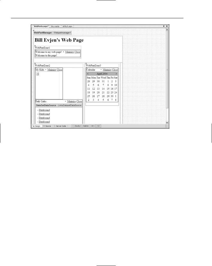
The WebPartZone control defines an area of items, or Web Parts, that can be moved, minimized, maximized, deleted, or added based on programmatic code or user preferences. When you drag and drop WebPartZone controls onto the design surface using Visual Studio 2005, the WebPartZone control is drawn at the top of the zone, along with a visual representation of any of the items contained within the zone.
You can place almost anything in one of the Web zones. For example, you can include
HTML elements
Raw text
HTML server controls
298
Portal Frameworks and Web Parts
Web server controls
User controls
Custom controls
WebPartZone controls are declared like this:
<asp:WebPartZone ID=”WebPartZone1” Runat=”server”></asp:WebPartZone>
The LayoutOrientation attribute
The Web Parts declared within a WebPartZone control can be displayed either horizontally or vertically. By default, all the items are displayed vertically, but to display the items horizontally, you simply add the LayoutOrientation attribute to the <asp:WebPartZone> element:
<asp:WebPartZone ID=”WebPartZone1” Runat=”server” LayoutOrientation=”Horizontal”></asp:WebPartZone>
The first row in the table from Listing 10-2 uses horizontal orientation, whereas the other two zones use the default vertical orientation.
The ZoneTemplate element
In order to include items within the templated WebPartZone control, you must include a <ZoneTemplate> element. The ZoneTemplate element encapsulates all the items contained within a particular zone. The order in which they are listed in the ZoneTemplate section is the order in which they appear in the browser until changed by the end user or by programmatic code. The sample <ZoneTemplate> section used earlier is illustrated here:
<asp:WebPartZone ID=”WebPartZone2” Runat=”server”> <ZoneTemplate>
<asp:DynamicImage ID=”DynamicImage1” Runat=”server” ImageFile=”~/kids.jpg” Width=”150” Title=”My Kids”> </asp:DynamicImage> <myUserControl1:DailyLinksWebPart ID=”DailyLinksWebPart1” Runat=”server” Title=”Daily Links” > </myUserControl1:DailyLinksWebPart >
</ZoneTemplate>
</asp:WebPartZone>
This zone contains two items — a dynamic image and a user control consisting of a collection of links that come from an XML file.
Default Web Part control elements
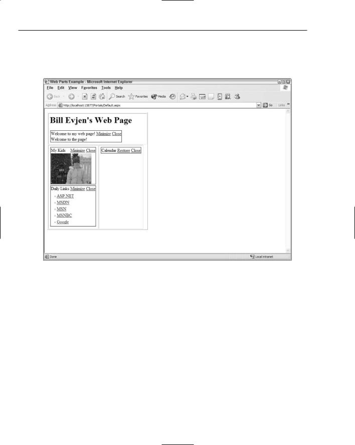
By default, when you generate a page using the code from Listing 10-2, you discover that you can exert only minimal control over the Web Parts themselves. In the Default view, which isn’t the most artistic, you are only able to minimize or close a Web Part, which removes that particular Web Part from the screen.
299
Chapter 10
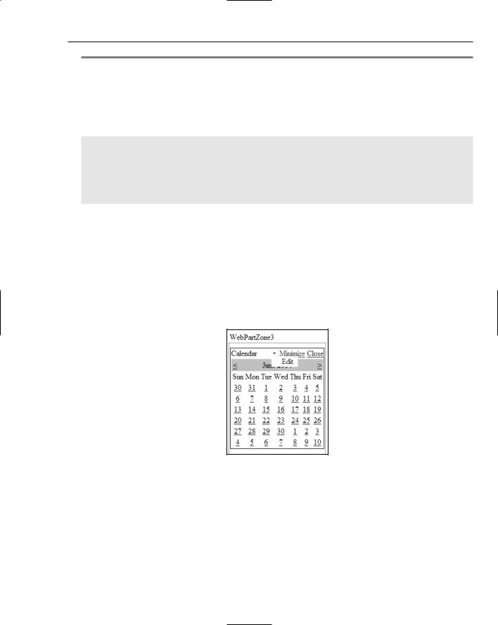
Figure 10-6 shows what the Web Part that contains the Calendar control looks like after you minimize it. Notice also that if you opt to close one of the Web Parts, the item completely disappears. You seem to have no way to make it come back — even if you shut down the page and restart it. This is by design — so don’t worry. I show you how to get it back!
Figure 10-6
A few of the items included in the zones have new titles. By default, the title that appears at the top of the Web Part is the name of the control. For instance, you can see that the Calendar control is simply titled Calendar. If you add a Button control to the zone, it would simply be called Button. To give better and more meaningful names to the Web Parts that appear in a zone, you simply add a Title attribute to the control — just as you did with the DynamicImage control and the User control, which both appear on the page. In the example above, I rename the DynamicImage control My Kids, whereas I give the user control the Title value Daily Links.
Besides this little bit of default functionality, you can do considerably more with the Web Parts contained within this page, but you have to make some other additions, which I review next.
300
Portal Frameworks and Web Parts
Explaining the WebPartPageMenu control
The WebPartPageMenu control is another management control that simplifies applying customization capabilities to your pages that utilize the Portal Framework. This control provides a menu on the page so that the end user can customize the page and then save his changes to the server.
The WebPartPageMenu control enables the end user to
Add new Web Parts to the page: Includes Web Parts not displayed on the page by default and Web Parts that the end user has previously deleted. This aspect of the control works with the catalog capabilities of the Portal Framework, which is discussed shortly.
Enter the design mode for the page: Enables the end user to drag and drop elements around the page. The end user can use this capability to change the order in which items appear in a zone or to move items from one zone to another.
Modify the Web Parts settings: Enables the end user to customize aspects of the Web Parts, such as their appearance and behavior. It also allows the end user to modify any custom settings that developers apply to the Web Part.
Connect Web Parts on the page: Enables the end user to make a connection between one or more Web Parts on the page. For instance, if the end user is working in a financial services application and enters a stock symbol into one of the Web Parts — by using a connection to another Web Part — a chart is changed or news appears based upon the variable defined in the first Web Part.
Building upon Listing 10-2, Listing 10-3 adds a WebPartPageMenu control to the table’s header.
Listing 10-3: Adding a WebPartPageMenu control
<tr valign=”top”>
<td colspan=”2”>
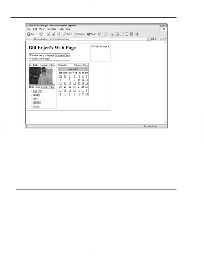
<h1>Bill Evjen’s Web Page</h1>
<asp:WebPartZone ID=”WebPartZone1” Runat=”server” LayoutOrientation=”Horizontal”>
<ZoneTemplate>
<asp:Label ID=”Label1” Runat=”server” Text=”Label” Title=”Welcome to my web page!”>
Welcome to the page! </asp:Label>
</ZoneTemplate>
</asp:WebPartZone>
</td>
<td>
<asp:WebPartPageMenu ID=”Webpartpagemenu1” Runat=”server”>
</asp:WebPartPageMenu>
</td>
</tr>
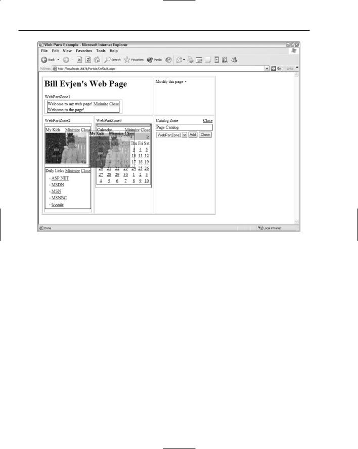
This adds the WebPartPageMenu control to the top of the table as shown in Figure 10-7.
301
Chapter 10
Figure 10-7
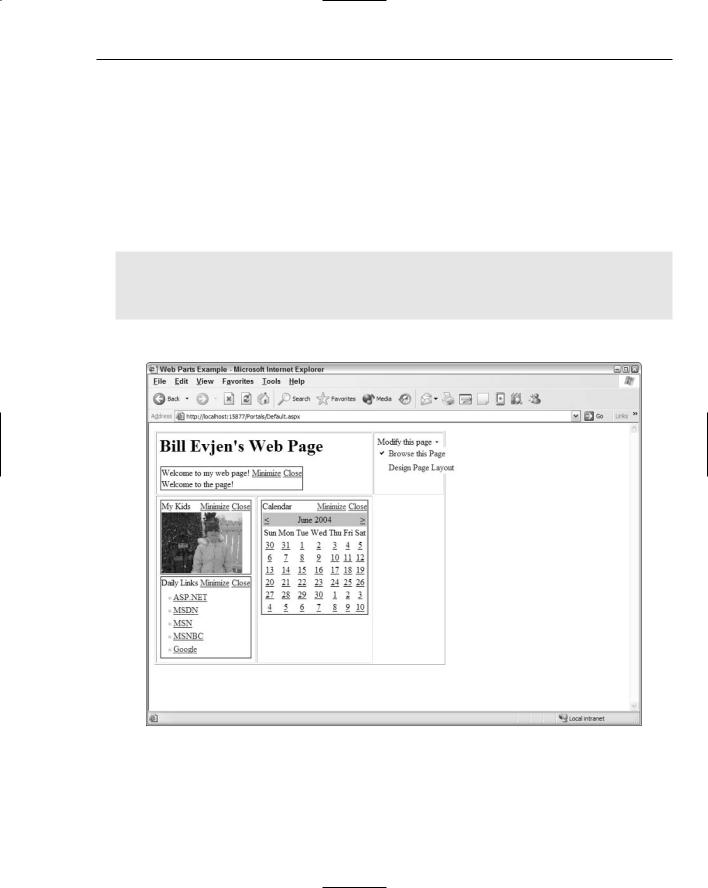
When the end user clicks on the link, a drop-down window of options appears, as shown in Figure 10-8.
The next section covers an important addition to the Portal Framework provided by the WebPartPageMenu control — the capability to Add Web Parts to This Page.
Adding Web Parts to a page
The end user has a built-in way to add Web Parts to the page by using the Portal Framework. The WebPartPageMenu control enables you to add Web Parts, but you also need to provide the end user with a list of items he can add. To do this, simply add a Catalog Zone to the last table cell in the bottom of the table. This is illustrated in the partial code example in Listing 10-4.
Listing 10-4: Adding a Catalog Zone
<tr valign=”top”> <td>
<asp:WebPartZone ID=”WebPartZone2” Runat=”server”> <ZoneTemplate>
<asp:DynamicImage ID=”DynamicImage1” Runat=”server” ImageFile=”~/kids.jpg” Width=”150” Title=”My Kids”> </asp:DynamicImage> <myUserControl1:DailyLinksWebPart ID=”DailyLinksWebPart1” Runat=”server” Title=”Daily Links” >
302
Portal Frameworks and Web Parts
</myUserControl1:DailyLinksWebPart > </ZoneTemplate>
</asp:WebPartZone>
</td>
<td>
<asp:WebPartZone ID=”WebPartZone3” Runat=”server”> <ZoneTemplate>
<asp:Calendar ID=”Calendar1” Runat=”server”> </asp:Calendar>
</ZoneTemplate>
</asp:WebPartZone>
</td>
<td>
<asp:CatalogZone ID=”Catalogzone1” Runat=”server”> <ZoneTemplate>
<asp:PageCatalogPart ID=”Pagecatalogpart1” Runat=”server” /> </ZoneTemplate>
</asp:CatalogZone>
</td>
</tr>
Figure 10-8
303
Chapter 10
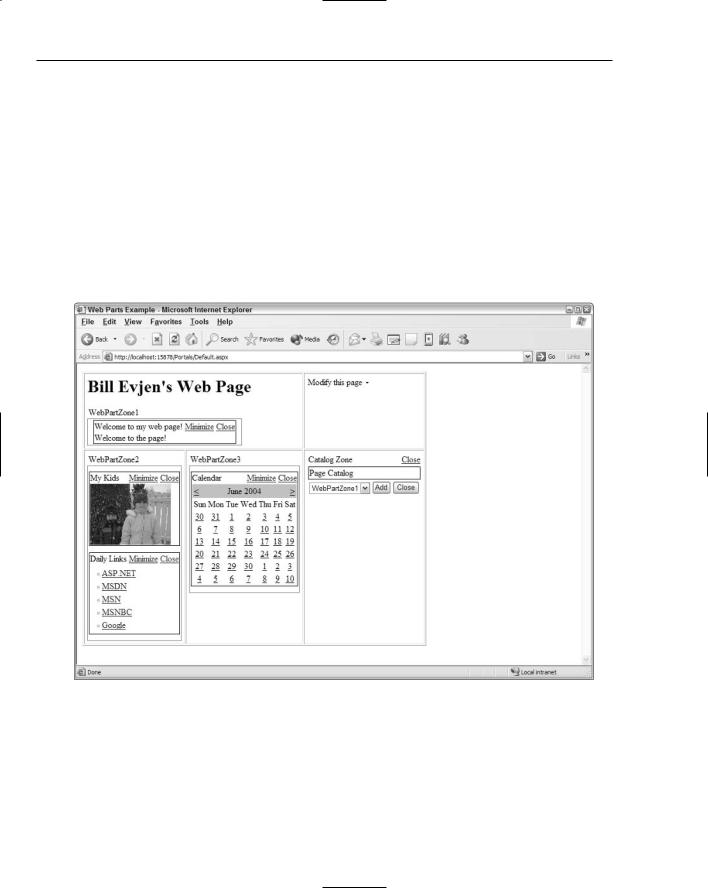
To add the capability for the end user to select items to place on the page after he selects the option in the WebPartPageMenu control, you must create a Catalog Zone with the <asp:CatalogZone> control. This is similar to creating a Web Part Zone, but the Catalog Zone is specifically designed to allow for categorization of items to be placed on the page. After the Catalog Zone is in place, the next step is to create a <ZoneTemplate> section within the Catalog Zone because this is a templated section. Inside the <ZoneTemplate> element is a single control — the PageCatalogPart control. If you run the page after adding the PageCatalogPart control, you see the results shown in Figure 10-9.
To get some items to appear in the list, delete one or more items from the page’s default view and enter the catalog mode through the WebPartPageMenu control. At this point, you see the deleted Web Parts. The PageCatalogPart control contains a title and check box list of items that can be selected. The PageCatalogPart control also includes a drop-down list of all the available Web Part Zones on the page. You can place the selected Web Parts in this list. After you select the Web Parts and the appropriate zone, you click the Add button and the items appear in their specified locations.
Figure 10-9
304
Portal Frameworks and Web Parts
Moving Web Parts
Not only can the end user change the order in which Web Parts appear in a zone, he can also move Web Parts from one zone to another. By adding the WebPartPageMenu control, you have already provided the end user with this capability. He simply needs to enter a mode that allows for this type of movement.
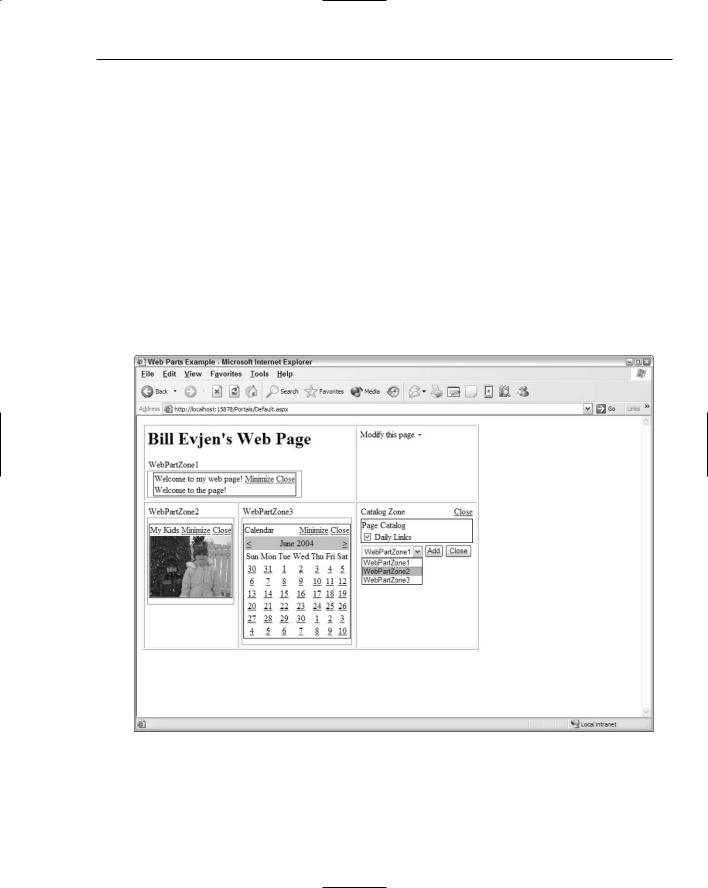
The end user can move Web Parts by selecting Design Page Layout from the list. This is the second option in the list and changes the page so that the end user can see the zones defined on the page. This view is illustrated in Figure 10-10.
From this figure, you can see the three zones (WebPartZone1, WebPartZone2, and WebPartZone3). At this point, the end user can select one of the Web Parts and either change its order in the zone or move it to an entirely different zone on the page. To grab one of the Web Parts, the user simply clicks and holds the left mouse button on the title of the Web Part. When done correctly, a cross-hair appears, meaning that the user has grabbed hold of the Web Part and can drag it to another part of the page. While the end user drags the Web Part around the page, a visual representation of the item appears (see Figure 10-11). In this state, the Web Part is a bit transparent and its location in the state of the page is defined with a blue line. Releasing the left mouse button drops the Web Part at the blue line’s location.
Figure 10-10
305
Chapter 10
Figure 10-11
After the end user places all the items where he wants them, he can save the locations of the items for later use. When he reopens the browser, everything is drawn in the last state in which he left the page. This is done on a per-user basis, so any other users browsing to the same page see either their own modified results or the default view if it is a first visit to the page.
The user can then leave the Design view by opening the list of options from the WebPartPageMenu control and selecting Browse this Page.
Another way to move Web Parts is to enter the catalog mode of the page (which is the first option in the list from the WebPartPageMenu control). The catalog mode enables you to add deleted items to the page, and it also allows you to modify the location of the items on the page by providing the same drag-and-drop capability as the design mode.
Modifying the Web Part Settings
The third option in the WebPartPageMenu control drop-down list is Modify Web Part Settings. This selection allows the end user to modify settings determining appearance, behavior, and layout for particular Web Parts on the page.
To make this functionality work, you must add an Editor Zone to the page just as you add the Catalog Zone. This is illustrated in Listing 10-5. You place this bit of new code within the same table directly below the Catalog Zone declaration.
306
Portal Frameworks and Web Parts
Listing 10-5: Adding an Editor Zone to the page
<td>
<asp:CatalogZone ID=”Catalogzone1” Runat=”server”> <ZoneTemplate>
<asp:PageCatalogPart ID=”Pagecatalogpart1” Runat=”server” /> </ZoneTemplate>
</asp:CatalogZone>
<asp:EditorZone ID=”Editorzone1” Runat=”server”> <ZoneTemplate>
<asp:AppearanceEditorPart ID=”Appearanceeditorpart1” Runat=”server” /> <asp:BehaviorEditorPart ID=”Behavioreditorpart1” Runat=”server” /> <asp:LayoutEditorPart ID=”Layouteditorpart1” Runat=”server” />
</ZoneTemplate>
</asp:EditorZone>
</td>
Just like the <asp:CatalogZone>, the <asp:EditorZone> control is a templated control that requires a <ZoneTemplate> section. Within this section, you can place controls that allow for the modification of the appearance, behavior, and layout of the selected Web Part. These controls include the
<asp:AppearanceEditorPart>, <asp:BehaviorEditorPart>, and <asp:LayoutEditorPart> controls.
When you run this new section of code and select Modify Web Part Settings from the WebPartPageMenu control, you cause an arrow to appear next to the Web Part title. Clicking this arrow shows an Edit option, as illustrated in Figure 10-12.
Figure 10-12
After you select the Edit option, the right column of the table shows the various editing sections for this particular Web Part.
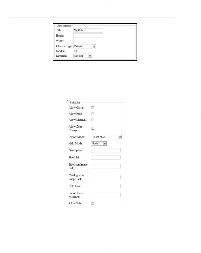
The Appearance section enables the end user to change the Web Part’s details, including the title, how the title appears, and other appearance-related items such as the item’s height and width. The Appearance section is shown in Figure 10-13.
307
Chapter 10
Figure 10-13
The Behavior section (shown in Figure 10-14) enables the end user to select whether the Web Part can be closed, minimized, or exported. It also gives the end user the capability to change the roles of users who can view the Behavior section. The Behavior section is generally used if you want to allow site editors (or admins) to change the dynamics of how end users can modify Web Parts. General viewers of the page most likely won’t see this section.
Figure 10-14
308
Portal Frameworks and Web Parts
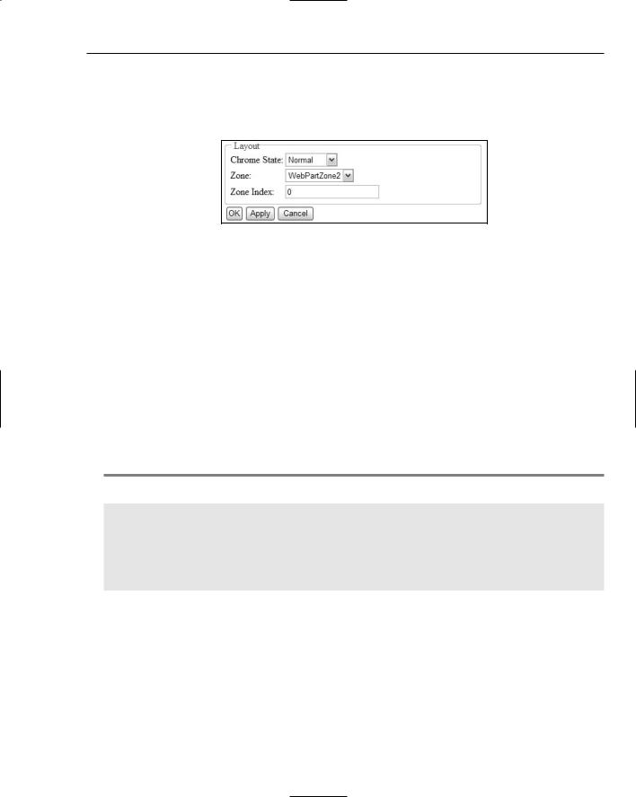
The Layout section (shown in Figure 10-15) enables the end user to change the order in which Web Parts appear in a zone or allows the end user to move Web Parts from one zone to another. This is quite similar to the drag-and-drop capabilities illustrated previously, but this section allows for the same capabilities through the manipulation of simple form elements.
Figure 10-15
After the appearance or the layout of the Web Parts is to your liking, simply click OK or Apply.
Connecting Web Parts
The last option in the WebPartPageMenu control is Connect Web Parts on this Page. This section enables you to make property connections between two Web Parts on the same page. For example, within the Weather Web Part built into one of ASP.NET’s pre-built applications, you can have a separate Web Part that is simply a text box and a button that allows the end user to input a zip code. This, in turn, modifies the contents in the original Weather Web Part.
Customizing the look and feel of the WebPartPageMenu control
You can completely customize the look and feel of all the items used throughout the framework, just as you can modify all aspects of the Portal Framework. Because so many options are available to developers, I cannot possibly cover every point of customization. To see what I mean, take a look at a modified WebPartPageMenu control in particular, as shown in Listing 10-6.
Listing 10-6: Modifying the look and feel of the WebPartPageMenu control
<asp:WebPartPageMenu ID=”Webpartpagemenu1” Runat=”server” Text=”MODIFY PAGE” Font-Size=”8” Font-Names=”Verdana” MenuStyle-GridLines=”Horizontal” MenuStyle-Font-Size=”8” MenuStyle-Font-Names=”Verdana” MenuStyle-BorderColor=”Gray” MenuStyle-BorderStyle=”Solid” MenuStyle-BorderWidth=”1” HoverStyle-BackColor=”Gainsboro” VerbHoverStyle-BackColor=”Khaki”>
</asp:WebPartPageMenu>
A huge list of possible modifications can be made to this control — I selected just a few of the possible choices! As you can see, I changed the text so that it is capitalized and displayed in a different font. I also designed the background color of the text to change if the end user hovers the mouse over the text. After the end user opens the WebPartPageMenu control, the box in which the items are displayed changes as well. Notice that an option changes to a different color when the end user hovers the mouse over that particular option. Running this example produces a WebPartPageMenu like the one shown in Figure 10-16.
309