

New Ways to Handle Data
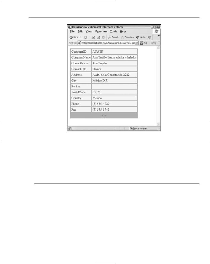
Figure 4-20
Selecting which fields to display in the DetailsView control
You can customize the appearance of the DetailsView control by picking and choosing which fields the control displays. By default, the control displays each and every column from the table it is working with. Much like the GridView control, however, the DetailsView control enables you to specify that only certain selected columns be displayed. This is illustrated in Listing 4-17.
Listing 4-17: Choosing the fields to display in the DetailsView control
<%@ Page Language=”VB” %>
<html xmlns=”http://www.w3.org/1999/xhtml” > <head runat=”server”>
<title>DetailsView Control</title> </head>
<body>
<form id=”form1” runat=”server”>
<asp:DetailsView ID=”DetailsView1” Runat=”server”
(continued)
101
Chapter 4
Listing 4-17: (continued)
DataSourceId=”AccessDataSource1”
AllowPaging=”True” BorderColor=”#DEBA84” BorderStyle=”None” BorderWidth=”1px” BackColor=”#DEBA84” CellSpacing=”2” CellPadding=”3” PagerSettings-Mode=”NextPrevious” AutoGenerateRows=”False”>
<Fields>
<asp:BoundField HeaderText=”Customer ID” DataField=”CustomerID”> </asp:BoundField>
<asp:BoundField HeaderText=”Company Name” DataField=”CompanyName”> </asp:BoundField>
<asp:BoundField HeaderText=”Country” DataField=”Country”> </asp:BoundField>
<asp:BoundField NullDisplayText=”NO REGION” HeaderText=”Region” DataField=”Region”>
</asp:BoundField>
</Fields>
<PagerStyle ForeColor=”#8C4510” HorizontalAlign=”Center”> </PagerStyle>
<EditRowStyle ForeColor=”White” BackColor=”#738A9C” Font-Bold=”True”> </EditRowStyle>
<RowStyle ForeColor=”#8C4510” BackColor=”#FFF7E7”> </RowStyle>
<FooterStyle ForeColor=”#8C4510” BackColor=”#F7DFB5”> </FooterStyle>
<HeaderStyle ForeColor=”White” BackColor=”#A55129” Font-Bold=”True”> </HeaderStyle>
</asp:DetailsView>
<asp:AccessDataSource ID=”AccessDataSource1” Runat=”server” SelectCommand=”Select * From Customers” DataFile=”Data/Northwind.mdb”>
</asp:AccessDataSource>
</form>
</body>
</html>
When this page is run, you see that the DetailsView control now displays only four values for each of the rows (as shown in Figure 4-21).
Figure 4-21
102

New Ways to Handle Data
You select columns exactly as you did when using the GridView control. The big difference is that instead of using the <Columns> element to define the columns to bind to, the DetailsView control uses the <Fields> element. Notice that the columns are bound to the DetailsView control using the same ASP.NET controls you used for the GridView control: <asp:BoundField>, <asp:ButtonField>,
<asp:CheckBoxField>, <asp:CommandField>, <asp:HyperLinkField>, and <asp:TemplateField>. In fact, you use these field declaration controls just as you did with the GridView control shown earlier in the chapter.
Using the GridView and DetailsView together
Now for an interesting and useful example, look at how you would use the GridView and the DetailsView controls together. You can use the GridView to show a master view of the data (in this case, the Customers table from the sample Northwind.mdb file), whereas you can use the DetailsView control to show the details of any selected rows in the main GridView control (see Listing 4-18).
Listing 4-18: Enabling the GridView and DetailsView controls to work together
<%@ Page Language=”VB” %>
<html xmlns=”http://www.w3.org/1999/xhtml” > <head id=”Head1” runat=”server”>
<title>GridView & DetailsView Controls</title> </head>
<body>
<form id=”form1” runat=”server”> <p>
<asp:GridView ID=”GridView1” Runat=”server” DataSourceId=”AccessDataSource1” AllowPaging=”True” BorderColor=”#DEBA84” BorderStyle=”None” BorderWidth=”1px” BackColor=”#DEBA84” CellSpacing=”2” CellPadding=”3” DataKeyNames=”CustomerID” AutoGenerateSelectButton=”true” AutoGenerateColumns=”False” PageSize=”5”>
<Columns>
<asp:BoundField HeaderText=”Customer ID” DataField=”CustomerID”> </asp:BoundField>
<asp:BoundField HeaderText=”Company Name” DataField=”CompanyName”> </asp:BoundField>
</Columns>
<FooterStyle ForeColor=”#8C4510” BackColor=”#F7DFB5”> </FooterStyle>
<RowStyle ForeColor=”#8C4510” BackColor=”#FFF7E7”> </RowStyle>
<SelectedRowStyle ForeColor=”White” BackColor=”#738A9C” Font-Bold=”True”>
</SelectedRowStyle>
<Pagerstyle ForeColor=”#8C4510” HorizontalAlign=”Center”> </PagerStyle>
<HeaderStyle ForeColor=”White” BackColor=”#A55129” Font-Bold=”True”>
</HeaderStyle>
(continued)
103

Chapter 4
Listing 4-18: (continued)
</asp:GridView>
</p>
<p><b>Customer Details:</b></p>
<asp:DetailsView ID=”DetailsView1” Runat=”server” DataSourceId=”AccessDataSource2”
BorderColor=”#DEBA84” BorderStyle=”None” BorderWidth=”1px” BackColor=”#DEBA84” CellSpacing=”2” CellPadding=”3” AutoGenerateRows=”True”>
<PagerStyle ForeColor=”#8C4510” HorizontalAlign=”Center”> </PagerStyle>
<EditRowStyle ForeColor=”White” BackColor=”#738A9C” Font-Bold=”True”> </EditRowStyle>
<RowStyle ForeColor=”#8C4510” BackColor=”#FFF7E7”> </RowStyle>
<FooterStyle ForeColor=”#8C4510” BackColor=”#F7DFB5”> </FooterStyle>
<HeaderStyle ForeColor=”White” BackColor=”#A55129” Font-Bold=”True”>
</HeaderStyle>
</asp:DetailsView>
<asp:AccessDataSource ID=”AccessDataSource1” Runat=”server” SelectCommand=”Select * From Customers” DataFile=”~/Northwind.mdb” />
<asp:AccessDataSource ID=”AccessDataSource2” Runat=”server” SelectCommand=”Select * From Customers”
DataFile=”~/Northwind.mdb” FilterExpression=”CustomerID=’@CustID’”> <FilterParameters>
<asp:ControlParameter Name=”CustID” ControlId=”GridView1” PropertyName=”SelectedValue”>
</asp:ControlParameter>
</FilterParameters>
</asp:AccessDataSource>
</form>
</body>
</html>
When this page is run in the browser, you get the results illustrated in Figure 4-22.
In this figure, one of the rows in the GridView has been selected (noticeable by the color change). The details of this selected row are shown in the DetailsView control directly below the GridView control.
To see how this works, look at the changes made to the second AccessDataSource control, Access DataSource2. The only change made to the main <asp:AccessDataSource> element here is the addition of the FilterExpression attribute. The FilterExpression attribute is used to modify the SelectCommand attribute when filtering is applied. The String value given to the FilterExpression attribute expresses how you want the AccessDataSource control to filter the select command. In this case, the value of the FilterExpression is CustomerID=@CustomerID. If filtering is utilized, the AccessDataSource control filters the records that are retrieved from the Select * From Customers command so that the command resembles Select * From Customers Where CustomerID=@ CustomerID. The parameter specified in the FilterExpression attribute, @CustomerID, is defined within the AccessDataSource control itself through the use of the <FilterParameters> element.
104