


Site Navigation
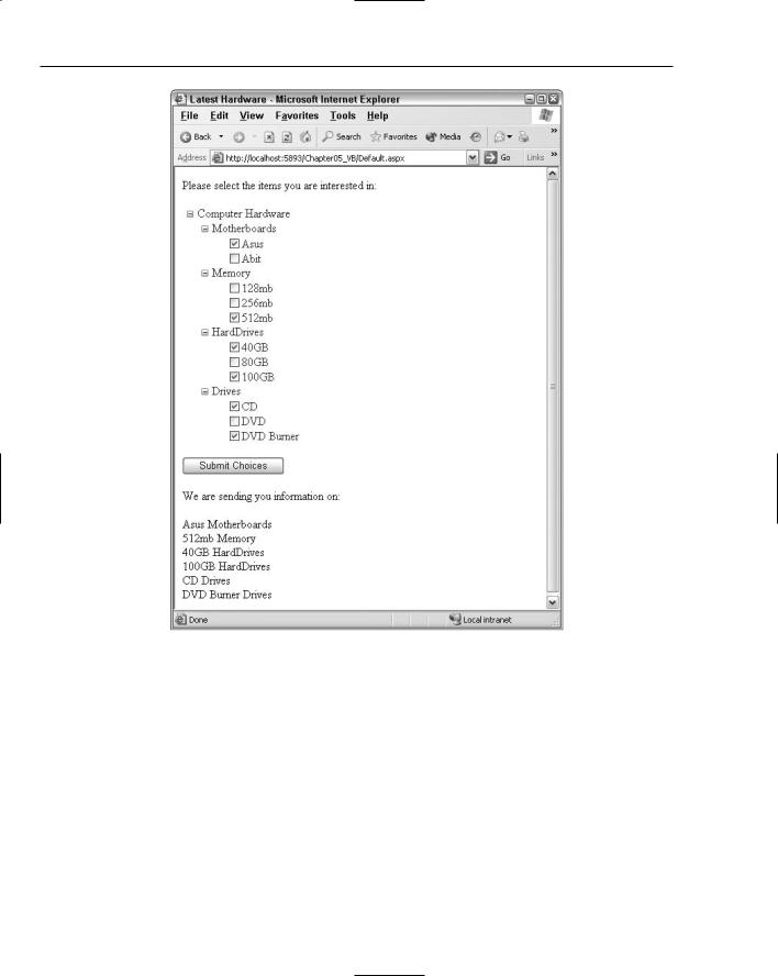
In this example, you first set the ShowTextBoxes property to Leaf, meaning that you are only interested in having check boxes appear next to items in the TreeView control which do not contain any child nodes. The only items with check boxes next to them should be the last item that can be expanded in
the hierarchical list.
After this property is set, you then work with the items that are selected by the end user in the Button1_Click event. The first thing you should check is whether any selection at all was made:
If TreeView1.CheckedNodes.Count > 0 Then
...
End If
In this case, the number of checked nodes on the postback needs to be greater than zero, meaning that at least one was selected. If so, you can execute the code within the If statement. The If statement then proceeds to populate the Label control that is on the page. To populate the Label control with data from the selected nodes, you use a For Each statement, as shown in the following:
For Each node As TreeNode In TreeView1.CheckedNodes
...
Next
This creates an instance of a TreeNode object and checks each TreeNode object within the TreeView1 collection of checked nodes.
For each node that is checked, you grab the nodes Text value and the Text value of this node’s parent node to further populate the Label control:
Label1.Text += node.Text & “ “ & node.Parent.Text & “<br>”
In the end, you get a page that produces the results shown in Figure 5-13.
Specifying custom icons in the TreeView control
The TreeView control allows for a high degree of customization. You saw earlier in the chapter that you were easily able to customize the look and feel of the TreeView control by specifying one of the built-in styles. Applying one of these styles dramatically changes the appearance of the control. One of the most noticeable changes concerns the icons used for the nodes within the TreeView control. Although it is not as easy as just selecting one of the styles built into the TreeView control, you can apply your own icons to be used for the nodes within the hierarchical list of nodes.
145
Chapter 5
Figure 5-13
The TreeView control contains the properties discussed in the following table. These properties enable you to specify your own images to use for the nodes of the control.
Property |
Description |
|
|
CollapseImageUrl |
Applies a custom image next to nodes that have been expanded to |
|
show any of their child nodes and have the capability of being |
|
collapsed. |
ExpandImageUrl |
Applies a custom image next to nodes that have the capability of |
|
being expanded to display their child nodes. |
LeafImageUrl |
Applies a custom image next to a node that has no child nodes |
|
and is last in the hierarchical chain of nodes. |
|
|
146

|
|
Site Navigation |
|
|
|
|
Property |
Description |
|
|
|
|
NoExpandImageUrl |
Applies a custom image to nodes that, for programmatic reasons, |
|
|
cannot be expanded or to nodes that are leaf nodes. This is pri- |
|
|
marily used for spacing purposes to align leaf nodes with their |
|
|
parent nodes. |
|
ParentNodeImageUrl |
Applies a custom image only to the parent nodes within the |
|
|
TreeView control. |
|
RootNodeImageUrl |
Applies a custom image next to only the root nodes within the |
|
|
TreeView control. |
|
|
|
Listing 5-11 shows an example of these properties in use.
Listing 5-11: Applying custom images to the TreeView control
<asp:TreeViewTreeView ID=”TreeView1” Runat=”server” Font-Underline=”false” DataSourceId=”Xmldatasource1” CollapseImageUrl=”Images/CollapseImage.gif” ExpandImageUrl=”Images/ExpandImage.gif” LeafImageUrl=”Images/LeafImage.gif”>
<DataBindings>
<asp:TreeNodeBinding DataMember=”Hardware” Text=”Computer Hardware” /> <asp:TreeNodeBinding DataMember=”Item” TextField=”Category” /> <asp:TreeNodeBinding DataMember=”Option” TextField=”Choice” />
</DataBindings>
</asp:TreeView>
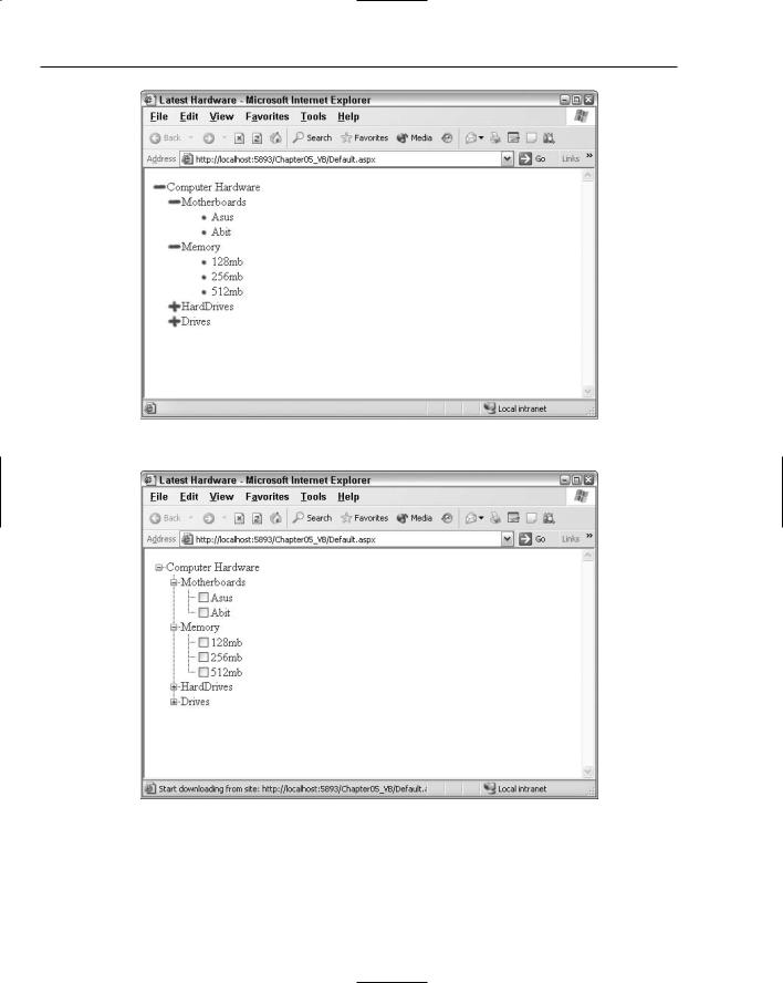
Specifying these three images to precede the nodes in your control overrides the default values of using a plus (+) sign and a minus (–) sign for the expandable and collapsible nodes. It also overrides simply using an image for any leaf nodes when by default nothing is used. Using the code from Listing 5-11, you get something similar to the results illustrated in Figure 5-14.
Specifying lines used to connect nodes
Because the TreeView control shows a hierarchical list of items to the end user, you sometimes want to show the relationship between these hierarchical items more explicitly than it is shown by default with the TreeView control. One possibility is to show line connections between parent and child nodes within the display. Simply set the ShowLines property of the TreeView control to True (by default, this property is set to False):
<asp:TreeViewTreeView ID=”TreeView1” Runat=”server” Font-Underline=”false” DataSourceId=”Xmldatasource1” ShowCheckBoxes=”leaf” ShowLines=”True”>
...
</asp:TreeViewTreeView>
This code gives the result shown in Figure 5-15.
147
Chapter 5
Figure 5-14
Figure 5-15
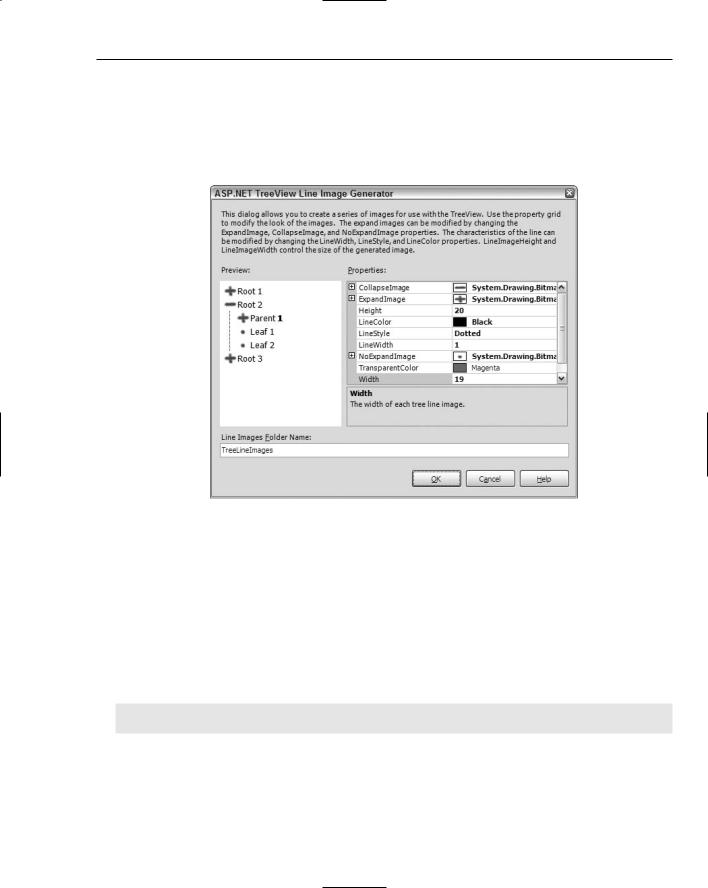
If the ShowLines property is set to True, you can also define your own lines and images within the TreeView control. This is quite easy to do because Visual Studio 2005 provides you with an ASP.NET TreeView Line Image Generator tool. This tool enables you to visually design how you want the lines
148
Site Navigation
and corresponding expanding and collapsing images to appear. After you have it set up as you want, the tool then creates all the necessary files for any of your TreeView controls to use.
To get at the tool, move to the Design view of your file and click open the smart tag for the TreeView control that is on your page. Here you find the option Customize Line Images. Click this and you are presented with the ASP.NET TreeView Line Image Generator dialog (shown in Figure 5-16).
Figure 5-16
From within this dialog, you can select the images used for the nodes that require an Expand, Collapse, or NoCollapse icon. You can also specify the color and style of the lines that connect the nodes. As you create your styles, a sample TreeView control output is displayed for you directly in the dialog based on how your styles are to be applied. The final step is to choose the output of the files that this dialog will create. When you have completed this step, click the OK button. This generates a long list of new files to the folder that you specified in the dialog. By default, the ASP.NET TreeView Line Image Generator wants you to name the output folder TreeLineImages, but feel free to name it as you wish. If the folder doesn’t exist in the project, you will be prompted to allow Visual Studio to create the folder for you. Once in place, the TreeView control can use your new images and styles by setting the LineImagesFolderUrl property as shown here:
<asp:TreeViewTreeView ID=”TreeView1” Runat=”server” ShowLines=”true”
DataSourceId=”SiteMapDataSource1” LineImagesFolderUrl=”TreeViewLineImages”>
The important properties are shown in bold. The ShowLines property must be set to True. After it is set, it uses the default settings displayed earlier, unless you have specified a location where it can retrieve custom images and styles using the LineImagesFolderUrl property. As you can see, this simply points to the new folder, TreeViewLineImages, that you created and which contains all the new images and styles. Take a look in the folder. It is interesting to see what is output by the tool.
149