

Chapter 4
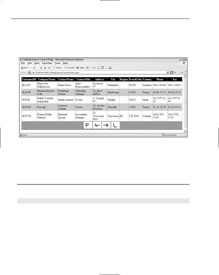
I won’t go through examples of the other attributes and how they relate to the paging capabilities of the GridView. Some of these cool attributes, however, include the PagerSettings-FirstPageImageUrl,
PagerSettings-FirstPageText, PagerSettings-LastPageImageUrl, and the PagerSettingsLastPageText attributes. When these are used with the PagerSettings-mode attribute set to one of the NextPrevious styles, you can have images or custom text appear in place of the greater-than/ less-than signs, as illustrated in Figure 4-6.
Figure 4-6
Sorting rows in the GridView control
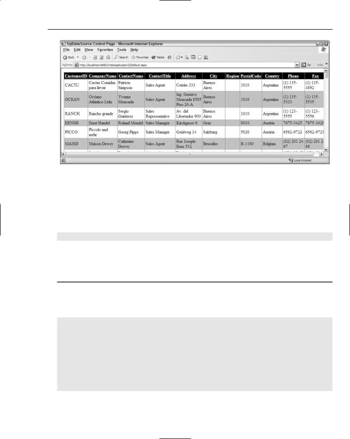
Using the same GridView control from the previous examples, you can enable the end user to sort rows as easily as he can paginate them. This is quite useful when dealing with a large collection of data in the GridView. If you can sort the data by clicking the column heading you can easily view the data in a logical manner. How to apply sorting to the data in the GridView control is shown in Listing 4-5.
Listing 4-5: Turning on sorting in the GridView control
<asp:GridView ID=”GridView1” Runat=”server” DataSourceId=”SqlDataSource1” BackColor=”White” GridLines=”Vertical” AllowSorting=”True” BorderStyle=”Solid” CellPadding=”3” ForeColor=”Black” BorderColor=”#999999” BorderWidth=”1px”>
...
</asp:GridView>
If you set the value of the AllowSorting attribute to True, the end user can click a column heading to sort the entire list based on that selected column. Clicking the same column again sorts the list in the reverse direction. Figure 4-7 shows the GridView sorted by Country.
82
New Ways to Handle Data
Figure 4-7
Defining bound columns in the GridView control
In many instances, you want to display only select columns from the table of data being retrieved. One way to do this is to modify your select statement so that it retrieves only the columns you want to display. For instance, your Select statement might resemble the following:
Select CustomerId, CompanyName From Customers
This code determines that only these two columns are displayed in the GridView control. At times, you may want to retrieve certain columns in order to act upon the information they contain, but not display these columns to the end user. For example, you may want to retrieve the CustomerId column from the Customers table, but not display this column to the end user. You see how you can do this in Listing 4-6.
Listing 4-6: Building columns in the GridView control
<asp:GridView ID=”GridView1” Runat=”server” DataSourceId=”SqlDataSource1” AllowSorting=”True” BackColor=”White” GridLines=”Vertical” BorderStyle=”Solid” CellPadding=”3” ForeColor=”Black” BorderColor=”#999999” BorderWidth=”1px” AutoGenerateColumns=”False”>
<Columns>
<asp:BoundField Visible=”False” DataField=”CustomerID”> </asp:BoundField>
<asp:BoundField SortExpression=”CompanyName” HeaderText=”Company Name” DataField=”CompanyName”>
</asp:BoundField>
<asp:BoundField SortExpression=”Country” HeaderText=”Country” DataField=”Country”>
</asp:BoundField>
</Columns>
...
</asp:GridView>
83

Chapter 4
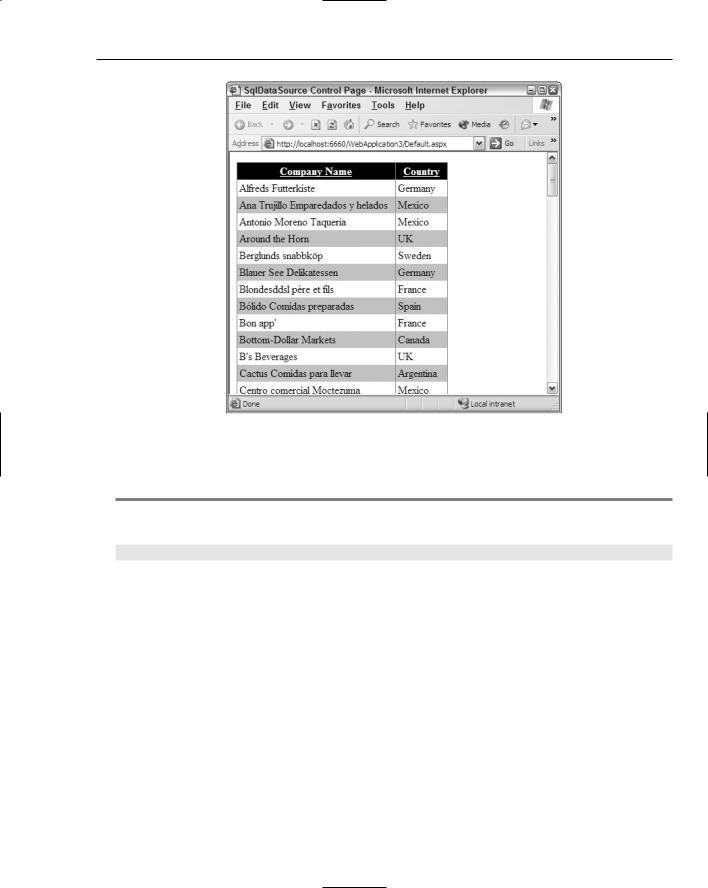
For the example in Listing 4-6, I changed the SQL statement in the SqlDataSource control to Select * From Customers just to show that you can pick and choose which items to display in the GridView control. The attribute AutoGenerateColumns is added to the main <asp:GridView> node and set to False. By default, this attribute is set to True causing the GridView control to automatically generate each and every column that comes from the dataset retrieved by the SqlDataSource control. When the attribute is set to False, you must specify which columns the GridView control generates.
You can also use the <Columns> section to specify how the columns are displayed in the GridView control. The < Columns > section of the GridView control can take any number of <asp:BoundField> elements. The <asp:BoundField> elements are what you use to associate a column displayed in the GridView control to a column of data from the Customers table in the Northwind database. You can see that each of the three <asp:BoundField> elements in this GridView control example is used in a different manner. The first <asp:BoundField> element grabs the CustomerId field. This is specified in the <asp:BoundField > element by the DataField attribute. The String value assigned to the DataField element must be the column name used in the Customers table. The other important attribute used in the <asp:BoundField> is the Visible attribute. By default, the Visible attribute is set to True — meaning that the column is displayed in the GridView control; but in this case, you set
it to False. Why? Because when the end user is acting on a row of data, you may want to associate that row of data with an identifier (such as a primary key value). You may not, however, want to show that data item to the end user. This is illustrated later in the chapter in the example where users edit rows of data.
The second <asp:BoundField> element is associated with the CompanyName column in the Customers table via the use of the DataField attribute. This <asp:BoundField> element also has a few additional items contained within it. The first is the HeaderText attribute. Column names contained with databases are not the prettiest things in the world, nor are they always that descriptive. For this reason, you often change the column header names in the GridView control to make them a little more userfriendly. You make this change using the HeaderText attribute. The String value placed here is used by the GridView control at the top of the column. In this case, you change the default display of CompanyName to Company Name. The second attribute used in the second <asp:BoundField> element is the SortExpression attribute. This attribute points to the column name used in the Customers table. When sorting is enabled, the GridView knows on which column to sort the data.
In the third <asp:BoundField>, you don’t use the HeaderText attribute because Country is a good heading listing. The result of Listing 4-6 is illustrated in Figure 4-8.
When you use the <asp:BoundField> elements, the columns appear from left to right in the order in which they are used in the <Columns> section of the GridView control. Therefore, you can easily change the order in which they appear in the GridView control just by changing their order in the <Columns> section.
84
New Ways to Handle Data
Figure 4-8
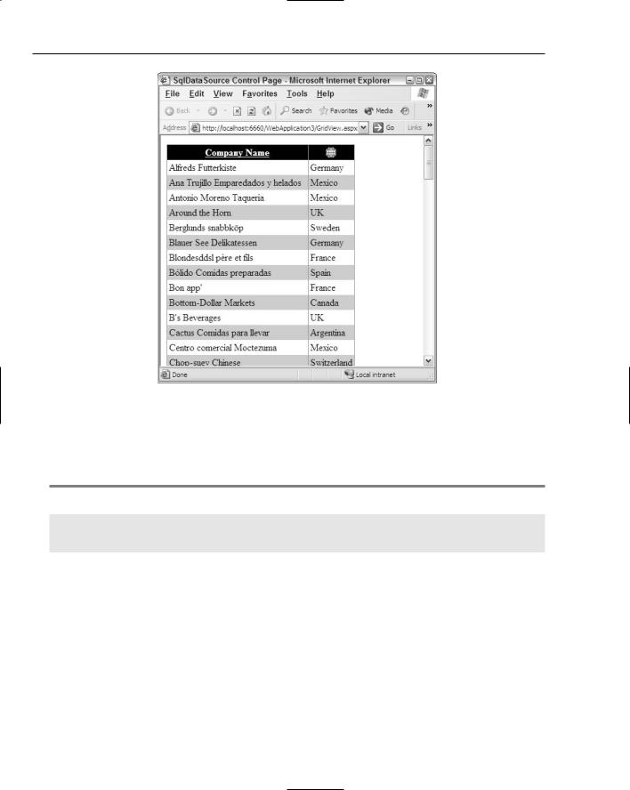
Another cool feature of the GridView control is that you can use images in the headings instead of text. This is shown in Listing 4-7.
Listing 4-7: Using images in the column headings
<asp:BoundField SortExpression=”Country” DataField=”Country” HeaderImageUrl=”~/iconGlobe.gif”>
</asp:BoundField>
This is a partial code listing. The <asp:BoundField> element associated with the Country heading is changed so that it now displays an image instead of text. The HeaderText attribute and value is removed and replaced with the HeaderImageUrl attribute. The value for this attribute points to the location of the image. This kind of construct gives you something similar to Figure 4-9.
85
Chapter 4
Figure 4-9
Another nice feature is that end users can click the image to sort the column (just as they clicked text column headers). An interesting feature associated with column generation is the capability to specify what the GridView should display when it encounters Null values within a column. For an example of this, add a column using an additional <asp:BoundField>, as illustrated in Listing 4-8.
Listing 4-8: Working with Null values in a column
<asp:BoundField SortExpression=”Region” NullDisplayText=”NO REGION” HeaderText=”Region” DataField=”Region”>
</asp:BoundField>
For this example, add an <asp:BoundField> element to display the Region column from the Customers table. As you look through the data in the Region section, notice that not every row has a value in it. What if you didn’t want just a blank box to show an empty value, but you wanted to show some text in place of the empty items in the column. To do this, you utilize the NullDisplayText attribute. The String value it provides is used for each and every row that doesn’t have a Region value. This construct produces the results illustrated in Figure 4-10.
86