

Visual Web Developer™ 2005 Express Edition For Dummies - Alan Simpson
.pdf
190 Part III: Personalization and Databases
Figure 9-14:
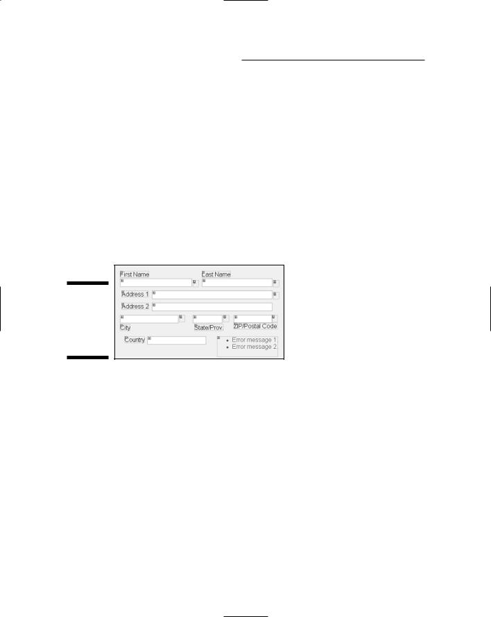
Using a validation control to keep the First Name control from being left blank.
In a Web browser, those properties play out as follows:
When the page first opens, the validation control is there but invisible.
If the user clicks the Submit button and the text box is empty, the validation control shows its Text property (here it’s a red asterisk).
The ErrorText is displayed in a ValidationSummary control — provided you’ve added one to your page (as described later in this chapter in its own section, “ValidationSummary”).
You can add as many validation controls to a page as you need to ensure quality data entry.
RangeValidator
The RangeValidator lets you check an entered value to verify that it falls within some range of acceptable values. It’s the same idea as other controls in that you drag it to the page and set its ControlToValidate property to the name of the control you want validated. Then you set the Maximum Value and Minimum Value properties to define the range of acceptable values for the control.
RegularExpressionValidator
A regular expression is a symbolic way of defining complex validation criteria. You can do things like validate an entry against a pattern of characters, or
Chapter 9: Using Personalization 191
add complex “or” logic to a validation control. The language for creating regular expressions is extensive and beyond the scope of this book. But there are some ready-made ones that you can use without studying the whole language of regular expressions.
For an in-depth discussion of regular expressions, see http://msdn. microsoft.com/library/en-us/cpguide/html/cpconcomregular expressions.asp.
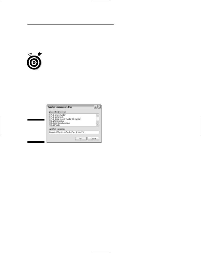
To validate a control against a regular expression, first drag a Regular ExpressionValidator onto the form and set its ControlToValidate property to the name (ID) of the Textbox control you want to validate. Then click the ValidationExpression property, click the Build button, and you can scroll through a list of predefined standard expressions in the Regular Expression Editor (looking very regular in Figure 9-15).
Figure 9-15:
The Regular
Expression
Editor.
If you find a standard expression you can use, click it and then click OK. In the Properties sheet, the expression appears as a bunch of parentheses, backslashes, and other weird characters. But that’s just what a regular expression looks like. It should work in your form anyway.
CompareValidator
Use the CompareValidator to check a text box entry by comparing it to a known value or the contents of another control. The most common use of this is when having a user enter a new password twice. Use a Compare Validator to compare the contents of the two controls, and reject both entries if they don’t match. Here’s how to use one:
1.Drag a CompareValidator control to your form and drop it there.
2.Check the new control by setting its ControlToValidate property to the name of the control.

192 Part III: Personalization and Databases
3.Use the control to make a comparison of contents.
•To compare your control’s contents to those of another control, set the ControlToCompare property to the name of the control to which you’re comparing the current control.
•To compare the entry to some other known value, set the ValueToCompare property of the control to the comparison value.
CustomValidator
Use a CustomValidator if none of the other validation controls can do what you need done — and (oh yeah) you also happen to be a skilled programmer. If that’s your thing, here are your steps:
1.Drag a CustomValidator control to the page.
2.Set the control’s ControlToValidate property to the name of the control you want to validate.
3.Switch back to your form.
4.Outside the Properties sheet, double-click the CustomValidator control you dropped onto the page.
The code-behind file for the page opens with a new CustomValidator1_ ServerValidate procedure all ready and waiting for you to type in your code.
5.Write your validation routine, close and save both files, then view the page in a Web browser to test it out.
ValidationSummary
The ValidationSummary control displays a summary of all failed validations that occurred on the form. All you have to do is drop it on the form. You don’t even need to change its properties.
In Design view, the ValidationSummary is just a placeholder showing no useful information. In a Web browser, it initially is invisible. After the user clicks the Submit button, it lists the ErrorMessageText of each control that failed validation. It’s simple to use, and handy for users.

Chapter 9: Using Personalization 193
Using the Forms Designer
That about wraps it up for profile properties. However, because I’ve touched on the topic of forms here, it might be worth taking a moment to mention that putting form controls in tables isn’t the only way to go in VWD. If you’re accustomed to working with forms-design programs or graphics programs, it may seem awkward to have to use tables to create forms.
If you want to be able to stick controls anywhere on a page, you can: Use absolute positioning, the option that puts them where you say. You can use absolute positioning in any .aspx page, Master Page, Web User Control, or HTML page. The easiest way to do so is to start by creating or opening a page. Then, in Design view, follow these steps:
1.Choose Layout Position AutoPosition Options from the menu bar.
2.Make sure the first check box is selected.
3.Set the drop-down list option to Absolutely Positioned.
4.Optionally, enable snapping to pixels by choosing the second option, as shown in Figure 9-16.
5.Click OK.
Figure 9-16:
Enabling absolute positioning.
Choosing the option to snap to pixels is an easy way to line things up on the form. If you want total freedom in positioning things on the form (as you’d have in a graphics program), you can leave Snap to Pixels turned off. Feel free to try both settings to see how they differ and what works for you.
194 Part III: Personalization and Databases
After you’ve enabled absolute positioning, any control you add to the page will initially jump to the upper-left corner of the page. But from there you can drag it anywhere you like; it’ll stay wherever you drop it. You can arrange your controls however you see fit.
For each text box you intend to put on your page, you’ll probably want to also add a Label control to hold some text describing what goes into the text box. To type text into a Label control, you have to change the label’s Text property in the Properties sheet. If you double-click the label, you wind up on the code-behind page. (If you do that by accident, just close the code-behind page and choose No when asked about saving your changes.)
Figure 9-17 shows an example where I’ve absolutely positioned Label, Textbox, Validation, and Button controls on a page to create a form similar to CreateProfile or EditProfile. Because each item is absolutely positioned on the page, there’s no need to use a table to get things lined up.
Figure 9-17:
Four controls positioned absolutely on a page.
Stacking absolutely-positioned objects
If you combine absolute and relative positioning, free-floating objects can cover (or be covered by) body text. With absolute positioning, you can set an object’s Z-Index to define where you want it to appear in a stack. An item with a Z-Index less than 0 is placed beneath text, like the box labeled Z = –1 in Figure 9-18.
Items with Z-Indexes greater than zero are stacked above text. For example, in Figure 9-18, the box labeled Z = 1 is one layer above the text, so it covers text beneath it. The box labeled Z = 2 is at an even higher layer, so it partially covers the boxes and text beneath it.
Setting the Z-Index of an absolutely-positioned item is pretty quick:
1.Right-click the item and choose Style.
Alternatively, you can click the item to select it, then click the Style property in the Properties sheet, and then click the Build button. Either way, the Style Builder opens.

Chapter 9: Using Personalization 195
Figure 9-18:
High Z- Index items stack above low Z-Index items
2.In the Style Builder, click the Position category, use the Z-Index setting to set the item’s Z value, and then click OK.
The on-screen object now has your chosen Z-Index.
To move an item quickly to the top or bottom of the stack without going through the Style Builder, click the item to select it. Then choose Format Order Send to Back (or Bring to Front, depending on where you want to put the item).
In Source view, absolutely-positioned items sport the style attributes that define the item’s place on the page, as in this example:
style=”position:absolute; top:152px; left:56px; z-index:2”
The top attribute defines the distance from the top of the page to the top of the control. The left attribute defines the distance from the left edge of the page to the left edge of the control. And of course z-index indicates the item’s stacking position.
If you give an item a Z-Index less than zero, then can’t select it in Design view, switch to Source view and make its Z-Index a positive number. Go back to Design view and make your changes. Then you can set the Z-Index back to a negative number.
Aligning absolutely-positioned objects
Before you align controls, get at least one control into position so you can use it as the model to which other controls will align. From there, it’s just a couple of easy steps:

196 Part III: Personalization and Databases
1.Select all the controls you want to line up, saving the model control for last.
Here’s the sequence: Click the first item you want to align, hold down the Shift key while clicking others, and keep holding down the Shift key as you click the model. Be sure to select the model control last so it shows white sizing handles.
2.Choose Format Align from the menu bar and line things up the way you want.
For example, in the left side of Figure 9-19, I selected a bunch of Label controls, making ZIP/Postal Code the model. The right side of that same figure shows the result of choosing Format Align Rights to get the right edges of all selected controls to line up to the right edge of the ZIP/Postal Code control.
It’s easy to make mistakes while trying to get the hang of alignment options (trust me on this one). If you make a real mess of things, just press Ctrl+Z to undo the mess.
Before aligning |
After aligning |
Figure 9-19:
Selected items (left) and result of aligning (right).
Sizing objects equally
If you want to make multiple objects the same size, the quick way is to pick or make a control to use as a the model — and then follow these steps:
1.Make a particular control the size and shape you want all the controls to be.
2.Select all the controls that you want to size.

Chapter 9: Using Personalization 197
Make sure you select the model item last so it shows the white sizing handles. For example, in the left side of Figure 9-21, I selected the control at the top last, so it acts as the model.
3.Choose Format Make Same Size from the menu bar.
4.Choose the uniform dimensions you want to apply to all controls.
You can make them the same width, the same height, or the same width and height. In the right side of Figure 9-20, I first made the controls all the same size (both height and width).
Before sizing equally |
After sizing equally |
Figure 9-20:
Selected items (left) and items made same size (right).
Spacing absolutely-positioned objects
If you want to equalize the spacing between multiple items in the page, first select all the items. No particular control plays the role of “model” here, so the order in which you selected the items isn’t important. After selecting the items, choose Format Horizontal Spacing if you want to make the selected items equally spaced across the screen. Or choose Format Vertical Spacing if you want to equally space the items down the screen. Note that you can also increase, decrease, or remove the spacing between items.
As always, if you really make a mess of things when trying to space multiple items, press Ctrl+Z to undo the change.
The left side of Figure 9-21 shows several Textbox controls selected. The right side shows those same selected controls after I chose Format Vertical Spacing Make Equal.

198 Part III: Personalization and Databases
Before spacing equally After spacing equally
Figure 9-21:
Selected items (left) and items made same size (right).
There’s no rule that says you must use absolute positioning and all the various options for aligning, sizing, and spacing controls. Using a table often gets you the same result with a lot less effort.

Chapter 10
Using Themes
In This Chapter
Creating themes for your site
Letting users choose their own themes
Applying themes to pages
Applying themes to Master Pages
In Windows and some other programs, users can choose a theme. The theme defines the general look and feel of the content in terms of color
scheme, font, the way buttons are represented, and so forth.
If you’re building a membership site where members are likely to spend a lot of time reading pages (for example, taking courses in an online school), then adding a similar theme capability to your Web site might be a good idea.
Granted, it’s a lot of work on your part. But it allows users to personalize the site content to their own needs and tastes, which, in turn, can make for a more pleasant experience at your site — and can encourage users to keep coming back for more — or even spread the word about your awesome site — instead of shopping elsewhere.
Creating Themes
The first step in adding themes to your site is to create an App_Themes older and a single Theme subfolder. You might want to start by creating a default theme that everyone first sees when they open the site. To create an App_Themes folder and a default Theme folder, follow these steps:
1.Right-click the site name at the top of Solution Explorer and choose Add ASP.NET Folder Theme.
2.Type a name of your own choosing and press Enter.
This is the name of your default Theme folder. I’ll name my first sample theme DefaultTheme, but you can name yours anything you like.