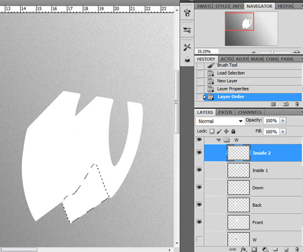
It’s best if we fill all the sides with color white, that way we can quickly see if we missed texturing any spots on the letter.
Once you have all the sides of the letter isolated, you can turn off the layer visibility of the original 3D shape.
Step 9 – Texture Wrapping
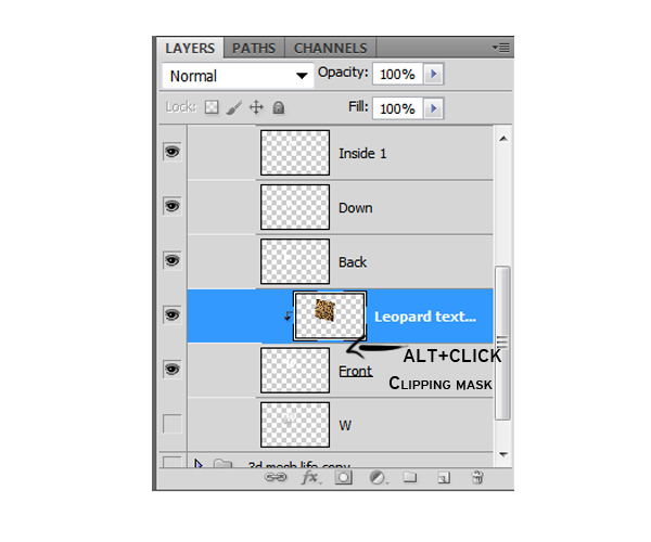
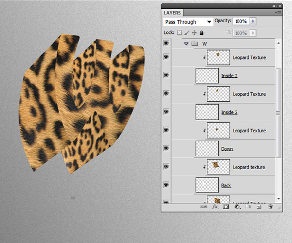
Download the Leopard fur texture and drag it to your document. We are going to duplicate it several times to wrap on each shape of the letter and we are going to link each of the texture layers with clipping masks. Drag the texture layer on top of the shape. While holding ALT and click between the two layers to create a clipping mask.
Now, using the transformation tools change the texture to match the perspective and position of the letter.
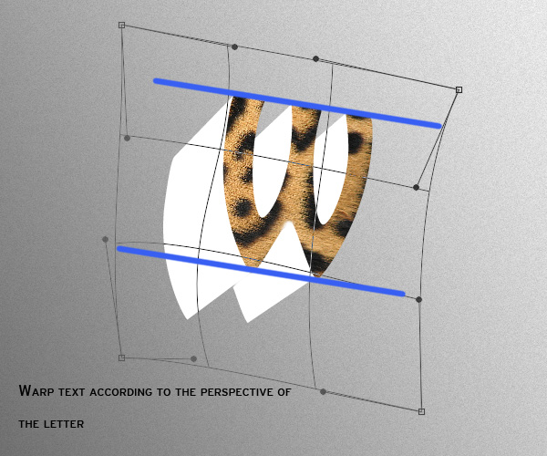
One of the best tools to wrap the text is the "Warp" option. Duplicate the text layer and clip mask one to each of the shapes and transform it accordingly.

It may take you some time to get the perspective right but it’ll get easier as you do it.
Once you’ve got all sides with the texture clip masked to each shape, your layers and 3D letter should look something like this:
Step 10 – Shading
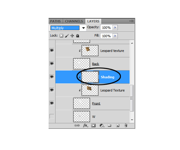
No we are going to apply shading to each side of the letter to add depth and realism. Create a new layer on top of the texture layer set its blending mode to "Multiply" and clip mask it.
Grab the Brush tool (B) with a basic circular tip of 0% hardness and about 150 pixel width with the brush opacity set to 30%, set your foreground color to black. Chose your light source (in this case I decided the light would come from the center part of the canvas on the upper side) and soft brush shades and shadows according to your light source.
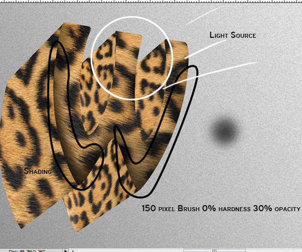
Brush as many times necessary on each side of the letter.

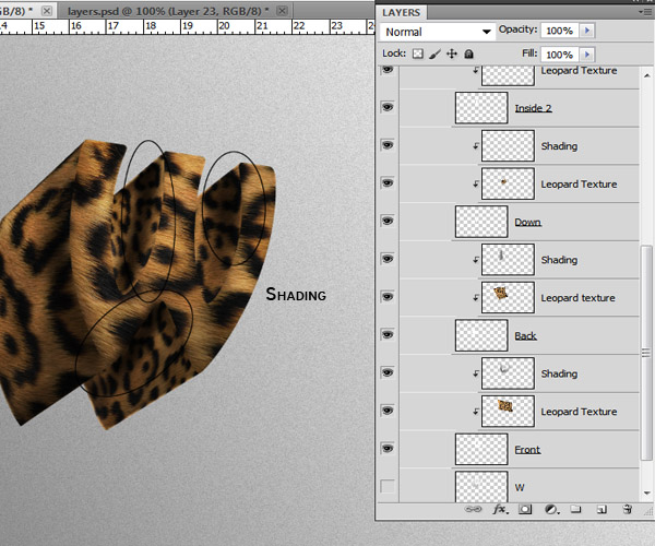
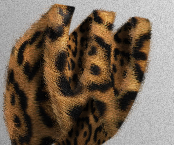
Your layers and shading should now look something like this:
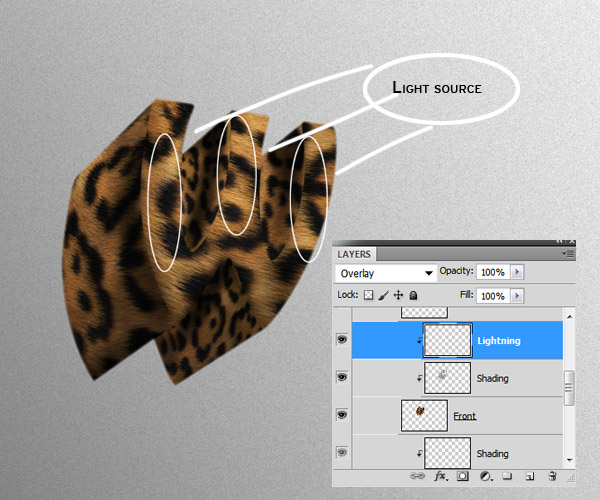
Step 11 – Lightning
Now that the shading on the letter is done, we need to enhance the parts where the light hits our shape. To do this, clip mask a new layer on top of the shading layer of the shape you want to add light.
In this case I’m just adding light to the front part of the letter. Set the layer’s blending mode to "Overlay" and using the same soft brush we used for the shading, now we are going to start painting with white.
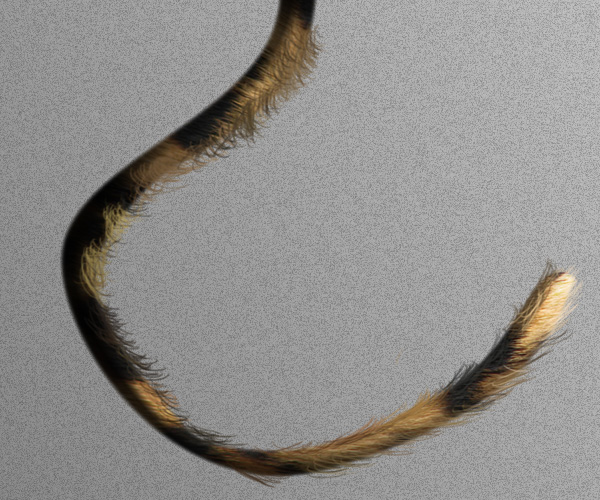
Step 12 – Hair
The hair or "fur" is very important for making this look realistical and overall add depth to the typography. Create a new layer on top of all the layers in your group. You don’t need to clip mask this one.
Grab the brush tool and select a hard round brush of about 3 pixels wide and 100% opacity. We need this to be really thing to get as much detail as possible. On the brushes menu make sure to check the "Shape Dynamics" option and set the Size Jitter Control to "Pen pressure."
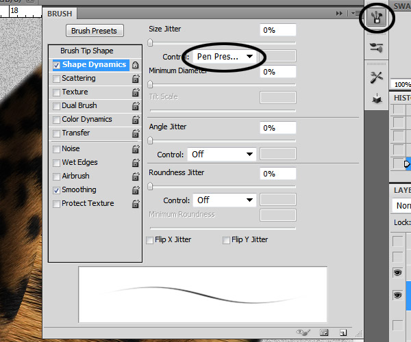
As you can see on the brush stroke preview, setting the control to pen pressure will make the stroke fade at the beginning and the end. I am using a graphics tablet to do this so the pressure dynamic will be better. In case you don’t have a graphics tablet, you can always use the Pen tool to draw tiny paths, then stroking them and duplicating them so you can fill the entire silhouette of the letter with hair easier.

Start by holding ALT + Click on a color of the texture to enter a "quick eyedropper" mode and sample it (I suggest you start with the darker tones first) start doing quick short strokes around the edges of the letter following the direction of the hair in the texture.
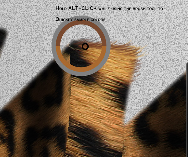
As you progress, keep sampling colors in regular basis (from the darkest to the lightest) taking in mind the colors on the texture to make a nice blending.
Take your time while doing this step. The more detail and variation of color you make the more realistic it will be.
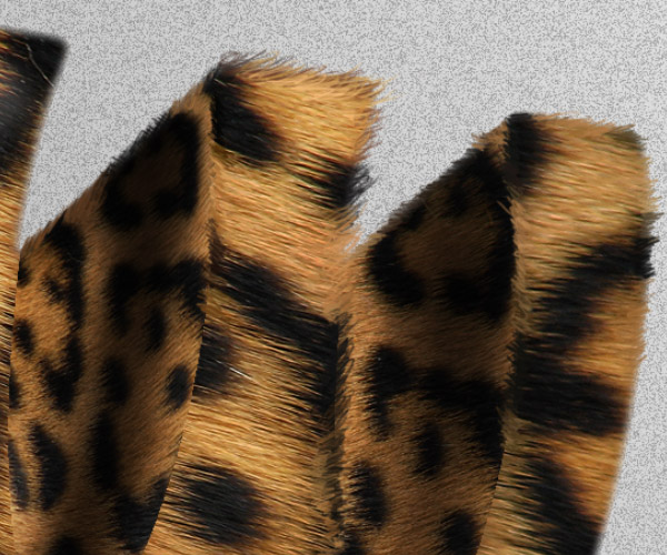
Once you have all the edges covered with the painted hair, change the size of the brush to 1 pixel. Select a medium tone color and scribble some lines randomly around it.
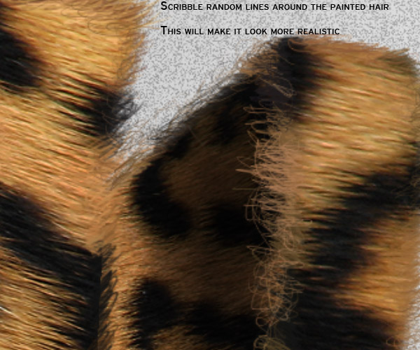
Keep working the hair until the edges are completely filled.
Step 13
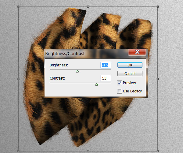
Now we are going to add some contrast to the image. When you are happy with the result of the previous steps, you can duplicate the "W" group and then Merge it (Command/Ctrl + E) to apply the next contrast settings:
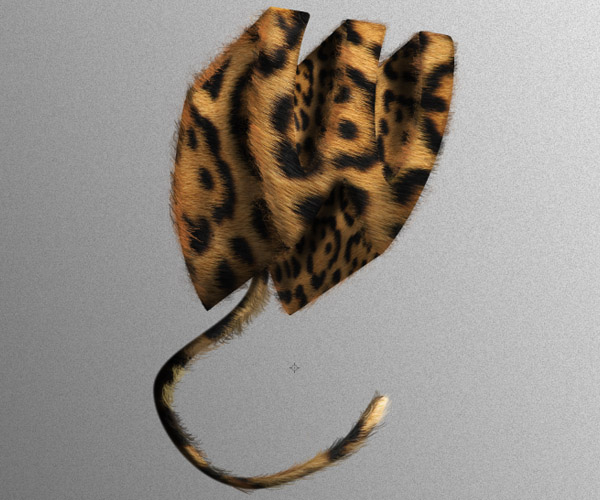
Step 14 – Tail
Little details like putting tails and eyes in this kind of manipulation really makes it pop and gives it a very organic look.
On the original texture image, Using the Pen tool or the Polygonal Lasso tool (L) draw a swirly shape and copy it into a new layer.

Now we need to give volume and shading to the tail. Go to the layer style menu, check on the Bevel and Emboss option and apply the next settings:
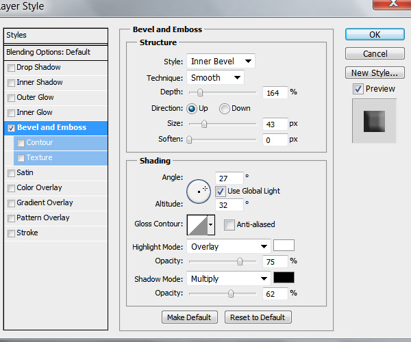
These settings will apply some shading and lights to the tail and give it some volume. Additionally you can clip mask a new layer and paint some more shadows and highlights like we did in the previous steps.
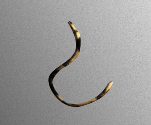
We also need to paint some hair. Use the same technique as we did with the letter edges.
You can also put the tail layers into a different group. This should be below our letter so the tail hides behind it.