

4 Describing Graphs using Noun Phrases
4.1 Overview
• Describing data in charts requires that we ‘translate' statistical information into grammatically correct sentences.
• Students can have particular problems doing this when they are required to produce complex noun phrases .
• Noun phrases always have a ‘head noun', which is then modified by (further described by) other elements of the phrase (adjectives, relative clauses, prepositional phrases, etc).
Examples of noun phrases (head noun underlined):
the man who works in that shop
people who live in glass houses
the car in the picture
Asian-heritage children who live in the UK but who do not speak their heritage language
Examples of noun phrases used within sentences:
- The man who works in that shop used to live next door to me.(noun phrase is subject of the verb)
- I saw a film last night about people who live in glass houses .(noun phrase is object of a preposition)
- I don't like the car in the picture . (noun phrase is object of the verb)
- The graph presents data about Asian-heritage children who live in the UK but who do not speak their heritage language. (noun phrase is object of a proposition)
4.2 Noun Phrases used in Chart Descriptions
4.2.1 Introducing the Description
Typical ways to introduce the description of a graph include:
The chart shows + noun phrase
The chart describes + noun phrase
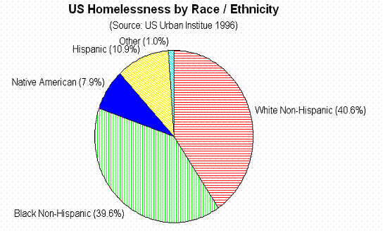
For the chart above we could say:
The chart shows data about homelessness in the US in terms of race / ethnicity.
The chart describes the race / ethnicity of homeless people in the US.
TIP - The introductory sentence often contains a re-wording of the title of the graph.
4.2.2 Comparing Data
In order to effectively compare data within a graph or table, or between two graphs or tables, it is necessary to create noun phrases by transforming the labels in the graphic (which will usually be single words, or in ungrammatical note-form) into fully grammatical phrases which agree grammatically with the rest of your sentence.
For example, we see in the graph:
Black Non-Hispanic (39.6%)
The percentage of black non-Hispanic homeless people (39.6%) was almost
equal to the percentage of white non-Hispanic homeless (40.6%).
Equally, while the title of the graph is ‘US Homelessness by Race / Ethnicity', the term ‘homelessness' may need to be adapted to fit grammatically within a particular sentence, e.g.:
The percentage of homeless people was highest for the white non- Hispanic group.
4.2.3 Task
Choose the best option to make the sentences grammatically accurate:
a) The largest percentage of ______________ were white non-Hispanics (40.6%).
i) homeless people
ii) homelessness people
iii) homelessness
b) The smallest percentage of homelessness was among ‘other' racial / ethnic groups, while the second smallest percentage was for ______________ - at 7.9%.
i) Native American
ii) Native Americans
iii) Native America
c) The largest ______________________was that of white non-Hispanics (40.6%). However black non-Hispanic homeless people accounted for virtually the same percentage: 39.6.
i) homelessness percent
ii) percent homeless
iii) percentage of homeless people