

Ielts Writing, Task 1 - Graph Description
• Understanding and correctly interpreting graphs
• Describing graphs using comparative forms
• Describing graphs using noun phrases
1 Ielts Writing Task 1: Overview and Typical Problems
1.1 Overview
IELTS writing Task One requires you to describe a graph, chart, table or diagram.
• You must write at least 150 words, and should allow about 20 minutes.
• Usually some kind of statistical information is represented in graphic form, and you must translate this into a readable text.
• Occasionally candidates will be asked to describe a process which is illustrated by a labelled diagram (such as the process of making cheese, or how a central-heating system works).
1.2 Typical Student Problems
• Not Understanding the Data (I) - Not Reading the Labels: Students do not correctly understand the data in the charts: often they do not carefully read the labels (e.g. student writes ‘250 people were unemployed in London in 1982' , when they should write ‘250 thousand people were unemployed in London in 1982' )
• Not Understanding the Data (II) - Not Applying Common Sense to your Interpretations: Students do not apply their common sense to the interpretation of data in the charts (e.g., in the example above, common sense should tell us that it was impossible that only 250 people were unemployed in London in 1982; we should then analyse the chart carefully to find a more satisfactory interpretation).
• Just ‘Listing' the Data: Students simply ‘list' data from charts or graphs without trying to indicate what is more or less significant . You should look for the more important or interesting data, and present it first (for example large differences or changes).
• Not ‘Translating' Note Form to Grammatical English: Students often write the labels or titles directly as they appear in the chart. However, these are usually in ‘note form', so need to be changed into grammatically correct English in your writing. For example, in a chart describing the life expectancy of smokers and non-smokers, one label may be ‘Non-Smoking' - meaning ‘non-smoking people '. It would therefore be ungrammatical to say ‘the average life-expectancy of non-smoking in the UK was 72' ; we need to change the label to a form such as ‘the average life-expectancy of non-smokers in the UK was 72' .
• Incorrect Use of Noun Phrases: When we describe data in charts we have to use noun phrases, such as ‘the number of white unemployed people', or ‘the percentage of male non-smokers in the UK '. Correct use of such forms often presents difficulty for students.
2 Understanding and Correctly Interpreting Graphs
2.1 Task: Graph Interpretation
Look at Graphs A, B & C and then answer the questions which follow:
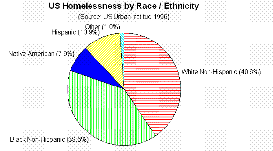 Graph A
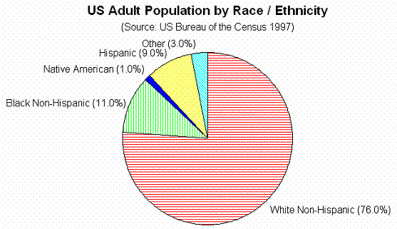
Graph B
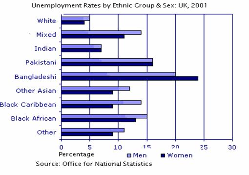
Graph C
2.1.1 Questions
• What was the main difference between Whites and other ethnic groups in terms of unemployment?
• What was the general trend in female unemployment compared to male unemployment?
• Is it significant that Black-non-Hispanics made up 11% of the total US population, but 40% of the homeless population? Why is / isn't this significant?
• How does this compare to the position of White non-Hispanics in the US ?
• Are there any similarities in the data in charts about the US (A and B) compared to the chart about the UK (C)?