


416 Part IV Working with Windows Applications
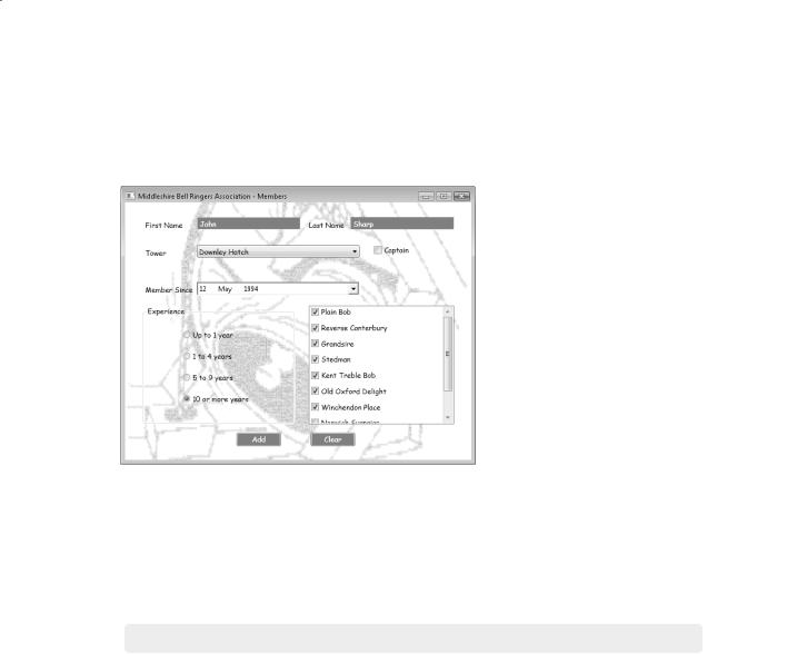
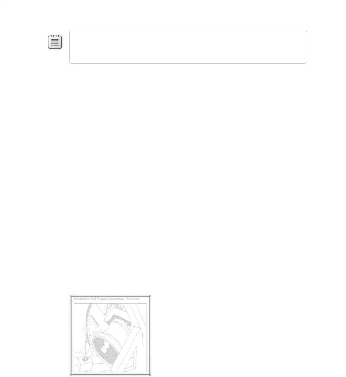
chapters, you will provide menus and learn how to implement validation to ensure that the data that is entered makes sense. The following graphic shows what the application will look like after you have completed it. (You can see the completed version by building and running the BellRingers project in the \Microsoft Press\Visual CSharp Step by Step\Chapter 22 \Completed BellRingers\ folder in your Documents folder.)
Creating a Windows Presentation Foundation Application
In this exercise, you’ll start building the Middleshire Bell Ringers Association application by creating a new project, laying out the form, and adding controls to the form. You have been using existing WPF applications in Microsoft Visual Studio 2008 in previous chapters, so much of the first couple of exercises will be a review for you.
Create the Middleshire Bell Ringers Association project
1.Start Visual Studio 2008 if it is not already running.
2.If you are using Visual Studio 2008 Standard Edition or Visual Studio 2008 Professional Edition, perform the following operations to create a new WPF application:
2.1.On the File menu, point to New, and then click Project.
The New Project dialog box opens.
2.2.In the Project Types pane, click Visual C#.
2.3.In the Templates pane, click the WPF Application icon.
2.4.In the Location field, type \Microsoft Press\Visual CSharp Step By Step\ Chapter 22 under your Documents folder.

Chapter 22 Introducing Windows Presentation Foundation |
417 |
2.5.In the Name field, type BellRingers.
2.6.Click OK.
3.If you are using Microsoft Visual C# 2008 Express Edition, perform the following tasks to create a new graphical application.
3.1.On the Tools menu, click Options.
3.2.In the Options dialog box, click Projects and Solutions in the tree view in the left pane.
3.3.In the right pane, in the Visual Studio projects location text box, specify the location Microsoft Press\Visual CSharp Step By Step\Chapter 22 under your Documents folder.
3.4.Click OK.
3.5.On the File menu, click New Project.
3.6.In the New Project dialog box, click the WPF Application icon.
3.7.In the Name field, type BellRingers.
3.8.Click OK.
The new project is created and contains a blank form called Window1.
Examine the form and the Grid layout
1.Examine the form in the XAML pane underneath the Design View window. Notice that the XAML definition of the form looks like this:
<Window x:Class=”BellRingers.Window1” xmlns=”http://schemas.microsoft.com/winfx/2006/xaml/presentation” xmlns:x=”http://schemas.microsoft.com/winfx/2006/xaml” Title=”Window1” Height=”300” Width=”300”>
<Grid>
</Grid>
</Window>
The Class attribute specifies the fully qualified name of the class that implements the form. In this case, it is called Window1 in the BellRingers namespace. The WPF
Application template uses the name of the application as the default namespace for forms. The xmlns attributes specify the XML namespaces that define the schemas used
by WPF; all the controls and other items that you can incorporate into a WPF application have definitions that live in these namespaces. (If you are not familiar with XML
namespaces, you can ignore these xmlns attributes for now.) The Title attribute specifies the text that appears in the title bar of the form, and the Height and Width attributes
418 |
Part IV Working with Windows Applications |
specify the default height and width of the form. You can modify these values either by changing them in the XAML pane or by using the Properties window. You can also
change the value of these and many other properties dynamically by writing C# code that executes when the form runs.
2.Click the Window1 form in the Design View window. In the Properties window, locate and click the Title property, and then type Middleshire Bell Ringers Association – Members to change the text in the title bar of the form.
Notice that the value in the Title attribute of the form changes in the XAML pane, and the new title is displayed in the title bar of the form in the Design View window.
Note The Window1 form contains a child control that you will examine in the next step. If the Properties window displays the properties for a System.Windows.Controls.Grid control, click the Window1 text on the Window1 form. This action selects the form rather than the grid, and the Properties window then displays the properties for the System.Windows.
Window control.
3.In the XAML pane, notice that the Window element contains a child element called
Grid.
In a WPF application, you place controls such as buttons, text boxes, and labels in a
panel on a form. The panel manages the layout of the controls it contains. The default panel added by the WPF Application template is the Grid, with which you can specify
exactly the location of your controls at design time. Other panels are available that provide different styles of layout. For example, StackPanel automatically places controls
in a vertical arrangement, with each control arranged directly beneath its immediate predecessor. Another example is WrapPanel, which arranges controls in a row from left to right and then wraps the content to the next line when the current row is full. A primary purpose of a layout panel is to govern how the controls are positioned if the user resizes the window at run time; the controls are automatically resized and repositioned according to the type of the panel.
Note The Grid panel is flexible but complex. By default, you can think of the Grid panel as
defining a single cell into which you can drop controls. However, you can set the properties of a Grid panel to define multiple rows and columns (hence its name), and you can
drop controls into each of the cells defined by these rows and columns. In this chapter, we keep things simple and use only a single cell.
4.In the Design View window, click the Window1 form, and then click the Toolbox tab.
5.In the Common section, click Button, and then click in the upper-right part of the form.
Chapter 22 Introducing Windows Presentation Foundation |
419 |
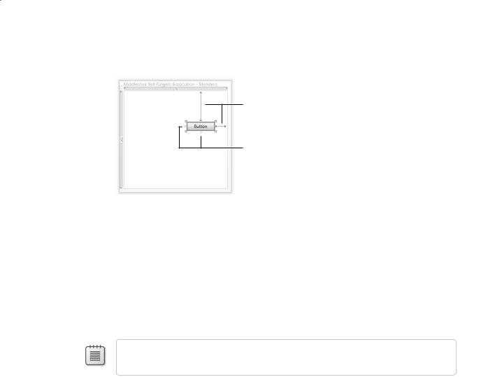
A button control that displays two connectors anchoring it to the top and right edges of the form is added to the form, like this:
Connectors
Anchor points
Although you clicked the form, the Button control is added to the Grid control contained in the form. The grid occupies the entire form apart from the title bar at the top. The connectors show that the button is anchored to the top and right edges of the grid.
6.Examine the code in the XAML pane. The Grid element and its contents should now look something like this (your values for the Margin property might vary):
<Grid>
<Button HorizontalAlignment=”Right” Margin=”0,84,34,0”
Name=”button1” Width=”75” Height=”23” VerticalAlignment=”Top”>Button</Button>
</Grid>
Note Throughout this chapter, lines from the XAML pane are shown split and indented so they will fit on the printed page.
When you place a control on a grid, you can connect any or all of the anchor points to the corresponding edge of the grid. By default, the Design View window connects the
control to the nearest edges. If you place the control toward the lower left of the grid, it will be connected to the bottom and left edges of the grid.
The HorizontalAlignment and VerticalAlignment properties of the button indicate the edges to which the button is currently connected, and the Margin property indicates the distance to those edges. Recall from Chapter 1, “Welcome to C#,” that the Margin
property contains four values specifying the distance from the left, top, right, and bottom edges of the grid, respectively. In the XAML fragment just shown, the button is 84 units from the top edge of the grid and 34 units from the right edge. (Each unit is 1/96th of an inch.) Margin values of 0 indicate that the button is not connected to the corresponding edge. When you run the application, the WPF runtime will endeavor to maintain these distances even if you resize the form.
420 |
Part IV Working with Windows Applications |
7.On the Debug menu, click Start Without Debugging to build and run the application.
8.When the form appears, resize the window. Notice that as you drag the edges of the form around, the distance of the button from the top and right edges of the form remains fixed.
9.Close the form, and return to Visual Studio 2008.
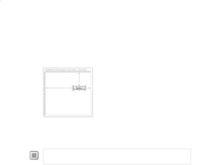
10.In the Design View window, click the button control, and then click the left anchor point to attach the control to the left edge of the form, as shown in the following image:
In the XAML pane, notice that the HorizontalAlignment property is no longer specified. The default value for the HorizontalAlignment and VerticalAlignment properties is a value called Stretch, which indicates that the control is anchored to both opposite edges. Also notice that the Margin property now specifies a nonzero value for the left margin.
Note You can click the anchor point that is connected to the edge of the grid to remove the connection.
11.On the Debug menu, click Start Without Debugging to build and run the application again.
12.When the form appears, experiment by making the form narrower and wider. Notice that the button no longer moves because it is anchored to the left and right edges of the form. Instead, the button gets wider or narrower as the edges move.
13.Close the form, and return to Visual Studio 2008.
14.In the Design View window, add a second Button control to the form from the Toolbox, and position it near the middle of the form.
Chapter 22 Introducing Windows Presentation Foundation |
421 |
15.In the XAML pane, set the Margin property values to 0, remove the VerticalAlignment and HorizontalAlignment properties if they appear, and set the Width and Height properties, as shown here:
<Button Margin=”0,0,0,0” Name=”button2” Width=”75” Height=”23”>Button</Button>
Tip You can also set many of the properties of a control, such as Margin, by using the Properties window. However, you cannot set all properties by using the Properties window,
and sometimes it is simply easier to type values directly into the XAML pane as long as you enter the values carefully.
Note If you don’t set the Width and Height properties of the button control, the button fills the entire form.
16.On the Debug menu, click Start Without Debugging to build and run the application once more.
17.When the form appears, resize the form. Notice that as the form shrinks or grows the new button relocates itself to try to maintain its relative position on the form with respect to all four sides (it tries to stay in the center of the form). The new button control even travels over the top of the first button control if you shrink the height of the form.
18.Close the form, and return to Visual Studio 2008.
As long as you are consistent in your approach, by using layout panes, such as the Grid, you can build forms that look right regardless of the user’s screen resolution without having to write complex code to determine when the user has resized a window. Additionally, with WPF, you can modify the look and feel of the controls an application uses, again without having to write lots of complex code. With these features together, you can build applications that can easily be customized to conform to any house style required by your organization. You will examine some of these features in the following exercises.
Add a background image to the form
1.In the Design View window, click the Window1 form.
2.In the Toolbox, in the Common section, click Image, and then click anywhere on the form. You will use this image control to display an image on the background of the form.
422 |
Part IV Working with Windows Applications |
Note You can use many other techniques to display an image in the background of a Grid. The method shown in this exercise is probably the simplest, although other strategies can provide more flexibility.
3.In the XAML pane, set the Margin property of the image control, and remove any other property values apart from the Name, as shown here:
<Image Margin=”0,0,0,0” Name=”image1”/>
The image control expands to occupy the grid fully, although the two button controls remain visible.
4.In Solution Explorer, right-click the BellRingers project, point to Add, and then click
Existing Item. In the Add Existing Item – BellRingers dialog box, move to the folder
Microsoft Press\Visual CSharp Step By Step\Chapter 22 under your Documents folder. In the File name box, type Bell.gif, and then click Add.
This action adds the image file Bell.gif as a resource to your application. The Bell.gif file contains a sketch of a ringing bell.
5.In the XAML pane, modify the definition of the image control as shown here. Notice that you must replace the closing tag delimiter (/>) of the image control with an ordinary tag delimiter character (>) and add a closing </Image> tag:
<Image Margin=”0,0,0,0” Name=”image1” > <Image.Source>
<BitmapImage UriSource=”Bell.gif” /> </Image.Source>
</Image>
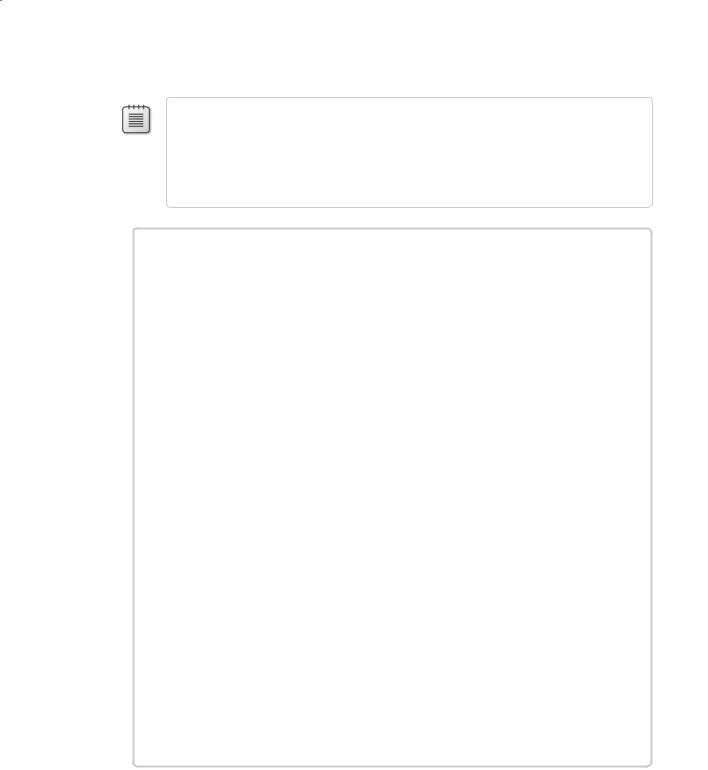
The purpose of an image control is to display an image. You can specify the source of the image in a variety of ways. The example shown here loads the image from the file Bell.gif that you just added as a resource to the project.
The image should now appear on the form, like this:
Chapter 22 Introducing Windows Presentation Foundation |
423 |
There is a problem, however. The image is not in the background, and it totally obscures the two button controls. The issue is that, unless you specify otherwise, all controls placed on a layout panel have an implied z-order that renders controls added lower down in the XAML description over the top of controls added previously.
Note The term z-order refers to the relative depth positions of items on the z-axis of a three-dimensional space (the y-axis being vertical and the x-axis being horizontal). Items with a higher value for the z-order appear in front of those items with a lower value.
There are at least two ways you can move the image control behind the buttons. The
first is to move the XAML definitions of the buttons so that they appear after the image control, and the second is to explicitly specify a value for the ZIndex property for the control. Controls with a higher ZIndex value appear in front of those on the same panel with a lower ZIndex. If two controls have the same ZIndex value, their relative
precedence is determined by the order in which they occur in the XAML description, as before.
Note A panel is a control that acts as a container for other controls and determines how they are laid out with respect to one another. The Grid control is an example of a panel control. You will see other examples of panel controls later in this section of the book. You can place more than one panel on a form.
6.In the XAML pane, set the ZIndex properties of the button and image controls as shown in bold type in the following code:
<Button Panel.ZIndex=”1” Margin=”169,84,34,0”
Name=”button1” Height=”23” VerticalAlignment=”Top”>Button</Button>
<Button Panel.ZIndex=”1” Height=”23” Margin=”0,0,0,0”
Name=”button2” Width=”76”>Button</Button>
<Image Panel.ZIndex=”0” Margin=”0,0,0,0” Name=”image1” >
<Image.Source>
<BitmapImage UriSource=”Bell.gif” />
</Image.Source>
</Image>
The two buttons should now reappear in front of the image.
With WPF, you can modify the way in which controls such as buttons, text boxes, and labels present themselves on a form. You will investigate this feature in the next exercise.
424 |
Part IV Working with Windows Applications |
Create a style to manage the look and feel of controls on the form
1.In the XAML pane, modify the definition of the first button on the form, as shown in
bold type in the following code. Notice that it is good practice to split the XAML description of a control that contains composite child property values such as Button. Resource over multiple lines to make the code easier to read and maintain:
<Button Style=”{DynamicResource buttonStyle}” Panel.ZIndex=”1” Margin =”169,84,34,0” Name=”button1” Height=”23” VerticalAlignment=”Top”>
<Button.Resources>
<Style x:Key=”buttonStyle”>
<Setter Property=”Button.Background” Value=”Gray”/>
<Setter Property=”Button.Foreground” Value=”White”/> <Setter Property=”Button.FontFamily” Value=”Comic Sans MS”/>
</Style>
</Button.Resources>
Button </Button>
You can use the <Style> element of a control to set default values for the properties of that control. (Styles can do other things as well, as you will see later in this chapter.) This example specifies the values for the background and foreground colors of the button
as well as the font used for the text on the button. You should notice that the button displayed in the Design View window changes its appearance to match the property
values specified for the style.
Styles are resources, and you add them to a Resources element for the control. You can give each style a unique name by using the Key property. You can then reference the new style from the Style property of the control. The syntax {DynamicResource buttonStyle} creates a new style object based on the named style and then applies this style to the button.
Note When you compile a WPF window, Visual Studio adds any resources included with the window to a collection associated with the window. Strictly speaking, the Key property doesn’t specify the name of the style but rather an identifier for the resource in this collection. You can specify the Name property as well if you want to manipulate the resource in your C# code, but controls reference resources by specifying the Key value for that resource. Controls and other items that you add to a form should have their Name property set because, as with resources, this is how you reference these items in code.
Styles have scope. If you attempt to reference the buttonStyle style from the second
button on the form, it will have no effect. Instead, you can create a copy of this style and add it to the Resources element of the second button, and then reference it, like
this:
<Grid>
<Button Style=”{DynamicResource buttonStyle}” Panel.ZIndex=”1” Margin =”169,84,34,0” Name=”button1” Height=”23” VerticalAlignment=”Top”>

Chapter 22 Introducing Windows Presentation Foundation |
425 |
<Button.Resources>
<Style x:Key=”buttonStyle”>
<Setter Property=”Button.Background” Value=”Gray”/>
<Setter Property=”Button.Foreground” Value=”White”/>
<Setter Property=”Button.FontFamily” Value=”Comic Sans MS”/> </Style>
</Button.Resources> Button
</Button>
<Button Style=”{DynamicResource buttonStyle}” Panel.ZIndex=”1” Height=”23” Margin=”0,0,0,0” Name=”button2” Width=”76”>
<Button.Resources>
<Style x:Key=”buttonStyle”>
<Setter Property=”Button.Background” Value=”Gray”/>
<Setter Property=”Button.Foreground” Value=”White”/>
<Setter Property=”Button.FontFamily” Value=”Comic Sans MS”/> </Style>
</Button.Resources> Button
</Button>
...
</Grid>
However, this approach can get very repetitive and becomes a maintenance nightmare if you need to change the style of buttons. A much better strategy is to define the style as a resource for the window, and then you can reference it from all controls in that window.
2.In the XAML pane, add a <Window.Resources> element above the grid, move the definition of the buttonStyle style to this new element, and then delete the <Button. Resources> element from both buttons. Reference the new style from both buttons, and split the definition of the button2 control over multiple lines to make it more readable. The updated code for the entire XAML description of the form is as follows, with the resource definition and references to the resource shown in bold type:
<Window x:Class=”BellRingers.Window1” xmlns=”http://schemas.microsoft.com/winfx/2006/xaml/presentation” xmlns:x=”http://schemas.microsoft.com/winfx/2006/xaml” Title=”Middleshire Bell Ringers Association - Members” Height=”300” Width=”300”>
<Window.Resources>
<Style x:Key=”buttonStyle”>
<Setter Property=”Button.Background” Value=”Gray”/>
<Setter Property=”Button.Foreground” Value=”White”/> <Setter Property=”Button.FontFamily” Value=”Comic Sans MS”/>
</Style>
</Window.Resources>
<Grid>
<Button Style=”{StaticResource buttonStyle}” Panel.ZIndex=”1”
Margin =”169,84,34,0” Name=”button1” Height=”23” VerticalAlignment=”Top”> Button
</Button>

426 |
Part IV Working with Windows Applications |
<Button Style=”{StaticResource buttonStyle}” Panel.ZIndex=”1” Height=”23” Margin=”0,0,0,0” Name=”button2” Width=”76”>
Button </Button>
<Image Panel.ZIndex=”0” Margin=”0,0,0,0” Name =”image1”> <Image.Source>
<BitmapImage UriSource=”Bell.gif” /> </Image.Source>
</Image>
</Grid>
</Window>
Notice that both buttons now appear in the Design View window using the same style.
Note The code you have just entered references the button style by using the StaticResource rather than the DynamicResource keyword. The scoping rules of static re-
sources are like those of C# in that they require you to define a resource before you can reference it. In step 1 of this exercise, you referenced the buttonStyle style above the XAML
code that defined it, so the style name was not actually in scope. This out-of-scope reference works because using DynamicResource defers until run time the time at which the
resource reference is resolved, at which point the resource should have been created.
Generally speaking, static resources are more efficient than dynamic ones are because they are resolved when the application is built, but dynamic resources give you more flexibility.
For example, if the resource itself changes as the application executes (you can write code to change styles at run time), any controls referencing the style using StaticResource will not be updated, but any controls referencing the style using DynamicResource will be.
There are many other differences between the behavior of static and dynamic resources and restrictions on when you can reference a resource dynamically. For more information, consult the .NET Framework documentation provided with Visual Studio 2008.
There is still a little bit of repetition involved in the definition of the style; each of the
properties (background, foreground, and font family) explicitly state that they are button properties. You can remove this repetition by specifying the TargetType attribute in the Style tag.
3. Modify the definition of the style to specify the TargetType attribute, like this:
<Style x:Key=”buttonStyle” TargetType=”Button”> <Setter Property=”Background” Value=”Gray”/> <Setter Property=”Foreground” Value=”White”/>
<Setter Property=”FontFamily” Value=”Comic Sans MS”/> </Style>
You can add as many buttons as you like to the form, and you can style them all using the buttonStyle style. But what about other controls, such as labels and text boxes?
4.In the Design View window, click the Window1 form, and then click the Toolbox tab. In the Common section, click TextBox, and then click anywhere in the lower half of the form.
Chapter 22 Introducing Windows Presentation Foundation |
427 |
5.In the XAML pane, change the definition of the text box control and specify the Style attribute shown in bold type in the following example, attempting to apply the buttonStyle style:
<TextBox Style=”{StaticResource buttonStyle}” Height=”21” Margin=”114,0,44,58” Name=”textBox1” VerticalAlignment=”Bottom” />
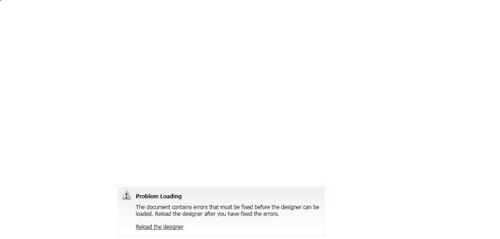
Not surprisingly, attempting to set the style of a text box to a style intended for a button fails. The Design View window displays the error message “The document root
element has been altered or an unexpected error has been encountered in updating
the designer. Click here to reload.” If you click the message as indicated, the form disappears from the Design View window and is replaced with the following message:
Don’t panic; you will now fix your mistake!
6.In the XAML pane, modify the Key property and change the TargetType to Control in the definition of the style, and then modify the references to the style in the button and text box controls as shown in bold type here:
<Window x:Class=”BellRingers.Window1”
...> <Window.Resources>
<Style x:Key=”bellRingersStyle” TargetType=”Control”> <Setter Property=”Background” Value=”Gray”/> <Setter Property=”Foreground” Value=”White”/>
<Setter Property=”FontFamily” Value=”Comic Sans MS”/> </Style>
</Window.Resources>
<Grid>
<Button Style=”{StaticResource bellRingersStyle}” ...> Button
</Button>
<Button Style=”{StaticResource bellRingersStyle}” ...> Button
</Button>
...
<TextBox ... Style=”{StaticResource bellRingersStyle}” ... /> </Grid>
</Window>
Because the style no longer applies exclusively to buttons, it makes sense to rename it. Setting the TargetType attribute of a style to Control specifies that the style can be applied to any control that inherits from the Control class. In the WPF model, many different types of controls, including text boxes and buttons, inherit from the Control class.
However, you can provide Setter elements only for properties that explicitly belong
428 Part IV Working with Windows Applications
to the Control class. (Buttons have some additional properties that are not part of the Control class; if you specify any of these button-only properties, you cannot set the
TargetType to Control.)
7.In the Design View window, click the Reload the designer link. The form should now appear. Notice that the text box is rendered with a gray background.
8.On the Debug menu, click Start Without Debugging to build and run the application. Type some text in the text box, and verify that it appears in white using the Comic Sans MS font.
Unfortunately, the choice of colors makes it a little difficult to see the text caret when you click the text box and type text. You will fix this in a following step.
9.Close the form, and return to Visual Studio 2008.
10.In the XAML pane, edit the bellRingersStyle style and add the <Style.Triggers> element
shown in bold type in the following code. (If you get an error message that the TriggerCollection is sealed, simply rebuild the solution.)
<Style x:Key=”bellRingersStyle” TargetType=”Control”> <Setter Property=”Background” Value=”Gray”/> <Setter Property=”Foreground” Value=”White”/>
<Setter Property=”FontFamily” Value=”Comic Sans MS”/>
<Style.Triggers>
<Trigger Property=”IsMouseOver” Value=”True”> <Setter Property=”Background” Value=”Blue” />
</Trigger>
</Style.Triggers>
</Style>
A trigger specifies an action to perform when a property value changes. The bellRingersStyle style detects a change in the IsMouseOver property to temporarily
modify the background color of the control the mouse is over.
Note Don’t confuse triggers with events. Triggers respond to transient changes in
property values. If the value in the triggering property reverts, the triggered action is undone. In the example shown previously, when the IsMouseOver property is no longer true for a control, the Background property is set back to its original value. Events specify
an action to perform when a significant incident (such as the user clicking a button) occurs in an application; the actions performed by an event are not undone when the incident is finished.
11.On the Debug menu, click Start Without Debugging to build and run the application again. This time, when you click the text box, it turns blue so that you can see the text caret more easily. The text box reverts to its original gray color when you move the mouse away. Notice that the buttons do not behave in quite the same way. Button controls already implement this functionality and turn a paler shade of blue when you place the mouse over them. This default behavior overrides the trigger specified in the style.
Chapter 22 Introducing Windows Presentation Foundation |
429 |
12. Close the form, and return to Visual Studio 2008.
Note An alternative approach that you can use to apply a font globally to all controls on
a form is to set the text properties of the window holding the controls. These properties include FontFamily, FontSize, and FontWeight. However, styles provide additional facilities,
such as triggers, and you are not restricted to setting font-related properties. If you specify the text properties for a window and apply a style to controls in the window, the controls’ style takes precedence over the window’s text properties.
How a WPF Application Runs
A WPF application can contain any number of forms—you can add forms to an application by using the Add Window command on the Project menu in Visual Studio 2008.
How does an application know which form to display when an application starts? If you recall from Chapter 1, this is the purpose of the App.xaml file. If you open the App.xaml file for the BellRingers project, you will see that it looks like this:
<Application x:Class=”BellRingers.App” xmlns=”http://schemas.microsoft.com/winfx/2006/xaml/presentation” xmlns:x=”http://schemas.microsoft.com/winfx/2006/xaml” StartupUri=”Window1.xaml”>
<Application.Resources>
</Application.Resources>
</Application>
When you build a WPF application, the compiler converts this XAML definition to an Application object. The Application object controls the lifetime of the application and is
responsible for creating the initial form that the application displays. You can think of the Application object as providing the Main method for the application. The key property is StartupUri, which specifies the XAML file for the window that the Application ob-
ject should create. When you build the application, this property is converted to code
that creates and opens the specified WPF form. If you want to display a different form, you simply need to change the value of the StartupUri property.
It is important to realize that the StartupUri property refers to the name of the XAML
file and not the class implementing the window in this XAML file. If you rename the class from the default (Window1), the file name does not change (it is still Window1.
xaml). Similarly, if you change the name of the file, the name of the window class defined in this file does not change. It can become confusing if the window class and XAML file have different names, so if you do want to rename things, be consistent and change both the file name and the window class name.