

FINANSBANK_GUIDELINES
.pdfCorporate Identity Guidelines
Issue date August 2005
Corporate identity designed by Fortune Street www.fortunestreet.com

Basic
Elements
Print and other communications
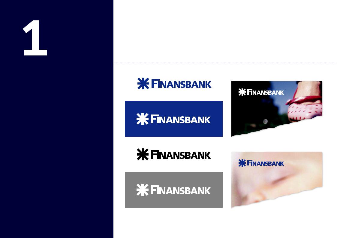
3D and branch interiors
Welcome to Finansbank’s Corporate Identity Guidelines. These provide users with instructions to achieve high standards of work, quickly and easily. The Guidelines are arranged in bite size chunks so you can easily absorb the rule and apply it. Please take the time to check the rules regarding the work you are doing and ask if something you need is not listed here.
|
|
|
|
|
Please contact Lale Yolcu for advice. |
03 |
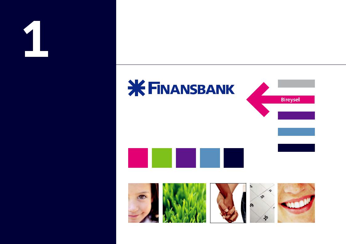
Introduction |
12 |
Colours |
21 |
Illustration and colour style for Ticari |
04 |
Master Finansbank logo |
13 |
Segment colours, arrows and bars |
22 |
Pattern and colour style |
05 |
Minimium space rule |
14 |
CardFinans – segment colours, |
|
for Kurumsal |
06 |
Master logo in use |
|
arrows and bars |
23 |
Cropping images |
07 |
Master logo in use on |
15 |
Pattern |
24 |
Template for guidelines |
|
colour backgrounds |
16 |
Pattern in use |
25 |
Corporate identity errors to avoid |
08 |
Master and holding company logos |
17 |
Use of photography for consumer |
|
|
09 |
Master and subsidiary logos |
18 |
Use of illustration for small business |
|
|
10 |
Frutiger typeface |
19 |
Use of photography for CardFinans |
|
|
11 |
Segmentation bars and arrows |
20 |
CardFinans bulletin and statement |
|
|
27 |
Section 2 Introduction |
38 |
Standard posters for Isletme |
46 |
CardFinans credit cards, |
28 |
Stationery – letterheads |
39 |
Standard posters for Ticari |
|
application of graphics |
32 |
Compliment slip |
|
and Kurumsal |
47 |
CardFinans co-branded cards, |
33 |
Business card & envelope |
40 |
Bireysel one-third A4 size leaflet |
|
application of graphics |
34 |
Promotional envelope |
41 |
Isletme A5 size leaflet |
48 |
Web-site styling |
35 |
Window posters for Bireysel |
43 |
Finansbank cash cards |
49 |
Powerpoint templates |
36 |
Sponsored poster |
44 |
CardFinans credit cards, pattern |
|
|
37 |
Western Union posters |
|
and colour schemes |
|
|
52 |
Section 3 Introduction |
60 |
CardFinans Payment Points |
|
|
53 |
Blue fascia sign |
61 |
CardFinans stand alone Payment |
|
|
54 |
Segment signs on windows |
|
Points (concept) |
|
|
55 |
External ATMs |
62 |
CardFinans stand alone |
|
|
56 |
Stand Alone ATM, internal |
|
Payment Points |
|
|
|
ATMs and Service Wall |
63 |
Glass partition graphics |
|
|
57 |
Window posters |
64 |
General bank interiors |
|
|
58General teller areas
59CardFinans teller areas
Basic
Elements
Master Finansbank logo
Segmentation bars and arrows
Typefaces
Colours
Pattern
Use of imagery and illustration
Introduction |
Basic Elements |
This section introduces each of the basic graphic elements of the identity.
Master Finansbank logo
abcdefghijk
Frutiger typeface
Customer segment bars and arrow
Main segment colours and CardFinans colour – see specifications later
Finansbank imagery
3
Basic
Elements
Master Finansbank logo
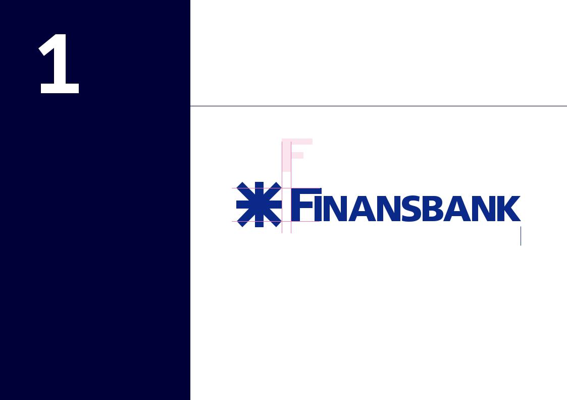
Master Finansbank logo |
Basic Elements |
The Bank’s logo is generally reproduced in Reflex Blue on white or reversed out of Reflex Blue in white. The logo may also be reproduced in black on white. See options later. Please note that the Bank’s logo exists on its own without any form of strap line.
There is a fixed relationship between the size of the symbol and the logotype (as shown) and this should not be altered. Always ensure you use correct artwork. Never try to re-create the logo with a look-a-like version. It will not be correct.
See Master_logo
4
Basic
Elements
Minimum space rules
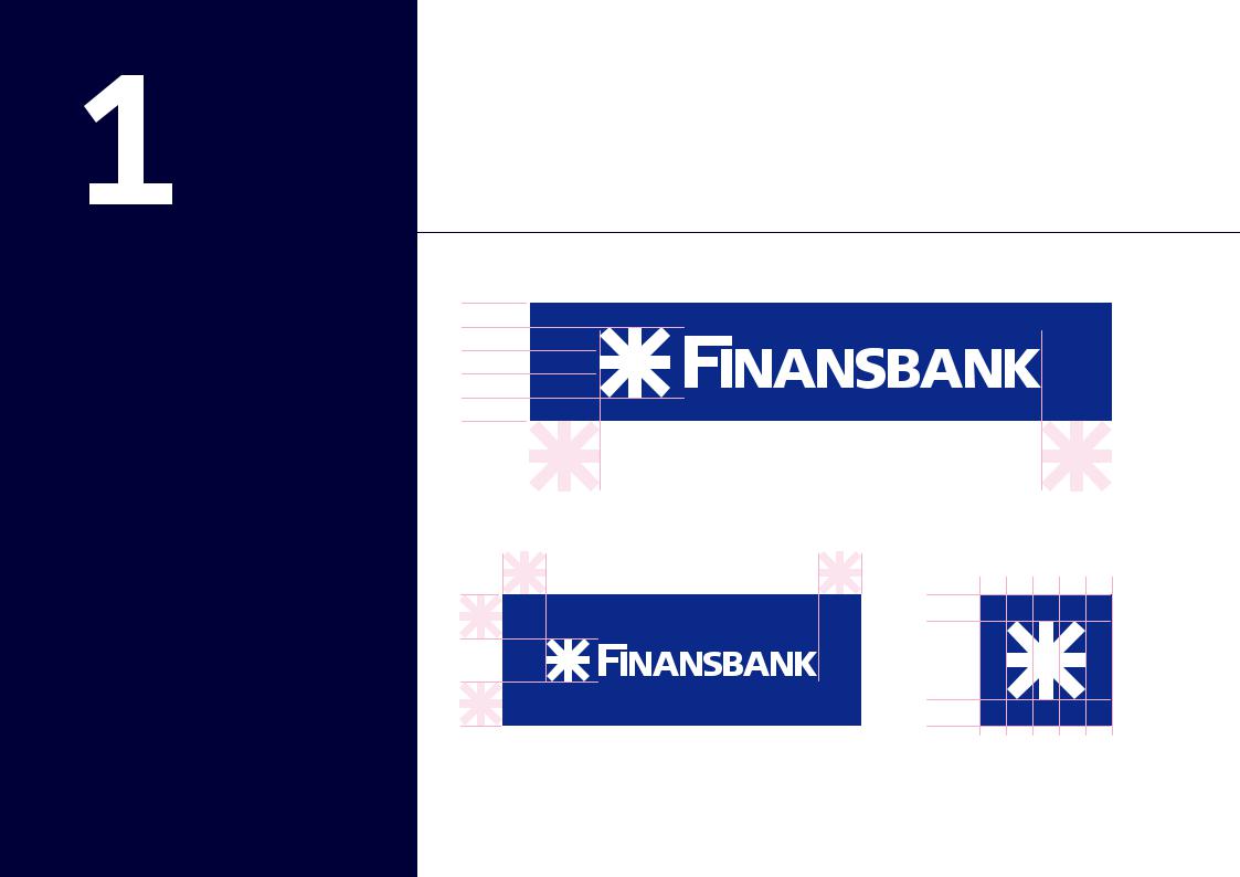
Minimum space rule |
Basic Elements |
For fascia signs and strip graphics such as internet panels, divide the height of the fascia into five equal parts and place the logo to fill three of the parts as shown. Wherever possible, ensure that there is at least one symbol’s distance between the logo and the end of the fascia as shown (internet may be an exception).
Fascia rule
See Minimum space_logo
1/5 height of fascia
1/5 height of fascia
Rule for print |
symbolofheight1/3 |
|
|
|
|
|
1/3 height of symbol |
rev |
|
See Symbol |
|
|
|
|
|
3/5 height of sign |
|
|
1/3 height of symbol |
|
|
See Master_logo_rev |
|
For other uses, make sure there is at least one symbol’s |
For the symbol on its own, please ensure |
|
distance top and bottom and to either side as shown. |
there is a third of the height of the symbol |
|
|
all around the symbol as shown. |
|
5
Basic
Elements
Master logo in use
See Bireysel_poster_02
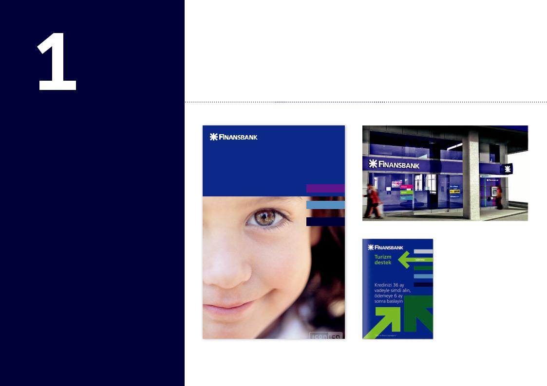
Master logo in use |
Basic Elements |
These designs show the rules for minimum space in use on fascias and print.
OH
Master logo in use on branch front
Master logo in use on poster |
Master logo in use on A5 leafl et |
6
Basic
Elements
Master logo
in use on colour backgrounds and imagery
Master logo in use |
Basic Elements |
You can use the logo in these ways on different backgrounds. Don’t reproduce the logos in colours that are not shown here.
50% tint of black
7
Basic
Elements
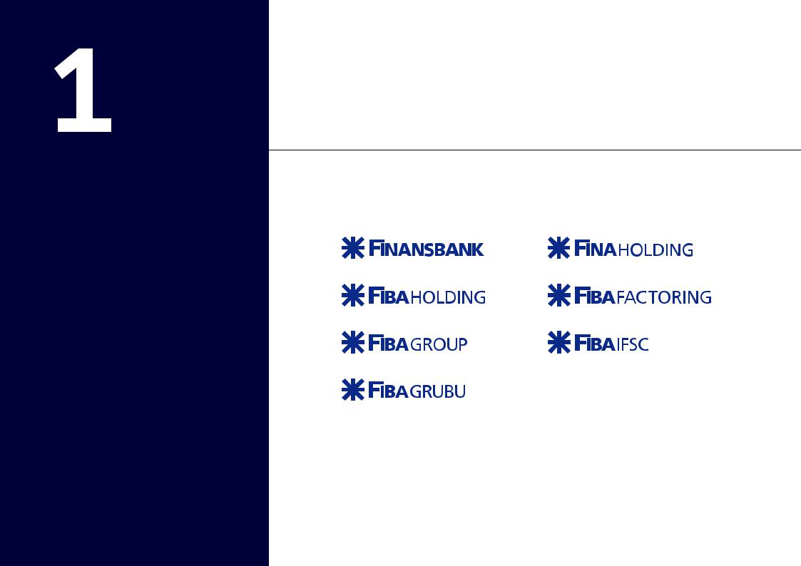
Master and Holding Company logos
Master and Holding |
Basic Elements |
Company logos |
|
A standardised system exists for the creation of all logos. They should follow the clear space and colour rules applying to the master logo.
See Master_logo |
See FINA_HOLDING_logo |
See FIBA_HOLDING_logo |
See FIBA_FACTORING_logo |
See FIBA_GROUP_logo |
See FIBA_IFSC_logo |
When you create a new subsidiary logo, the light version of the logo e.g. for the word ‘FACTORING’ is made in Frutiger 55
Roman. There is 1.5mm spacing between the word FIBA and its See FIBA_GRUBU_logo suffix at when the suffix is set in 38pt, this will obviously change
when scaled up or down.
8
Basic
Elements
Master and
Subsidiary Company logos
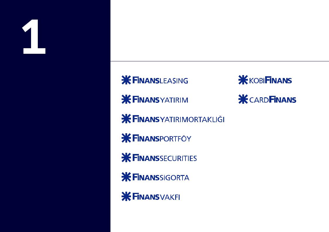
Master and Subsidiary |
Basic Elements |
Company logos |
|
A standardised system exists for the creation of all subsidiary logos. They should follow the clear space and colour rules applying to the master logo.
See FINANS_LEASING_logo
See FINANS_YATIRIM_logo
See FINANS_YATRIMORTAKLIGI_logo
See FINANS_PORTFÖY
See FINANS_SECURITIES_logo
See KOBI_FINANS_logo
See CARD_FINANS_logo
When you create a new subsidiary logo, the light version of the logo e.g. for the word ‘LEASING’ is made in Frutiger 55 Roman. There is 1.5mm spacing between the word FINANS and its suffix at when the suffix is set in 38pt, this will obviously change when scaled up or down.
See FINANS_SIGORTA_logo
See FINANS_VAKFI_logo
9
Basic
Elements
Typefaces
Frutiger typeface |
Basic Elements |
Use the Frutiger family for all printed and external communications. The designs shown on this page illustrate Frutiger in use.
800mm |
297mm |
Turizm
destek 

 210mm paketi
1200mm |
Frutiger 65 bold – 20/22pt |
Frutiger 45 light – 8/10pt |
|
|
Kredinizi 36 ay vadeyle simdi alin, ödemeye 6 ay sonra baslayin.
FRUTIGER – 45 Light
FRUTIGER – 55 Roman
FRUTIGER – 65 Bold
FRUTIGER – 75 Black
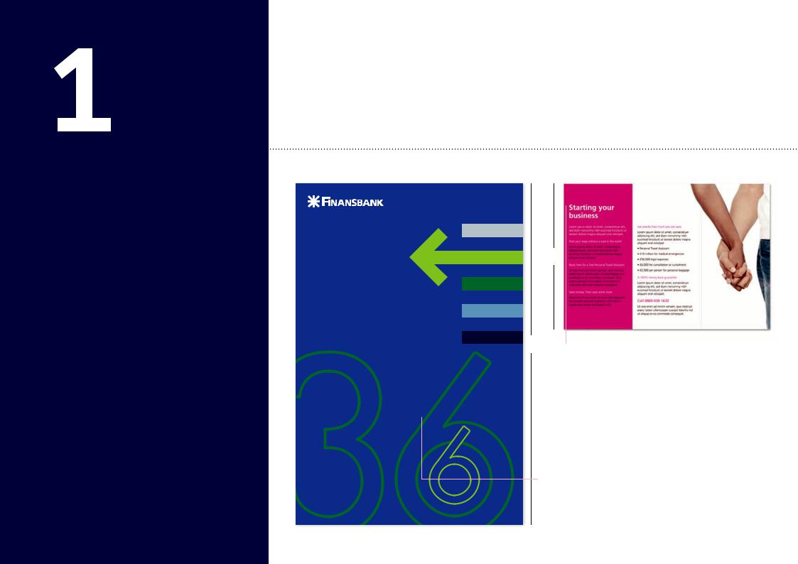
Frutiger 65 bold 150/165pt
Please note when using numbers
“Bilgi ve finans kaynaginiz” as part of the illustration, use Futura. see section on Isletme
See Isletme_poster_01 |
Frutiger 65 bold 160/160pt |
10 |
|
|