

CHAPTER 6. INTRODUCTION TO GUI PROGRAMMING |
280 |
6.7 Basic Layout
Components are the fundamental building blocks of a graphical user interface. But you have |
(online) |
||||||||||||||
to do more with components besides create them. Another aspect of GUI programming is |
|
||||||||||||||
laying out components on the screen, that is, deciding where they are drawn and how big |
|
||||||||||||||
they are. You have probably noticed that computing coordinates can be a di cult problem, |
|
||||||||||||||
especially if you don’t assume a fixed size for the drawing area. Java has a solution for this, as |
|
||||||||||||||
well. |
|
||||||||||||||
Components are the visible objects that make up a GUI. Some components are containers, |
|
||||||||||||||
which can hold other components. Containers in Java are objects that belong to some subclass of |
|
||||||||||||||
java.awt.Container. The content pane of a JApplet or JFrame is an example of a container. |
|
||||||||||||||
The standard class JPanel, which we have mostly used as a drawing surface up till now, is |
|
||||||||||||||
another example of a container. |
|
||||||||||||||
Because a JPanel object is a container, it can hold other components. Because a JPanel is |
|
||||||||||||||
itself a component, you can add a JPanel to another JPanel. This makes complex nesting of |
|
||||||||||||||
components possible. JPanels can be used to organize complicated user interfaces, as shown in |
|
||||||||||||||
this illustration: |
|
||||||||||||||
|
|
|
|
|
|
|
|
|
|
|
|
|
|
|
|
|
|
|
|
|
|
|
|
|
|
|
|
|
|
|
|
|
|
|
|
|
|
|
|
|
|
|
|
|
|
|
|
|
|
|
|
|
|
|
|
|
|
|
|
|
|
|
|
|
|
|
|
|
|
|
|
|
|
|
|
|
|
|
|
|
|
|
|
|
|
|
|
|
|
|
|
|
|
|
|
|
|
|
|
|
|
|
|
|
|
|
|
|
|
|
|
|
|
|
|
|
|
|
|
|
|
|
|
|
|
|
|
|
|
|
|
|
|
|
|
|
|
|
|
|
|
|
|
|
|
|
|
|
|
|
|
|
|
|
|
|
|
|
|
The components in a container must be “laid out,” which means setting their sizes and positions. It’s possible to program the layout yourself, but ordinarily layout is done by a layout manager . A layout manager is an object associated with a container that implements some policy for laying out the components in that container. Di erent types of layout manager implement di erent policies. In this section, we will cover the three most common types of layout manager, and then we will look at several programming examples that use components and layout.
Every container has an instance method, setLayout(), that takes a parameter of type LayoutManager and that is used to specify the layout manager that will be responsible for laying out any components that are added to the container. Components are added to a container by calling an instance method named add() in the container object. There are actually several versions of the add() method, with di erent parameter lists. Di erent versions of add() are appropriate for di erent layout managers, as we will see below.
CHAPTER 6. INTRODUCTION TO GUI PROGRAMMING |
281 |
6.7.1Basic Layout Managers
Java has a variety of standard layout managers that can be used as parameters in the setLayout() method. They are defined by classes in the package java.awt. Here, we will look at just three of these layout manager classes: FlowLayout, BorderLayout, and GridLayout.
A FlowLayout simply lines up components in a row across the container. The size of each component is equal to that component’s “preferred size.” After laying out as many items as will fit in a row across the container, the layout manager will move on to the next row. The default layout for a JPanel is a FlowLayout; that is, a JPanel uses a FlowLayout unless you specify a di erent layout manager by calling the panel’s setLayout() method.
The components in a given row can be either left-aligned, right-aligned, or centered within that row, and there can be horizontal and vertical gaps between components. If the default constructor, “new FlowLayout()”, is used, then the components on each row will be centered and both the horizontal and the vertical gaps will be five pixels. The constructor
public FlowLayout(int align, int hgap, int vgap)
can be used to specify alternative alignment and gaps. The possible values of align are
FlowLayout.LEFT, FlowLayout.RIGHT, and FlowLayout.CENTER.
Suppose that cntr is a container object that is using a FlowLayout as its layout manager. Then, a component, comp, can be added to the container with the statement
cntr.add(comp);
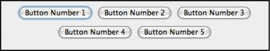
The FlowLayout will line up all the components that have been added to the container in this way. They will be lined up in the order in which they were added. For example, this picture shows five buttons in a panel that uses a FlowLayout:
Note that since the five buttons will not fit in a single row across the panel, they are arranged in two rows. In each row, the buttons are grouped together and are centered in the row. The buttons were added to the panel using the statements:
panel.add(button1);
panel.add(button2);
panel.add(button3);
panel.add(button4);
panel.add(button5);
When a container uses a layout manager, the layout manager is ordinarily responsible for computing the preferred size of the container (although a di erent preferred size could be set by calling the container’s setPreferredSize method). A FlowLayout prefers to put its components in a single row, so the preferred width is the total of the preferred widths of all the components, plus the horizontal gaps between the components. The preferred height is the maximum preferred height of all the components.
CHAPTER 6. INTRODUCTION TO GUI PROGRAMMING |
282 |
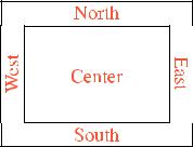
A BorderLayout layout manager is designed to display one large, central component, with up to four smaller components arranged along the edges of the central component. If a container, cntr, is using a BorderLayout, then a component, comp, should be added to the container using a statement of the form
cntr.add( comp, borderLayoutPosition );
where borderLayoutPosition specifies what position the component should occupy in the layout and is given as one of the constants BorderLayout.CENTER, BorderLayout.NORTH,
BorderLayout.SOUTH, BorderLayout.EAST, or BorderLayout.WEST. The meaning of the five positions is shown in this diagram:
Note that a border layout can contain fewer than five components, so that not all five of the possible positions need to be filled.
A BorderLayout selects the sizes of its components as follows: The NORTH and SOUTH components (if present) are shown at their preferred heights, but their width is set equal to the full width of the container. The EAST and WEST components are shown at their preferred widths, but their height is set to the height of the container, minus the space occupied by the NORTH and SOUTH components. Finally, the CENTER component takes up any remaining space; the preferred size of the CENTER component is completely ignored. You should make sure that the components that you put into a BorderLayout are suitable for the positions that they will occupy. A horizontal slider or text field, for example, would work well in the NORTH or SOUTH position, but wouldn’t make much sense in the EAST or WEST position.
The default constructor, new BorderLayout(), leaves no space between components. If you would like to leave some space, you can specify horizontal and vertical gaps in the constructor of the BorderLayout object. For example, if you say
panel.setLayout(new BorderLayout(5,7));
then the layout manager will insert horizontal gaps of 5 pixels between components and vertical gaps of 7 pixels between components. The background color of the container will show through in these gaps. The default layout for the original content pane that comes with a JFrame or JApplet is a BorderLayout with no horizontal or vertical gap.
Finally, we consider the GridLayout layout manager. A grid layout lays out components in a grid of equal sized rectangles. This illustration shows how the components would be arranged in a grid layout with 3 rows and 2 columns:

CHAPTER 6. INTRODUCTION TO GUI PROGRAMMING |
283 |
|||
|
|
|
|
|
|
|
|
|
|
|
|
|
|
|
|
|
|
|
|
If a container uses a GridLayout, the appropriate add method for the container takes a single parameter of type Component (for example: cntr.add(comp)). Components are added to the grid in the order shown; that is, each row is filled from left to right before going on the next row.
The constructor for a GridLayout takes the form “new GridLayout(R,C)”, where R is the number of rows and C is the number of columns. If you want to leave horizontal gaps of H pixels between columns and vertical gaps of V pixels between rows, use “new GridLayout(R,C,H,V)” instead.
When you use a GridLayout, it’s probably good form to add just enough components to fill the grid. However, this is not required. In fact, as long as you specify a non-zero value for the number of rows, then the number of columns is essentially ignored. The system will use just as many columns as are necessary to hold all the components that you add to the container. If you want to depend on this behavior, you should probably specify zero as the number of columns. You can also specify the number of rows as zero. In that case, you must give a non-zero number of columns. The system will use the specified number of columns, with just as many rows as necessary to hold the components that are added to the container.
Horizontal grids, with a single row, and vertical grids, with a single column, are very common. For example, suppose that button1, button2, and button3 are buttons and that you’d like to display them in a horizontal row in a panel. If you use a horizontal grid for the panel, then the buttons will completely fill that panel and will all be the same size. The panel can be created as follows:
JPanel buttonBar = new JPanel(); buttonBar.setLayout( new GridLayout(1,3) );
//(Note: The "3" here is pretty much ignored, and
//you could also say "new GridLayout(1,0)".
//To leave gaps between the buttons, you could use
//"new GridLayout(1,0,5,5)".) buttonBar.add(button1); buttonBar.add(button2); buttonBar.add(button3);
You might find this button bar to be more attractive than the one that uses the default FlowLayout layout manager.
6.7.2Borders
We have seen how to leave gaps between the components in a container, but what if you would like to leave a border around the outside of the container? This problem is not handled by layout managers. Instead, borders in Swing are represented by objects. A Border object can be added to any JComponent, not just to containers. Borders can be more than just empty space. The class javax.swing.BorderFactory contains a large number of static methods for creating border objects. For example, the function
CHAPTER 6. INTRODUCTION TO GUI PROGRAMMING |
284 |
BorderFactory.createLineBorder(Color.BLACK)
returns an object that represents a one-pixel wide black line around the outside of a component. If comp is a JComponent, a border can be added to comp using its setBorder() method. For example:
comp.setBorder( BorderFactory.createLineBorder(Color.BLACK) );
When a border has been set for a JComponent, the border is drawn automatically, without any further e ort on the part of the programmer. The border is drawn along the edges of the component, just inside its boundary. The layout manager of a JPanel or other container will take the space occupied by the border into account. The components that are added to the container will be displayed in the area inside the border. I don’t recommend using a border on a JPanel that is being used as a drawing surface. However, if you do this, you should take the border into account. If you draw in the area occupied by the border, that part of your drawing will be covered by the border.
Here are some of the static methods that can be used to create borders:
•BorderFactory.createEmptyBorder(top,left,bottom,right) — leaves an empty border around the edges of a component. Nothing is drawn in this space, so the background color of the component will appear in the area occupied by the border. The parameters are integers that give the width of the border along the top, left, bottom, and right edges of the component. This is actually very useful when used on a JPanel that contains other components. It puts some space between the components and the edge of the panel. It can also be useful on a JLabel, which otherwise would not have any space between the text and the edge of the label.
•BorderFactory.createLineBorder(color,thickness) — draws a line around all four edges of a component. The first parameter is of type Color and specifies the color of the line. The second parameter is an integer that specifies the thickness of the border. If the second parameter is omitted, a line of thickness 1 is drawn.
•BorderFactory.createMatteBorder(top,left,bottom,right,color) — is similar to createLineBorder, except that you can specify individual thicknesses for the top, left, bottom, and right edges of the component.
•BorderFactory.createEtchedBorder() — creates a border that looks like a groove etched around the boundary of the component. The e ect is achieved using lighter and darker shades of the component’s background color, and it does not work well with every background color.
•BorderFactory.createLoweredBevelBorder()—gives a component a three-dimensional e ect that makes it look like it is lowered into the computer screen. As with an EtchedBorder, this only works well for certain background colors.
•BorderFactory.createRaisedBevelBorder()—similar to a LoweredBevelBorder, but the component looks like it is raised above the computer screen.
•BorderFactory.createTitledBorder(title)—creates a border with a title. The title is a String, which is displayed in the upper left corner of the border.
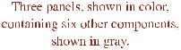
There are many other methods in the BorderFactory class, most of them providing variations of the basic border styles given here. The following illustration shows six components with six di erent border styles. The text in each component is the command that created the border for that component: