

- •Using Your Sybex Electronic Book
- •Acknowledgments
- •Contents at a Glance
- •Introduction
- •Who Should Read This Book?
- •How About the Advanced Topics?
- •The Structure of the Book
- •How to Reach the Author
- •The Integrated Development Environment
- •The Start Page
- •Project Types
- •Your First VB Application
- •Making the Application More Robust
- •Making the Application More User-Friendly
- •The IDE Components
- •The IDE Menu
- •The Toolbox Window
- •The Solution Explorer
- •The Properties Window
- •The Output Window
- •The Command Window
- •The Task List Window
- •Environment Options
- •A Few Common Properties
- •A Few Common Events
- •A Few Common Methods
- •Building a Console Application
- •Summary
- •Building a Loan Calculator
- •How the Loan Application Works
- •Designing the User Interface
- •Programming the Loan Application
- •Validating the Data
- •Building a Math Calculator
- •Designing the User Interface
- •Programming the MathCalculator App
- •Adding More Features
- •Exception Handling
- •Taking the LoanCalculator to the Web
- •Working with Multiple Forms
- •Working with Multiple Projects
- •Executable Files
- •Distributing an Application
- •VB.NET at Work: Creating a Windows Installer
- •Finishing the Windows Installer
- •Running the Windows Installer
- •Verifying the Installation
- •Summary
- •Variables
- •Declaring Variables
- •Types of Variables
- •Converting Variable Types
- •User-Defined Data Types
- •Examining Variable Types
- •Why Declare Variables?
- •A Variable’s Scope
- •The Lifetime of a Variable
- •Constants
- •Arrays
- •Declaring Arrays
- •Initializing Arrays
- •Array Limits
- •Multidimensional Arrays
- •Dynamic Arrays
- •Arrays of Arrays
- •Variables as Objects
- •So, What’s an Object?
- •Formatting Numbers
- •Formatting Dates
- •Flow-Control Statements
- •Test Structures
- •Loop Structures
- •Nested Control Structures
- •The Exit Statement
- •Summary
- •Modular Coding
- •Subroutines
- •Functions
- •Arguments
- •Argument-Passing Mechanisms
- •Event-Handler Arguments
- •Passing an Unknown Number of Arguments
- •Named Arguments
- •More Types of Function Return Values
- •Overloading Functions
- •Summary
- •The Appearance of Forms
- •Properties of the Form Control
- •Placing Controls on Forms
- •Setting the TabOrder
- •VB.NET at Work: The Contacts Project
- •Anchoring and Docking
- •Loading and Showing Forms
- •The Startup Form
- •Controlling One Form from within Another
- •Forms vs. Dialog Boxes
- •VB.NET at Work: The MultipleForms Project
- •Designing Menus
- •The Menu Editor
- •Manipulating Menus at Runtime
- •Building Dynamic Forms at Runtime
- •The Form.Controls Collection
- •VB.NET at Work: The DynamicForm Project
- •Creating Event Handlers at Runtime
- •Summary
- •The TextBox Control
- •Basic Properties
- •Text-Manipulation Properties
- •Text-Selection Properties
- •Text-Selection Methods
- •Undoing Edits
- •VB.NET at Work: The TextPad Project
- •Capturing Keystrokes
- •The ListBox, CheckedListBox, and ComboBox Controls
- •Basic Properties
- •The Items Collection
- •VB.NET at Work: The ListDemo Project
- •Searching
- •The ComboBox Control
- •The ScrollBar and TrackBar Controls
- •The ScrollBar Control
- •The TrackBar Control
- •Summary
- •The Common Dialog Controls
- •Using the Common Dialog Controls
- •The Color Dialog Box
- •The Font Dialog Box
- •The Open and Save As Dialog Boxes
- •The Print Dialog Box
- •The RichTextBox Control
- •The RTF Language
- •Methods
- •Advanced Editing Features
- •Cutting and Pasting
- •Searching in a RichTextBox Control
- •Formatting URLs
- •VB.NET at Work: The RTFPad Project
- •Summary
- •What Is a Class?
- •Building the Minimal Class
- •Adding Code to the Minimal Class
- •Property Procedures
- •Customizing Default Members
- •Custom Enumerations
- •Using the SimpleClass in Other Projects
- •Firing Events
- •Shared Properties
- •Parsing a Filename String
- •Reusing the StringTools Class
- •Encapsulation and Abstraction
- •Inheritance
- •Inheriting Existing Classes
- •Polymorphism
- •The Shape Class
- •Object Constructors and Destructors
- •Instance and Shared Methods
- •Who Can Inherit What?
- •Parent Class Keywords
- •Derived Class Keyword
- •Parent Class Member Keywords
- •Derived Class Member Keyword
- •MyBase and MyClass
- •Summary
- •On Designing Windows Controls
- •Enhancing Existing Controls
- •Building the FocusedTextBox Control
- •Building Compound Controls
- •VB.NET at Work: The ColorEdit Control
- •VB.NET at Work: The Label3D Control
- •Raising Events
- •Using the Custom Control in Other Projects
- •VB.NET at Work: The Alarm Control
- •Designing Irregularly Shaped Controls
- •Designing Owner-Drawn Menus
- •Designing Owner-Drawn ListBox Controls
- •Using ActiveX Controls
- •Summary
- •Programming Word
- •Objects That Represent Text
- •The Documents Collection and the Document Object
- •Spell-Checking Documents
- •Programming Excel
- •The Worksheets Collection and the Worksheet Object
- •The Range Object
- •Using Excel as a Math Parser
- •Programming Outlook
- •Retrieving Information
- •Recursive Scanning of the Contacts Folder
- •Summary
- •Advanced Array Topics
- •Sorting Arrays
- •Searching Arrays
- •Other Array Operations
- •Array Limitations
- •The ArrayList Collection
- •Creating an ArrayList
- •Adding and Removing Items
- •The HashTable Collection
- •VB.NET at Work: The WordFrequencies Project
- •The SortedList Class
- •The IEnumerator and IComparer Interfaces
- •Enumerating Collections
- •Custom Sorting
- •Custom Sorting of a SortedList
- •The Serialization Class
- •Serializing Individual Objects
- •Serializing a Collection
- •Deserializing Objects
- •Summary
- •Handling Strings and Characters
- •The Char Class
- •The String Class
- •The StringBuilder Class
- •VB.NET at Work: The StringReversal Project
- •VB.NET at Work: The CountWords Project
- •Handling Dates
- •The DateTime Class
- •The TimeSpan Class
- •VB.NET at Work: Timing Operations
- •Summary
- •Accessing Folders and Files
- •The Directory Class
- •The File Class
- •The DirectoryInfo Class
- •The FileInfo Class
- •The Path Class
- •VB.NET at Work: The CustomExplorer Project
- •Accessing Files
- •The FileStream Object
- •The StreamWriter Object
- •The StreamReader Object
- •Sending Data to a File
- •The BinaryWriter Object
- •The BinaryReader Object
- •VB.NET at Work: The RecordSave Project
- •The FileSystemWatcher Component
- •Properties
- •Events
- •VB.NET at Work: The FileSystemWatcher Project
- •Summary
- •Displaying Images
- •The Image Object
- •Exchanging Images through the Clipboard
- •Drawing with GDI+
- •The Basic Drawing Objects
- •Drawing Shapes
- •Drawing Methods
- •Gradients
- •Coordinate Transformations
- •Specifying Transformations
- •VB.NET at Work: Plotting Functions
- •Bitmaps
- •Specifying Colors
- •Defining Colors
- •Processing Bitmaps
- •Summary
- •The Printing Objects
- •PrintDocument
- •PrintDialog
- •PageSetupDialog
- •PrintPreviewDialog
- •PrintPreviewControl
- •Printer and Page Properties
- •Page Geometry
- •Printing Examples
- •Printing Tabular Data
- •Printing Plain Text
- •Printing Bitmaps
- •Using the PrintPreviewControl
- •Summary
- •Examining the Advanced Controls
- •How Tree Structures Work
- •The ImageList Control
- •The TreeView Control
- •Adding New Items at Design Time
- •Adding New Items at Runtime
- •Assigning Images to Nodes
- •Scanning the TreeView Control
- •The ListView Control
- •The Columns Collection
- •The ListItem Object
- •The Items Collection
- •The SubItems Collection
- •Summary
- •Types of Errors
- •Design-Time Errors
- •Runtime Errors
- •Logic Errors
- •Exceptions and Structured Exception Handling
- •Studying an Exception
- •Getting a Handle on this Exception
- •Finally (!)
- •Customizing Exception Handling
- •Throwing Your Own Exceptions
- •Debugging
- •Breakpoints
- •Stepping Through
- •The Local and Watch Windows
- •Summary
- •Basic Concepts
- •Recursion in Real Life
- •A Simple Example
- •Recursion by Mistake
- •Scanning Folders Recursively
- •Describing a Recursive Procedure
- •Translating the Description to Code
- •The Stack Mechanism
- •Stack Defined
- •Recursive Programming and the Stack
- •Passing Arguments through the Stack
- •Special Issues in Recursive Programming
- •Knowing When to Use Recursive Programming
- •Summary
- •MDI Applications: The Basics
- •Building an MDI Application
- •Built-In Capabilities of MDI Applications
- •Accessing Child Forms
- •Ending an MDI Application
- •A Scrollable PictureBox
- •Summary
- •What Is a Database?
- •Relational Databases
- •Exploring the Northwind Database
- •Exploring the Pubs Database
- •Understanding Relations
- •The Server Explorer
- •Working with Tables
- •Relationships, Indices, and Constraints
- •Structured Query Language
- •Executing SQL Statements
- •Selection Queries
- •Calculated Fields
- •SQL Joins
- •Action Queries
- •The Query Builder
- •The Query Builder Interface
- •SQL at Work: Calculating Sums
- •SQL at Work: Counting Rows
- •Limiting the Selection
- •Parameterized Queries
- •Calculated Columns
- •Specifying Left, Right, and Inner Joins
- •Stored Procedures
- •Summary
- •How About XML?
- •Creating a DataSet
- •The DataGrid Control
- •Data Binding
- •VB.NET at Work: The ViewEditCustomers Project
- •Binding Complex Controls
- •Programming the DataAdapter Object
- •The Command Objects
- •The Command and DataReader Objects
- •VB.NET at Work: The DataReader Project
- •VB.NET at Work: The StoredProcedure Project
- •Summary
- •The Structure of a DataSet
- •Navigating the Tables of a DataSet
- •Updating DataSets
- •The DataForm Wizard
- •Handling Identity Fields
- •Transactions
- •Performing Update Operations
- •Updating Tables Manually
- •Building and Using Custom DataSets
- •Summary
- •An HTML Primer
- •HTML Code Elements
- •Server-Client Interaction
- •The Structure of HTML Documents
- •URLs and Hyperlinks
- •The Basic HTML Tags
- •Inserting Graphics
- •Tables
- •Forms and Controls
- •Processing Requests on the Server
- •Building a Web Application
- •Interacting with a Web Application
- •Maintaining State
- •The Web Controls
- •The ASP.NET Objects
- •The Page Object
- •The Response Object
- •The Request Object
- •The Server Object
- •Using Cookies
- •Handling Multiple Forms in Web Applications
- •Summary
- •The Data-Bound Web Controls
- •Simple Data Binding
- •Binding to DataSets
- •Is It a Grid, or a Table?
- •Getting Orders on the Web
- •The Forms of the ProductSearch Application
- •Paging Large DataSets
- •Customizing the Appearance of the DataGrid Control
- •Programming the Select Button
- •Summary
- •How to Serve the Web
- •Building a Web Service
- •Consuming the Web Service
- •Maintaining State in Web Services
- •A Data-Driven Web Service
- •Consuming the Products Web Service in VB
- •Summary

BUILDING COMPOUND CONTROLS 401
Building Compound Controls
A compound control provides a visible interface that combines multiple Windows controls. As a result, this type of control doesn’t inherit the functionality of any specific control. You must expose its properties by providing your own code. This isn’t as bad as it sounds, because a compound control inherits the UserControl object, which exposes quite a few members of its own. You will add your own members, and in many cases you can map a property or method of the compound control to a property or method of one of its constituent controls. If your control contains a TextBox control, for example, you can map the custom control’s WordWrap property to the equivalent property of the TextBox. The following property procedure demonstrates how to do it:
Property WordWrap() As Boolean
Get
WordWrap = TextBox1.WordWrap
End Get
Set(ByVal Value As Boolean)
TextBox1.WordWrap = Value
End Set
End Property
As you can see, you don’t have to maintain a private variable for storing the value of the custom control’s WordWrap property. When this property is set, the Property procedure assigns the property’s value to the TextBox1.WordWrap property. Likewise, when this property’s value is requested, the procedure reads it from the constituent control and returns it.
The same logic applies to events. Let’s say your compound control contains a TextBox and a ComboBox control, and you want to raise the TextChanged event when the user edits the TextBox control and the (custom) SelectionChanged event when the user selects another item in the ComboBox control. First, you must declare the two events:
Event TextChanged
Event SelectionChanged
Then, you must raise the two events from within the appropriate event handlers: the TextChanged event from the TextBox.TextChanged event hander and the SelectionChanged from
the ComboBox.SelectedIndexChanged event handler:
Private Sub TextBox1_TextChanged(ByVal sender As System.Object, _
ByVal e As System.EventArgs) Handles FocusedTextBox1.TextChanged RaiseEvent TextChanged()
End Sub
Private Sub ComboBox1_SelectedIndexChanged(ByVal sender As System.Object, _ ByVal e As System.EventArgs) Handles ComboBox1.SelectedIndexChanged
RaiseEvent SelectionChanged() End Sub
VB.NET at Work: The ColorEdit Control
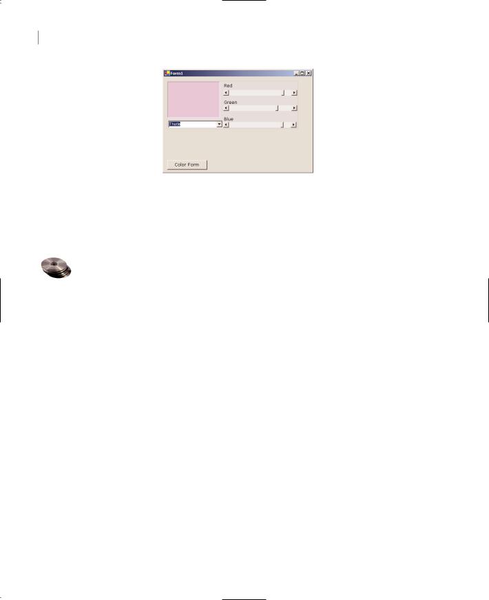
The control we’ll build in this section is very similar to the Color dialog box. The ColorEdit control allows you to specify a color by adjusting its red, green, and blue components with three scroll bars, or to select a color by name. The control’s surface at runtime on a form is shown in Figure 9.4.
Copyright ©2002 SYBEX, Inc., Alameda, CA |
www.sybex.com |
402 Chapter 9 BUILDING CUSTOM WINDOWS CONTROLS
Figure 9.4
The ColorEdit control on a form
Now open the UserControl object and design its interface, as shown in Figure 9.4. The three ScrollBar controls are named RedBar, GreenBar, and BlueBar respectively. The MinimumValue property for all three controls is 0; the MaximumValue for all three is 255. This is the valid range of values for a color component. The control at the top-left corner is a Label control with its background color set to Black. (We could have used a PictureBox control in its place.) The role of this control is to display the selected color.
The ComboBox control at the bottom of the control is the NamedColors control, which is populated with color names when the control is loaded. Color is the name of an object that allows you to manipulate colors, and it exposes 140 properties, which are color names (Beige, Azure, and so on). Don’t bother entering all the color names in the ComboBox control; just open the ColorEdit project on the CD and you will find the AddNamedColors() subroutine, which does exactly that. The first few lines of this function are shown next:
Private Sub AddNamedColors() With ComboBox1.Items
.Add(“AliceBlue”)
.Add(“AntiqueWhite”)
.Add(“Aqua”)
The user can specify a color by sliding the three ScrollBar controls or by selecting an item in the ComboBox control. In either case, the Label control’s Background color will be set to the selected color. If the color was specified with the ComboBox control, the three ScrollBars will be adjusted to reflect the color’s basic components (red, green, and blue components).
Not all possible colors you can specify with the three ScrollBars have a name (there are approximately 16 million colors). That’s why the ComboBox control contains the “Unknown” item, which is selected when the user specifies a color by settings its basic components.
Finally, the ColorEdit control exposes two properties, the SelectedColor and NamedColor properties. The NamedColor property retrieves the selected color’s name. If the color wasn’t isn’t selected on the ComboBox control, the value “Unknown” will be returned. The SelectedColor property returns, or sets, the current color. The SelectedColor property’s type is Color, and it can be assigned any expression that represents a color value. The following statement will assign the form’s BackgroundColor property to the SelectedColor property of the control:
ctrlColorEditor.SelectedColor = Me.BackgroundColor
Copyright ©2002 SYBEX, Inc., Alameda, CA |
www.sybex.com |

BUILDING COMPOUND CONTROLS 403
You can also specify a color value with the FromARGB method of the Color object:
ctrlColorEditor.SelectedColor = Color.FromARGB(red, green, blue)
The implementation of the SelectedColor property is shown in Listing 9.3, and it’s straightforward. The Get section of the procedure assigns the Label’s background color to the SelectedColor property. The Set section of the procedure extracts the three color components from the value of the property and assigns them to the three ScrollBar controls. Then it calls the ShowColor subroutine to update the display (you’ll see shortly what this subroutine does).
Listing 9.3: The SelectedColor Property Procedure
Property SelectedColor() As Color
Get
SelectedColor = Label1.BackColor
End Get
Set(ByVal Value As Color)
HScrollBar1.Value = Value.R
HScrollBar2.Value = Value.G
HScrollBar3.Value = Value.B
ShowColor()
End Set
End Property
The NamedColor property (Listing 9.4) is read-only and is marked with the ReadOnly keyword in front of the procedure’s name. This property retrieves the value of the ComboBox control and returns it.
Listing 9.4: The NamedColor Property Procedure
ReadOnly Property NamedColor() As String
Get
NamedColor = ComboBox1.SelectedItem
End Get
End Property
When the user selects a color name in the ComboBox control, the code retrieves the corresponding color value with the Color.FromName method. This method accepts a color name as argument (a string) and returns a color value, which is assigned to the namedColor variable. Then the code extracts the three basic color components with the R, G, and B properties (these properties return the red, green, and blue color components). Listing 9.5 shows the code behind the ComboBox control’s SelectedIndexChanged event, which is fired every time a new color name is selected on the control.
Copyright ©2002 SYBEX, Inc., Alameda, CA |
www.sybex.com |

404 Chapter 9 BUILDING CUSTOM WINDOWS CONTROLS
Listing 9.5: Specifying a Color by Name
Private Sub ComboBox1_SelectedIndexChanged(ByVal sender As System.Object, _
ByVal e As System.EventArgs) Handles ComboBox1.SelectedIndexChanged Dim namedColor As Color
Dim colorName As String
colorName = ComboBox1.SelectedItem If colorName <> “Unknown” Then
namedColor = Color.FromName(colorName) HScrollBar1.Value = namedColor.R HScrollBar2.Value = namedColor.G HScrollBar3.Value = namedColor.B ShowColor()
End If End Sub
The ShowColor property simply sets the Label’s background color to the color specified by the three ScrollBar controls. Even when you select a color value by name, the control’s code sets the three ScrollBars to the appropriate values. This way, we don’t have to write additional code to update the display. The ShowColor subroutine is quite trivial:
Sub ShowColor()
Label1.BackColor = Color.FromARGB(255, HScrollBar1.Value, _
HScrollBar2.Value, HScrollBar3.Value)
End Sub
The single statement in this subroutine picks up the values of the three basic colors from the ScrollBar controls and creates a new color value with the FromARGB method of the Color object. The first argument is the transparency of the color (the “A” or alpha channel), and we set it to 255 for a completely opaque color. You can edit the project’s code to take into consideration the transparency channel as well. If you do, you must replace the Label control with a PictureBox control and display an image on it. Then draw a rectangle with the specified color on top of it. If the color isn’t completely opaque, you’ll be able to see the underlying image and visually adjust the transparency channel.
Testing the ColorEdit Control
To test the new control, you must place it on a form. Build the ColorEdit control, add a new project to the current solution as before, reference the new control in the test project, and then add an instance of the control to the form. You don’t have to enter any code in the test form. Just run it and see how you specify a color either with the scroll bars or by name. You can also read the value of the selected color through the SelectedColor property. The code behind the Color Form button on the test form does exactly that:
Private Sub Button1_Click(ByVal sender As System.Object, _
ByVal e As System.EventArgs) Handles Button1.Click
Me.BackColor = ColorEdit1.SelectedColor
End Sub
Copyright ©2002 SYBEX, Inc., Alameda, CA |
www.sybex.com |