

THE SCROLLBAR AND TRACKBAR CONTROLS 279
You can also add new items at runtime by adding the same code in the control’s LostFocus event handler:
Private Sub ComboBox1_LostFocus(ByVal sender As Object, _
ByVal e As System.EventArgs) Handles ComboBox1.LostFocus Dim newItem As String = ComboBox1.Text
AddElement(newItem) End Sub
The ScrollBar and TrackBar Controls
The ScrollBar and TrackBar controls let the user specify a magnitude by scrolling a selector between its minimum and maximum values. In some situations, the user doesn’t know in advance the exact value of the quantity to specify (in which case, a text box would suffice), so your application must provide a more flexible mechanism for specifying a value, along with some type of visual feedback.
VB6 VB.NET
The ScrollBar control is the same as in VB6 with no substantial improvements. You will notice that there is only one ScrollBar control on the Toolbox, instead of the horizontal and vertical ones of VB6. In VB.NET, you can set the orientation of the control through the Orientation property. The main event of the ScrollBar control, Change, has a new name: it’s now called ValueChanged.
The TrackBar control is the old Slider control; other than its name, nothing else has changed.
The vertical scroll bar that lets a user move up and down a long document is a typical example of the use of a ScrollBar control. In the past, users had to supply line numbers to locate the section of the document they wanted to view. With a highly visual operating system, however, this is no longer even an option.
The scroll bar and visual feedback are the prime mechanisms for repositioning the view in a long document or in a large picture that won’t fit entirely in its window. When scrolling through a document or image to locate the area of interest, the user doesn’t know or care about line numbers or pixel coordinates. Rather, the user uses the scroll bar to navigate through the document, and the visible part of the document provides the required feedback.
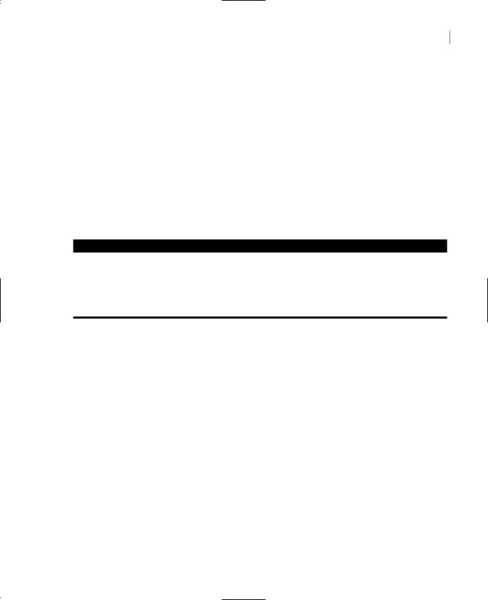
The TrackBar control is similar to the ScrollBar control, but it doesn’t cover a continuous range of values. The TrackBar control has a fixed number of tick marks, which the developer can label (e.g., Off, Slow, and Speedy, as shown in Figure 6.12). The user can place the slider’s indicator to the desired value. While the ScrollBar control relies on some visual feedback outside the control to help the user position the indicator to the desired value, the TrackBar control forces the user to select from a range of valid values.
In short, the ScrollBar control should be used when the exact value isn’t as important as the value’s effect on another object or data element. The TrackBar control should be used when the user can type a numeric value and the value your application expects is a number in a specific range; for example, integers between 0 and 100, or a value between 0 and 5 inches in steps of 0.1 inches (0.0, 0.1, 0.2 … 5.0).
Copyright ©2002 SYBEX, Inc., Alameda, CA |
www.sybex.com |
280 Chapter 6 BASIC WINDOWS CONTROLS
The TrackBar control is preferred to the TextBox control in similar situations because there’s no need for data validation on your part. The user can only specify valid numeric values with the mouse.
Figure 6.12
The TrackBar control lets the user select one of several discrete values.
The ScrollBar Control
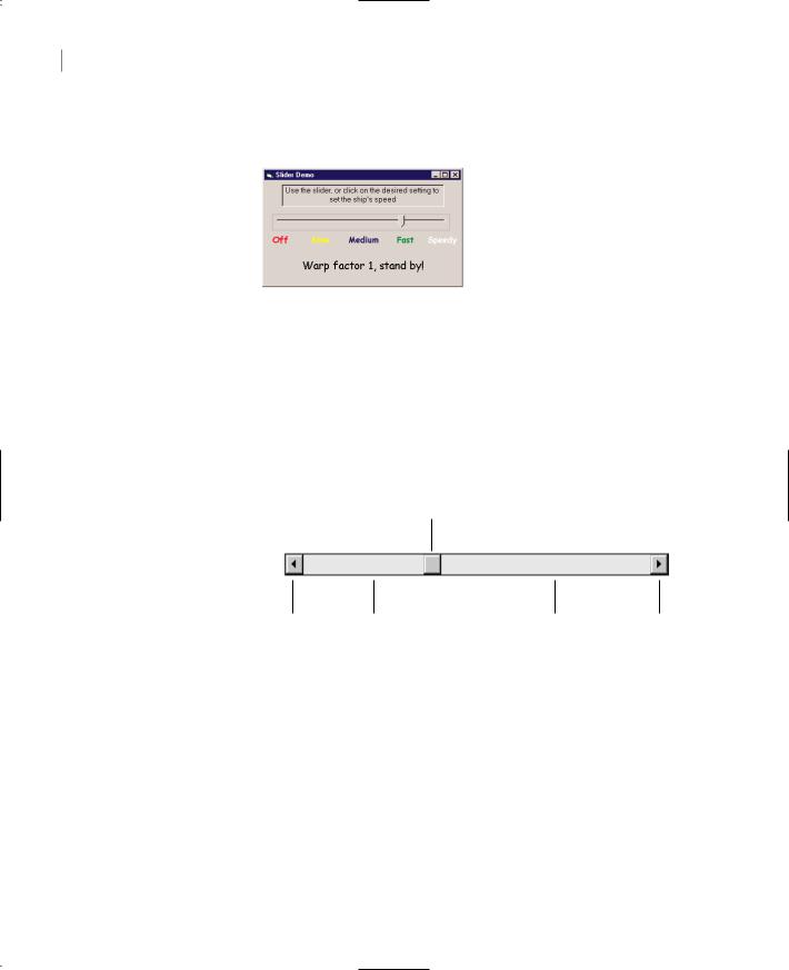
The ScrollBar control is a long stripe with an indicator that lets the user select a value between the two ends of the control, and it can be positioned either vertically or horizontally. Use the Orientation property to make the control vertical or horizontal. The left (or bottom) end of the control corresponds to its minimum value; the other end is the control’s maximum value. The current value of the control is determined by the position of the indicator, which can be scrolled between the minimum and maximum values. The basic properties of the ScrollBar control, therefore, are properly named Minimum, Maximum, and Value (see Figure 6.13).
Figure 6.13 |
Value |
The basic properties of the ScrollBar control
SmallChange |
LargeChange |
LargeChange |
SmallChange |
Minimum The control’s minimum value. The default value is 0, but because this is an Integer value you can set it to negatives values as well.
Maximum The control’s maximum value. The default value is 100, but you can set it to any value you can represent with the Integer data type.
Value The control’s current value, specified by the indicator’s position.
The Minimum and Maximum properties are positive Integer values. To cover a range of negative numbers or non-integers, you must supply the code to map the actual values to Integer values. For example, to cover a range from 2.5 to 8.5, set the Minimum property to 25, set the Maximum property to 85, and divide the control’s value by 10. If the range you need is from –2.5 to 8.5, do the same but set the Minimum property to 0, set the Maximum property to 110, and subtract 25 from the Value property every time you read it.
Copyright ©2002 SYBEX, Inc., Alameda, CA |
www.sybex.com |
THE SCROLLBAR AND TRACKBAR CONTROLS 281
VB.NET at Work: The Colors Project
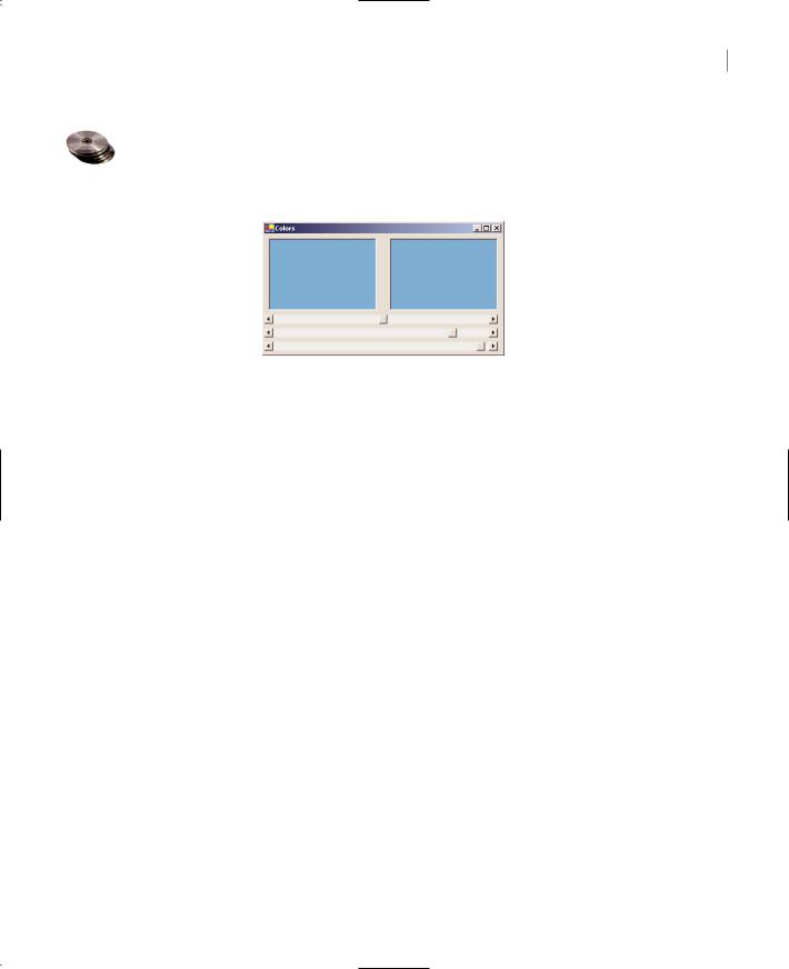
Figure 6.14 shows another example that demonstrates how the ScrollBar control works. The Colors application lets the user specify a color by manipulating the value of its basic colors (red, green, and blue) through scroll bars. Each basic color is controlled by a scroll bar and has a minimum value of 0 and a maximum value of 255.
Figure 6.14
The Colors application demonstrates the use of the ScrollBar control.
Note If you aren’t familiar with color definition in the Windows environment, see the section “Specifying Colors” in Chapter 14.
As the scroll bar is moved, the corresponding color is displayed, and the user can easily specify a color without knowing the exact values of its primary components. All the user needs to know is whether the desired color contains, for example, too much red or too little green. With the help of the scroll bars and the immediate feedback from the application, the user can easily pinpoint the exact value. Notice that this “exact value” is of no practical interest; only the final color counts.
Scroll bars and slider bars have minimum and maximum values that can be set with the Minimum and Maximum properties. The indicator’s position in the control determines its value, which is set or read with the Value property. In the Colors application, the initial value of the control is set to 128 (the middle of the range). Before looking at the code for the Colors application, let’s examine the control’s events.
The ScrollBar Control’s Events
The user can change the ScrollBar control’s value in three ways:
By clicking the two arrows at its ends. The value of the control changes by the amount specified with the SmallChange property.
By clicking the area between the indicator and the arrows. The value of the control changes by the amount specified with the LargeChange property.
By dragging the indicator with the mouse.
You can monitor the changes on the ScrollBar’s value from within your code with two events: ValueChanged and Scroll. Both events are fired every time the indicator’s position is changed. If you change the control’s value from within your code, then only the ValueChanged event will be fired.
The Scroll event can be fired in response to many different actions, such as the scrolling of the indicator with the mouse or a click on one of the two buttons at the ends of the scrollbars. If you
Copyright ©2002 SYBEX, Inc., Alameda, CA |
www.sybex.com |

282 Chapter 6 BASIC WINDOWS CONTROLS
want to know the action that caused this event, you can examine the Type property of the second argument of the event handler. The settings of the e.Type property are shown in Table 6.4.
Table 6.4: The Actions That Can Cause the Scroll Event
Member |
Description |
EndScroll |
The user has stopped scrolling the control. |
First |
The control was scrolled to the Minimum position. |
LargeDecrement |
The control was scrolled by a large decrement (user clicked the bar between |
|
the button and the left arrow). |
LargeIncrement |
The control was scrolled by a large increment (user clicked the bar between |
|
the button and the right arrow). |
Last |
The control was scrolled to the Maximum position. |
SmallDecrement |
The control was scrolled by a small decrement (user clicked the left arrow). |
SmallIncrement |
The control was scrolled by a small increment (user clicked the right arrow). |
ThumbPosition |
The button was moved. |
ThumbTrack |
The button is being moved. |
|
|
Events in the Colors Application
The Colors application demonstrates how to program the two events. The two PictureBox controls display the color designed with the three scroll bars. The left PictureBox is colored from within the Scroll event, while the other one is colored from within the ValueChanged event.
As the user moves the indicator with the mouse, different colors are shown in the second PictureBox, which is colored from within the ValueChanged event. This event is every time a scrollbar changes value.The other PictureBox doesn’t follow the changes as they occur. In the Scroll event handler of the three scroll bars, the code examines the value of the e.Type property and reacts to it only if the event was fired because the scrolling of the indicator has ended. For all other actions, the event handler doesn’t update the color of the left PictureBox.
If the user attempts to change the Color value by clicking the two arrows of the scroll bars or by clicking in the area to the left or to the right of the indicator, both PictureBox controls are updated. While the user slides the indicator, or keeps pressing one of the end arrows, only the PictureBox to the right is updated.
The conclusion from this experiment is that you can program either event to provide continuous feedback to the user. If this feedback requires too many calculations, which would slow down the reaction of the corresponding event handler, you can postpone the reaction until the user has stopped scrolling the indicator. You can detect this condition by examining the value of the e.Type property. When it’s ScrollEventType.EndScroll, you can execute the appropriate statements. Listing 6.17 shows the code behind the Scroll and ValoueChanged events of the Srollbar that controls the red component of the color. The code of the corresponding events of the other two controls is identical.
Copyright ©2002 SYBEX, Inc., Alameda, CA |
www.sybex.com |