

Beginning ASP.NET 2.0 With CSharp (2006) [eng]
.pdf
Chapter 5
How It Works
Now it might not look fantastic, but it didn’t take long to change how this element appeared on the page. This technique can then be applied to each element on the site. You can apply many different style attributes to a site, and so Appendix E includes some of the most common elements to help you to pick out your favorite styles for a site.
The good news is that having learned to style elements on a page, it’s just a short step to reorganizing your code into using a style sheet. The style attributes on HTML elements use exactly the same syntax as the style syntax used in style sheets, so move on to the next section and tidy up all this style code.
CSS — Cascading Style Sheets
The concept of style sheets has been around for several years now (it was first made a recommendation by the W3C in December 1996), and every well-designed web application will be backed by a welldefined CSS style sheet that defines a specific look and feel for the site. Using a style sheet, you are able to define how every type of element on a page will appear, and you can also create definitions for specific styles that you can pick and choose from to apply to specific elements on a page. For example, you can specify that every instance of a <div> tag should contain navy text, or you can define a style class called HighlightedText that you can apply to any <div>, or other similar element, on a page. Here’s a section from a style sheet that defines these styles:
div
{
font-family: ‘Trebuchet MS’; Color: Navy;
}
.HighlightedText
{
font-family: ‘Trebuchet MS’; Color: Navy;
}
Notice that the only difference between these two is that the HighlightedText class has a period before the name of the custom class. This identifies the section as a class that can be applied to any element you want, instead of defining default styling for a particular type of element.
To apply a style to an element, you don’t need to do anything to the element itself. As long as your page knows where the style information for the page can be found, the style will be applied automatically (locating style information is discussed in just a moment). However, to specify a custom class to be used to style an element, you use the Class attribute. For example:
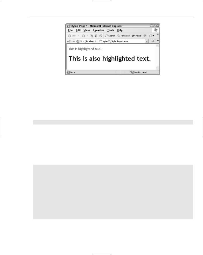
<div class=”HighlightedText”>This is highlighted text.</div>
<h1 class=”HighlightedText”>This is also highlighted text.</h1>
Although you can’t see the color of the text in this printed book, you can see that the font style that was defined in the preceding style class has been applied to these two elements in Figure 5-7.
138
Styling with Themes
Figure 5-7
Of course, if you try this out for yourself, you’ll see that the font has also been rendered in navy blue.
Style Syntax
Style definitions are surrounded by curly brackets (braces). The position of the opening brace is usually either next to the name of the element or class, or on the following line. For example, the div style can be rewritten as follows:
div{
font-family: ‘Trebuchet MS’; Color: Navy;
}
You can choose whichever presentation style you prefer — personally, I like my braces to all line up in a vertical line.
Style information can also be applied to elements like anchor tags (<a>) with some specific modifiers to provide some dynamic hover-style appearance as follows:
a:link, a:visited
{
color: #cc3300; text-decoration: underline;
}
a:hover
{
text-decoration: none;
}
a:active
{
color: #ff9900; text-decoration: underline;
}
This code will render red links with underline on a page that, when you hover your mouse over them, lose their underline, and when you click them, they momentarily appear slightly orange. This is to provide you with some feedback that you are hovering over a link, and that you have just clicked a link.
139
Chapter 5
The comma-separated items mean that the following style information will be applied to both style definition items (in this case, the a:link and a:visited items).
The first step in moving to a fully CSS-based layout is to decide what styles you want to use for each element and construct a set of style definitions.
You can put style definitions in two places so that they can be used in a web page. The first option is to embed style information at the top of the web page within a <style> tag, placed within the <head> element. The other option is to create a separate external style sheet to store the style definitions, and to link that external style sheet to each web page that it should be applied to.
In the next sections, you look first at placing style definitions within the <style> tags on a page, and then see how to attach an external CSS style sheet.
Moving from Style Attributes to a Style Section
If you are only interested in styling a single page, you can embed style information in the <head> section of the HTML for the page as follows:
<html xmlns=”http://www.w3.org/1999/xhtml” > <head runat=”server”>
<title>Styled Page 1</title> <style>
.HighlightedText
{
font-family: ‘Trebuchet MS’; Color: Navy;
}
</style>
</head>
<body>
<form id=”form1” runat=”server”>
<div class=”HighlightedText”>This is highlighted text.</div> <h1 class=”HighlightedText”>This is also highlighted text.</h1>
</form>
</body>
</html>
This code is the same code used to display the previous example. Notice how you can embed the style information quite easily within the <head> of the page using the <style> tag. This technique is fine for single pages — in fact, if you ever save a Word document as HTML, you’ll see that this technique is used to define the document styles in use so that the document can be rendered as HTML. I just saved this document from within Word 2003 as a Web Page (Filtered), which produces HTML code that’s a lot cleaner than the standard auto-generated code when you just save as a Web Page from Word. After I saved it, I viewed the source code that was generated, and found the following style definition that describes how some of the highlighted sections of code used in this chapter are defined:
140
Styling with Themes
p.code, li.code, div.code {margin-top:0cm; margin-right:0cm; margin-bottom:0cm; margin-left:30.0pt; margin-bottom:.0001pt; line-height:112%; font-size:8.5pt; font-family:Courier;}:
This technique isn’t really ideal for constructing a web site with style information applied to many different pages, because you would have to copy the <style> tags and style definitions across to all of the pages in the site individually. The solution for that scenario is to move to a separate CSS.
Moving to a Separate CSS
This step is perhaps the simplest to achieve. When you have style definitions encapsulated within <style> tags, it’s a really simple matter to extract that information into a separate style sheet. All you need to do is create a file with the file extension of .css, copy across all the style information from your web page, and then add a link to that style sheet as follows:
<head runat=”server”> <title>Styled Page 2</title>
<link href=”StyleSheet.css” rel=”stylesheet” type=”text/css” /> </head>
The style sheet file contains only style information, so say you had a style sheet with all of your style code in it:
.HighlightedText
{
font-family: ‘Trebuchet MS’; color: Navy;
}
a:link, a:visited
{
color: #cc3300; text-decoration: underline;
}
a:hover
{
text-decoration: none;
}
a:active
{
color: #ff9900; text-decoration: underline;
}
141
Chapter 5
You can then link that style sheet to your web page, and make a minor addition to the page code:
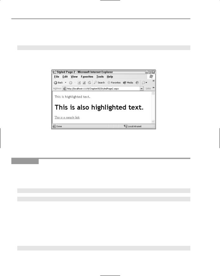
<form id=”form1” runat=”server”>
<div class=”HighlightedText”>This is highlighted text.</div> <h1 class=”HighlightedText”>This is also highlighted text.</h1> <div><a href=”default.aspx”>This is a sample link</a></div>
</form>
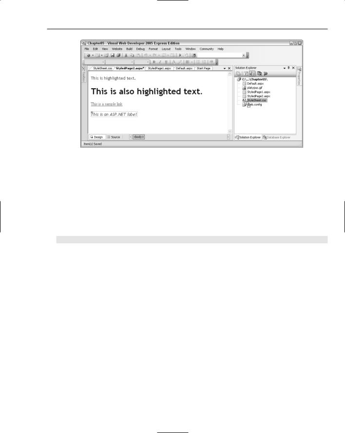
When you view this page you’ll see the result shown in Figure 5-8.
Figure 5-8
Go ahead and try these concepts. In the next Try It Out, you create a simple styled page that is based on the StyledPage1.aspx that you created earlier.
Try It Out |
Styling a Simple Page, Part 2 — Using CSS |
1.Create another new page in your Chapter05 web site and call it StyledPage2.aspx.
2.Copy the <div> and heading from StyledPage1.aspx and remove the style attributes from each element. In their place, add a class attribute, and give it a value of “HighlightedText”:
<form id=”form1” runat=”server”> <div class=”HighlightedText”>
This is highlighted text.</div> <h1 class=”HighlightedText”>
This is also highlighted text.</h1> </form>
3.Add a hyperlink to the page below the heading with the text This is a sample link. Enter
“default.aspx” as the value for the href:
<form id=”form1” runat=”server”> <div class=”HighlightedText”>
This is highlighted text.</div> <h1 class=”HighlightedText”>
This is also highlighted text.</h1>
<div><a href=”default.aspx”>This is a sample link</a></div> </form>
142

Styling with Themes
4.After the hyperlink, add a line break, followed by an ASP.NET Label control. Remember that server controls have a different set of properties than standard controls, so set the label’s
CssClass property to “HighlightedText”, and the Font-Italic property to “true”:
This is also highlighted text.</h1>
<div><a href=”default.aspx”>This is a sample link</a></div><br /> <asp:Label CssClass=”HighlightedText” Font-Italic=”true” ID=”Label1”
runat=”server” Text=”This is an ASP.NET label”></asp:Label> </form>
5.Right-click the Chapter05 site in the Solution Explorer and select Add New Item. Select StyleSheet from the list of icons and accept the default name: StyleSheet.css. In this file, add the following code:
.HighlightedText
{
font-family: ‘Trebuchet MS’; color: Navy;
}
a:link, a:visited
{
color: #cc3300; text-decoration: underline;
}
a:hover
{
text-decoration: none;
}
a:active
{
color: #ff9900; text-decoration: underline;
}
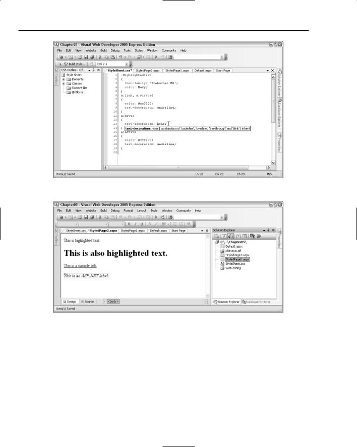
Notice how you get the same syntax help when you work with a CSS style sheet as when you work with <style> attributes on a HTML control in Source View, as displayed in Figure 5-9.
Also notice the Build Style icon on the toolbar. If you click this button, it launches the Style Builder dialog box. You can try this out for yourself — add another element definition (a <div>, perhaps), and add the opening and closing curly braces. Place your cursor between those braces and click the button to launch the style builder. After you have selected the styles you want, just click OK and your styles appear as CSS items in the StyleSheet.css file.
6.There is just one final thing to do, which is to tell your page to refer to the styles defined in the
.css file. Switch back to StyledPage2.aspx and flip to Design View. You should see the screen shown in Figure 5-10.
7.Now drag and drop the StyleSheet.css file icon from the Solution Explorer onto the design surface. As soon as you do that, your page will change appearance (see Figure 5-11).
If you run the page now, you’ll see pretty much the same thing in your browser window.
143
Chapter 5
Figure 5-9
Figure 5-10
144
Styling with Themes
Figure 5-11
How It Works
Only two things are required to style an HTML element on a page using a separate CSS file. One is the class to be used by the element, and the other is a link that the page will use to locate the CSS file. When you dragged the CSS file onto the design surface of the page, the following code was added for you at the top of the page:
<html xmlns=”http://www.w3.org/1999/xhtml”> <head runat=”server”>
<title>Styled Page 2</title>
<link href=”StyleSheet.css” rel=”stylesheet” type=”text/css” /> </head>
That link at the top of your page tells your page where to find its style information. From that moment on, any class attributes in the page will attempt to refer to the CSS style sheet for the styling information for those elements. If the class cannot be found, no styles are applied, unless they are specified manually in the Style attribute of the element.
HTML elements with class attributes specified can also have additional style information specified in the Style attribute. Any styles defined in the Style attribute will override those specified in the CSS file, giving you the chance to fine-tune the appearance of selected elements on your page.
Server controls are somewhat different. Because a server control will be converted to appropriate HTML when it is rendered, the available properties will be different. In this example, you used a Label control. The Label control is a relatively simple control, so there’s not a huge amount of styling you can add to it. In this case, you added a link to the CSS style, and defined one additional style. The CssClass attribute used by server controls relates directly to the class attribute found on HTML elements. The individual style attributes are similar to the individual parts found in the HTML style attributes:
<asp:Label CssClass=”HighlightedText” Font-Italic=”true” ID=”Label1”
runat=”server” Text=”This is an ASP.NET label”></asp:Label>
145

Chapter 5
When the label is rendered, the following code is generated:
<span id=”Label1” class=”HighlightedText” style=”font-style:italic;”>This is an ASP.NET label</span>
Notice that the custom style attributes are converted to a standard style tag on the browser. Because CSS styling is applied on the client side, once the page is rendered the class and style attributes on the HTML elements will have styles and CSS styling applied just like static HTML elements.
Limitations of CSS and Server-Side Code Styles
When you style a site using CSS, you can specify how specific elements will appear on a page. This works just fine in a static HTML web site, but when it comes to server-side elements, you will start to run into problems. Take, for example, a simple ASP.NET Panel control. If you drag a Panel control onto a page, add some text, and view the page in two different browsers (for example, Internet Explorer and an older or more limited browser like Links), you will see different results when you view the source of the page. Here’s some example source code:
<form id=”form1” runat=”server”>
<asp:Panel ID=”Panel1” runat=”server” Height=”50px” Width=”125px”>This text is contained within an ASP.NET Panel control
</asp:Panel>
</form>
Now, viewed in Internet Explorer 6 and Firefox 1.5, the following source code has been generated:
<form method=”post” action=”StyledPanels.aspx” id=”form1”> <div>
<input type=”hidden” name=”__VIEWSTATE” id=”__VIEWSTATE” value=”/wEPDwULLTEwODU4OTkxMzRkZHehxD/SHmjEeZzCKx7+bB752B3R” />
</div>
<div id=”Panel1” style=”height:50px;width:125px;”>
This text is contained within an ASP.NET Panel control </div>
</form>
Now if you view that same page in an older browser (for example, Mozilla 5.0), you’ll see the following:
<form name=”form1” method=”post” action=”StyledPanels.aspx” id=”form1”> <input type=”hidden” name=”__VIEWSTATE” id=”__VIEWSTATE”
value=”/wEPDwULLTEwODU4OTkxMzRkZHBovyeleyCJNtOpi+uco+l/zE5a” />
<div id=”Panel1”>
This text is contained within an ASP.NET Panel control </div>
</form>
Notice how the Panel has been rendered to a <div> control in both cases, but in the second case, it has lost its height and width information. It’s a small change in this case, but it’s a great improvement over ASP.NET 1.1, which renders ASP.NET Panel controls as HTML tables on Mozilla, Firefox, and other non-Internet Explorer browsers. For example:
146

Styling with Themes
<table id=”Panel1” cellpadding=”0” cellspacing=”0” border=”0” height=”50” width=”125”>
<tr><td>
This text is contained within an ASP.NET Panel control </td></tr>
</table>
Although ASP.NET 2.0 has removed a lot of issues like this from our day-to-day programming lives, the problem still remains that what you see on the server side isn’t the same as you will see on the client side, and you can’t guarantee that an element will always be rendered in the same way on every browser. What ASP.NET 2.0 attempts to do is to provide a mechanism for specifying the appearance of an element based on its server-side control type, not on its client-side control type, so that when a control is rendered on different browsers, consistency is maintained where possible. This is achieved using themes and skins.
Themes
Themes are used to define the look and feel of a web site, similarly to how pages are styled using CSS. However, unlike CSS, themes can specify how server-side elements, such as a TreeView control, will appear when they are rendered on the browser. Remember that server controls have to be converted to standard HTML and possibly JavaScript if a browser is to understand how to render them on a page. A themed server control will have style attributes applied to each of the relevant client-side elements that are generated when the page is requested.
A theme can be used in one of two ways. It can be used as a Stylesheet theme, which acts in a similar way to a regular CSS style sheet. The alternative is to use your theme as a Customization theme, which changes the order of preference for style rules that you may be used to, so that the Customization theme will specify the style to use for each element, overriding any style preferences specified in a separate style sheet, or even in the style attributes of an element.
The basic method for creating a theme is the same, whichever way you use it. Additionally, you can choose to use one theme throughout an entire site, or a different theme on each page.
Creating a Theme
The process of creating a theme involves creating a .skin file, which defines the appearance of each element on the page, and placing this skin file within a folder, the name of which specifies the name of the theme. All themes are stored within a folder in an application directory called App_Themes. Here’s a look at a sample skin file:
<asp:Calendar runat=”server” Font-Names=”Century Gothic” Font-Size=”Small”> <OtherMonthDayStyle BackColor=”Lavender” />
<DayStyle ForeColor=”MidnightBlue” /> <TitleStyle BackColor=”LightSteelBlue” />
</asp:Calendar>
<asp:TreeView runat=”server” ExpandDepth=”1” Font-Names=”Century Gothic” BorderColor=”LightSteelBlue” BorderStyle=”Solid” >
<SelectedNodeStyle Font-Bold=”True” ForeColor=”SteelBlue” /> <RootNodeStyle Font-Bold=”True” />
<NodeStyle ForeColor=”MidnightBlue” /> <LeafNodeStyle Font-Size=”Smaller” />
147