COLOR MIXING
The color wheel is a visual tool that helps us organize color in our minds. Create your own color wheels using different triads to create limited palettes. Limiting your palette to three colors will allow you to explore mixing and create harmonious relationships of color. Here are a few basic color terms.
Hue
The spectrum of colors that appear in the rainbow: red, orange, yellow, blue, green, violet.
Primary and Secondary Colors
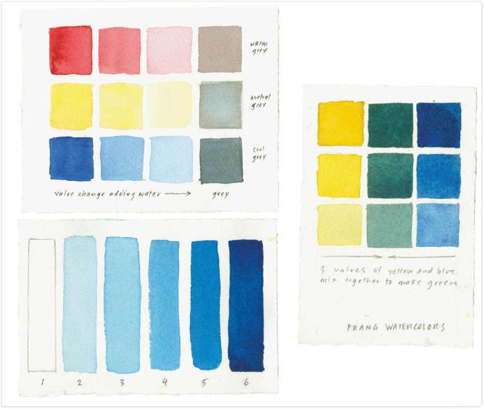
The three primary colors are yellow, red, and blue. Secondary colors green, orange, and violet are mixed from the primary colors.
Tertiary Colors
The colors formed by mixing adjacent primary and secondary colors: yellow orange, red orange, red purple, blue purple, blue green, and yellow green.
Analogous Colors
Colors that sit next to one another on the color wheel, such as yellow, red, and orange.
Complementary Colors
Colors that sit opposite one another on the color wheel, such as yellow and purple or red and green. Complementary colors accentuate one another; mixing complements together mutes or grays the color.
Value or Tone
The relative lightness or darkness of a color. Having different color values adds rhythm and depth to any painting through contrast and gradation of tones. Breaking down color values helps to simplify a complicated scene.
You can look at any subject or view and simplify it into three distinct values: the lightest, darkest, and medium tones. To add depth of tone, I sometimes work with a range of five values, including the white of the paper.
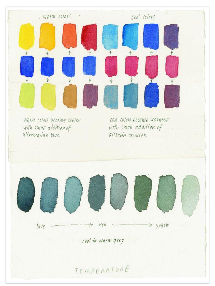
Color Temperature
All colors have a temperature, warm or cool, that can create moods. When you put two complementary colors together, each appears more intense, and their relationship is pleasing to the eye. You can shift any color toward warm, cool, or neutral: to make blue warmer, add a small touch of red; to make a yellow cooler, add a touch of blue; to make a vivid orange more gray, add a touch of purple, which will neutralize it. I sometimes adjust the temperature of two colors next to each other to create cool against warm.