HTML 4_01 Weekend Crash Course - G. Perry
.pdf324 |
Sunday Morning |
Why isn’t a width of 100 percent used, as was used for the header table in the previous session? Problems sometime arise with percentage width measurements in tables. The left-hand table column is squeezed down to fit any other columns whose widths are specified in pixel measurements. In other words, the center column of the table must be exactly 105 pixels to ensure that enough room appears for the thumbnail pictures the Barkleys want to put before most of their announcements on the home page. Given that this column is a fixed width, the 100 percent would mean that the browser would adjust other columns if necessary. It would turn out that the browser would adjust the left column in this situation, making the navigation bar thin and squeezed and messing up the spacing of the text. By specifying all three columns by an exact pixel measurement, and by keeping the total width less than the screen size of most computers in use today, you can keep your columns an accurate size. By giving the far right table a width of 2,000 pixels,
you ensure that the heading will fill the entire Web page no matter how great the user’s screen resolution is.
Remember that this bottom table begins the body of the home page. The header section holds the table that you created in the previous session.
The Navigation Bar
This Web page’s navigation bar would have been a great use of a frame; the window with the navigation bar remains on the screen while the user scrolls the content in the large window. You already know the frame feature’s problems and limitations.
Given the problems with frames, such as the fact that some browsers still in use don’t even support frames, the Barkleys decided that their home page should stick with tables, which have been around since the first version of HTML. Fortunately, the Web page looks much better without the frame.
Note
Except in extremely advanced sites developed by graphics and Web specialists, frames can make even a good site look amateurish. Not all sites that use frames look amateurish, but frames add an element that detracts from almost any page.
The cell on the left of the page’s bottom table will hold the navigation area for the page. The left column consists of a single cell. This cell must span three rows because the rest of the page uses three rows by design; the Barkleys want their top two messages to their friends and family to appear in the large content area of the body and other notes to appear throughout other pages on the site.

Session 24—The Web Site Home Page’s Text and Graphics |
325 |
The Barkleys are wise to keep their home page text to a minimum. The rather large header already consumes much of the site. Although the header is not one that overshadows their content, the Barkleys must keep the content on the home page simple and let the navigation bar take users to more detailed points of interest.
Listing 24-1 shows the navigation bar portion of the body. The cell is the first cell in the row, so a <tr> tag must inform the browser that a new row is beginning.
Listing 24-1
Creating the navigation bar’s code
<tr>
<td width=140 height=382 bgcolor=#009900 align=center valign=top rowspan=3>
<font face=Arial size=2 color=#FFFFFF> <b><i>Welcome</i>
<hr>
Mom’s Corner <br>Dad’s Corner <br>Kid’s Playground <br>Family Pictures <br>Favorite Movies <hr><hr>
<i>Special
<br>Bulletins</i>
<hr>
Family Travels</b> </font>
</td>
The <hr> (horizontal rule) tags draw a horizontal ruler line across the cell. To separate the two large sections of the navigation bar, the Barkleys used two horizontal rules. The first section, the Welcome section, will remain fairly static, and the Barkleys have no plans to change the structure. The second section, the
Special Bulletins section, may hold from one to 10 items depending on how important the family considers each new item to be. As it stands now, only one Special Bulletin, the recent family travels, appears in the navigation bar’s second section. The rowspan=3 attribute informs the browser that this cell is to extend as far
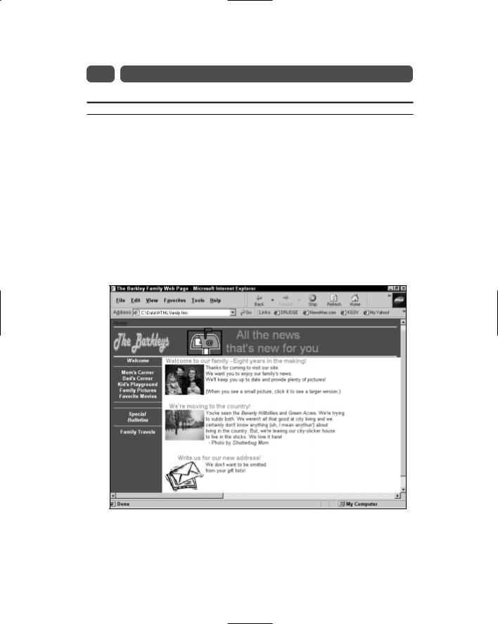
down as needed to hold its contents. Without the rowspan=3 attribute, the browser would make the rest of the navigation bar only as wide as the first cell. Figure 24-3 shows the Barkleys’ home page as it now appears.
Morning Sunday—V Part
24 Session

326 |
Sunday Morning |
Figure 24-3
The navigation bar spans three rows to extend down the page.
Obviously, the navigation bar requires links to pages. In the next session, you will add hyperlink anchor tags to each of the navigation entries.
The Final Two Columns: Images and Text
The two final columns are rather simple to add. The middle column’s primary job is to hold thumbnail images the Barkleys will use next to their home page announcements. In addition, to make heading text run across the top of the center column’s graphic and into the third column where most of the text content lies, the middle column will hold the first few letters of the headings, as you’ll see here. The two columns of cells in the white, content section finish out the three columns that the bottom table displays. In other words, the large section below the heading is just a three-column table, with the first column being the navigation bar and the second and third holding content.
Listing 24-2 contains the code for the top cell in the first row of the middle column. It holds the thumbnails and some heading text.

Session 24—The Web Site Home Page’s Text and Graphics |
327 |
Listing 24-2
Creating the top cell in the table’s first row
<td width=114 height=1 bgcolor=white valign=top align=right> <p align=right>
<font face=Arial size=3 color=#CC9900>
<b>Welcome to o</b><img border=0 src=”ourfamT.jpg” align=top width=105 height=82 alt=”Our Family”>
</font>
</p>
</td>
The key points to Listing 24-2 are simply that the background color is now white (bg=white) and the cell’s contents are aligned vertically to the top of the cell (valign=top) and horizontally (align=right) to the right so that the headline text can be continued into the next cell.
Finish entering the text in the third cell before viewing the page. Listing 24-3 contains the contents of the third cell.
Listing 24-3
Creating the third cell in the table’s first row
<td width=2000 height=1 bgcolor=white valign=top align=left> <p>
<font face=Arial size=3 color=#CC9900>
<b>ur family - Eight years in the making!</b> </font>
<font face=Arial size=2 color=black> <br> Thanks for coming to visit our site. <br> We want you to enjoy our family’s news.
<br> We’ll keep you up to date and provide plenty of pictures!
<br><br> (When you see a small picture, click it to see a larger version.)
</font>
</td>
</tr>
Morning Sunday—V Part
24 Session
Figure 24-4 shows the Barkleys’ home page as it now appears. The final cell helps fix the spacing properly for the page. The third column maintains the white background and continues the gold headline that began in the previous column.

328 |
Sunday Morning |