

Professional Graphic Designs
Manring Masterpiece Design is a professional Graphic Design firm for growing companies all over the world. We create Marketing materials to help you increase your customer base and financial gains. Our strategy is to deliver the best solutions for advertising, Marketing and promotional items possible. Make a meaningful connection between your company and your target market, and change your business for the better by using MMD.
MMD specializes in corporate identity, print marketing materials website development including Search Engine Optimization. A very powerful first impression is created when a company is represented by strong professional logo design and highly skilled print design and expert website design. We specialize in creating that dynamic!
We provide cost-effective expert design services to our clients without compromising the quality of our work. We offer rates that are within your budget, premium designs and quick turnaround. These are the three basic principles of the service to our clients. Our primary goal is to provide you with the most professional, innovative marketing materials at affordable rates possible. Compare the prices you will find here to others, and when you are ready for great customer service, great designs and amazing rates, contact MMD!
Call today for a free phone consultation! 404-734-7980
We offer a wide variety of services: |
||
|
|
|
Ex. 4. Find information about Andre de Tulus-Lotre, Pier Bonar and Alfonce Mukha
Peter Berence in Internet. Search information about their biographies/works/influence on modern state of design. Share this information with other students and make notes.
Ex. 5. Work in small groups. Students will pretend to be a graphic design firm. They have to create their text as it is given in exercise 2 (above). Think of the name of the firm, services you give, price list. The team with best presentation (ideas, content, projects) is winner.
Ex. 6. Work in several small groups. Follow the link http://prestonforeman.articlealley.com/the-difference-between-professional-and-amateur-graphic-design-1377719.html and watch videos of interviews with experts. For example: ‘What is the difference between Graphic Designer and Web Designer?’, ‘I’m a graphic designer – True Life’ or ‘Is graphic design a wast of time?’, ect.
All teams have to see drifferent videos. After listening teams exchange the got information. What new have you learnt for yourself? Make notes.
Ex. 7. Translate the sentences paying attention to the Infinitive in different meanings:
1. To build or not to build – that is the question. 2. Bernini brilliantly used sculpture to dramatize the climaxes of his composition. 3. Brunelleschi`s Palazzo was one of the first to display classical orders. 4. In Renaissance buildings rustication is used chiefly in the basement storey to give an appearance of strength. 5. Artificial ponds or canals were used to ornament ancient Roman buildings. 6. Egyptian architects manipulated light and shade to give variety to surfaces. 7. The window was extended to become the window wall. 8. It is not necessary to invent new architecture every Monday morning. 9. To increase the height of the interior, a second arcade was superimposed on the first. 10. London was the first city to take its urban transport underground. 11. The last buildings to be constructed in St Petersburg before the Napoleonic invasion were the Admiralty buildings. 12. Brick was the first building material to be made by man. 13. It is important to realize this project.
GRAMMAR: Non-finite form of the verb: Participle I.
The form of Participle I is the infinitive + ing: working, loving, sitting.
It uses:
To form the continuous tenses: he is working
As adjectives: running water
After have + object: we have people standing on our steps all day.
Participle I can sometimes replace a relative pronoun + verb: people who wish to visit the caves/ people wishing to visit the caves.
After verbs of sensation: I see him passing my house every day.
After catch/find/leave + object: I caught them stealing my apples.
After go, come, spend, waste, to be busy: come dancing.
Ex. 8. Translate the sentences paying special attention to the function of the participle in the sentence.
1. The boy playing in the garden is my sister’s son. 2. He asked her to go on with her story, promising not to interrupt her again. 3. Receiving no letters from her father, she called him. 4. He left the office at three o’clock, saying he would be back at five. 5. She stood leaning against the wall. 6. He lay on the sofa reading a newspaper. 7. Seeing her he raised his hat. 8. A person bringing good news is always welcome. 9. Receiving the telegram, he rang the manager up. 10. There are many wonderful books describing the life of people in the North.
Ex. 9. Give your examples of Participle I.
Ex. 10. Game “Guess what your group-mates’ friends/relatives/acquaintances are doing at this moment”. Students (one by one) show it through mimics and geste.
Ex. 11. Translate into your language.
1. While we were crossing the bridge, we saw a man, who was talking with our father. 2. As we were very tired, we refused to go for a walk. 3. As the boys had climbed the mountains the summer before, they understood the difficulties. 4. A large branch, which had been broken by the wind, lay across the road. 5. At a conference, a number of important scientific problems are being discussed. 6. A person bringing good news is always welcome. 7. While skating yesterday, he fell and hurt himself. 8. When writing a telegram we must use as few as possible. 9. The leaves lying on the ground reminded us of autumn. 10. Arranging everything, he could come home very late.
Ex. 12. Put in the verbs in brackets as Present Participle into the gaps. Example: _______ birds (fly). Answer: flying birds
1) …..dogs (bark) |
2) ……children (play) |
3) ……..girls (scream) |
4) ……..cowboys (dance) |
5) ……..ducks (swim) |
6) ……..babies (cry) |
7) ………..water (run) |
8) ………..teachers (sing) |
9) ……….leaves (fall) |
10) ……..people (lie) |
Ex. 13. Use the words in brackets as participles in the gaps. Example: _________ news (surprise). Answer: surprising news
1) a ………..boy (wait) |
2) an …………story (interest) |
3) a ………..car (break) |
4) the ……….pizza (forget) |
5) the ………….father (work) |
6) I saw him …………. (go) |
7) the …………computer (repair) |
8) the ……..students (talk) |
9) ……..fans (excite) |
10) the girl ………next door (live) |
Ex. 14. Game “Boss”. Play in pairs. One student gives orders to another student and the latter has to fulfil. Use Participle I in the sentences.
Example: Pass me the book lying on that table.
Call the student sitting in front of the window.
Unit 6
Theme: Great theoretics of design John Rankin and William Morris
Grammar: Non-finite form of the verb – Participle II
Objectives: Introduction of new lexical material on theme “Great theoretics of design John Rankin and William Morris” and fixing active vocabulary in speech exercises, development of skills of oral and writing speech.
Discussion: Their biographies and works.
Introduction of new grammar theme “Participle II” and fulfilling grammar exercises.
Ex. 1. Read the text.
4 Quick and Easy Design Theory Tips
Oftentimes you can create a snappy design that just doesn’t seem to work – it looks nice and all, but there’s something about it, something you just can’t quite put your finger on, that stalls it dead in it’s tracks. We’ll explore four areas that may just solve the problem … or at least help you get pointed in the right direction.
1. Contrast
If something has strong contrast, it means it stands out better from the page, or from other items on the page. In a nutshell, contrast works something like this:
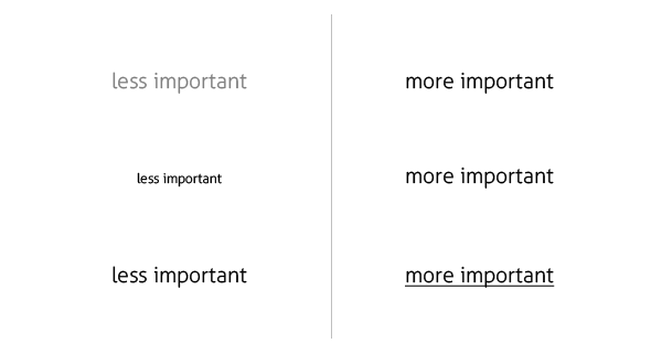
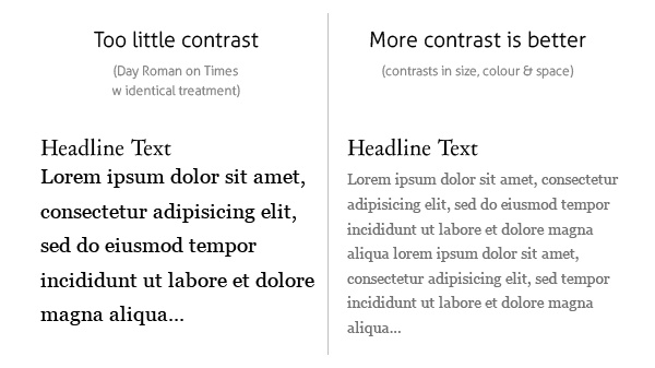
As you can see illustrated above, the most common way to increase contrast is through colour (black on white works better than light grey on white, for example), through size, or through other treatments. But it can also be done visually by reducing the number of items that compete for attention and putting the primary focus on the main stuff although this might apply a bit more to websites or ad pages that have many items, or where the ‘real estate’ is more valuable and more information is presented at one time.
It can also be applied to type treatments, the size of the item in question, and even something as small as line thicknesses.
A good rule of thumb is that if they are not the same, make them markedly different.
However, there should always be a measure of consistency with what contrasts you use for certain areas on the page — simply, don’t jumble up your contrasts to such an extreme that some content is harder to read or it hurts your viewers’ eyes, and keep contrasts the same (or very similar) in given sections of a page.
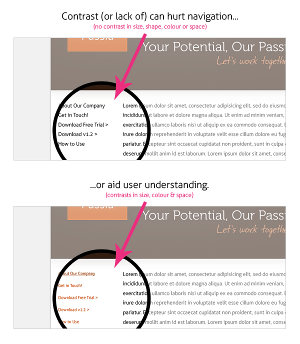
Contrast is key to differentiating among sections of your website, as illustrated:
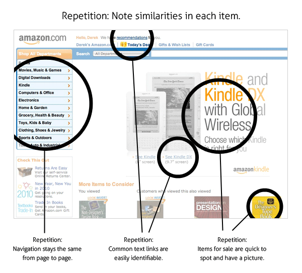
2. Repetition
Repetition aids in the understanding of content (visual or written) through organization. Repeating these elements not only helps the viewer to understand their relationship to each other but also to the page as a whole (and subsequently understanding relative importance within the page) as well as its importance within the site. Knowing what importance to put on key areas helps the viewer organize the content in his mind.
Defining key elements through repetition makes the experience coherent and unified — whether the experience is browsing your website, reading a brochure or looking at a business card.
For example, if we were to style all copy on the page at the same font size and weight, we’d certainly have repetition but there would be no sense of importance on key areas. (see Contrast, above as well) We’ve learned to style redundant items like navigation, footers, etc., to be a certain size and weight and other areas to be ‘heavier,’ visually. This marked consistency in the former areas comforts the viewer by telling his brain that these items are unchanging and reliable (important for navigational elements) and the content can have his attention without needing to re-examine each page every time it loads. In this example, we use repetition to our benefit and it aids in navigation and understanding. It wouldn’t work that way if every single item looked the same. (unless, of course, our site, by design, needs to be this way — in which case we find other, more subtle ways to inform the viewer of primary and redundant areas) The greater the similarity between or among elements, (typically) the more gravity is given to subtleties, as shown below:
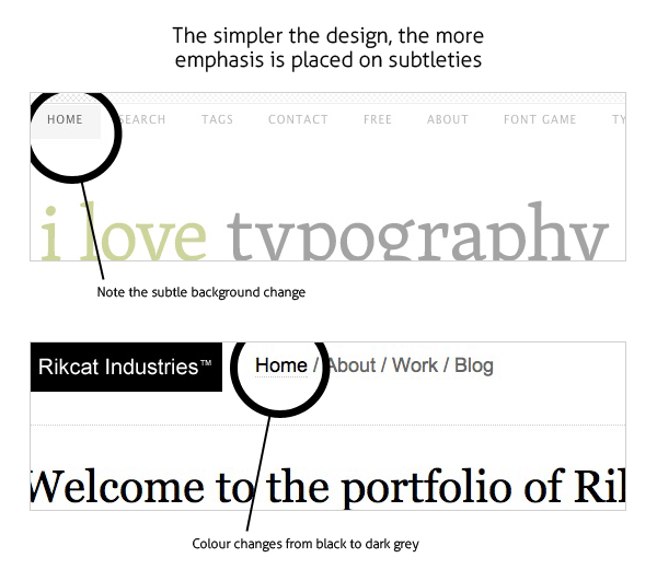
These subtleties would be lost on a busier, more graphically intense site but work well on these sites that are already a bit minimal to begin with. For example, on Amazon.com these subtleties in main navigation would be missed more often than not and that would result in a drop in sales volume and revenue for the company. Individual elements of good design, as illustrated, compliment itself as a whole.
Example
Notice
how the Amazon index page breaks up information and content sections
using good use repetition for each component or type of item:
3. Alignment
Each item or element on the page should not just be placed at random. This doesn’t mean that every single itemmust be aligned with every thing else, or even aligned with something else — but should contribute to the coherence of the whole. What you’re looking for is a visual connection between or among the elements on the page.
Alignment can help increase an item’s visual weight on the page, and therefore the importance the viewer puts on it.
This can be used to increase contrast as well — pull quotes are a great example of how bumping out of regular alignment can draw attention without throwing the user’s train of thought. By aligning more strictly most items on the page (or redundant items like navigation) and letting a main feature pop out of this alignment, we are contrasting that item with the others on the page, and thereby increase it’s visual weight and the importance the viewer puts on it.
Example
Take a look at how Amazon accomplishes this on their product info pages (I pulled up Simple Minds “Graffiti Soul” album):

4. Proximity
It goes without saying that if we have two related elements on a page (eg: a picture that accompanies an article) we want to keep it close by it’s article, and preferably close by the part of the article it relates to specifically.
Proximity is one of the key ways we determine relationships and organize information.
For example, some business cards have both a business name & number and a personal name & number. Nowhere on the card does it specifically say that the number under the business name applies to the person, and the number under the person is the generic business number. We know, by their proximity, that if we dial the first number we’ll reach the front desk and if we dial the second we’ll reach the person whose name is on the card.
Example
Take a look at Amazon.com again. Notice the bottom links and screen size information for the two Kindle models:
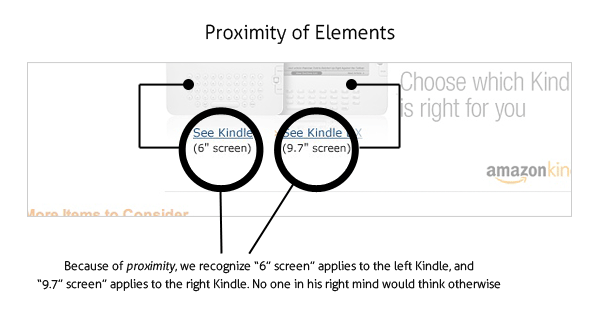 We
wouldn’t think for a second that the screen sizes would apply to
anything other than the Kindle models they are shown under,
respectively. The power of proximity is one of suggestion. Without
actually saying two
pieces of information are connected, you are able to reduce visual
clutter and present material more intuitively.
We
wouldn’t think for a second that the screen sizes would apply to
anything other than the Kindle models they are shown under,
respectively. The power of proximity is one of suggestion. Without
actually saying two
pieces of information are connected, you are able to reduce visual
clutter and present material more intuitively.
Items placed closer to the primary content on a site we know are related to the primary content or are at least of greater relational importance to that content. Relevancy is implied by the proximity of one item to another: We increase the likelihood of a relationship the closer these items become.
It’s Design Theory
It’s important to understand that these are principles of design theory — common sense, if you will. They aren’t hard and fast rules, and sometimes we can bend a principle a bit more on one project than we do on another. It’s all in the design at hand. That said, it’s really about common sense although sometimes having a good eye for this type of stuff can make a big difference.
These four principles are a good starting point to break down any design and see if it needs to be tweaked or worked with a bit. And it’s easy to remember (work out the acronym for yourself: D)
Here they are again, simply:
Contrast
Repetition
Alignment
Proximity
Ex. 2. Practice & Have Fun. With each of these four principles in mind, grab a small notebook and spot areas in common visual designs that can be tweaked or worked with – whether they’re your projects or not – and write down ways they can be improved. After a little while, it’ll be like second nature looking at things this way and you’ll also notice an upgrade in your own design work.
Ex. 3. Find some information about great theoretics of design John Rankin and William Morris. Share with your group-mates.
Ex. 4. Telephoning roleplays and vocabulary for architects. Revision of Present Simple and Continuous
Choose the telephoning situations which are most realistic for you (in English or in your own language) and roleplay them with your partner.
Phone a client and tell them that you won’t be able to finish the project by the deadline |
Phone a client to discuss changing the budget for a project |
Take a call from a supplier who wants to inform you about new materials |
Phone to check the progress of a project and what stage they are at now. |
You are a journalist for an architecture magazine. Phone a famous architect and ask interview questions about their daily routine and present projects. |
Pretend you are a client phoning an architect to ask them to make some changes to a design. |
Someone keeps phoning to speak to the chief architect at your firm. Give them different reasons each time why he is too busy to speak to them. |
Useful language
Examples of buildings you could talk about:
(Detached/ Semi-detached/ Terraced) house/ Bungalow/ Hotel/ B&B/ Care home/ Hospital/ Clinic/ (High rise) block of flats/ Office building/ Community centre/ Old people’s home/ Shopping centre/ Department store/ Sports centre/ Gym/ Market/ Warehouse/ Factory/ Plant
Examples of stages:
Planning permission/ Safety inspection/ Ribbon cutting (ceremony)/ Laying the foundation stone/ Concept/ Public meeting/ Plastering/ Laying foundations/ Demolishing previous building/ Scaffolding/ Plumbing/ Wiring/ Fittings/ Flooring (= linoleum, carpet etc)/ Finishing touches/ Columns/ Internal walls/ Roof/ Windows/ Facing/ Bidding/ Architectural competition/ Design/ Consultation/ Sketch/ Model/ Computer modelling/ (Final) go ahead/ Estimate/ Blueprint/ Survey/ Landscaping
GRAMMAR: Non-finite form of the verb: Participle II
The form of Participle II is regular verbs by adding –ed or –d to the Infinitive and the past participle of irregular verbs
It uses:
As an adjective; stolen money
To form the perfect tenses/infinitives and participles and the passive voice: he has seen, it was broken, to have loved.
The participle II can replace a subject + passive verb as the participle I can replace subject + active form: She enters. She is accompanied by her mother./ She enters, accompanied by her mother.
Ex. 5. Participles as adjectives. Complete the gaps with -ed or -ing.
Examples: a shocking story, a reserved seat·
a scream_.__ children, a satisfi__ customer, a disgust___ meal, a confus__ explanation, a cake load__ with calories, a house in an expos__ position, a conceiL__ person, a frighten__ film, an exhaust__ walk, disappoint __ exam results, a bor exercise, a tir __ journey, an unexpect__ surprise, disturb__ news I, a thrill__ story, a relax___ holiday, a disappoint___ customer, well-behav __ children, a prornis_. __ start.
Ex. 6. Translate the sentences into your language.
1. Informed of the arrival of the ship, they sent a car to the port. 2. She showed the travelers the room reserved for them. 3. Books read in childhood seem like old friends. 4. The answer received from her greatly surprised us. 5. The figures mentioned in his article were published in “Izvestia”. 6. Having left in that town all his life, he knew it very well.
Ex. 7. Give your examples of Participle II. Take examples from what you see around yourself.
Example: an asked student, an opened door, a done exercise, etc.
Ex. 8. Join each of the following sentences, using either participle I or participle II.
1. I knew that he was poor. I offered to pay his fare. 2. She became tired of my complaints about the program. She turned it off. 3. He found no one at home. He left the house in a bad temper. 4. He realized that he had missed the last train. He began to walk. 5. They found the money. They began quarreling about how to divide it. 6. She entered the room suddenly. She found them smoking. 7. He fed the dog. He sat down to his own dinner. 8. He stole the silver. He looked for a place to hide it. 9. I didn’t like to sit down. I knew that there were ants in the grass. 10. I had heard that the caves were dangerous. I didn’t like to go any further without a light.
Ex. 9. Put in the verbs in brackets as Past Participle into the gaps. Example: _______ politicians (shock). Answer: shocked politicians
1) …………watches (repair) |
2) …………computers (steal) |
3) …………..fans (fascinate) |
4) …………..students (bore) |
5) …………boys (confuse) |
6) ……….umbrellas (forget) |
7) …………girls (disappoint) |
8) ………….comics (swap) |
9) ……….doctors (worry) |
10) ………..queens (amuse) |
Ex. 10. Put in the verbs in brackets as participles present participle or past participle into the gaps. Example: I talked to the man _______ the newspaper. Answer: I talked to the man reading the newspaper.
1) He saw his friend ……… (go) out with Sue. |
2) The bus crashed into the blue car ……… (drive) down the hill. |
3) Peter hurt his leg ……. (do) karate. |
4) The umbrella ……… (find) at the bus stop belongs to John Smith. |
5) The people ……… (dance) in the street are all very friendly. |
6) I heard my mother ………. (talk) on the phone. |
7) My uncle always has his car …….. (wash). |
8) We stood ……….. (wait) for the taxi. |
9) ……… (look) down from the tower we saw many people walking in the streets. |
10) The people drove off in a ………. (steal) car. |
Ex. 11. Participle clauses