

Charts How to create simple charts
Creating
tables is one very important feature of any spreadsheet. When you
have the information you need, the next step is to be able to present
it as well as possible. We have covered simple
formatting in a previous lesson.
This lesson will be about how to present the information visually,
with a minimum of numbers and other informations using graphs. We’ll
start off with a table and end up with different graphs, all showing
the same informations in different views.
Calc is very
good at crunching numbers for you, but it's also a very capable tool
for displaying numbers visually as well. In this lesson we'll show
you how to create a chart from a table, which is the most common way
of creating charts.
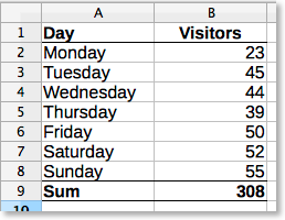 ⁃
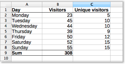
First,
start by typing this simple table. At the bottom column called
“Visitors”,
in cell B9,
type this formula:
=SUM(B2:B8)
Feel
free to format as you wish, the formatting of this table shown here
is just an example.
Now, select the area A1:B8 by
click-hold-and drag. By including the first line, Calc will
automatically insert the text from the first line into the graph for
you.
⁃
First,
start by typing this simple table. At the bottom column called
“Visitors”,
in cell B9,
type this formula:
=SUM(B2:B8)
Feel
free to format as you wish, the formatting of this table shown here
is just an example.
Now, select the area A1:B8 by
click-hold-and drag. By including the first line, Calc will
automatically insert the text from the first line into the graph for
you.
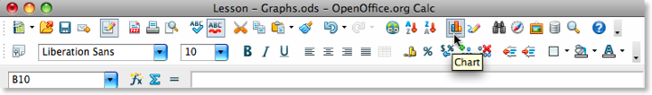 Click
the Chart button. If it doesn't show on you computer, you can go to
the Insert menu
and choose Chart...
This
will take you to a wizard, that helps you set up the chart quickly
and painlessly. On the left hand side of the wizard, you see the
different steps you go through, which helps you to both keep track of
where you are in the process and also allows you to jump back and
forth quickly.
In this case, we'll start with the
chart that Calc suggests,
which is a Column chart,
and we choose the the first one of the three options on the right,
which is called “Normal”.
Click
the [Next >>]
button to go to the Data
Range section. Since we already
have defined the area we want to use by selecting it just before
starting the wizard, this step is pretty much redundant now.
Press
the [Next >>]
button to go to the Data
Series section. And, again, this
area is also redundant, since we did a thorough job before starting
the wizard and included not just the data, but also the descriptions.
If we hadn't done that, we could define those here.
Press
the [Next >>]
button to go to the Chart
elements section. This is where we
can add some information to the chart to be more descriptive, and
where we can remove redundant elements. In this case, we can remove
the legend by un-checking the Display
Legend. As we only have one series of
data, it's pretty unnecessary, or what?
We'll add
some text to the Title: Visitors at MySite.net
Then some
text to the sub-title: One week
X axis describes what the
horizontal line is, which is: Day of week
Y axis describes
what the vertical line is, which is: Number of visitors
Now
click [Finish]
to display the resulting chart.
Pretty easy, eh? The
chart should look something like this:
Click
the Chart button. If it doesn't show on you computer, you can go to
the Insert menu
and choose Chart...
This
will take you to a wizard, that helps you set up the chart quickly
and painlessly. On the left hand side of the wizard, you see the
different steps you go through, which helps you to both keep track of
where you are in the process and also allows you to jump back and
forth quickly.
In this case, we'll start with the
chart that Calc suggests,
which is a Column chart,
and we choose the the first one of the three options on the right,
which is called “Normal”.
Click
the [Next >>]
button to go to the Data
Range section. Since we already
have defined the area we want to use by selecting it just before
starting the wizard, this step is pretty much redundant now.
Press
the [Next >>]
button to go to the Data
Series section. And, again, this
area is also redundant, since we did a thorough job before starting
the wizard and included not just the data, but also the descriptions.
If we hadn't done that, we could define those here.
Press
the [Next >>]
button to go to the Chart
elements section. This is where we
can add some information to the chart to be more descriptive, and
where we can remove redundant elements. In this case, we can remove
the legend by un-checking the Display
Legend. As we only have one series of
data, it's pretty unnecessary, or what?
We'll add
some text to the Title: Visitors at MySite.net
Then some
text to the sub-title: One week
X axis describes what the
horizontal line is, which is: Day of week
Y axis describes
what the vertical line is, which is: Number of visitors
Now
click [Finish]
to display the resulting chart.
Pretty easy, eh? The
chart should look something like this: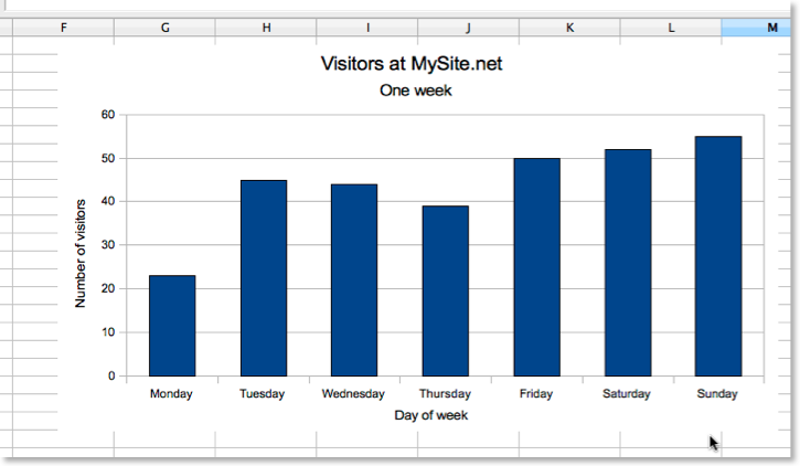 We'll
modify it slightly now, to make it a little bit more suited to our
needs and desires.
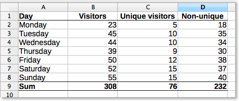
Go to cell C1 and
enter Unique visitors,
and then fill out like you see below here:
We'll
modify it slightly now, to make it a little bit more suited to our
needs and desires.
Go to cell C1 and
enter Unique visitors,
and then fill out like you see below here:
 Use
the =SUM()-formula
in cell C9 to
sum the cells above:
=SUM(C2:C8)
Continue
with adding the column D.
The formula in cell D2 is:
=B2-C2
Copy
this cell all the way down to cell D8.
Then copy cell C9 to D9.
When you are ready, it should look something like this:
Use
the =SUM()-formula
in cell C9 to
sum the cells above:
=SUM(C2:C8)
Continue
with adding the column D.
The formula in cell D2 is:
=B2-C2
Copy
this cell all the way down to cell D8.
Then copy cell C9 to D9.
When you are ready, it should look something like this:
 Now
we will try to change the chart to show the information from these
two columns, preferably without starting from scratch!
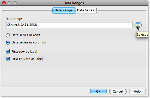
Double-click
the chart, and then right-click the chart. Select Data
Ranges... If the tab Data
Range isn't select it, do so. At
the top of the window there is a Data
range-field, now click the button to
the right.
Now
we will try to change the chart to show the information from these
two columns, preferably without starting from scratch!
Double-click
the chart, and then right-click the chart. Select Data
Ranges... If the tab Data
Range isn't select it, do so. At
the top of the window there is a Data
range-field, now click the button to
the right.
 Now
the window shrinks drastically to allow you to select the areas you
want to add. To add more more data to the chart, you need to click at
the end of the text that's already in the Data range-field, so that
the text is de-selected:
Now
the window shrinks drastically to allow you to select the areas you
want to add. To add more more data to the chart, you need to click at
the end of the text that's already in the Data range-field, so that
the text is de-selected:
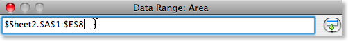 Type
a semicolon at the end of the field. Mark the area you want to add to
the chart by left-clicking and dragging. Mark the C1:D8 area,
like this:
Type
a semicolon at the end of the field. Mark the area you want to add to
the chart by left-clicking and dragging. Mark the C1:D8 area,
like this:
 Now
click the button at the right of the floating window, and you're
brought back to the main window. Click [OK],
and you're done! Now your chart should show you data from all the
columns, something like this:
Now
click the button at the right of the floating window, and you're
brought back to the main window. Click [OK],
and you're done! Now your chart should show you data from all the
columns, something like this:
 Try
to experiment with this. We will later make more tutorials on how to
edit charts, and how to use them more creatively, but the best way of
learning how to use charts, is by trial-and-error.
Try
to experiment with this. We will later make more tutorials on how to
edit charts, and how to use them more creatively, but the best way of
learning how to use charts, is by trial-and-error.