

1manly_b_f_j_statistics_for_environmental_science_and_managem
.pdf136 Statistics for Environmental Science and Management, Second Edition
Table 5.6
pH Values for Five Randomly Selected Rivers in the South Island of New Zealand, for Each Month from January 1989 to December 1997
Year |
Month |
|
|
pH Values |
|
|
Mean |
Range |
|
|
|
|
|
|
|
|
|
1989 |
Jan |
7.27 |
7.10 |
7.02 |
7.23 |
8.08 |
7.34 |
1.06 |
|
Feb |
8.04 |
7.74 |
7.48 |
8.10 |
7.21 |
7.71 |
0.89 |
|
Mar |
7.50 |
7.40 |
8.33 |
7.17 |
7.95 |
7.67 |
1.16 |
|
Apr |
7.87 |
8.10 |
8.13 |
7.72 |
7.61 |
7.89 |
0.52 |
|
May |
7.60 |
8.46 |
7.80 |
7.71 |
7.48 |
7.81 |
0.98 |
|
Jun |
7.41 |
7.32 |
7.42 |
7.82 |
7.80 |
7.55 |
0.50 |
|
Jul |
7.88 |
7.50 |
7.45 |
8.29 |
7.45 |
7.71 |
0.84 |
|
Aug |
7.88 |
7.79 |
7.40 |
7.62 |
7.47 |
7.63 |
0.48 |
|
Sep |
7.78 |
7.73 |
7.53 |
7.88 |
8.03 |
7.79 |
0.50 |
|
Oct |
7.14 |
7.96 |
7.51 |
8.19 |
7.70 |
7.70 |
1.05 |
|
Nov |
8.07 |
7.99 |
7.32 |
7.32 |
7.63 |
7.67 |
0.75 |
|
Dec |
7.21 |
7.72 |
7.73 |
7.91 |
7.79 |
7.67 |
0.70 |
|
|
|
|
|
|
|
|
|
1990 |
Jan |
7.66 |
8.08 |
7.94 |
7.51 |
7.71 |
7.78 |
0.57 |
|
Feb |
7.71 |
8.73 |
8.18 |
7.04 |
7.28 |
7.79 |
1.69 |
|
Mar |
7.72 |
7.49 |
7.62 |
8.13 |
7.78 |
7.75 |
0.64 |
|
Apr |
7.84 |
7.67 |
7.81 |
7.81 |
7.80 |
7.79 |
0.17 |
|
May |
8.17 |
7.23 |
7.09 |
7.75 |
7.40 |
7.53 |
1.08 |
|
Jun |
7.79 |
7.46 |
7.13 |
7.83 |
7.77 |
7.60 |
0.70 |
|
Jul |
7.16 |
8.44 |
7.94 |
8.05 |
7.70 |
7.86 |
1.28 |
|
Aug |
7.74 |
8.13 |
7.82 |
7.75 |
7.80 |
7.85 |
0.39 |
|
Sep |
8.09 |
8.09 |
7.51 |
7.97 |
7.94 |
7.92 |
0.58 |
|
Oct |
7.20 |
7.65 |
7.13 |
7.60 |
7.68 |
7.45 |
0.55 |
|
Nov |
7.81 |
7.25 |
7.80 |
7.62 |
7.75 |
7.65 |
0.56 |
|
Dec |
7.73 |
7.58 |
7.30 |
7.78 |
7.11 |
7.50 |
0.67 |
|
|
|
|
|
|
|
|
|
1991 |
Jan |
8.52 |
7.22 |
7.91 |
7.16 |
7.87 |
7.74 |
1.36 |
|
Feb |
7.13 |
7.97 |
7.63 |
7.68 |
7.90 |
7.66 |
0.84 |
|
Mar |
7.22 |
7.80 |
7.69 |
7.26 |
7.94 |
7.58 |
0.72 |
|
Apr |
7.62 |
7.80 |
7.59 |
7.37 |
7.97 |
7.67 |
0.60 |
|
May |
7.70 |
7.07 |
7.26 |
7.82 |
7.51 |
7.47 |
0.75 |
|
Jun |
7.66 |
7.83 |
7.74 |
7.29 |
7.30 |
7.56 |
0.54 |
|
Jul |
7.97 |
7.55 |
7.68 |
8.11 |
8.01 |
7.86 |
0.56 |
|
Aug |
7.86 |
7.13 |
7.32 |
7.75 |
7.08 |
7.43 |
0.78 |
|
Sep |
7.43 |
7.61 |
7.85 |
7.77 |
7.14 |
7.56 |
0.71 |
|
Oct |
7.77 |
7.83 |
7.77 |
7.54 |
7.74 |
7.73 |
0.29 |
|
Nov |
7.84 |
7.23 |
7.64 |
7.42 |
7.73 |
7.57 |
0.61 |
|
Dec |
8.23 |
8.08 |
7.89 |
7.71 |
7.95 |
7.97 |
0.52 |
|
|
|
|
|
|
|
|
|
1992 |
Jan |
8.28 |
7.96 |
7.86 |
7.65 |
7.49 |
7.85 |
0.79 |
|
Feb |
7.23 |
7.11 |
8.53 |
7.53 |
7.78 |
7.64 |
1.42 |
|
Mar |
7.68 |
7.68 |
7.15 |
7.68 |
7.85 |
7.61 |
0.70 |
|
Apr |
7.87 |
7.20 |
7.42 |
7.45 |
7.96 |
7.58 |
0.76 |

Environmental Monitoring |
137 |
Table 5.6 (continued)
pH Values for Five Randomly Selected Rivers in the South Island of New Zealand, for Each Month from January 1989 to December 1997
Year |
Month |
|
|
pH Values |
|
|
Mean |
Range |
|
|
|
|
|
|
|
|
|
|
May |
7.94 |
7.35 |
7.68 |
7.50 |
7.12 |
7.52 |
0.82 |
|
Jun |
7.80 |
6.96 |
7.56 |
7.22 |
7.76 |
7.46 |
0.84 |
|
Jul |
7.39 |
7.12 |
7.70 |
7.47 |
7.74 |
7.48 |
0.62 |
|
Aug |
7.42 |
7.41 |
7.47 |
7.80 |
7.12 |
7.44 |
0.68 |
|
Sep |
7.91 |
7.77 |
6.96 |
8.03 |
7.24 |
7.58 |
1.07 |
|
Oct |
7.59 |
7.41 |
7.41 |
7.02 |
7.60 |
7.41 |
0.58 |
|
Nov |
7.94 |
7.32 |
7.65 |
7.84 |
7.86 |
7.72 |
0.62 |
|
Dec |
7.64 |
7.74 |
7.95 |
7.83 |
7.96 |
7.82 |
0.32 |
|
|
|
|
|
|
|
|
|
1993 |
Jan |
7.55 |
8.01 |
7.37 |
7.83 |
7.51 |
7.65 |
0.64 |
|
Feb |
7.30 |
7.39 |
7.03 |
8.05 |
7.59 |
7.47 |
1.02 |
|
Mar |
7.80 |
7.17 |
7.97 |
7.58 |
7.13 |
7.53 |
0.84 |
|
Apr |
7.92 |
8.22 |
7.64 |
7.97 |
7.18 |
7.79 |
1.04 |
|
May |
7.70 |
7.80 |
7.28 |
7.61 |
8.12 |
7.70 |
0.84 |
|
Jun |
7.76 |
7.41 |
7.79 |
7.89 |
7.36 |
7.64 |
0.53 |
|
Jul |
8.28 |
7.75 |
7.76 |
7.89 |
7.82 |
7.90 |
0.53 |
|
Aug |
7.58 |
7.84 |
7.71 |
7.27 |
7.95 |
7.67 |
0.68 |
|
Sep |
7.56 |
7.92 |
7.43 |
7.72 |
7.21 |
7.57 |
0.71 |
|
Oct |
7.19 |
7.73 |
7.21 |
7.49 |
7.33 |
7.39 |
0.54 |
|
Nov |
7.60 |
7.49 |
7.86 |
7.86 |
7.80 |
7.72 |
0.37 |
|
Dec |
7.50 |
7.86 |
7.83 |
7.58 |
7.45 |
7.64 |
0.41 |
|
|
|
|
|
|
|
|
|
1994 |
Jan |
8.13 |
8.09 |
8.01 |
7.76 |
7.24 |
7.85 |
0.89 |
|
Feb |
7.23 |
7.89 |
7.81 |
8.12 |
7.83 |
7.78 |
0.89 |
|
Mar |
7.08 |
7.92 |
7.68 |
7.70 |
7.40 |
7.56 |
0.84 |
|
Apr |
7.55 |
7.50 |
7.52 |
7.64 |
7.14 |
7.47 |
0.50 |
|
May |
7.75 |
7.57 |
7.44 |
7.61 |
8.01 |
7.68 |
0.57 |
|
Jun |
6.94 |
7.37 |
6.93 |
7.03 |
6.96 |
7.05 |
0.44 |
|
Jul |
7.46 |
7.14 |
7.26 |
6.99 |
7.47 |
7.26 |
0.48 |
|
Aug |
7.62 |
7.58 |
7.09 |
6.99 |
7.06 |
7.27 |
0.63 |
|
Sep |
7.45 |
7.65 |
7.78 |
7.73 |
7.31 |
7.58 |
0.47 |
|
Oct |
7.65 |
7.63 |
7.98 |
8.06 |
7.51 |
7.77 |
0.55 |
|
Nov |
7.85 |
7.70 |
7.62 |
7.96 |
7.13 |
7.65 |
0.83 |
|
Dec |
7.56 |
7.74 |
7.80 |
7.41 |
7.59 |
7.62 |
0.39 |
|
|
|
|
|
|
|
|
|
1995 |
Jan |
8.18 |
7.80 |
7.22 |
7.95 |
7.79 |
7.79 |
0.96 |
|
Feb |
7.63 |
7.88 |
7.90 |
7.45 |
7.97 |
7.77 |
0.52 |
|
Mar |
7.59 |
8.06 |
8.22 |
7.57 |
7.73 |
7.83 |
0.65 |
|
Apr |
7.47 |
7.82 |
7.58 |
8.03 |
8.19 |
7.82 |
0.72 |
|
May |
7.52 |
7.42 |
7.76 |
7.66 |
7.76 |
7.62 |
0.34 |
|
Jun |
7.61 |
7.72 |
7.56 |
7.49 |
6.87 |
7.45 |
0.85 |
|
Jul |
7.30 |
7.90 |
7.57 |
7.76 |
7.72 |
7.65 |
0.60 |
(continued on next page)

138 Statistics for Environmental Science and Management, Second Edition
Table 5.6 (continued)
pH Values for Five Randomly Selected Rivers in the South Island of New Zealand, for Each Month from January 1989 to December 1997
Year |
Month |
|
|
pH Values |
|
|
Mean |
Range |
|
|
|
|
|
|
|
|
|
|
Aug |
7.75 |
7.75 |
7.52 |
8.12 |
7.75 |
7.78 |
0.60 |
|
Sep |
7.77 |
7.78 |
7.75 |
7.49 |
7.14 |
7.59 |
0.64 |
|
Oct |
7.79 |
7.30 |
7.83 |
7.09 |
7.09 |
7.42 |
0.74 |
|
Nov |
7.87 |
7.89 |
7.35 |
7.56 |
7.99 |
7.73 |
0.64 |
|
Dec |
8.01 |
7.56 |
7.67 |
7.82 |
7.44 |
7.70 |
0.57 |
|
|
|
|
|
|
|
|
|
1996 |
Jan |
7.29 |
7.62 |
7.95 |
7.72 |
7.98 |
7.71 |
0.69 |
|
Feb |
7.50 |
7.50 |
7.90 |
7.12 |
7.69 |
7.54 |
0.78 |
|
Mar |
8.12 |
7.71 |
7.20 |
7.43 |
7.56 |
7.60 |
0.92 |
|
Apr |
7.64 |
7.75 |
7.80 |
7.72 |
7.73 |
7.73 |
0.16 |
|
May |
7.59 |
7.57 |
7.86 |
7.92 |
7.22 |
7.63 |
0.70 |
|
Jun |
7.60 |
7.97 |
7.14 |
7.72 |
7.72 |
7.63 |
0.83 |
|
Jul |
7.07 |
7.70 |
7.33 |
7.41 |
7.26 |
7.35 |
0.63 |
|
Aug |
7.65 |
7.68 |
7.99 |
7.17 |
7.72 |
7.64 |
0.82 |
|
Sep |
7.51 |
7.64 |
7.25 |
7.82 |
7.91 |
7.63 |
0.66 |
|
Oct |
7.81 |
7.53 |
7.88 |
7.11 |
7.50 |
7.57 |
0.77 |
|
Nov |
7.16 |
7.85 |
7.63 |
7.88 |
7.66 |
7.64 |
0.72 |
|
Dec |
7.67 |
8.05 |
8.12 |
7.38 |
7.77 |
7.80 |
0.74 |
|
|
|
|
|
|
|
|
|
1997 |
Jan |
7.97 |
7.04 |
7.48 |
7.88 |
8.24 |
7.72 |
1.20 |
|
Feb |
7.17 |
7.69 |
8.15 |
6.96 |
7.47 |
7.49 |
1.19 |
|
Mar |
7.52 |
7.84 |
8.12 |
7.85 |
8.07 |
7.88 |
0.60 |
|
Apr |
7.65 |
7.14 |
7.38 |
7.23 |
7.66 |
7.41 |
0.52 |
|
May |
7.62 |
7.64 |
8.17 |
7.56 |
7.53 |
7.70 |
0.64 |
|
Jun |
7.10 |
7.16 |
7.71 |
7.57 |
7.15 |
7.34 |
0.61 |
|
Jul |
7.85 |
7.62 |
7.68 |
7.71 |
7.72 |
7.72 |
0.23 |
|
Aug |
7.39 |
7.53 |
7.11 |
7.39 |
7.03 |
7.29 |
0.50 |
|
Sep |
8.18 |
7.75 |
7.86 |
7.77 |
7.77 |
7.87 |
0.43 |
|
Oct |
7.67 |
7.66 |
7.87 |
7.82 |
7.51 |
7.71 |
0.36 |
|
Nov |
7.57 |
7.92 |
7.72 |
7.73 |
7.47 |
7.68 |
0.45 |
|
Dec |
7.97 |
8.16 |
7.70 |
8.21 |
7.74 |
7.96 |
0.51 |
|
|
|
|
|
|
|
|
|
|
|
|
|
|
|
Mean |
7.640 |
0.694 |
Source: This is part of a larger data set provided by Graham McBride, National Institute of Water and Atmospheric Research, Hamilton, New Zealand.
The range chart is shown in Figure 5.6(b). Using the factors for setting the action and warning limits from Table 5.5, these limits are set at 0.16 × 0.694 = 0.11 (lower action limit), 0.37 × 0.694 = 0.26 (lower warning limit), 1.81 × 0.694 = 1.26 (upper warning limit), and 2.36 × 0.694 = 1.64 (upper action limit). Due to the nature of the distribution of sample ranges, these limits are not symmetrically placed about the mean.
Environmental Monitoring |
139 |
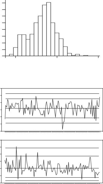
Frequency
80
70
60
50
40
30
20
10
0
7 |
8 |
9 |
pH
Figure 5.5
Histogram of the distribution of pH for samples from lakes in the South Island of New Zealand, 1989 to 1997.
Sample Mean
Sample Range
8.2 |
|
x Chart |
|
8.0 |
UAL |
||
|
|||
7.8 |
UWL |
|
|
|
|
7.6
7.4 LWL
7.2 LAL
7.0
2.0
Range Chart
1.5UAL UWL
1.0
0.5
LWL 0.0 LAL
Jan89 Jan90 Jan91 Jan92 Jan93 Jan94 Jan95 Jan96 Jan97
Figure 5.6
Control charts for pH levels in rivers in the South Island of New Zealand. For a process that is stable, about 1 in 40 points should plot outside one of the warning limits (LWL and UWL), and only about 1 in 1000 points should plot outside one of the action limits (LAL and UAL).

140 Statistics for Environmental Science and Management, Second Edition
With 108 observations altogether, it is expected that about five points will plot outside the warning limits. In fact, there are ten points outside these limits, and one point outside the lower action limit. It appears, therefore, that the mean pH level in the South Island of New Zealand was changing to some extent during the monitored period, with the overall plot suggesting that the pH level was high for about the first two years, and was lower from then on.
The range chart has seven points outside the warning limits, and one point above the upper action limit. Here again there is evidence that the process variation was not constant, with occasional spikes of high variability, particularly in the early part of the monitoring period.
As this example demonstrates, control charts are a relatively simple tool for getting some insight into the nature of the process being monitored, through the use of the action and control limits, which indicate the level of variation expected if the process is stable. See a book on industrial process control such as the one by Montgomery (2005) for more details about the use of x and range charts, as well as a number of other types of charts that are intended to detect changes in the average level and the variation in processes.
5.8 Detection of Changes Using CUSUM Charts
An alternative to the x chart that is sometimes used for monitoring the mean of a process is a CUSUM chart, as proposed by Page (1961). With this chart, instead of plotting the means of successive samples directly, the differences between the sample means and the desired target mean are calculated and summed. Thus if the means of successive samples are x1, x2, x3, and so on,
then S1 = (x1 − μ) is plotted against sample number 1, S2 = (x1 − μ) + (x2 − μ) is plotted against sample number 2, S3 = (x1 − μ) + (x2 − μ) + (x3 − μ) is plot-
ted against sample number 3, and so on, where μ is the target mean of the process. The idea is that because deviations from the target mean are accumulated, this type of chart will show small deviations from the target mean more quickly than the traditional x chart. See MacNally and Hart (1997) for an environmental application.
Setting control limits for CUSUM charts is more complicated than it is for an x chart (Montgomery 2005), and the details will not be considered here. There is, however, a variation on the usual CUSUM approach that will be discussed because of its potential value for monitoring under circumstances where repeated measurements are made on the same sites at different times. That is to say, the data are like the pH values for a fixed set of Norwegian lakes shown in Table 5.3, rather than the pH values for random samples of New Zealand rivers shown in Table 5.6.
Environmental Monitoring |
141 |
This method proceeds as follows (Manly 1994; Manly and MacKenzie 2000). Suppose that there are n sample units measured at m different times. Let xij be the measurement on sample unit i at time tj, and let xi be the mean of all the measurements on the unit. Assume that the units are numbered in order of their values for xi, to make x1 the smallest mean and xn the largest mean. Then it is possible to construct m CUSUM charts by calculating
Sij = (x1j − x 1) + (x2j − x2) + … + (xij − xi) |
(5.3) |
for j from 1 to m and i from 1 to n, and plotting the Sij values against i, for each of the m sample times.
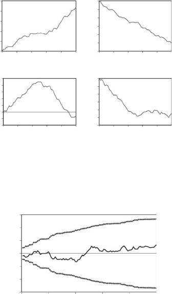
The CUSUM chart for time tj indicates the manner in which the observations made on sites at that time differ from the average values for all sample times. For example, a positive slope for the CUSUM shows that the values for that time period are higher than the average values for all periods. Furthermore, a CUSUM slope of D for a series of sites (the rise divided by the number of observations) indicates that the observations on those sites are, on average, D higher than the corresponding means for the sites over all sample times. Thus a constant difference between the values on a sample unit at one time and the mean for all times is indicated by a constant slope of the CUSUM going either up or down from left to right. On the other hand, a positive slope on the left-hand side of the graph followed by a negative slope on the righthand side indicates that the values at the time being considered were high for sites with a low mean but low for sites with a high mean. Figure 5.7 illustrates some possible patterns that might be obtained, and their interpretation.
Randomization methods can be used to decide whether the CUSUM plot for time tj indicates systematic differences between the data for this time and the average for all times. In brief, four approaches based on the null hypothesis that the values for each sample unit are in a random order with respect to time are:
1.A large number of randomized CUSUM plots can be constructed where, for each one of these, the observations on each sample unit are randomly permuted. Then, for each value of i, the maximum
and minimum values obtained for Sij can be plotted on the CUSUM chart. This gives an envelope within which any CUSUM plot for real data can be expected to lie, as shown in Figure 5.8. If the real data plot goes outside the envelope, then there is clear evidence that the null hypothesis is not true.
2.Using the randomizations, it is possible to determine whether Sij is significantly different from zero for any particular values of i and j.
Thus if there are R − 1 randomizations, then the observed value of •Sij• is significantly different from zero at the 100α% level if it is among
142 Statistics for Environmental Science and Management, Second Edition
Cusum
Cusum
Sites in Order of Their Mean Values
50
40
30
20
10
0
0 |
10 |
20 |
30 |
40 |
50 |
|
(a) High Values for All Sites |
|
|||
25
20
15
10
5
0
–5
–10
0 10 20 30 40 50
(c) High Values Then Low Values
Sites in Order of Their Mean Values
0
–10
–20
–30
–40
–50
–60
0 |
10 |
20 |
30 |
40 |
50 |
|
(b) Low Values for All Sites |
|
|||
0
–5
–10
–15
–20
–25
–30
0 10 20 30 40 50
(d) Low Values Then Average Values
Figure 5.7
Some examples of possible CUSUM plots for a particular time period: (a) all the sites tend to have high values for this period; (b) all the sites tend to have low values for this period; (c) sites with a low mean for all periods tend to have relatively high values for this period, but sites with a high mean for all periods tend to have low values for this period; and (d) sites with a low mean for all periods tend to have even lower low values in this period, but sites with a high mean for all periods tend to have values close to this mean for this period.
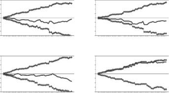
Cusum
60
40
20
0
–20
–40
–60
0 |
20 |
40 |
60 |
80 |
100 |
|
Sites in Order of Their Mean Values |
|
|||
Figure 5.8
Example of a randomization envelope obtained for a CUSUM plot. For each site, in order, the minimum and maximum (as indicated by broken lines) are those obtained from all the randomized data sets for the order number being considered. For example, with 1000 randomizations, all of the CUSUM plots obtained from the randomized data are contained within the envelope. In this example, the observed CUSUM plot is well within the randomization limits.
Environmental Monitoring |
143 |
the largest 100α% of the R values of •Sij• consisting of the observed value and the R − 1 randomizations.
3.To obtain a statistic that measures the overall extent to which a CUSUM plot differs from what is expected on the basis of the null hypothesis, the standardized deviation of Sij from zero,
Zij = Sij/√Var(Sij)
is calculated for each value of i. A measure of the overall deviation of the jth CUSUM from zero is then
Zmax,j = Max(•Z1j•, •Z2j•, …, •Znj•)
The value of Zmax,j for the observed data is significantly large at the 100α% level if it is among the largest 100α% of the R values consist-
ing of itself plus R − 1 other values obtained by randomization.
4.To measure the extent to which the CUSUM plots for all times differ from what is expected from the null hypothesis, the statistic
Zmax,T = Zmax,1 + Zmax,2 + … + Zmax,m
can be used. Again, the Zmax,T for a set of observed data is significantly large at the 100α% level if it is among the largest 100α% of the
R values consisting of itself plus R − 1 comparable values obtained from randomized data.
See Manly (1994) and Manly and MacKenzie (2000) for more details about how these tests are made.
Missing values can be handled easily. Again, see Manly (1994) and Manly and MacKenzie (2000) for more details. For the randomization tests, only the observations that are present are randomly permuted on a sample unit.
The way that the CUSUM values are calculated using equation (5.3) means that any average differences between sites are allowed for, so that there is no requirement for the mean values at different sites to be similar. However, for the randomization tests, there is an implicit assumption that there is negligible serial correlation between the successive observations at one sampling site, i.e., there is no tendency for these observations to be similar because they are relatively close in time. If this is not the case, as may well happen for many monitored variables, then it is possible to modify the randomization tests to allow for this. A method to do this is described by Manly and MacKenzie (2000), who also compare the power of the CUSUM procedure with the power of other tests for systematic changes in the distribution of the variable being studied. This modification will not be considered here.
144 Statistics for Environmental Science and Management, Second Edition
The calculations for the CUSUM method are fairly complicated, particularly when serial correlation is involved. A Windows computer program called CAT (Cusum Analysis Tool) to do these calculations can be downloaded from the Web site www.proteus.co.nz.
Example 5.3: CUSUM Analysis of pH Data
As an example of the use of the CUSUM procedure, consider again the data from a Norwegian research program that are shown in Table 5.3. Figure 5.9 shows the plots for the years 1976, 1977, 1978, and 1981, each compared with the mean for all years. It appears that the pH values in 1976 were generally close to the mean, with the CUSUM plots falling well within the limits found from 9999 randomizations, and the Zmax value (1.76) being quite unexceptional (p = 0.48). For 1977 there is some suggestion of pH values being low for lakes with a low mean, but the Zmax value (2.46) is not particularly large (p = 0.078). For 1978 there is also little evidence of differences from the mean for all years (Zmax = 1.60; p = 0.626). However, for 1981 it is quite another matter. The CUSUM plot even exceeds some of the upper limits obtained from 9999 randomizations, and the observed Zmax value (3.96) is most unlikely to have been obtained by chance (p = 0.0002). Thus there is very clear evidence that the pH values in 1981 were higher than in the other years, although the CUSUM plot shows that the differences were largely on the lakes with relatively low mean pH levels, because it becomes quite flat on the righthand side of the graph.
The sum of the Zmax values for all four years is Zmax,T = 9.79. From the randomizations, the probability of obtaining a value this large is 0.0065,
Cusum
Cusum
Cusum for 1976, p = 0.476
4 |
|
|
2 |
Cusum |
|
0 |
||
|
||
–2 |
|
|
–4 |
Lakes in Order of Mean pH |
|
|
||
4 |
Cusum for 1978, p = 0.626 |
|
|
||
2 |
Cusum |
|
0 |
||
|
||
–2 |
|
–4
Lakes in Order of Mean pH
Cusum for 1977, p = 0.078
4
2
0
–2
–4
Lakes in Order of Mean pH
Cusum for 1981, p = 0.0002
4
2
0
–2
–4
Lakes in Order of Mean pH
Figure 5.9
CUSUM plots for 1976, 1977, 1978, and 1981 compared with the mean for all years. The horizontal axis corresponds to lakes in the order of mean pH values for the four years. For each plot, the upper and lower continuous lines are the limits obtained from 9999 randomized sets of data, and the CUSUM is the line with open boxes. The p-value with each plot is the probability of obtaining a plot as extreme or more extreme than the one obtained.
Environmental Monitoring |
145 |
giving clear evidence of systematic changes in the pH levels of the lakes, for the years considered together.
5.9 Chi-Squared Tests for a Change in a Distribution
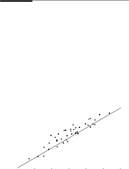
Stehman and Overton (1994) describe a set of tests for a change in a distribution, which they suggest will be useful as a screening device. These tests can be used whenever observations are available on a random sample of units at two times. If the first observation in a pair is x and the second one is y, then y is plotted against x, and three chi-squared calculations are made.
The first test compares the number of points above a 45 degree line with the number below, as indicated in Figure 5.10. A significant difference indicates an overall shift in the distribution either upward (most points above the 45 degree line) or downward (most points below the 45 degree line). In Figure 5.10 there are 30 points above the line and 10 points below. The expected counts are both 20 if x and y are from the same distribution.
The one-sample chi-squared test (Appendix 1, Section A1.4) is used to compare the observed and expected frequencies. The test statistic is Σ(O − E)2/E, where O is an observed frequency, E an expected frequency, and the summation is over all such frequencies. Thus for the situation being considered, the statistic is
(30 − 20)²/20 + (10 − 20)²/20 = 10.00
Y
35 |
|
|
|
|
|
30 |
|
30 Points Above Line |
|
||
25 |
|
|
|
|
|
20 |
|
10 Points Below Line |
|
||
|
|
|
15 |
|
|
|
|
|
10 |
|
|
|
|
|
5 |
|
|
|
|
|
|
|
|
5 |
10 |
15 |
20 |
25 |
30 |
35 |
|
|
|
X |
|
|
|
Figure 5.10
Test for a shift in a distribution by counting points above and below the line y = x.