

1manly_b_f_j_statistics_for_environmental_science_and_managem
.pdf216 Statistics for Environmental Science and Management, Second Edition
distances apart that is shown in Figure 9.3(b). The correlation is 0.07, which is not significant by the Mantel randomization test (p = 0.15).
For these data, the use of reciprocal distances as suggested by Mantel (1967) is not helpful. The correlation between pipi count differences and the reciprocal of the distances separating the quadrats is 0.03, which is not at all significant by the randomization test (p = 0.11), and the correlation between cockle count differences and reciprocal distances is −0.03, which is also not significant (p = 0.14). Plots of the count differences against the reciprocal distances are shown in Figures 9.3(b) and (d).
There are other variations on the Mantel test that can be applied with the shellfish data. For example, instead of using the quadrat counts, these can just be coded to 0 (absence of shellfish) and 1 (presence of shellfish), which then avoids the situation where two quadrats have a large difference in counts, but both also have a large count relative to most quadrats. A matrix of presence–absence differences between quadrats can then be calculated, where the ith row and jth column contains 0 if quadrat i and quadrat j either both have a shellfish species, or are both missing it, and 1 if there is one presence and one absence. If this is done, then it turns out that there is a significant negative correlation of −0.047 between the presence– absence differences for pipis and the reciprocal distances between quadrats (p = 0.023). Other correlations (presence–absence differences for pipis versus distances, and presence–absence differences for cockles versus distances and reciprocal distances) are close to zero and not at all significant.
One problem with using the Mantel randomization test is that it is not usually an option in standard statistical packages, so that a special computer program is needed. One possibility is to use the program RT available from the Web site www.west-inc.com.
The SADIE approach was also applied to the pipi and cockle data, using a Windows program called RBRELV13.exe (Perry 2008). Included in the output from the program are the statistics D (the distance to regularity), Pa (the probability of a value for D as large as that observed occurring for randomly allocated quadrat counts), Ea (the mean distance to regularity for randomly allocated counts), and Ia = D/Ea (the index of nonrandomness in the distribution of counts). For pipis, these statistics are D = 48,963, Pa = 0.26, Ea = 44,509, and Ia = 1.10. There is no evidence here of nonrandomness. For cockles, the statistics are D = 5704, Pa = 0.0037, Ea = 2968, and Ia = 1.92. Here, there is clear evidence of some clustering.
In summary, the above analyses show that there is very clear evidence that the individual pipis and cockles are not randomly distributed over the sampled area because the quadrat counts for the two species do not have Poisson distributions. Given the values of the quadrat counts for pipis, the Mantel test gives evidence of structure that is not as simple as the counts tending to become more different as the distance apart increases, while the SADIE analysis based on the distance to regularity gives no evidence of structure. By contrast, for cockles, the Mantel test approach gives no real evidence of nonrandomness in the location of counts, but the SADIE analysis indicates some clustering. If nothing else, these analyses show that the evidence for nonrandomness in quadrat counts depends very much on how this is measured.

Spatial-Data Analysis |
217 |
9.4 Correlation between Quadrat Counts
Suppose that two sets of quadrat counts are available, such as those shown in Table 9.1 for two different species of shellfish. There may then be interest in knowing whether there is any association between the sets of counts, in the sense that high counts tend to occur either in the same locations (positive correlation) or in different locations (negative correlation).
Unfortunately, testing for an association in this context is not a straightforward matter. Besag and Diggle (1977) and Besag (1978) proposed a randomization test that is a generalization of Mead’s (1974) test for randomness in the spatial distribution of a single species, which can be used when the number of quadrats is a multiple of 16. However, this test is not valid if there is spatial correlation within each of the sets of counts being considered (Manly 2007, sec. 10.6).
One promising method for handling the problem seems to be along the lines of one that is proposed by Perry (1998). This is based on an algorithm for producing permutations of quadrat counts with a fixed level of aggregation and a fixed centroid over the study region, combined with a test statistic based on the minimum amount of movement between quadrats that is required to produce counts that are all equal. One test statistic is derived as follows:
1.The counts for the first variable are scaled by multiplying by the sum
of the counts (M2) for the second variable, and the counts for the second variable are scaled by multiplying by the sum of the counts (M1) for the first variable. This has the effect of making the scaled total count equal to M1M2 for both variables.
2.The scaled counts for both variables are added for the quadrats being considered.
3.A statistic T is calculated, where this is the amount of movements of individuals between quadrats that is required to produce an equal number of scaled individuals in each quadrat.
4.The statistic T is compared with the distribution of the same statistic that is obtained by permuting the original counts for variable 1, with the permutations constrained so that the spatial distribution of the counts is similar to that of the original data. An index of association,
It(2)1 = T/Et(2)1, is also computed, where Et(2)1 is the mean of T for the permuted sets of data. The significance level of It(2)1 is the proportion of permutations that give a value as larger or larger than the observed value.
5.The observed statistic T is also compared with the distribution that is obtained by permuting the original counts for variable 2, again with constraints to ensure that the spatial distribution of the counts is similar to that for the original data. Another index of association is
218 Statistics for Environmental Science and Management, Second Edition
then It(1)2 = T/Et(1)2, where Et(1)2 is the mean number of steps to regularity for the permuted sets of data. The significance level of It(1)2 is the proportion of permutations that give a value as large or larger than
the observed value.
The idea with this approach is to compare the value of T for the real data with the distribution that is obtained for alternative sets of data for which the spatial distribution of quadrat counts is similar to that for the real data for each of the two variables being considered. This is done by constraining the permutations for the quadrat counts so that the distance to regularity is close to that for the real data, as is also the distance between the centroid of the counts and the center of the study region. A special algorithm is used to find the minimum number of steps to regularity. Perry (1998) should be consulted for more details about how this is achieved.
If the two variables being considered tend to have large counts in the same quadrats, then T will be large, with any clustering in the individual variables being exaggerated by adding the scaled counts for the two variables. Hence, val-
ues of It(2)1 and It(1)2 greater than 1 indicate an association between the two sets of counts. On the other hand, values of It(2)1 and It(1)2 of less than 1 indicate a tendency for the highest counts to be in different quadrats for the two variables.
Apparently, in practice It(2)1 and It(1)2 tend to be similar, as do their significance levels. In that case, Perry (1998) suggests averaging It(2)1 and It(1)2 to get
a single index It, and averaging the two significance levels to get a combined significance level Pt.
Perry (1998) suggests other test statistics that can be used to examine the association between quadrat counts, and is still developing the SADIE approach for analyzing quadrat counts. See Perry (2008), Perry et al. (2002), and Perry and Dixon (2002) for more about these methods.
Example 9.2: Correlation between Counts for Pipis and Cockles
To illustrate the SADIE approach for assessing the association between two sets of quadrat counts, consider again the pipi and cockle counts given in Table 9.1. It may be recalled from Example 9.1 that these counts clearly do not have Poisson distributions, so that the individual shellfish are not randomly located, and there is mixed evidence concerning whether the counts themselves are randomly located. Now the question to be considered is whether the pipi and cockle counts are associated in terms of their distributions.
The data were analyzed with the computer program SADIEA (Perry 2008). The distance to regularity for the total of the scaled quadrat counts is T = 129,196 m. When 1000 randomized sets of data were produced keeping the cockle counts fixed and permuting the pipi counts, the average distance to regularity was Et(2)1 = 105,280 m, giving the index of association It(2)1 = 129,196/105,280 = 1.23. This was exceeded by 33% of the permuted sets of data, giving no real evidence of association. On the other hand, keeping the pipi counts fixed and permuting the cockle

Spatial-Data Analysis |
219 |
counts gave an average distance to regularity of Et(1)2 = 100,062, giving the index of association It(1)2 = 129,196/100,062 = 1.29. This was exceeded by 3.4% of the permuted sets of data. In this case, there is some evidence of association.
The conclusions from the two randomizations are quite different in
terms of the significance of the results, although both It(2)1 and It(1)2 suggest some positive association between the two types of count. The rea-
son for the difference in terms of significance is presumably the result of a lack of symmetry in the relationship between the two shellfish. In every quadrat where cockles are present, pipis are present as well. However, cockles are missing from half of the quadrats where pipis are present. Therefore, cockles are apparently associated with pipis, but pipis are not necessarily associated with cockles.
9.5 Randomness of Point Patterns
Testing whether a set of points appears to be randomly located in a study region is another problem that can be handled by computer-intensive methods. One approach was suggested by Besag and Diggle (1977). The basic idea is to calculate the distance from each point to its nearest neighbor and calculate the mean of these distances. This is then compared with the distribution of the mean nearest-neighbor distance that is obtained when the same number of points are allocated to random positions in the study area.
An extension of this approach uses the mean distances between second, third, fourth, etc., nearest neighbors as well as the mean of the first nearestneighbor distances. Thus, let Qi denote the mean distance between each point and the point that is its ith nearest neighbor. For example, Q3 is the mean of the distances from points to the points that are third closest to them. The observed configuration of points then yields the statistics Q1, Q2, Q3, and so on. These are compared with the distributions for these mean values that are generated by randomly placing the same number of points in the study area, with a computer simulation being carried out to produce these distributions.
This type of procedure is sometimes called a Monte Carlo test. With these types of tests, there is freedom in the choice of the test statistics to be employed. They do not have to be based on nearest-neighbor distances and, in particular, the use of Ripley’s (1981) K-function is popular (Andersen 1992; Haase 1995).
Example 9.3: The Location of Messor wasmanni Nests
As an example of the Monte Carlo test based on nearest-neighbor distances that has just been described, consider the locations of the 45 nests of Messor wasmanni that are shown in Figure 9.1. The values for the mean nearest-neighbor distances Q1 to Q10 are shown in the second column of

220 Statistics for Environmental Science and Management, Second Edition
Table 9.2
Results from Testing for Randomness in the Location of Messor wasmanni Nests Using Nearest-Neighbor Statistics
|
|
|
Percentage Significance Levela |
|
i |
Observed Value of Qi |
Simulated Mean of Qi |
Lower Tail |
Upper Tail |
|
|
|
|
|
1 |
22.95 |
18.44 |
99.82 |
0.20 |
2 |
32.39 |
28.27 |
99.14 |
0.88 |
3 |
42.04 |
35.99 |
99.94 |
0.08 |
4 |
50.10 |
42.62 |
99.96 |
0.06 |
5 |
56.58 |
48.60 |
99.98 |
0.04 |
6 |
61.03 |
54.13 |
99.56 |
0.46 |
7 |
65.60 |
59.34 |
98.30 |
1.72 |
8 |
70.33 |
64.26 |
97.02 |
3.00 |
9 |
74.45 |
68.99 |
94.32 |
5.70 |
10 |
79.52 |
73.52 |
94.78 |
5.24 |
aSignificance levels were obtained using an option in the computer package RT (Manly 2007).
Table 9.2, and the question to be considered is whether these values are what might reasonably be expected if the 45 nests are randomly located over the study area.
The Monte Carlo test proceeds as follows:
1.A set of data for which the null hypothesis of spatial randomness is true is generated by placing 45 points in the study region in such a way that each point is equally likely to be anywhere in the region.
2.The statistics Q1 to Q10 are calculated for this simulated set of data.
3.Steps 1 and 2 are repeated 5000 times.
4.The lower-tail significance level for the observed value of Qi is calculated as the percentage of times that the simulated values for Qi are less than or equal to the observed value of Qi.
5.The upper-tail significance level for the observed value of Qi is calculated as the percentage of times that the simulated values of Qi are greater than or equal to the observed value of Qi.
Nonrandomness in the distribution of the ant nests is expected to show up as small percentages for the loweror upper-tail significance levels, which indicates that the observed data were unlikely to have arisen if the null hypothesis of spatial randomness is true.
The last two columns of Table 9.2 show the lowerand upper-tail significance levels that were obtained from this procedure when it was carried out using an option in the computer package RT (Manly 2007). It is apparent that all of the observed mean nearest-neighbor distances are somewhat large, and that the mean distances from nests to their six nearest neighbors are much larger than what is likely to occur by chance with spatial randomness. Instead, it seems that there is some tendency for the ant nests to

Spatial-Data Analysis |
221 |
be spaced out over the study region. Thus the observed configuration does not appear to be the result of the nests being randomly located.
9.6 Correlation between Point Patterns
Monte Carlo tests are also appropriate for examining whether two point patterns seem to be related, as might be of interest, for example, with the comparison of the positions of the nests for the Messor wasmanni and Cataglyphis bicolor ants that are shown in Figure 9.1. In this context, Lotwick and Silverman (1982) suggested that a point pattern in a rectangular region can be converted to a pattern over a larger area by simply copying the pattern from the original region to similar sized regions above, below, to the left, and to the right, and then copying the copies as far away from the original region as required. A test for independence between two patterns then involves comparing a test statistic observed for the points over the original region with the distribution of this statistic that is obtained when the rectangular “window” for the species 1 positions is randomly shifted over an enlarged region for the species 2 positions. Harkness and Isham (1983) used this type of analysis with the ant data and concluded that there is evidence of a relationship between the positions of the two types of nests. See also Andersen’s (1992) review of these types of analyses in ecology.
As Lotwick and Silverman note, the need to reproduce one of the point patterns over the edge of the region studied in an artificial way is an unfortunate aspect of this procedure. It can be avoided by taking the rectangular window for the type 1 points to be smaller than the total area covered and calculating a test statistic over this smaller area. The distribution of the test statistic can then be determined by randomly placing this small window within the larger area a large number of times. In this case, the positions of any type 1 points outside the small window are ignored, and the choice of the positioning of the small window within the larger region is arbitrary.
Another idea involves considering a circular region and arguing that if two point patterns within the region are independent, then this means that they have a random orientation with respect to each other. Therefore, a distribution that can be used to assess a test statistic is the one that is obtained by randomly rotating one of the sets of points about the center point of the region. A considerable merit with this idea is that the distribution can be determined as accurately as desired by rotating one of the sets of points about the center of the study area from zero to 360 degrees in suitably small increments (Manly 2007, sec. 10.7).
The method of Perry (1998) that has been described in Section 9.4 can be applied with a point pattern as well as with quadrat counts. From an analysis

222 Statistics for Environmental Science and Management, Second Edition
based on this method, Perry concluded that there is no evidence of association between the positions of the nests for the two species of ants that are shown in Figure 9.1.
9.7 Mantel Tests for Autocorrelation
With a variable measured at a number of different positions in space, such as the values of pH and SO4 that are shown in Figure 9.3, one of the main interests is often to test for significant spatial autocorrelation, and then to characterize this correlation if it is present. The methods that can be used in this situation are extensive, and no attempt will be made here to review them in any detail. Instead, a few simple analyses will be briefly described.
If spatial autocorrelation is present, then it will usually be the case that this is positive, so that there is a tendency for observations that are close in space to have similar values. Such a relationship is conveniently summarized by plotting, for every possible pair of observations, some measure of the difference between two observations against some measure of the spatial difference between the observations. The significance of the autocorrelation can then be tested using the Mantel (1967) randomization test that is described in Section 9.3.
Example 9.4: Autocorrelation in Norwegian Lakes
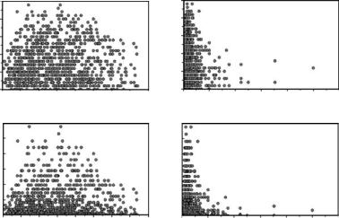
Figure 9.4 shows four plots constructed from the pH data of Figure 9.2. Part (a) of the figure shows the absolute differences in pH values plotted against the geographical distances between the 1035 possible pairs of lakes. Here, the smaller pH differences tend to occur with both the smallest and largest geographical distances, and the correlation between the pH differences and the geographical distances of r = 0.034 is not significantly large (p = 0.276, from a Mantel test with 5000 randomizations). Part (b) of the figure shows the absolute pH differences plotted against the reciprocals of the geographical distances. The correlation here is −0.123, which has the expected negative sign and is highly significantly low (p = 0.0008, with 5000 randomizations). Part (c) of the figure shows 0.5(pH difference)2 plotted against the geographical distance. The reason for considering this plot is that it corresponds to a variogram cloud, in the terminology of geostatistics, as discussed further below. The correlation here is r = 0.034, which has the correct sign but is not significant (p = 0.286, with 5000 randomizations). Finally, part (d) of the plot shows the 0.5(pH difference)2 values plotted against the reciprocals of geographical distances. Here the correlation of r = −0.121 has the correct sign and is highly significantly low (p = 0.0006, with 5000 randomizations).
Spatial-Data Analysis |
223 |
0.5 (Squared Dierence) Absolute pH Dierence
2.5 |
|
|
|
|
|
|
|
|
|
2.5 |
|
|
|
|
|
|
|
2.0 |
|
|
|
|
|
|
|
|
|
2.0 |
|
|
|
|
|
|
|
1.5 |
|
|
|
|
|
|
|
|
|
1.5 |
|
|
|
|
|
|
|
1.0 |
|
|
|
|
|
|
|
|
|
1.0 |
|
|
|
|
|
|
|
0.5 |
|
|
|
|
|
|
|
|
|
0.5 |
|
|
|
|
|
|
|
0.0 0 |
1 |
2 |
3 |
4 |
5 |
6 |
7 |
8 |
0.0 |
0 |
2 |
4 |
6 |
8 |
10 |
12 |
|
3.0 |
|
|
|
|
(a) |
|
|
|
|
3.0 |
|
|
|
(b) |
|
|
|
|
|
|
|
|
|
|
|
|
|
|
|
|
|
|
|
||
2.5 |
|
|
|
|
|
|
|
|
|
2.5 |
|
|
|
|
|
|
|
2.0 |
|
|
|
|
|
|
|
|
|
2.0 |
|
|
|
|
|
|
|
1.5 |
|
|
|
|
|
|
|
|
|
1.5 |
|
|
|
|
|
|
|
1.0 |
|
|
|
|
|
|
|
|
|
1.0 |
|
|
|
|
|
|
|
0.5 |
|
|
|
|
|
|
|
|
|
0.5 |
|
|
|
|
|
|
|
0.0 |
0 |
1 |
2 |
3 |
4 |
5 |
6 |
7 |
8 |
0.0 |
0 |
2 |
4 |
6 |
8 |
10 |
12 |
|
|
|
|
Distance Apart |
|
|
|
|
|
|
Reciprocal of Distance |
|
|
||||
|
|
|
|
|
(c) |
|
|
|
|
|
|
|
|
(d) |
|
|
|
Figure 9.4
Measures of pH differences plotted against geographical distances (measured in degrees of latitude and longitude) and reciprocals of geographical distances for pairs of Norwegian lakes.
The significant negative correlations for the plots in parts (b) and (d) of Figure 9.4 give clear evidence of spatial autocorrelation, with close lakes tending to have similar pH values. It is interesting to see that this evidence appears when the measures of pH difference are plotted against reciprocals of geographical distances rather than plotted against the geographical distances themselves, as is commonly done with geostatistical types of analysis.
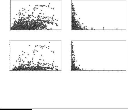
By contrast, when plots and correlations are produced for the SO4 variable, for which the data are shown in the lower part of Figure 9.2, then spatial autocorrelation is more evident when the measures of SO4 differences are plotted against the geographical distances rather than their reciprocals (Figure 9.5). However, the spatial autocorrelation is altogether stronger for SO4 than it is for pH, and is highly significant for all four types of plots:
1.for absolute SO4 differences plotted against geographical distances, r = 0.30, p = 0.002;
2.for absolute SO4 differences plotted against reciprocal geographical distances, r = −0.23, p = 0.002;
3.for half-squared SO4 differences plotted against geographical distances, r = 0.25, p = 0.0008; and
4.for half-squared SO4 differences plotted against reciprocal geographical distances, r = −0.16, p = 0.012.
224 Statistics for Environmental Science and Management, Second Edition
Dierence 4
SOAbsolute
0.5 erence)Di(Square
14 |
|
|
|
|
|
|
|
|
14 |
|
|
|
|
|
|
12 |
|
|
|
|
|
|
|
|
12 |
|
|
|
|
|
|
10 |
|
|
|
|
|
|
|
|
10 |
|
|
|
|
|
|
8 |
|
|
|
|
|
|
|
|
8 |
|
|
|
|
|
|
6 |
|
|
|
|
|
|
|
|
6 |
|
|
|
|
|
|
4 |
|
|
|
|
|
|
|
|
4 |
|
|
|
|
|
|
2 |
|
|
|
|
|
|
|
|
2 |
|
|
|
|
|
|
0 0 |
1 |
2 |
3 |
4 |
5 |
6 |
7 |
8 |
0 0 |
2 |
4 |
6 |
8 |
10 |
12 |
80 |
|
|
|
(a) |
|
|
|
|
80 |
|
|
(b) |
|
|
|
|
|
|
|
|
|
|
|
|
|
|
|
|
|
||
70 |
|
|
|
|
|
|
|
|
70 |
|
|
|
|
|
|
60 |
|
|
|
|
|
|
|
|
60 |
|
|
|
|
|
|
50 |
|
|
|
|
|
|
|
|
50 |
|
|
|
|
|
|
40 |
|
|
|
|
|
|
|
|
40 |
|
|
|
|
|
|
30 |
|
|
|
|
|
|
|
|
30 |
|
|
|
|
|
|
20 |
|
|
|
|
|
|
|
|
20 |
|
|
|
|
|
|
10 |
|
|
|
|
|
|
|
|
10 |
|
|
|
|
|
|
0 0 |
1 |
2 |
3 |
4 |
5 |
6 |
7 |
8 |
0 0 |
2 |
4 |
6 |
8 |
10 |
12 |
|
|
|
Distance Apart |
|
|
|
|
|
Reciprocal of Distance |
|
|
||||
|
|
|
|
(c) |
|
|
|
|
|
|
|
(d) |
|
|
|
Figure 9.5
Measures of SO4 differences plotted against geographical distances (measured in degrees of latitude and longitude) and reciprocals of geographical distances for pairs of Norwegian lakes.
9.8 The Variogram
Geostatistics is the name given to a range of methods for spatial data analysis that were originally developed by mining engineers for the estimation of the mineral resources in a region, based on the values measured at a sample of locations (Krige 1966; David 1977; Journel and Huijbregts 1978). A characteristic of these methods is that an important part is played by a function called the variogram (or sometimes the semivariogram), which quantifies the extent to which values tend to become more different as pairs of observations become farther apart, assuming that this does in fact occur.
To understand better what is involved, consider Figure 9.5(c). This plot was constructed from the SO4 data for the 46 lakes with the positions shown in Figure 9.2. There are 1035 pairs of lakes, and each pair gives one of the plotted points. What is plotted on the vertical axis for the pair consisting of lake i with lake j is
Dij = 0.5(yi − yj)2
where yi is the SO4 level for lake i. This is plotted against the geographical distance between the lakes on the horizontal axis. There does indeed appear to be a tendency for Dij to increase as lakes get farther apart, and a variogram can be used to quantify this tendency.
Spatial-Data Analysis |
225 |
Variogram
11 |
|
|
|
|
|
|
|
|
|
|
|
|
|
|
|
|
|
|
|
|
|
|
|
|
|
|
|
|
|
|
|
|
|
|
|
|
|
|
|
10 |
|
|
Sill |
|
|
|
|
|
|
|
|
|
|
|
|
|
|
||
|
|
|
|
|
|
|
|
|
|
|
|
|
|
|
|
||||
9 |
|
|
|
|
|
|
|
|
|
|
|
|
|
|
|
|
|||
|
|
|
|
|
|
|
|
|
|
|
|
|
|
|
|
||||
8 |
|
|
|
|
|
|
|
|
|
|
|
|
|
|
|
|
|
|
|
|
|
|
|
|
|
|
|
|
|
|
|
|
|
|
|
|
|
|
|
7 |
|
|
|
|
|
|
|
|
|
|
|
|
|
|
|
|
|
|
|
|
|
|
|
|
|
|
|
|
|
|
|
|
|
|
|
|
|
|
|
6 |
|
|
|
|
|
|
|
|
|
|
|
|
|
|
|
|
|
|
|
|
|
|
|
|
|
|
|
|
|
|
|
|
|
|
|
|
|
|
|
5 |
|
|
|
|
|
|
|
|
|
|
|
|
|
|
|
|
|
|
|
|
|
|
|
|
|
|
|
|
|
|
|
|
|
|
|
|
|
|
|
4 |
|
|
|
|
|
|
|
|
|
|
|
|
|
|
|
|
|
|
|
|
|
|
|
|
|
|
|
|
|
|
|
|
|
|
|
|
|
|
|
3 |
|
|
|
|
|
|
|
Range of Influence |
|
|
|
|
|
|
|
|
|||
|
|
|
|
|
|
|
|
|
|
|
|
|
|
|
|||||
2 |
|
|
|
|
|
|
|
|
|
|
|
|
|
|
|
||||
|
|
Nugget E ect |
|
|
|
|
|
|
|
|
|
|
|
||||||
|
|
|
|
|
|
|
|
|
|
|
|
|
|||||||
1 |
|
|
|
|
|
|
|
|
|
|
|
|
|
|
|
|
|
|
|
0 |
1 |
2 |
3 |
4 |
5 |
6 |
|||||||||||||
|
|
|
|
|
|
Distance Between Points (h) |
|
|
|
|
|
||||||||
Figure 9.6
A model variogram with the nugget effect, the sill, and the range of influence indicated.
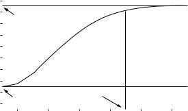
A plot like that in Figure 9.5(c) is sometimes called a variogram cloud. The variogram itself is a curve through the data that gives the mean value of Dij as a function of the distance between the lakes. There are two varieties of this. An experimental or empirical variogram is obtained by smoothing the data to some extent to highlight the trend, as described in the following example. A model variogram is obtained by fitting a suitable mathematical function to the data, with a number of standard functions being used for this purpose.
Typically, a model variogram looks something like the one in Figure 9.6. Even two points that are very close together may tend to have different values, so there is what is called a “nugget effect,” with the expected value of 0.5(yi − yj)2 being greater than zero, even with h = 0. In the figure, this nugget effect is 3. The maximum height of the curve is called the “sill.” In the figure, this is 10. This is the maximum value of 0.5(yi − yj)2, which applies for two points that are far apart in the study area. Finally, the range of influence is the distance apart at which two points have effectively independent values. This is sometimes defined as the point at which the curve is 95% of the difference between the nugget and the sill. In the figure, the range of influence is 4.
There are a number of standard mathematical models for variograms. One is the Gaussian model, with the equation
γ(h) = c + (S − c)[1 − exp(−3h2/a2)] |
(9.6) |
where c is the nugget effect, S is the sill, and a is the range of influence. When h = 0, the exponential term equals 1, so that γ(0) = c. When h is very large, the exponential term becomes insignificant, so that γ(∞) = S. When h = a, the exponential term becomes exp(3) = 0.050, so that γ(a) = c + 0.95(S − c).
Other models that are often considered are the spherical model with the equation