
1P-16-0912-Superior-Presentations
.pdf
Superior
Presentations
4imprint.com

The A+ formula:
A guide to delivering superior presentations
Fresh out of business school, James was hired by the company where he had interned for two summers. After only a month on the job, he received an email from the senior vice president that read, “I’d like you to join me in Denver next Wednesday to meet with a small group of local investors. Not only do we need them to finance the project, they also have the political pull we need to get the job done. All the information I have is attached. I’ll be on vacation through Tuesday, so be prepared to debrief me on the plane.”
After a week of tireless preparation, James nervously walked his colleague through the research. She commended his approach, giving him the confidence he unknowingly and so desperately needed.
The room of financiers was more than intimidating. This was not like hall where he presented ideas hoping for an “A.” Instead, millions of rested on his shoulders. The mere thought made him perspire like
a geyser. While he was able to keep his voice from cracking, he struggled to keep his nerves in check.
As he gave the audience a moment to mull over the financial statement handout, James remembered his feisty grandmother’s
advice before his first show and tell: “Kid, don’t be nervous. Just
picture everyone in their underwear!” The thought brought a misplaced smile to his face. He quickly grabbed his glass of water to hide the embarrassment written all over his face.
While may be not to this extent, we have all nervously stood in this young man’s shoes at some point in our lives. Presentations carry the weight of responsibility, which can be paralyzing for some. As Ralph Waldo Emerson said, “Speech is power: speech is to persuade, to convert, to compel.”1 Although information on its own does not summon one to action, a charismatic personality coupled with an inspirational message is what creates power. From making abstract concepts meaningful and converting nuggets of data into groundswells of emotion, this is where the magic happens.
As a presenter, it is your responsibility to deliver not only an idea or a concept, but an experience. Within this Blue Paper®, we will explore how to properly draft, design, refine and deliver a presentation and much more.
1 Emerson, Ralph Waldo. Letters and Social Aims. Boston: J. R. Osgood, 1876. Print.
© 2012 4imprint, Inc. All rights reserved
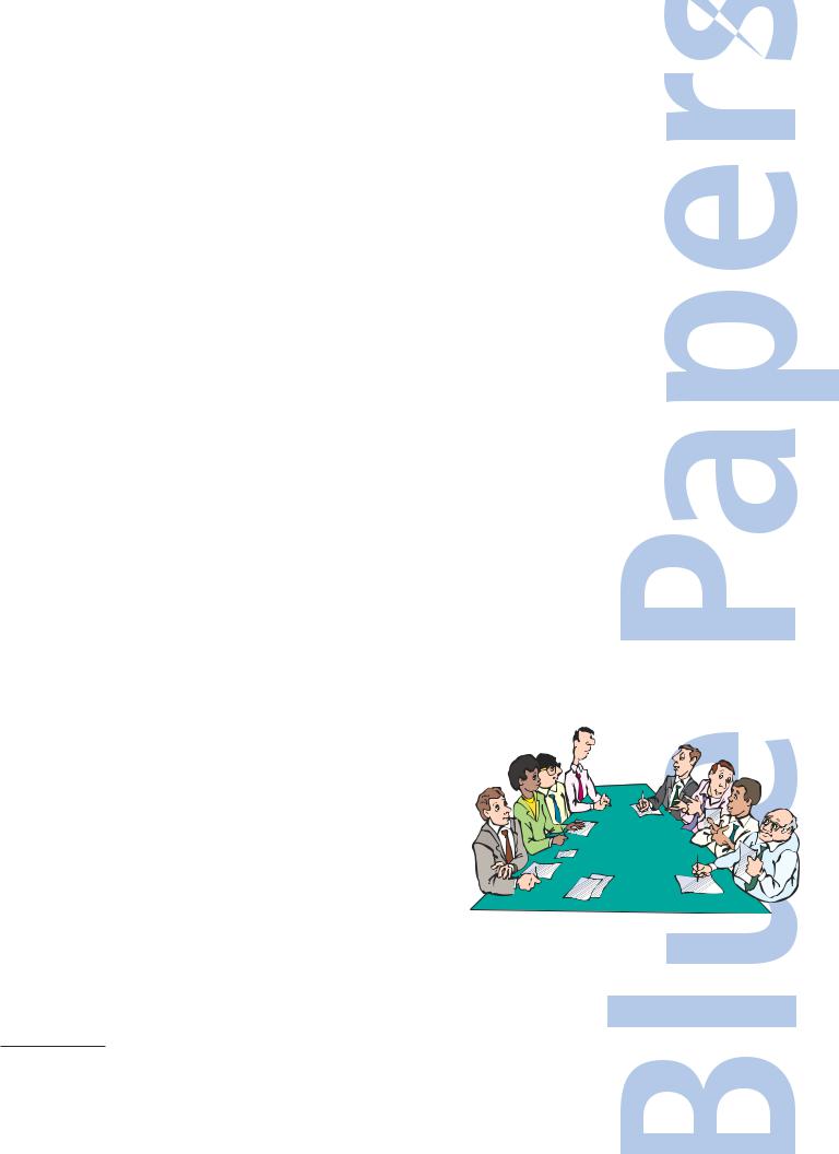
So let’s dive in, shall we?
Phase 1: Craft your message
Few people possess the talent of weaving words into a much larger message. Two who stand out from the crowd are George Carlin and Mark Twain–renowned authors, comedians and entertainers in their times. They carefully crafted works and delivered performances that drew focus to larger social issues. Twain once said, “It usually takes more than three weeks to prepare a good impromptu speech.”2 Similarly, after forty years in comedy, the anti-establishment comedian Carlin punched a clock every day and ran through every line about 40 times to find the perfect rhythm. This illustrates one of the keys to effective presentations: the art of presentation takes considerable preparation.
Unknowingly, or perhaps underestimating the value of the craft, a novice presenter often decides to draft the message while simultaneously designing the visual presentation. Content should be created independently from the show. Put simplistically: Think before you speak.
Noted writer, graphic designer and CEO, Nancy Duarte has dedicated her career to the art and psychology behind superior presentations. As a master
communicator, she devotes 36 to 90 hours toward the preparation of a one-hour speech containing 30 slides.3 Based on Duarte’s estimate, Twain was not too far off in his jest, despite not having seen the advent of PowerPoint®.
Audience-Centric Messaging
Much like planning a party, the first step is to consider who will be in attendance. Your audience will undoubtedly set the tone of both your verbal and visual messages. Whether you’re presenting to a lecture hall of students 
 or a reception hall for your brother’s wedding, there are four


goals of all speech: inform, persuade, entertain or inspire. While all may apply to your message, it’s foolish to open your mouth without focusing on at least one goal.
The Shape of Presentations
When drafting your message, focus not only on your goal
but the path it takes to get there. In her years of research, Nancy Duarte began mapping the structure of historic dramas with the assumption that, like the arcs in musical theory, great presentations must also have a shape. Analyzing verbal
2 “Mark Twain Quotes.” BrainyQuote. BookRags Media Network. Web. 27 June 2012. <http://www.brainyquote.com/quotes/quotes/m/marktwain100433.html>.
3 Duarte, Nancy. Slide:ology: The Art and Science of Creating Great Presentations. Beijing: O’Reilly Media, 2008. Print.
© 2012 4imprint, Inc. All rights reserved

peaks and valleys, her efforts concluded that great speeches throughout history indeed adhere to a pattern.4
To effectively alternate between the status quo and the new utopia, incorporate stories into your presentation. Stories create an emotional connection and apply meaning to your cold, hard facts.6
To illustrate, consider this statement:
A nine-year old operates a front yard lemonade stand to meet a $2,000 goal. This story seems to be about teaching a child the value of hard work.
If we revise this statement, adding more details, it has the potential to change the entire message:
Nine-year old Jessica set up a lemonade stand in her front yard where she works each day in the hot summer sun. Her goal is to raise $2,000 to help local needy children buy school supplies. Skyrocketing unemployment rates have placed 15% of area families below the poverty line. Because of Jessica’s dedication, kids will return to school in the fall with the basic tools for success.
While this story took slightly longer to craft, the reward is also greater. The second story has more meaning, giving a greater significance to the facts.
Designing Dramatic Elements
From her years of experience, Duarte recommends creating an antagonist in which the audience can rally around. She also cautions against misunderstanding
4 Duarte, Nancy. “Nancy Duarte: The Secret Structure of Great Talks.” TED: Ideas worth Spreading. TED Conferences, LLC, Feb. 2012. Web. 03 July 2012. <http://www.ted.com/talks/lang/en/nancy_duarte_the_secret_structure_of_great_talks.html>.
5ibid
6Signorelli, Jim. “Five Reasons Why Marketers Should Care About Stories.” Daily Fix Blog. MarketingProfs, 27 June 2012. Web. 27 June 2012. <http://www.mpdailyfix.com/five-reasons-why-marketers-should-care-about-stories/?adref=nlt062612>.
©2012 4imprint, Inc. All rights reserved

your role as the presenter. You should play the mentor, or the Mr. Miyagi to the Karate Kid, leading the audience to arrive at its own cathartic conclusions.7
Dramatic scripting and effective presentations are similar in their approach to creating a captive audience. Writer Aaron Sorkin, who is best known for writing A Few Good Men© and The West Wing©, says that there is a formula to scripting a drama. First, make an over-simplistic, yet charged statement that begs for an explanation. Follow that with a passionate fact dump to achieve several goals, the first being a support for the argument; second, to establish a reputation as an authority; and most importantly, to set a rapid tempo. He then follows Duarte’s pattern of “what is” and “what could be,” but states that “rhythmically you don’t
want this to be too on the money. You’re not just testing the human ear anymore; you want people to hear what [you’re] saying.” Finally, rather than telling the audience what to think, lead them toward a conclusion.8
Create Stimulus for Reaction
Laughter is a great option for getting your audience to physically react to your message. Follow the advice of the classic number from Singin’ in the Rain©: “Just slip on a banana peel, the world’s at your feet. Make ‘em laugh. Make ‘em laugh. Make ‘em laugh...”9 Injecting humor into the situation allows the audience
to relax and put their guard down, thereby leveling the playing field. While not everyone can properly execute a joke, simple and humorous anecdotes or analogies are within everyone’s reach.
When using humor as a tactic to connect, remember to make sure it’s relevant. If you run off topic, you risk tarnishing your credibility and losing your audience. Additionally, if your attempt at humor falls flat, don’t dwell on it. Plan to keep your message flowing, with or without the humor.
Before moving into the production of your presentation, let’s take a moment to briefly recap the first important points of crafting your message. There is a definitive pattern in the message that turns an ordinary presentation into an extraordinary experience. There are several ways in which to follow that pattern based on the goal of your presentation, but the pattern is always the
same. Finally, through your messaging, lead the audience toward a conclusion to increase their involvement.
7 ibid  8 Sorkin, Aaron B. “How to Write an Aaron Sorkin Script, by Aaron Sorkin.” GQ. Condé Nast, 20 June 2012. Web.
28 June 2012. <http://www.gq.com/entertainment/tv/blogs/the-stream/2012/06/how-to-write-a-monologue-like- aaron-sorkin.html>.
9 Singin’ in the Rain. Dir. Gene Kelly. Perf. Gene Kelly, Debbie Reynolds, Donald O’Connor. Warner Bros./ MGM, 1952.
© 2012 4imprint, Inc. All rights reserved

Phase 2: Design your visual presentation
You have carefully created a story, but now it’s time to make it visually appealing. There are many presentation tools to select from, so take into consideration the crowd, the environment and how to best get your point across. For instance,
if you walk into a board room to present thirdquarter sales to six upper-level managers, you may want to shy away from the laser pointer. By contrast, if the same speech was presented to a theater full of executives, the laser pointer would be appropriate to focus the attention of the group. Again, utilize the best tools to connect with your audience.
Over the years, many presentation tools have emerged. While PowerPoint continues to be the mainstay, exciting and more interactive programs are changing the presentation format. For instance, Prezi® deviates from a linear slideshow, allowing the presenter to illustrate both a macro and micro-view of a topic.
When it comes to the design of your presentation, consider the words of Leonardo di Vinci: “Simplicity is the ultimate sophistication.”10 Your goal is not to visually overstimulate your audience. Aim to present visual cues designed for
easy recall. Within this section are design tactics for taking your visuals to the next level, regardless of your presentation tool.
First, it’s important to open with a super-stellar slide. Despite the warning, people cannot help but judge the book by its cover–or a presentation by its opening slide. Although it is often assumed that the formation of a snap judgment is unreliable, inaccurate or baseless, many psychologists whole-heartedly disagree. Studies conducted by Dr. Nalini Ambady and Dr. Robert Rosenthal at Harvard University®11 repeatedly show subjects were able to draw logical conclusions based on a two-minute interaction. They coined the term “thin-slicing,” that refers to the subconscious’ ability to accurately and quickly draw logical conclusions, not from information provided alone, but from their accumulation of experiences. In short, whether you opt to create suspense or surprise, aim to hold your audience captive from the first slide.
Another tactic to employ: Repeat. Repeat. Repeat. Repetition is extremely valuable to the absorption and retention of your message. Ivan Pavlov, the grandfather of the classical conditioning principle, discovered that behavior can be trained to react to certain stimuli as the familiar story of Pavlov’s dogs suggests.
10 “Leonardo Da Vinci Quotes.” ThinkExist.com. ThinkExist, Web. 09 July 2012. <http://thinkexist.com/quotation/simplicity_is_the_ultimate_sophistication/213576.html>.
11 Ambady, Nalini, and Robert Rosenthal. “Half a Minute: Predicting Teacher Evaluations from Thin Slices of Nonverbal Behavior and Physical Attractiveness.” Journal of Personality and Social Psychology 64.3 (1993): 431-41. Print.
© 2012 4imprint, Inc. All rights reserved

Pavlov would ring a bell and follow it with the immediate delivery of food. After much repetition, the dogs would salivate at the mere tone of the bell–without the presence of food.12 Although it’s not suggested to ring bells at your audience attempting to get them to drool, the same classical conditioning theory can be applied to your presentation. Repetition allows for information to be absorbed more easily and stored longer, giving your message opportunity to leave a lasting impression. Start using this tactic by telling the audience what they can expect
in the presentation, then present them with the message and finish with a summary.13 Tell them what you’re going to tell them. Tell them. Then, tell them what you’ve told them.
It is important to note that each slide or screen should contain fewer than 40 words. Anything longer is considered a document and worthy of a handout. The average person can read 250 to 300 words per minute, whereas they can comfortably process verbal information at 150 to 160 words per minute.14 This disparity in time will allow your audience’s mind to wander, and you risk not being able to reel them back in. Limiting your presentation text allows your
audience to rapidly peruse the visual information and then focus more intently on your message.
When you want the audience to focus on the spoken word, utilize dark slides to draw attention to the speaker. If the slide is black and is void of all content, the audience is almost forced to focus solely on the presenter. In contrast, white slides will draw the audience’s attention toward the screen in anticipation of what
may come.
Business author Dan Heath warns that bullets should be avoided like the plague. The majority of presentations are bulleted and info-heavy, which he claims is “death by presentation.” To differentiate, he recommends three things in place of overwhelming visuals: Be simple, show something useful and tease before you tell.15 Heath recommends watching a video on YouTubeSM entitled The Girl EffectSM as an illustration on how to use all three techniques properly.
Focusing on differentiation, attempt to deviate from the standard templates contained within your presentation tool. If you’re unfamiliar with basic design concepts, this brief overview can help you make your visuals resonate.
12 “Pavlov’s Dog”. Nobelprize.org. 10 Jul 2012 http://www.nobelprize.org/educational/medicine/pavlov/readmore.html
13 Desjardins, Jesse. “Steal This Presentation.” SlideShare. SlideShare, Inc., 13 July 2011. Web. 09 July 2012. <http://www.slideshare.net/geterrdone/steal-this-presentation-8581018>.
14 Bailey, Robert W. Human Performance Engineering. Prentice Hall, 1996. Print.
15 Heath, Dan. “Made To Stick: Presentations That Stick.” FastCompany.com. 7 Apr. 2010. Web. 27 June 2012. <http://www.fastcompany.com/video/presentations-that-stick>.
© 2012 4imprint, Inc. All rights reserved

Design Basics 101
In the basics of design, we will cover the basic principles of layout, fonts, palettes and images along with the use of video.
According to The Non-Designers Design Book, there are four basic and interconnected principles that apply to the layout of every well-designed piece: contrast, repetition, alignment and proximity.16
•Contrast carries the most visual weight, as it directs the readers’ eyes. The designer should utilize a variety of elements–from fonts
and line thickness, to colors and spacing–aimed to keep the slide visually stimulating. But be cautioned, this does not mean that
your slides should have 15 different fonts and 20 different colors. Spice it up with contrast, but don’t go overboard.
•The use of repetition throughout your entire piece creates an organizational framework. For example, if a 56pt. Bold Century Gothic font is used as a headline on the second slide, it should remain that size and style throughout the entire presentation.
•Proper alignment will create a clean look and pairs all items visually, rather than making each element look disconnected. The simplest method to properly align elements is to divide your screen into three columns and place your elements across one, two or all three. For example, the most prominent image can span all three columns, while the main points can span two and the image credit or caption can occupy the third column. Alignment can apply from slide to slide, as well. Note that headlines should appear in the same page position throughout.
•Keep related elements in proximity or near each other. Although this is most applicable for complex designs, it also has implications for presentations. In using the previous example with one main photo, the body content and image credits or caption–the caption should be in close proximity to the main image. If the text is at the bottom of the slide, it becomes a questionable reference point.
Now, let’s explore the fun world of fonts. Your choice of font will definitely influence the tone of your presentation. The best example of an epic font failure comes from the sports world. When LaBron James decided to depart the Cleveland CavaliersSM, Cav’s owner Dan Gilbert fired off an angry email … written entirely in the playful font Comic Sans.17 His gaffe went viral and all validity was
16 “The Joshua Tree Epiphany.” The Non-designers Design Book: Design and Typographic Principles for the Visual Novice. Berkeley: Peachpit Press, 2004. 13. Print.
17 Biderman, David, and Emily Steel. “LeBron and the Revenge of Comic Sans.” WSJ.com. Dow Jones & Company, Inc., 9 July 2010. Web. 27 June 2012.
© 2012 4imprint, Inc. All rights reserved

voided due to his poor font choice.
To avoid humility greater than wearing a scarlet “A” written in Comic Sans, here are a few basic rules for choosing your fonts:
•Use a balanced mix of serif and sans-serif fonts. Serif fonts have the playful ligatures or “feet” and are typically used for body text. In some design circles, it is believed that the feet create an eye line, making the text easier to read.18 Examples of serif fonts include the universal Times New Roman as well as Garamond and Courier New. Conversely, sans serif fonts are visually cleaner and are often used for headlines and captions. These fonts include the popular Arial, Calibri and Century Gothic.
•Avoid using more than three fonts as not to visually clutter the slide. If unsure about your choices, play it safe and remain within one font family. For example, the Franklin Gothic family has a variety of options ranging from very bold to ultra-thin.19
•Size your fonts 30 points or larger. Remember that your slides are visuals, not an eye exam. If you have slides that convey so much data that you will only fit it using a smaller font, chances are you have a larger problem. Either simplify your data or draft an auxiliary handout.
Next, let’s talk about colors used in your presentation. The aesthetics of color are recognized beyond being pretty. When choosing your color combos, the obvious option is to go with the branded colors. But for those presentations that are not branded and a little more free-form, palette selection can be a little more daunting.
For years, color has been considered a powerful tool because audiences instinctively and subconsciously connect colors with emotion. According to The Wright Theory of Color Psychology, each shade has a universal and distinct effect on people, based on personality type.20 Based on this theory, here’s a sample of attributes elicited by each color:21
•Red–can indicate strength, warmth, energy, excitement, defiance or aggression.
<http://blogs.wsj.com/dailyfix/2010/07/09/lebron-james-and-the-revenge-of-comic-sans/>.
18 Martin, Michael. “Typographic Design Patterns and Best Practices | Smashing Magazine.”Smashing Magazine. Smashing Media GmbH, 20 Aug. 2009. Web. 27 June 2012. <http://www.smashingmagazine.com/2009/08/20/ typographic-design-survey-best-practices-from-the-best-blogs/>.
19Ibid.
20Wright, Angela. “How It Works.” Colour Affects. Web. 27 June 2012. <http://www.colour-affects.co.uk/how-it-works>.
21Wright, Angela. “Psychological Properties Of Colours — Colour Affects.” Psychological Properties Of Colours. Web. 27 June 2012. <http://www.colour-affects.co.uk/psychological-properties-of-colours>.
©2012 4imprint, Inc. All rights reserved

•Orange–can reveal security, sensuality, passion, abundance, fun, frivolity or immaturity.
•Yellow–can indicate optimism, confidence, friendliness, creativity, emotional fragility, depression or anxiety.
•Green–can indicate harmony, rest, restoration, peace, stagnation or blandness.
•Blue–which is the most preferred color, can indicate intelligence, communication, trust, serenity, logic, reflection, calm or coldness.
•Purple–can represent spiritual awareness, vision, luxury, truth, quality, decadence, suppression or inferiority.
•Pink–can indicate femininity, love, survival of the species, inhibition or physical weakness.
•Brown–can indicate seriousness, nature, reliability, stability or a lack of humor.
•Black–can indicate sophistication, glamour, security, emotional safety, oppression or coldness.
•Grey–carries more of a negative connotation and can indicate apathy, depression or a lack of energy.
•White–can represent sterility, clarity, purity, simplicity, sophistication, efficiency, unfriendliness or elitism.
If you are still in need of inspiration, designers and color enthusiasts recommend visiting ColourLovers.com for palette suggestions.22
Now that we’ve covered fonts and palettes, let’s venture into imagery. Like the psychology of color, imagery’s effects are also hard-coded in the brain. By layering verbal information with images, you deliver another tool for recalling
information.23 For a simple illustration, let’s assume you are part of the audience on a presentation about dogs. The speaker has an emotional story about how his black Lab “Cody” saved his daughter’s life. Without visuals, this is a compelling story that undoubtedly will resonate. However, if the presenter displays an image of Cody playing with his daughter, there is now increased potential to recall this story every time you see a black Lab. By pairing a verbal message with a visual cue, the audience can better recall the information at another time.
When focusing on linking both verbal and visual information, it’s imperative to select the perfect image. Consider images that are atypical and unexpected with a secondary goal of injecting energy and excitement into your presentation. Be sure to simplify the amount of visual information being processed. Use only one image
22Ibid.
23“Dual Coding Theory (A. Paivio).” Instructional Design. Web. 27 June 2012. <http://www.instructionaldesign.org/theories/dual-coding.html>.
©2012 4imprint, Inc. All rights reserved
