

Part II unit 4 poster presentation
POSTER PRESENTATION - A poster is simply a static, visual medium (usually of the paper and board variety) that you use to communicate ideas and messages. The difference between poster and oral presentations is that you should let your poster do most of the 'talking'; that is, the material presented should convey the essence of your message. A visitor to a poster does not want to read it, but to inspect it. The key to creating an effective poster presentation is visual simplicity achieved without loss of information content.
PURPOSE: to present ideas clearly and concisely. The main point of a poster should be immediately clear to the audience when they first see it, so you need to think carefully about the impact.
OBJECTIVE: students use poster presentations to be selective in communicating their ideas, to demonstrate research work at different conferences.
1. Lead-in
Demonstrate a poster presentation and discuss the following questions.
What exactly is a poster presentation?
What exactly is the "presentation" part of a poster presentation?
What will the people viewing the poster be expecting from it?
2. Guidelines for designing a poster:
Make the title brief and descriptive
Provide a brief abstract to orient the viewer.
Plan a story for the viewer: (the context - what, why, how;
the results and analysis; the importance of the results)
Use telegraphic language and bulleted outlines
Construct easy-to-interpret graphs and tables for information and comparisons
Include a visual image to illustrate your project and/or results.
Make it easy for the viewer to determine the flow of information.
3. Layout
Poster
Sample
№
1
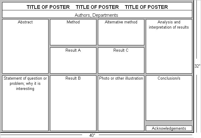
One of the simplest arrangements for a poster in landscape orientation with individual poster elements in portrait orientation.
Poster Sample № 2
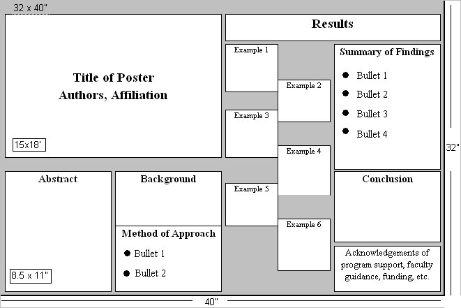
Landscape poster with a more complicated arrangement, but one which might work well when multiple small items such as photographs will be displayed.
4. Do’s & Don’ts
DO’S |
DON’TS |
LAYOUT & FORMAT |
|
1. Make up your poster in a large section, all of roughly comparable size. Suggestion: each standard-sized paper, individually on a colored-board of its own of slightly larger dimension (9.5 x 12”) |
1. Make your poster up on just one or two large boards |
2. Keep your title short, snappy and on target. The title needs to highlight your subject matter. |
2.Write an overlong title |
3. Make your title large enough to be read easily from a considerable distance. The title should never exceed the width of your poster area or should it ever occupy more than 2 lines. If things don’t fit, shorten the title, don’t reduce the type-size. |
3.Make the title type size too large or too small |
4. Put the names of all authors and institutional affiliations just below your title |
4.Leave people wondering about who did this work |
5.Use a type-size that can be read easily at a distance of 4ft or better. 14-point type for fine print and work way up (never down). For text-20-point type. |
5. Use too small a type-size for your poster. Never, ever, use 10\12 point type. Don’t use it in your text, anywhere. Don’t use it for captions, figure legends, footnotes. Don’t ever use small type on a poster |
6. Use a high-quality laser \ inkjet printer ( no dot matrix printers, typewriters, handwriting) |
6.Pick a font that’s a pain to read |
7. Design your poster as if you were designing the layout for a magazine \ newspaper. Strive consistency, uniformity and a clean readable look. |
7. Vary the type sizes \ typefaces excessively throughout the poster |
8. Lay out the poster segments in a logical order. Suggestion: columnar format to proceed vertically; first top to bottom, then left to right |
8. Make your reader all over the poster area to follow your presentation |
9. Use colors in your poster and try to use them in a way that helps to convey additional meaning. Suggestion: a) color borders select smth. that draws attention; b) color artwork-colors mean smth. and serve to make useful distinctions; c) pseudocoloring – color scale should be tasteful, sensible and intuitive; d) color contrast- never place isoluminous colors in close proximity (dark red on navy blue) |
9. Use gratuitous(неуместный) colors |
|
|
POSTER CONTENT |
|
10. Break your poster up into sections. Label all sections with titles. Always start with an abstract( less than 150 words).Display all graphs, photos, etc. in context. Write clear, short legends for every figure. Follow up with a conclusion section. |
10. Write your poster as one long, meandering thread |
11. Get right to the heart of the matter and remember the all-important KISS Principle: Keep It Simple, Stupid! Your poster must explain: a) what’s the question; b) why should we care; c) what’s your strategy; d) what did you actually do; e) what did you actually find; f) what did you think it all means; g) reservations; h) where do you go from here. BE brief and always stay on point. |
11.Ever expect anyone to spend more than 3-5min. at your poster |
12.Recall that a poster should be more telegraphic style |
12. Write your poster just as if it were a scientific paper |
13. Consider adding a helpful tutorial section to your poster |
13. Leave prospective readers hanging or assume they’re all experts |
14. Provide parties with routes into the literature and supply a context for your work 14. Leave out the references |
|
(Steven M. Block: Do’s and Don’ts of Poster Presentation, Biophysical Journal, Vol 71, 1996)