

C# ПІДРУЧНИКИ / c# / Hungry Minds - ASP.NET Bible VB.NET & C#
.pdf
|
Table 3-12: Events associated with ASP.NET server controls |
|
|
|
||
|
|
|
|
|
|
|
|
Control(s) |
|
Event |
|
Description |
|
|
|
|
|
|
|
|
|
|
|
|
|
submitted to |
|
|
|
|
|
|
the server. |
|
|
|
|
|
|
|
|
By default, only the Click event of the Button, LinkButton, and ImageButton server controls causes the form to be submitted to the server for processing — the form is said to be posted back to the server. The Change events associated with other controls are captured and cached and do not cause the form to be submitted immediately. When the form is posted back (as a result of a button click), all the pending events are raised and processed. No particular sequence exists for processing these Change events, such as TextChanged and CheckChanged on the server. The Click event is processed only after all the Change events are processed.
You can set the change events of server controls to result in the form post back to the server. To do so, modify the AutoPostBack property to True.
Event handlers
When the events are raised, you need to handle them for processing. The procedures that are executed when an event occurs are called event handlers. An event handler is associated with the corresponding event by using the WithEvents and Handles keywords. The WithEvents keyword is used to declare the control generating an event. For example, when you declare a control, say Image1 as 'Protected WithEvents Image1 As System.Web.UI.WebControls.Image', the WithEvents keyword specifies that Image1 is an object variable used to respond to events raised by the instance assigned to the variable. The Handles keyword is used to associate the event handler with the event, which is raised by the control. The control in turn is declared by using the
WithEvents keywords.
Event handlers are automatically created when you double-click the control in Design mode of the form. For example, the following code is generated when you double-click a Button control whose ID is RegisterButton. You can then write the code in the event handler to perform the intended task.
Public Sub RegisterButton_Click(ByVal sender As System.Object,
ByVal e As System.EventArgs) Handles RegisterButton.Click
End Sub
In this code:
§The procedure RegisterButton_Click is the event handler for the Click event of the button with ID RegisterButton. The Handles keyword associates the event with the event handler.
§The procedure takes two arguments. The first argument contains the event sender. An event sender is an object, such as a form or a control, that can generate events. The second argument contains the event data.
Implementing the events and event handlers
After discussing the events and event handlers in detail, we'll now implement them for the Web Forms page shown in Figure 3-3, earlier in the chapter.
In Figure 3-3, when you click the Register button, another page should open displaying a relevant message along with the username entered in the UserName TextBox control. Before you can proceed to write the event handlers, you need to add another Web Forms page (the target page) to the Application project. To do so:
1.Select Project → Add Web Form. The Add New Item dialog box opens.
2.Specify the name of the Web Forms page and click Open. In this case, leave the default name of the Web Forms page, WebForm2.aspx.
Tip |
When you add a Web Forms page to a project, the name of the Web |
|
Forms page automatically takes the next number. For example, if |
||
|
||
|
WebForm1 already exists in the project, the default name of the new |
|
|
Web Forms page would be WebForm2. |
Because the target page (WebForm2) should display a message, you need to add a Label control to this page. Set the ID property of this Label control to MessageLabel. To implement this functionality, you need to write the following code in the Click event of the Register button (in the WebForm1 page):
Response.Redirect("WebForm2.aspx?strTextValue=" & "Hi," &
UserName.Text & ", You have been successfully registered")
In this code, the Response.Redirect method takes the URL of the target page. The URL specifies another form named WebForm2.aspx (that you added) and passes a text string along with the value in the TextBox control whose ID is UserName in a variable called strTextValue.
After passing the text in the strTextValue variable, the Label control in the target form, WebForm2, must be initialized in the Init procedure of the form as follows:
MessageLabel.Text = Request.QueryString("strTextValue")
In this code, the value stored in the strTextValue is set as the caption of the label with ID MessageLabel in WebForm2.
The Web Forms page displayed in Figure 3-3 also contains a Reset button. When you click the Reset button, all the controls should be empty. To implement this functionality, use the following code:
UserName.Text = ""
Email.Text = ""
USStateList.ClearSelection()
SexOption.ClearSelection()
SubscriptionOptions.ClearSelection()
In this code:
§The Text property of the TextBox controls with IDs UserName and Email are set to a null value.
§ClearSelection is a method of the list controls, such as ListBox, DropDownList, CheckBoxList, and RadioButtonList controls. The method is used to clear any selection made in the list.
Handling post back
As mentioned earlier, the Web Forms page is posted back to the server only when a Button, LinkButton, or ImageButton ASP.NET server control is clicked. After the page is posted to the server, it is processed there. You can respond to a button event in one of the following ways:
§Write an event handler for the Click event of the button.
§Write the event handler for the Load event of the Web Forms page. The Load event is generated when the form is loaded from the server to the client (browser). You can use the IsPostBack property in the Load event to determine whether the page has been processed for the first time or by a button click. To understand the IsPostBack property better, consider the following code in the Page_Load event of the WebForm1 page. The following code checks whether the IsPostBack property is True. If it is, the Visible property of the Register button is set to False.
§Private Sub Page_Load(ByVal sender As System.Object, ByVal e
As
§System.EventArgs) Handles MyBase.Load
§If ResetButton.Page.IsPostBack = True Then
§RegisterButton.Visible = False
§End If
End Sub
Using the view state
In all Web applications, whenever a Web page is processed at the server, the page is created from scratch. In traditional Web applications, the server discards the page information after processing and sending the page to the browser. Because the page information is not preserved on the server, the Web pages are called stateless. However, the Web Forms framework works around this limitation and can save the state information of the form and its controls. To implement this, the Web Forms framework provides the following options:
§The ViewState: The framework automatically saves the state of the page and its current properties, and the state of the server controls and their base properties, with each round trip.
§The State Bags: Every page has a state bag that stores values to be restored in the next round trip.
The framework automatically stores and restores page information with each round trip. So, you do not need to worry about storing and restoring the page information with each round trip.
The ViewState contains the state of all the controls on a page between requests sent to the server. The state information is stored as hidden form fields as name-value pairs in the System.Web.UI.StateBag object. When you view an ASP.NET page in a browser, you can see the ViewState for this page by displaying the source code of the page. To do so, select View → Source in the browser in which the ASP.NET page is displayed. The ViewState thus is stored in a page rather than in the server. For complex pages that contain many controls, the ViewState information is too large to be stored in a page and might affect the performance of the page. This is the only disadvantage with ViewState. By default, the ViewState is enabled for all the server controls. All the server controls have the EnableViewState property set to True by default. Therefore, to take advantage of the ViewState, you do not need to do anything explicitly. However, as already mentioned, due to performance issues, you can set the EnableViewState property to False to disable the ViewState. If you do not want to maintain the state of any of the server controls on an ASP.NET page, you can set the EnableViewState property of the page to False:
<%@ Page EnableViewState="false" %>
Summary
This chapter served as a foundation for creating Web Forms applications. This chapter introduced you to the basic Web controls used for designing Web Forms pages. You learned the basic steps to create a Web Application project. Then, you learned the usage and properties of Web controls. The chapter also introduced you to events. You learned how to handle server-side events. Finally, you learned to handle post back and use the view state.
Chapter 4: Using Rich Web Controls
Overview
ASP.NET has brought about a complete change in the way controls are used in Web applications. In addition to the client-side rendering of controls, ASP.NET provides controls that can be rendered on the server side. This allows server-side processing, and thus provides dynamic Web pages resulting in a rich and improved user experience.
The previous chapter discussed the basic Web controls. In addition to these Web controls, there are specific Web controls that have more complex and rich functionality. These controls are called Rich Web controls, examples of which are the AdRotator and Calendar controls. Some of the Rich Web controls include:
§TreeView
§TabStrip
§MultiPage
§Toolbar
In this chapter, you will learn about the functionality of these Rich Web controls and learn how to work with them in ASP.NET.
Using the AdRotator Control
The AdRotator control is used to display flashing ads, such as banner ads and news flashes on Web pages. The control is capable of displaying ads randomly, because the control refreshes the display every time the Web page is refreshed, thereby displaying different ads for different users. Also, you can assign priorities to the ads so that certain ads are displayed more frequently than others.
You can add the AdRotator control in an ASP.NET Web page by using the following syntax:
<asp:AdRotator
propertyname = propertyvalue
propertyname = propertyvalue
>
</asp:AdRotator>
Alternatively, you can use the toolbox provided with VS.NET to add the control to the page. When you do so, the code is automatically generated and can be seen in the HTML view of the ASPX file.
Properties of the AdRotator control
Along with the properties that are inherited from the System.Web.UI.Control base class, the AdRotator control has three additional properties:
§AdvertisementFile
§KeywordFilter
§Target
This section describes these properties in detail.
AdvertisementFile
The AdvertisementFile property represents the path to an Advertisement file. The Advertisement file is a well-formed XML document that contains information about the image to be displayed for advertisement and the page to which a user is redirected when the user clicks the banner or image. The following is the syntax of the Advertisement file:
<Advertisements>
<Ad>
<ImageUrl>
URL of the image to display
</ImageUrl>
<NavigateUrl>
URL of the page to navigate to
</NavigateUrl>
<AlternateText>
Text to be displayed as ToolTip
</AlternateText>
<Keyword>
keyword used to filter
</Keyword>
<Impressions>
relative weighting of ad
</Impressions>
</Ad>
</Advertisements>
Note The Advertisement file must be a well-formed XML document, as the AdvertisementFile property of the AdRotator control needs to be set to an XML file.
The following are the different elements used in the Advertisement file:
§ImageUrl: Specifies an absolute or relative URL to an image file that presents the image for the advertisement. This element refers to the image that will be rendered in a browser.
§NavigateUrl: Specifies the URL of a page to navigate to, if a user clicks the advertisement image. If this parameter is not set, the ad is not "live." Although this parameter is optional, it must be specified, because the ad must direct clients to a target URL when it is clicked.
§AlternateText: Is an optional parameter that specifies some alternative text that will be displayed if the image specified in the ImageUrl parameter is not accessible. In some browsers, the AlternateText parameter appears as a ToolTip for the ad.
§Keyword: Is an optional parameter that specifies categories, such as computers, books, and magazines that can be used to filter for specific ads.
§Impressions: Is an optional parameter that provides a number that indicates the weight of the ad in the schedule of rotation relative to the other ads in the file. The larger the number, the more often the ad will be displayed.
KeywordFilter
The KeywordFilter property specifies a category filter to be passed to the source of the advertisement. A keyword filter allows the AdRotator control to display ads that match a given keyword. This enables the AdRotator control to display more context-sensitive ads, where the context is specified in the ASPX page containing the AdRotator control. When you use a keyword filter, three conditions arise:
§Both the KeywordFilter and AdvertisementFile properties are set. In such a case, the AdRotator control renders the image that matches the keyword specified.
§The AdvertisementFile property points to a valid Advertisement file, and the KeywordFilter property specifies a keyword that matches no images. In such a case, the control renders a blank image, and a trace warning is generated.
§The KeywordFilter property is empty. In such a case, keyword filtering will not be used to select an ad.
Target
The Target property specifies the name of the browser window or frame in which the advertisement needs to be displayed. This parameter can also take any of the HTML frame-related keywords, such as the following:
§_top: Loads the linked document into the topmost window.
§_blank: Loads the linked document into a new browser window.
§_self: Loads the linked document in the same window.
§_parent: Loads the linked document in the parent window of the window that contains the link.
After looking at the properties, let's understand the events associated with the AdRotator control.
Events of the AdRotator control
The AdRotator control supports the adCreated event that you can handle to monitor the activities of a user or a session. The adCreated event is generated with every round trip to the server, after the AdRotator control is created but before the page is rendered in the browser. The event handler for the adCreated event is OnAdCreated and has the following syntax:
OnAdCreated (sender as Object, e as AdCreatedEventArgs)
The event handler takes two parameters. The first parameter represents the object that raises the event. The second parameter represents the AdCreatedEventArgs object that contains the data related to this event. The AdCreatedEventArgs object has a set of properties that provide information specific to the AdCreated event:
§AdProperties: Is an IDictionary type object that provides all the advertisement properties that have been set for the currently selected advertisement.
§AlternateText: Is a String type value that sets the ALT property of the image that is sent to the browser. In some browsers, this text is displayed as a ToolTip when the mouse cursor hovers over the image.
§ImageUrl: Is a String value that sets the URL of the image that is displayed in the AdRotator control.
§NavigateUrl: Is a String type value that specifies the URL of the Web
page to navigate to when a user clicks the advertisement.
The OnAdCreated event handler can be used to select ads in a local code or to modify the rendering of an ad selected from the Advertisement file. If an advertisement file is set, the parameters of the AdCreated event handler are set to the selected ad when the event is generated. The source image that is specified by the Advertisement file is sized by the browser to the dimensions of the AdRotator control, regardless of the image's actual size. The ad is selected based on impressions weighting from the file.
If the values are not set in the Advertisement file, the developer can modify the values in the ImageUrl, NavigateUrl, and AlternateText properties to modify the rendering of the AdRotator control. A very common use of this is when developers need to populate the event arguments with values pulled from a database.
Rendering ads to client browsers using AdRotator
The following code uses the AdRotator server-side control to render ads to the client browsers. The AdRotator control uses an Advertisement file named Ads.xml.
<%@ Page Language="VB" %>
<html>
<head>
</head>
<body>
<form runat="server">
<h3><font face="Verdana">AdRotator Example</font></h3>
<asp:AdRotator id="AdRotator1" runat="server" AdvertisementFile="Ads.xml"/>
</form>
</body>
</html>
The following code describes the Ads.xml file that is used by the AdRotator control. The file contains two advertisements that will be dynamically shown to different users. The first ad points to an image file named Saturn.gif. When users click this image, they are directed to the Saturn Web site. The second ad points to the image named Moon.jpg. When users click this image, they are directed to the Moon Web site.
<Advertisements>
<Ad>
<ImageUrl>
saturn.gif
</ImageUrl>
<NavigateUrl>
http://www.saturnrings.com/
</NavigateUrl>
<AlternateText>
Saturn Rings Web Site
</AlternateText>
<Impressions>
1
</Impressions>
<Keyword>
Saturn
</Keyword>
</Ad>
<Ad>
<ImageUrl>
Moon.jpg
</ImageUrl>
<NavigateUrl>
http://www.moon.com
</NavigateUrl>
<AlternateText>

Moon Explorers Web Site
</AlternateText>
<Impressions>
1
</Impressions>
<Keyword>
Moon
</Keyword>
</Ad>
</Advertisements>
Figure 4-1 shows the output of the preceding code.
Figure 4-1: Sample output of the AdRotator control
Using the Calendar Control
The Calendar control is used to display a one-month calendar. Users can use this control to view dates or select a specific day, week, or month.
The following is the syntax to add the Calendar control:
<asp:Calendar id="Calendar1" runat="server"
propertyname = propertyvalue
propertyname = propertyvalue
/>
Properties of the Calendar control
The Calendar control has properties that you can set when you add the control to your page. Table 4-1 describes some of the properties of the Calendar control.
Table 4-1: Properties of the Calendar control
Property
CellPadding
Description
Specifies the space between cells.
CellSpacing |
Specifies the space |
|

Table 4-1: Properties of the Calendar control
Property
DayNameFormat
FirstDayOfWeek
ShowNextPrevMonth
NextMonthText
NextPrevFormat
PrevMonthText
SelectedDate
SelectedDates
SelectionMode
SelectMonthText
Description
between the contents of a cell and the cell's border.
Specifies the format of the day name.
Sets a value for the day of the week that will be displayed in the calendar's first column.
Takes a Boolean value and specifies whether or not the calendar is capable of displaying next and previous month hyperlinks.
Shows the HTML text for the "Next Month" navigation hyperlink if the
ShowNextPrevMont h property is set to true.
Specifies the format of the next month and previous month hyperlinks.
Shows the HTML text for the previous month hyperlink if the
ShowNextPrevMont h property is set to true.
Represents the date selected in the Calendar control.
Specifies a collection of DateTime objects representing days highlighted on the calendar. This is a read-only property.
Specifies whether the user can select a day, week, or month. The default is Day.
Shows the HTML text for the month selection in the selector column if the
SelectionMode
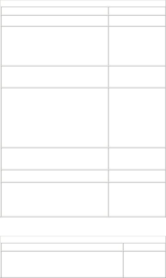
Table 4-1: Properties of the Calendar control
Property
SelectWeekText
ShowDayHeader
ShowGridLines
TitleFormat
TodaysDate
VisibleDate
Description
property is set to
DayWeekMonth.
Shows the HTML text for the week selection in the selector column if the
SelectionMode property is set to
DayWeek or DayWeekMonth.
Specifies whether or not to display the names of the days of the week.
Specifies a value that determines whether or not the days in the calendar should be displayed with gridlines around them. However, even if the property specifies to display lines around the calendar days, not all browsers can display the gridlines.
Specifies the format of the month name in the title bar of the calendar.
Specifies the current date.
Specifies the month to be displayed in the calendar. The property is updated after the
VisibleMonthChan ged event is raised.
In addition to the properties in Table 4-1, the Calendar control has certain style objects associated with it. The style objects are used to set the appearance of the individual elements, such as the appearance of the day and week values of the control. Some style objects are described in Table 4-2.
Table 4-2: Style objects
Property
DayHeaderStyle
Description
Sets the appearance of the days of the current month.