

C# ПІДРУЧНИКИ / c# / Hungry Minds - ASP.NET Bible VB.NET & C#
.pdf
To enable paging, you must first turn it on by setting the Paging property to True (by default, this is turned off). So, if your data source has many rows, it will appear as one long continuous list of tabular data on your page. Once Paging is set to True, you can set the other paging properties to control the display and the type of paging. You also need to code the PageIndexChanged event to handle when the user selects a new page of data. Typically, in this event, you need to set the CurrentPageIndex to the index of the page you want to display, and then call the DataBind method to rebind the data to the grid. The PageIndexChanged event takes the DataGridPageChangedEventArgs object as a parameter. This object has the following properties:
§CommandSource: Indicates the source of the command
§NewPageIndex: Gets the index of the page selected by the user from the page selection element of the control
You can also set the paging mode property PagerMode to one of two values: §NextPrev: Displays Previous and Next buttons to access the next and
previous pages
§NumericPages: Displays numbered buttons to access pages directly
By default, when paging is turned on, the Next and Previous links are displayed as less than (<) and greater than (>) symbols. As in the DataGridPaging.aspx code example, the links are displayed as "[Next Page]" and "[Previous Page]". The
NextPageText and PrevPageText can be set to any string value you choose. If you set the PagerMode to NumericPages, the links at the bottom of the grid for paging are displayed as numbers from 1 to n. Try it! Insert the PagerStyleMode="NumericPages" in the DataGrid.
Sorting Grid Data
One last important feature of the DataGrid control is sorting. Just like paging, you only need to set a few properties and then handle the Sort event.
Launch your browser and navigate to DataGridSorting.aspx; the screen should look like Figure 10-12.
Figure 10-12: DataGridSorting.aspx, as displayed in Internet Explorer
Take a look at the following code:
<%@ Import NameSpace="System.Data" %>
<html>
<head>
<title>Hungry Minds Chapter 9...</title>
<script language="C#" runat="server">
String SortOrder;
void Page_Load(Object sender, EventArgs e) {
if (!IsPostBack) {
if (SortOrder == null) SortOrder = "name";
Paging.DataSource = LoadDataSource();
Paging.DataBind();
}
}
ICollection LoadDataSource() {
DataSet ds = new DataSet();
ds.ReadXml(Page.MapPath("data.xml")) ; if (SortOrder != null)
ds.Tables[0].DefaultView.Sort = SortOrder; return ds.Tables[0].DefaultView;
}
void Sort_Grid(Object sender, DataGridSortCommandEventArgs e) { SortOrder = e.SortExpression.ToString();
SortMsg.Text = "<br>Grid sort order is <b>" + SortOrder + "</b>"; Paging.DataSource = LoadDataSource();
Paging.DataBind();
}
</script>
</head>
<body>
<img src="logo.gif"> <br>
<font face="verdana" size="5">DataGrid Sorting Example...</font> <hr>
<form method="post" runat="server" ID="Form1"> <asp:DataGrid
ID="Paging"
AutoGenerateColumns="true"
OnSortCommand="Sort_Grid"
ShowHeader="true"
BorderColor="#6699cc"
BorderWidth="1"
CellPadding="1"
Font-Name="verdana"
Font-Size="10pt"
HeaderStyle-BackColor="#6699cc"
AllowSorting="true"
RunAt="server">
</asp:DataGrid>
<asp:Label ID="SortMsg" Runat="server" />
</font>
</form>
<hr>
</body>
</html>
To enable sorting, you set the AllowSorting property of the DataGrid to True and set the OnSortCommand to point to the name of your sorting event. When sorting is enabled, the grid header columns are displayed as "clickable" links, allowing you to sort by any data column in the grid. In the DataGridSorting.aspx code, the Sort_Grid takes either of the following as a parameter:
§CommandSource: Gets the source of the command
§SortExpression: Gets the expression used to sort the DataGrid control
In the previous example, you extract the SortExpression into your SortOrder string variable and then use this value in your LoadDataSource routine. In the DataGridSorting.aspx code, you set the Sort property of the DefaultView in your data set and then call the DataBind method of the DataGrid to sort and redisplay the grid data.
Summary
This chapter covered how to format the grid using different styles. It also looked at using the Columns property of the DataGrid control to display data items as different column types. In addition, you saw how to enable paging and sorting in the DataGrid. With the help of the DataGrid and all of its built-in functionality, you can display, page, and sort your data with a minimal amount of coding.
Chapter 11: Using Templates
Overview
ASP.NET provides a rich set of Server controls that you can use in your Web Forms pages. When you drag Server controls to a Web Forms page, the controls have a default set of properties and styles already applied to them. These default properties and styles provide a specific look and layout to the controls. You can customize the look and layout of the controls by setting properties and styles according to your requirements. However, there might be situations when you cannot customize the controls by using the properties and styles. In such situations, ASP.NET allows you to create templates for some Server controls. Templates are used to customize the look and layout of Server controls according to your requirements.
This chapter introduces you to templates. You'll also learn how to create templates and combine them with the Repeater, DataList, and DataGrid controls.

Introduction to Templates
Templates consist of HTML elements, controls, and embedded Server controls that allow you to customize and manipulate the layout of a particular control. For example, you can customize the layout of the individual rows, alternating rows, or selected rows of a DataList or DataGrid ASP.NET Server control by defining different templates. Then, at run time, instead of the default HTML, the contents of the templates are rendered on the page.
You can define templates to control the layout of different portions — such as header item, footer item, edit item, selected item, alternating item, or separator — of a control according to your requirements. Different types of templates are available depending on the portion of the control for which the template is defined. For example, the template defined for the header of a control is called HeaderTemplate. However, not all the Server controls support templates. The Server controls that support templates are Repeater, DataList, and DataGrid. Also, not all types of templates are supported by all the controls that support templates. Table 11-1 lists the different types of templates and the controls that support them.
Table 11-1: Templates and the supporting controls
Template |
|
Description |
|
Supported |
|
|
|
|
by |
|
|
|
|
|
ItemTemplate |
|
The set of |
|
Repeater, |
|
|
elements |
|
DataList, |
|
|
and controls |
|
and |
|
|
that are |
|
DataGrid |
|
|
rendered |
|
|
|
|
once for |
|
|
|
|
each row in |
|
|
|
|
the data |
|
|
|
|
source. |
|
|
|
|
|
|
|
AlternatingItemTemplate |
|
The set of |
|
Repeater |
|
|
elements |
|
and |
|
|
and controls |
|
DataList |
|
|
that are |
|
|
|
|
rendered |
|
|
|
|
once for |
|
|
|
|
every |
|
|
|
|
alternating |
|
|
|
|
row in the |
|
|
|
|
data source. |
|
|
|
|
|
|
|
SelectedItemTemplate |
|
The set of |
|
DataList |
|
|
elements |
|
|
|
|
and controls |
|
|
|
|
that are |
|
|
|
|
rendered |
|
|
|
|
when an |
|
|
|
|
item is |
|
|
|
|
selected in |
|
|
|
|
the control. |
|
|
|
|
|
|
|
EditItemTemplate |
|
The set of |
|
DataList |
|
|
elements |
|
and |
|
|
and controls |
|
DataGrid |
|
|
that are |
|
|
|
|
rendered |
|
|
|
|
when an |
|
|
|
|
item is in |
|
|
|
|
Edit mode. |
|
|
|
Table 11-1: Templates and the supporting controls |
|
|
|
||
|
|
|
|
|
|
|
|
Template |
|
Description |
|
Supported |
|
|
|
|
|
|
by |
|
|
|
|
|
|
|
|
|
HeaderTemplate |
|
The set of |
|
Repeater, |
|
|
|
|
elements |
|
DataList, |
|
|
|
|
and controls |
|
and |
|
|
|
|
that are |
|
DataGrid |
|
|
|
|
rendered |
|
|
|
|
|
|
once before |
|
|
|
|
|
|
all the items |
|
|
|
|
|
|
in the |
|
|
|
|
|
|
control. |
|
|
|
|
|
|
|
|
|
|
|
FooterTemplate |
|
The set of |
|
Repeater, |
|
|
|
|
elements |
|
DataList, |
|
|
|
|
and controls |
|
and |
|
|
|
|
that are |
|
DataGrid |
|
|
|
|
rendered |
|
|
|
|
|
|
once after |
|
|
|
|
|
|
all the items |
|
|
|
|
|
|
in the |
|
|
|
|
|
|
control. |
|
|
|
|
|
|
|
|
|
|
|
SeparatorTemplate |
|
The set of |
|
Repeater |
|
|
|
|
elements |
|
and |
|
|
|
|
that are |
|
DataList |
|
|
|
|
rendered |
|
|
|
|
|
|
between |
|
|
|
|
|
|
each row. |
|
|
|
|
|
|
|
|
|
|
|
PagerTemplate |
|
The set of |
|
DataGrid |
|
|
|
|
elements |
|
|
|
|
|
|
and controls |
|
|
|
|
|
|
that are |
|
|
|
|
|
|
rendered |
|
|
|
|
|
|
while paging |
|
|
|
|
|
|
the |
|
|
|
|
|
|
information. |
|
|
|
|
|
|
|
|
|
|
Again, you can manipulate the look and layout of individual controls by using styles; however, you should not confuse styles with templates. Styles are used to specify the appearance of controls by setting specific properties, such as color, font, and width. On the other hand, templates are sets of HTML elements and controls that provide a specific layout to specific portions of a control. You can use styles with the controls that do not have templates defined for them. Also, you can use styles with the controls that have templates defined. For such controls, you can use styles to specify the appearance of the elements that define the template.
Before proceeding to create templates for the Repeater, DataList, and DataGrid Server controls, you need to understand the basic features of these controls, described next.
Repeater control
The Repeater control allows you to create custom lists to display data from different data sources. Unlike other Server controls, such as TextBox and ListBox, the Repeater control does not have a default look and layout. You need to provide the layout to the Repeater control by creating templates. Because it is you who provides the layout to the control, you can create any kind of list for the control, depending on your requirements.

Some of the lists that you can create include tables or grids, comma-separated lists, and bulleted or numbered lists.
After you drag a Repeater control on a form, you can set the base control properties by using the Properties window. Then, you need to create templates to provide the layout to the control. Of all the templates supported by the Repeater control, you must create at least one template, ItemTemplate, to provide a basic layout to the control. Then, you can create other templates to enhance the look and layout of the control. To render a Repeater control on a page, you must bind the control to a data source and create ItemTemplate.
The Repeater control supports two events:
§ItemCreated: Enables you to customize the way items are created. One way to customize the item-creation process is to set certain properties while the items are being created.
§ItemCommand: Generated when users click one of the buttons included in the Repeater control items. These buttons could be the usual Button controls or the LinkButton controls.
DataList control
The DataList control enables you to display rows of data from a data source in a list. Each row of data displayed in the DataList control is an item. To create items, you must create at least one template, ItemTemplate. By default, the items in a DataList control are displayed in a single vertical column. However, you can provide a custom layout to the items in the control by using templates.
In addition to specifying the layout of controls and the data to be displayed in individual items, the DataList control enables you to specify how the individual items are laid out with respect to each other. The options that you can choose from are the following:
§Vertical/horizontal: The default layout is a single vertical column. However, you can specify more than one column for the control. If you've specified a multiple-column layout for the control, you can also specify the ordering of items as vertical or horizontal.
§Number of columns: You can specify the number of columns that the list will have irrespective of the ordering of items as vertical or horizontal. In this manner, you can control the rendered width of the Web page.
§Flow/table: You can choose either flow layout or table layout for the control. The flow layout presents the list items in a format like a wordprocessing document, while the table layout presents the list items in an HTML table.
The DataList control supports many styles and templates that you can use extensively to customize the layout of the control. You can use the autoformat feature to customize the appearance of different elements of the control. In addition to the styles, you can create the templates to customize the control. For example, you can create EditItemTemplate to allow item editing in the control. The DataList control also enables you to have a multiple-column layout. Also, you can customize the control to allow multiple-item selection.
In addition to the ItemCreated event, the DataList control supports five more events that are generated when buttons are clicked in the list items. The type of the event generated depends on the CommandName property of the button that is clicked. The DataGrid control has a generic event called ItemCommand. This event is generated when a user clicks a button that has no predefined command. Table 11-2 shows the different events that are generated.
Table 11-2: The DataList events
Command |
|
Event |
|
|
|
Edit |
|
EditCommand |
|
|
|
Update |
|
UpdateCommand |

Table 11-2: The DataList events
|
Command |
|
|
Event |
|
|
|
|
|
|
|
|
Cancel |
|
|
CancelCommand |
|
|
|
|
|
|
|
|
Delete |
|
|
DeleteCommand |
|
|
|
|
|
||
|
Caution |
The CommandName property of a button is case-sensitive and |
|
||
|
|
takes values in lowercase. Therefore, be sure to assign |
|
||
|
|
lowercase values to the CommandName property. |
|
||
DataGrid control
The DataGrid Server control is a multicolumn, data-bound grid that enables you to define different types of columns. These columns not only provide layout to the grid contents, but also add functionalities to select, edit, sort, and page the data. Also, the DataGrid control provides functionality for full customization of the output through the use of specific columns called TemplateColumns.
When you add a DataGrid control to a form, the control will be rendered only if it is bound to a data source. A data source can be created by using Visual Studio Data Designer or any database on a server. It can also be a simple structure, such as an array of type ArrayList. When you bind a DataGrid control to a data source, the columns are generated automatically based on the fields in the data source. However, you can specify the columns in different ways. The different types of columns that you can create are described as follows:
§Bound columns: Used to specify the database fields that need to be displayed in the columns along with the order, format, and style of the display.
§Hyperlink column: Used to display information as hyperlinks that users can click to navigate to different pages. For example, you can display product names as hyperlinks. When users click these hyperlinks, they are directed to product details in a separate page.
§Button columns: Used to display buttons for each item in the grid and add custom functionality to the buttons. For example, you can add a button labeled Query and associate logic with it. When users click the button, the logic is executed.
§Edit command columns: Used to allow in-place editing of items. Inplace editing allows users to edit the items in the grid only. To implement this editing, you need to add a special column in the grid that contains buttons labeled Edit. When users click this button, the current row is
displayed again with editable fields for all columns. Also, the column with the Edit button is redisplayed with the Update and Cancel buttons.
For more information on Button columns and Edit command columns, refer to Chapter 10 and Chapter 12.
§Template columns: Used to create a custom layout for a column by using a combination of HTML text and Server controls. The controls in the Template column can be bound to display data from a data source.
This column provides you complete flexibility for customization. With the template columns, you can create custom-editing layout. This approach enables you to manipulate the columns that can be edited and the way users can edit data.
The DataGrid control supports multiple events that are raised from the controls in the grids. In addition to the ItemCreated, ItemCommand, EditCommand, UpdateCommand, CancelCommand, and DeleteCommand events, the control supports these two events:
§PageIndexChanged: Generated when a page selection element is clicked.
§SortCommand: Generated when a column is sorted.
Comparing the Repeater, DataList, and DataGrid controls
As mentioned, the Repeater, DataList, and DataGrid controls are used to display data in the form of lists on the Web Forms pages. All of these controls are bound to some data source and display each row in the data source as an entry called item.
All three controls must be bound to a data source by the DataSource property so that they can be rendered on a page. Even if the DataSource property is set, the controls will not display the data from the data source until the DataBind() method is called for the control. The DataSource property is set for the control. For the individual controls in the
|
templates, you can use the container data. |
|
|
|
|
|
||
|
Cross- |
|
For more information on data binding, refer to Chapter 9. |
|||||
|
Reference |
|
|
|
|
|
|
|
|
Table 11-3 compares the Repeater, DataList, and DataGrid controls. |
|
|
|
||||
|
Table 11-3: Comparison of the Repeater, DataList, and DataGrid controls |
|||||||
|
|
|
|
|
|
|
|
|
|
Feature |
|
Repeater |
|
DataList |
|
DataGrid |
|
|
|
|
|
|
|
|
|
|
|
Default layout |
|
No default |
|
The |
|
The |
|
|
|
|
layout |
|
default |
|
default |
|
|
|
|
|
|
layout is a |
|
layout is a |
|
|
|
|
|
|
single |
|
grid layout |
|
|
|
|
|
|
vertical |
|
|
|
|
|
|
|
|
column |
|
|
|
|
|
|
|
|
layout |
|
|
|
|
|
|
|
|
|
|
|
|
|
Autoformatting |
|
No options |
|
Provides |
|
Provides |
|
|
|
|
for |
|
options for |
|
options for |
|
|
|
|
autoformat |
|
autoformat |
|
autoformat |
|
|
|
|
ting |
|
ting |
|
ting |
|
|
|
|
|
|
|
|
|
|
|
Item selection and |
|
Items are |
|
Provides |
|
Provides |
|
|
editing |
|
read-only; |
|
options for |
|
options for |
|
|
|
|
no |
|
editable |
|
editable |
|
|
|
|
inherent |
|
contents |
|
contents; |
|
|
|
|
support for |
|
and single- |
|
also |
|
|
|
|
selecting |
|
and |
|
supports |
|
|
|
|
and editing |
|
multiple- |
|
singleand |
|
|
|
|
items |
|
item |
|
multiple- |
|
|
|
|
|
|
selection |
|
item |
|
|
|
|
|
|
|
|
selection |
|
|
|
|
|
|
|
|
|
|
|
Paging |
|
Does not |
|
Does not |
|
Provides |
|
|
|
|
support |
|
support |
|
support for |
|
|
|
|
default |
|
default |
|
paged |
|
|
|
|
paging, |
|
paging |
|
output |
|
|
|
|
and all |
|
|
|
|
|
|
|
|
data is |
|
|
|
|
|
|
|
|
displayed |
|
|
|
|
|
|
|
|
in a single |
|
|
|
|
|
|
|
|
list |
|
|
|
|
|
|
|
|
|
|
|
|
|
|
Creating Templates
You can create templates by using the Web Forms Designer in a WYSIWYG (What You See Is What You Get) way or by using the ASP.NET syntax in the ASPX file. This section explores both of these methods.
The method to create templates by using the Web Forms Designer is very convenient to use:
1.Right -click the control and choose Edit Template from the shortcut menu. Then, choose the type of template to edit. For example, to edit Item
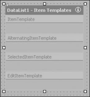
templates, such as ItemTemplate, AlternatingItemTemplate, SelectedItemTemplate, or EditItemTemplate of a DataList control, choose Item Templates. The control appears in the template-editing mode. Figure 11-1 displays the DataList control in the template-editing mode for the Item templates.
Figure 11-1: The DataList control in the template-editing mode
2.In the template-editing mode, add the HTML text and drag controls from the Toolbox onto the template. For example, you can drag Label or TextBox control to the Item template.
3.Edit the properties of the controls that you have added as you would do for any other control.
4.After you have added all the controls that you need to the template and edited their properties and styles, you need to end the template editing. To do so, right-click the control and choose End Template Editing.
Note |
The WYSIWYG template editing is not supported by the Repeater |
|
control. |
||
|
You can also create a template by directly editing the ASPX file in the HTML view. For example, if you want to create ItemTemplate for a DataList control, type the following code:
<asp:DataList ID=DataList1 runat="Server">
<ItemTemplate>
</ItemTemplate>
</asp:DataList>
You can then add the controls that you want to include in the Itemtemplate. Also, you can set the properties for the embedded controls and data-bind them. To do so, add the code for the embedded elements inside the <ItemTemplate> and </ItemTemplate> element. For example, to add a Label control to the ItemTemplate in the DataList control, use the following syntax:
<ItemTemplate>
Name: <asp:Label ID=Label1 runat="Server" Text='<%# data binding expression %>'/>
</ItemTemplate>
In this syntax, data binding expression represents the data binding expression for the Label control of the template. The data binding expression is evaluated at run time. As mentioned earlier, the Server control for which the template is created must be bound to a data source. Otherwise, it will not be rendered on the page. Then, the controls within
the template can be bound to the container data. The DataBinder.Eval() method provided by the .NET Framework evaluates the late-bound data binding expression and eliminates the explicit casting of the bound data to the desired data type .The DataBinder.Eval() method takes three arguments and has the following syntax:
<% # DataBinder.Eval(NamingContainer,DataFieldName,[FormatString])>
In this syntax:
§NamingContainer: Represents the naming container for the data item. The Page object can be one of the containers for data items. For the Repeater, DataList, and DataGrid controls, this argument is always
Container.DataItem.
§DataFieldName: Represents the name of the data item field.
§[FormatString]: Represents the format string, which determines the format of
the bound data item. This is an optional argument. If this argument is not specified, the data item is automatically formatted to a value, which is of object type.
Combining templates with the Repeater control
The templates that the Repeater control supports include ItemTemplate, AlternatingItemTemplate, HeaderTemplate, FooterTemplate, and SeparatorTemplate. To render the Repeater control on a page, you must bind the control to a data source and create at least ItemTemplate. The controls within the templates can be bound to the container data.
This section implements creating templates for the Repeater control. First, create an ASP.NET Web application project. You can create a Visual Basic or C# application. The example in this section creates a Visual Basic Web application. After you create the application, add a Repeater control to the form. In the example that follows, the Repeater control is bound to a DataView object, and the individual items are bound to the individual fields in the data source. To use the Data objects, you need to import the System.Data namespace. To do so, write the following statement in the HTML view of the ASPX file of the form:
<%@ Import Namespace="System.Data" %>
You need to create a DataView object that represents a data source. The DataView object created here represents a data source that contains products and their quantities. Write the following code in the <Script> tag to create the DataView object and bind the Repeater control to it:
<Script Language = "VB" runat="Server" ID=Script1>
Sub Page_Load(ByVal sender As System.Object, ByVal e As
System.EventArgs) Handles MyBase.Load
If Not IsPostBack Then
Dim DataTable1 As DataTable
Dim DataRow1 As DataRow
Dim strProd(5) as String
Dim intQty(5) as Integer
Dim I as Integer
strProd(0)="Cinnamon"
strProd(1)="Basil Leaf"
strProd(2)="Anise Seeds"
strProd(3)="Annatto Seeds"
strProd(4)="Asafoetida Powder"