

The Elisa guidebook
.pdfThe purpose of charting the data is to help monitor the performance of the kit in its use to measure antibodies against rinderpest. The points of assessment are always with reference to the performance of the control sera and reagents supplied.
The data on these reagents have been obtained after multiple testing so that expected values and variation from these values have been recorded and calcu-
Page 371
Fig. 20.
Illustrative SDC chart for C++ and C+ PI% data showing effect of different operators.
lated. The key assumption is that these are constants in the assay, i.e., that all the reagents and controls will remain the same physically throughout the time that they are used in the tests. Note that because of this assumption we have to be very careful not to handle the control samples poorly since they set the control limits of the assay.
The control serum samples represent sera containing an excess of antirinderpest antibodies (C++) and a relatively weak serum (C+) that should not give maximal inhibition but always be above the given cutoff value. We also have other ''constants" that should be the same on each plate, i.e., the mAb (Cm), the C¨C, and the Cc.
Page 372
Table 3
Control Samples Data After Processing
|
OD1 |
OD2 |
OD3 |
OD4 |
PI%1 |
PI%2 |
PI%3 |
PI%4 |
C++ |
0.077 |
0.063 |
0.072 |
0.071 |
88 |
90 |
89 |
89 |
C+ |
0.278 |
0.296 |
0.313 |
0.280 |
58 |
55 |
52 |
57 |
C¨C |
0.668 |
0.667 |
¡ª |
¡ª |
¨C2 |
¨C2 |
¡ª |
¡ª |
Cc |
0.011 |
0.009 |
¡ª |
¡ª |
98 |
99 |
¡ª |
¡ª |
Cm |
0.685 |
0.673 |
0.636 |
0.641 |
¨C4 |
¨C2 |
¨C9 |
¨C8 |
Table 4 |
|
|
|
|
|
|
|
|
Mean and SD for PI Values |
|
|
|
|
|
|
||
of Control Data |
|
|
|
|
|
|
|
|
|
|
Mean |
|
SD |
|
|
|
|
C++ |
|
89.0 |
|
2.7 |
|
|
|
|
C+ |
|
55.5 |
|
2.7 |
|
|
|
|
C¨C |
|
98.5 |
|
0.7 |
|
|
|
|
Cc |
|
¨C1 |
|
0 |
|
|
|
|
Table 5 |
|
|
|
|
|
|
|
|
Completed Calculation of Mean |
|
|
|
|
|
|||
and 2 ¡Á SD of Control Data |
|
|
|
|
|
|||
|
Mean |
|
SD |
2 ¡Á SD |
|
|
|
|
C++ |
89.0 |
|
2.7 |
5.4 |
|
|
|
|
C+ |
55.5 |
|
2.7 |
5.4 |
|
|
|
|
C- |
98.5 |
|
0.7 |
1.4 |
|
|
|
|
Cc |
¨C1 |
|
0 |
0 |
|
|
|
|
5.1¡ª Variation
There will be variation in the results obtained in the tests. The variation will be from plate to plate on the same day, from day to day, from operator to operator. The measurement of the variation is what the charts help the operator investigate. We can (and have to) accept a degree of variation. The acceptance limits are those given in the manual. Thus, for the Cm:
1.A target mean OD reading is given.
2.Upper and lower limits for OD are given.
3.A target PI% value is given.
4.Upper and lower control limits for PI% are given.

Page 373
Table 6
Example Data from Five Plates with Required Parameters
Calculated for Inclusion in DDD Charts
Plate |
Cm (OD) |
C++ |
C+ |
C¨C |
Cc |
1 |
0.59 (.07) |
85 (6.0) |
56 (5.0) |
97 (1.8) |
1 (0.2) |
2 |
0.64 (.15) |
89 (4.0) |
59 (4.5) |
94 (2.2) |
2 (0.2) |
3 |
0.68 (.09) |
92 (5.2) |
54 (5.5) |
91 (3.2) |
4 (0.1) |
4 |
0.71 (.13) |
84 (6.3) |
59 (6.3) |
89 (4.5) |
5 (0.3) |
5 |
0.61 (.09) |
89 (4.5) |
65 (3.9) |
93 (6.8) |
3 (0.4) |
Table 7
Control Data from Five Plates
|
Cm |
C++ |
C+ |
C¨C |
Cc |
Plate 1 |
¨C2 |
88 |
64 |
6 |
99 |
Plate 2 |
4 |
84 |
62 |
¨C3 |
91 |
Plate 3 |
3 |
87 |
59 |
¨C2 |
94 |
Plate 4 |
¨C1 |
89 |
63 |
4 |
93 |
Plate 5 |
¨C4 |
84 |
57 |
4 |
87 |
Table 8 |
|
|
|
|
|
Calculations of Mean and SD |
|
|
|
||
from Data in Table 7 |
|
|
|
|
|
|
Mean |
SD |
2 ¡Á SD |
|
|
Cm |
0 |
3.4 |
6.8 |
|
|
C++ |
86.4 |
2.3 |
4.6 |
|
|
C+ |
61.0 |
2.9 |
5.8 |
|
|
C¨C |
1.3 |
4.4 |
8.8 |
|
|
Cc |
92.8 |
4.4 |
8.8 |
|
|
For the C++, C+, C¨C, and Cc the mean and limits are expressed only in terms of the PI% figures.
Note that the first task when receiving a kit is to run the controls under the conditions described in the manual and to see what results are obtained. These should give mean values within the described limits in the manual.
Once this is established, the routine monitoring of the test on a daily, weekly, monthly, and yearly basis is vital to answer the question, Is the test the same each time? The charts merely plot the data that are generated each time a test is made. They are a visual representation of the data collected and concisely pre-
Page 374
sented. The charts should be updated immediately. The charts should be in full view so that all individuals involved in the test can see them.
5.2¡ª
What can we see from the charts?
The main constant monitoring device is the SDC chart data. This gives a time-bound view of the test. Points can be drawn connecting data from one test day to another. This can give early warning of a trend in the test indicating that something is wrong. This is illustrated under Subheading 6., where worked examples of different scenarios are examined.
The use of the DDD charts is important in that every single plate data is logged. A particular day's testing can be isolated for close examination from the SDC charts. The DDD charts can then be closely examined and reasons for excessive variation in the results examined. This is also examined under Subheading 6.
6¡ª
Worked Examples on the Uses of DDD and SDC Charts
Several examples of what might happen in laboratories in time are given:
1.Good tests: no real problems.
2.Some worries: us test drifting?
3.Operator problems: ups and downs.
6.1¡ª
Good Tests:
No Real Problems
Figure 12 shows a DDD chart with plots of the OD means and ¡À2 SD of the Cm for plates run by two different workers (Alan and Josy), on different days, with different kits (974 and 979).
6.1.1¡ª Observations
1.The SD bars are a similar length for all the plates and that the different operators have obtained similar mean values.
2.There are no large differences in SD or means for the kits.
3.The operators have identified themselves.
4.The operators have left a gap of 2 between different test days.
5.The operators have written in test dates.
6.The operators have denoted which kit was used. No further comments were worth noting.
The conclusion here is that the means of the OD values were near those specified in the manual and that there were no real differences between the operators' results. The same test's data was plotted as PI values on DDD charts. There were no large differences in SD or means for the kit controls. This would
Page 375
indicate that samples analyzed on the individual plates would give good results within the expected limits.
Figure 13 shows an example of a DDD with data plots showing PI% means and ¡À2 SDs of the mean PI% of plates run by the two different operators, on different days, with different kits. The PI% values are plotted for each plate used. The operators are identified as well as the test kits. Gaps have been left between plates used in testing on different days. The key is to be able to identify individual plate data. Note that the variation is similar from plate to plate irrespective of the kit used or the operator.
The workers have plotted SDC charts for the different days of testing (Fig. 14). Remember that they took the respective mean values required from all the plate data from tests performed on the same day. The results show that there is a clear difference between the C++ and C+ data. The means are in the expected range. There are no differences between operators or kits used (they had no effect on performance of tests). Data points have been connected to show any trend in data (going up or down).
6.2¡ª
Some Worries: Test Drifting
Figure 15 shows an SDC chart for a laboratory for the C++ and C+ controls. This is an example of an SDC chart with data plots showing PI% means and ¡À2 SDs of the mean PI% of C++ and C+ on six different days. The same kit is used throughout. Note that there seems to be a difference from the start of the month to the end. There was a gradual drift in the expected values from the first test in which the results were as expected to levels that are signaled as ALARM. The operators in this case should investigate the reasons that there is drift with reference to DDD chart data and examine operator differences and kit batch elements.
6.2.1¡ª
Examination of DDD Charts to Help Identify Problems
Reference to the DDD charts may highlight some reasons for the increased variation or drifting of an assay. Thus, the specific tests performed on the various days and plotted as overall SDC data can be examined in the light of individual plate data for any specific day's test.
Factors such as changes in conditions, operators, and kit batches also have to be examined, so that notes made on the charts highlighting these are important in this exercise. Note that the same kit has been used in the example, but with different operators.
The DDD chart in Fig. 16 shows the actual OD data for the Cm for the plates shown in Fig. 15. The chart illustrates a situation in which there was an observed reduction in the mean of the PI values for the C++ and C+ in consecutive tests in SDC charts (Fig. 15). Thus, the reductions in OD observed in
Page 376
the raw data for Cm (Fig. 15) are matched with alterations in the control PI values. This indicates that the performance of the test is changing over time; that is, the values are reducing with each test performed. Something has to be done to restore the recommended parameters with reference to the controls supplied. Again, the same kit was used for all tests so that differences cannot be ascribed to the change in reagents. The two operators had little effect on the reduction in expected PI values.
Figure 17 shows a DDD chart of C++ and C+ values of plates illustrating a situation in which there is a gradual reduction in values over time (using the same kit). This shows actual individual plate data for C++ and C+ PI values. There is no great difference in the variation seen for any particular plate for either value (C++ or C+), but there is a gradual alteration in the mean from test to test. The observed reductions in actual OD for Cm are matched with reductions in expected PI values. The conclusion here would be that the test results obtained for the particular kit being used are not good. This is irrespective of operator factors; both obtain similar variation. There seems to be a gradual reduction in expected OD and PI values over time. Both the C++ and C+ controls are now at ALARM levels even though the Cm OD values are just within allowable limits.
Reference to the DDD charts may also give a different picture in the context of having OD values observed for the Cm that are reducing.
The chart in Fig. 18 illustrates a situation in which the reduction in actual Cm OD is matched by an increase in PI values, particularly for the C+. The variation in the tests is similar; that is, each test gives a mean with a similar variation. However, there is a continuous increase with time in the mean for the C+. This clearly indicates that as the test OD value goes down, the apparent sensitivity (ability to detect antibodies) goes up.
6.3¡ª
Operator Problems: Ups and Downs
Examination of the DDD and SDC charts can highlight operator problems. We can make the assumption that the kits generally remain stable. The most dominant factor in causing variation in test results is the operator. Whether this variation is acceptable or not can be decided after results are examined.
Figure 19 is an illustration of an SDC chart (shown diagrammatically, since we should now be quite familiar with the concepts from the previous more detailed illustrations). The data show PI values for C++ and C+ and indicate that there are different results according to the operator, because the same kit is being used. The reasons can be determined by examination of all the control values plotted as DDD charts. Note also that operator BB has a higher variation in results as judged by the larger SD bars. In fact, operator BB has C++ and C+ values that are quite similar to each other, whereas there is a clear
Page 377
Fig. 21.
Enlarged portion of DDD plots of PI% C++ and C+.
difference in the operator JC's figures. Operator BB has higher mean and variation values using the same kit than operator JC. Operator BB's values are unacceptable. Attention to the plate data on DDD charts will determine whether variation is general for any test or whether there is high variation in one or two plates tested. This is shown in Fig. 20.
Care should be taken in assessing SDC charts without reference to DDD charts. Remember, the SDC charts record all the results from a given test. They record only the sum of all the mean data and the variation inherent in that data. They do not consider the variation in each plate, so we could have a situation in which we have the correct mean (in limits) for SDC charts, but this had been arrived at through tests having very high and compensating very low control data means. The variation bars in the SDC charts will indicate whether this is inherent, so attention to observed variation of the means is required, followed by specific examination of DDD charts.
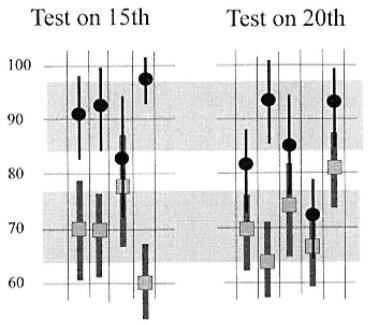
Figure 21 shows DDD data for operator BB on tests performed on the 15th and 20th. Actual plate data of the mean and variation for each plate are shown. The gray areas denote limits for C++ and C+ controls. On the 15th, there were two plates out of limits for C+, one above and one below, although the actual mean of all the means for C+ (as plotted on the SDC chart) was about 70%. Thus, this operator had two plates that should be rejected. Similarly, on the
Page 378
same date two of the C++ controls were outside limits. On the 20th, we see a similar situation with two plates giving control C+ outside limits and three giving C++ outside limits. The overall conclusion should be that there is unacceptable variation in the tests of operator BB and that several of the plates used in the tests should have been rejected (not included in the testing). The plotting of all data in DDD charts immediately highlights this situation.
The chart in Fig. 21 shows that the reverse trend for an operator can be seen, in which there is a reduction in expected PI values in comparison with other workers. The tests performed by one operator are not acceptable and since the test was performed as expected by another operator, it must be a factor of the failing operator that causes the problems with the assay.
7¡ª
Further Aid to Interpreting Charts
This section is intended to help the laboratory worker continuously interpret the charts as they are being plotted, i.e., as the "story" of the data unfolds. The rest of the kit's manual should be read first and the principles thoroughly understood. The intention here is to educate people in the ability to analyze charts to enable decisions to be made concerning day-to-day performance. The analysis infers that testing is being made over a significant time so that comparative results are obtained. This section uses "thumbnail" approaches at representing the different data that might be observed in practice. Analysis should lead to indications as to whether there is a need to take action and what actions are needed.
The advantages of charting data are that it can be viewed as a single entity and that trends and fluctuations can be rapidly observed through examination of SDC data and details at any time point can be expanded through examination of DDD data. This approach has already been explained. This section attempts to simplify likely scenarios in charts and indicate solutions where necessary based on observations.
7.1¡ª
Examination of SDC Charts: Individual Points as Plotted
Individual plots summarize all data on a given day and test and relate the results in actual time so that trends or irregularities can be noted on a continuous basis.
1.The plots reflect the mean value of any control and its variation in all the plates examined in a given day's testing.
2.The bar plotted shows the variation.
3.The mean value and the error bars should fall within the given limits for the assay for the various control samples both for actual OD values and for the processed PI% data.
Thus, the SDC plots can alert operators to unacceptable means and errors, causing them to examine closely the individual plate data for that test to exam-

Page 379
Fig. 22.
Illustration of mean values and error bars in SDC OD plots. Gray box shows the upper and lower limits for values (plus and minus 2 ¡Á SD) for the particular control sample examined.
ine what factors produced the variation (which affects the mean value and size of error bars).
Figure 22 illustrates the various situations that could be encountered:
1.Plot A shows the mean to be in limits and the error bar to be short and also within limits. This is ideal with reference to the sample tested.
2.Plot B shows the mean to be in limits but one error tail of the bar to be out of limits. The error is probably higher than acceptable. Reference to individual data for that day may reveal the reason; for example, a single plate control could have been missed or given an out-of-limit result, which both reduces the overall SDC mean plot and increases error.
3.Plot C shows the mean to be out of limits and most of the error bar too. Reference to individual plate data will probably reveal that most if the plates gave mean values that were too low and that readings differ greatly. This is unacceptable.
4.Plot D shows the mean value to be too low and out of limits but that the error is small, indicating little variation in results for all the plates used. This is unacceptable. The data must also be examined with reference to other controls to determine whether the low value was reflected in other data. The reduction, say, of both mean values for SDC of strong and weak positive might indicate a systemic (general error), e.g., too short an incubation time with substrate or a major general dilution error.
Page 380
7.2¡ª
Examination of SDC Cm, C++, and C+ over Time
The SDC plots cover both the actual OD and the processed PI% values. It is important that both types of plot be examined together. Thus, the charts should be placed in close proximity. This should immediately alert operators to unusual fluctuations from the expected values in both charts as well as deviations in one chart but not in the other. When the Cm OD values are within limits, it is expected that the control serum values for OD and hence PI% will be within limits. When the Cm OD values do start to increase or decrease significantly (approach limits), it is possible that "alterations" in OD value are not mirrored by a significant change in the control PI% plots. In other words, when Cm OD values are showing trends, as shown in Fig. 23, the control C++ and C+ PI% charts should be consulted to measure the effect of the OD changes on the PI% values.

As examples, the effect of a reducing OD value for 0% competition (maximum expected color from antigen binding to mAb [mAb control]) may (1) have no effect on the PI% results for the two control antisera, (2) affect both of these only when the OD falls below a certain level, or (3) only affect one control and not the other.
Figure 23 shows trends in time for SDC OD values for, say, the Cm, but would be pertinent to all plots of data for all controls. Basic large-scale trends are shown:
1.Situation A: This can be regarded as an ideal situation in which all means and error bars are within limits. The test values are constant, and it would not be expected that the test is altering in sensitivity.
2.Situation B: The curve is irregular with large swings in mean OD values throughout time. This reflects a good deal of variation probably owing to differences associated with particular operators (differences in variability).
3.Situation C: The curve is irregular but contains areas of similarity of means. This can often be ascribed to changes in operators performing assays and/or notable changes in reagents. This type of curve should be analyzed in terms of identifying whether there are such factors that can be associated with the data.
4.Situation D: There is a fairly constant downward trend (or could be upward) irrespective of operators and probably signifies that the reagents are altering in time. This is particularly indicated when several operators perform assays. The retitration of certain reagents may be necessary to ascertain whether the accepted limits can be achieved. This identification also includes the necessity to obtain fresh reagents.
7.3¡ª
Control C++ and C+ PI% Data
C++ and C+ controls examine the competitive ability of the control sera with respect to the maximum reactivity of the mAb and antigen. They control
Page 381

Fig. 23.
(A¨CD) SDC plots in time showing different trends. The trends are observed in real time. Action points represent points where the expected means fall outside limits set and where the error bars begin to fall outside the limits at the upper or lower values.
the test and can be used to assess the test's performance in terms of analytical sensitivity. The actual OD data are related to the PI% data through processing with respect to the Cm control data.
Attention to examination of both OD SDC Cm and PI% SDC for the C++ and C+ is essential as already indicated. Figure 24 summarizes what might be observed with respect to SDC OD data and PI% data in the charts. The arrows reflect the overall trend observed as shown in Fig. 23:
1.The horizontal arrow indicates within mean acceptable values (as in situation A in Fig. 23).
2.The downward-angled arrow indicates a trend downward in values (situation B in Fig. 23).
3.The upward-angled arrow indicates an upward trend in results (not shown).
Page 382
Fig. 24.
Possible relationship of trends in OD SDC Cm and PI% SDC C++ and C+. Boxes 2¨C3 show trends observed in SDC OD data in time for Cm. Boxes A¨CI indicate possibilities in trends of PE% date for each of the controls C++ and C+. Examination of OD and PE% SDC trends together gives a clue as to likely reasons for relationships. The gray boxes show
most likely effects on C++ and C+ for respective Cm OD trends.
Irregular data are not shown. In Fig. 24 the possibilities for SDC OD Cm data are represented by arrows (boxes 1¨C3), as well as all the possible, combinations of trends for the C++ and C+ PI% data. Figure 24 is meant to illustrate all combinations. The gray boxes represent the most likely combinations for SDC OD and PI% SDC data:
1. Box 1: The Cm OD values are within limits and constant. It is not expected that the C++ and C+ PI% values will be affected, and the expected trends in PI% are those indicated in box 1A. This situation is the one expected and mostly obtained. Box 1D shows a situation in which the C++ PI value is maintained but the C+ loses competing ability. This (increase in expected OD for C+) is a result of the control deteriorating and losing antibodies. The effect is not noted in the C++, probably because there is an excess of antibodies contained in the sample and the loss can be sustained without affecting the competing number of antibody molecules. Box 1E is also observed, but is more unusual, indicating that the C++ has lost antibody activity. This is most likely owing to poor storage of that sample. The other combinations are unlikely.