

The Elisa guidebook
.pdfPage 361
Fig. 10.
Illusrative chart for DDD plots of PI% C++ and C+ data.
Figure 7 shows data in the IQC Table 2. PI% results for two assay runs are shown. The two test days involved a single plate and four plates, respectively. The data required for SDC plots are shown in the thick lined boxes (overall mean and SD of results for all the plates run on that day). The data for the DDD charts (individual plate data) are also shown.
3¡ª
Controlling the Assay Using Graphs: Plotting the Data
We make use of the fact that the same control sera are set up on each plate. We can examine differences in results among plates to keep a check on the test performance. Two kinds of data are available, as already indicated (1) actual OD readings, and (2) PI% values calculated by the software and used to assess samples.
Remember that a convenient method of viewing data is to plot values on a chart. This can be examined easily and can give a view of the data over a time period. Two kinds of charts are recommended for quality control.

Page 362
Fig. 11.
Illustrative enlargement of chart for
DDDplots of C++ and C+ PI% data.
1.A chart that keeps the actual data for various test parameters for each plate used. This is called a DDD.
2.A chart that summarizes data for any particular tests done on a given day. This is called an SDC.
Page 363

Fig. 12.
Illustrative DDD chart for longer-term plots of several tests of Cm OD data.
3.1¡ª
Daily Detailed Data Charts
DDDs plot the OD data on the control Cm samples for each plate and the %PI values for other controls. Three charts are needed to cover all controls:
1.Cm: OD mean and SD.
2.C++ and C+: PI% mean and SD.
3.C¨C and Cc: PI% mean and SD.
3.1.1¡ª Examples
Table 3 shows data from a test. Let us take the data of a plate read out as shown in Table 3:
Cm data |
0.685 |
0.673 |
0.636 |
0.641 |
Calculate the Cm mean and SD of this data: mean = 0.659; SD = 0.024. Calculate the mean and SD for PI values given for C++, C+, C¨C, and Cc (see Table 4).

Page 364
Fig. 13.
Illustrative DDD chart for plots of C++ and C+ PI% data.
Multiply the SD by 2 and make a complete table as shown in IQC Tables 1 and 2 (see Table 5). The calculation of SD gives information about the variation observed in the data and is important in assessing confidence about the calculated mean.
3.2¡ª
Plotting on DDD Charts
Note that we may have run more than one plate on any given day. The DDD charts examine data from all plates run so that reference to each plate can be made. Let us assume that we have run five plates on one day. The data in Table 6 are an example of what might be expected from the five plates. The parentheses show the value of 2 ¡Á the SD for each point. Thus, for each plate the actual Cm values are noted and the PI values for each of the controls along with the SDs, are calculated. Now the data can be plotted.
3.3¡ª
DDD Chart Design
Figure 8 shows designs for plotting Cm OD. Figure 9 shows an enlargement of an area with data plotted. Figure 10 shows a design for a DDD control

Page 365
Fig. 14.
Illustrative SDC chart for plots of C++ and C+ PI% data.
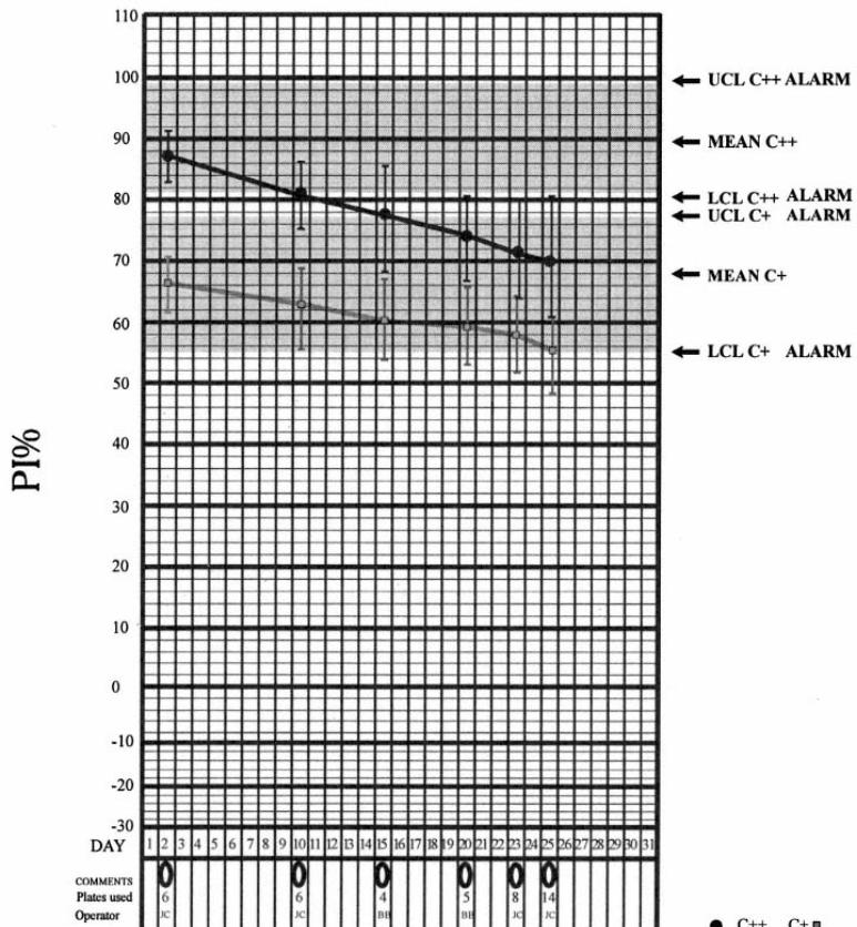
chart for PI% values. Figure 11 illustrates an enlarged plot of data. Note that (1) the charts should be updated every time a test is made by each operator, and (2) the charts should be displayed preferably near where tests are made.
In Fig. 8, the y-axis shows OD units. The x-axis contains columns, each one representing the data from a single plate. This chart is for plotting OD data from the Cm control. The expected mean of the Cm (given in the kit manual) and the allowed variation from the mean values are shown in the gray areas. This represents 1, 2, and 3 SD from the mean. The test values obtained on a
Page 366

Fig. 15.
Illustrative SDC chart of C++ and C+ PI% data showing downward trend.
plate should be within the ¡À2 ¡Á SD, preferably as close to the indicated mean as possible. The ACTION notice at ¡À3 ¡Á SD from expected mean indicates that results are at too great a variance from the expected mean and that the test parameters should be examined. UCL and LCL are ALARM points representing the mean ¡À3 ¡Á SD values.
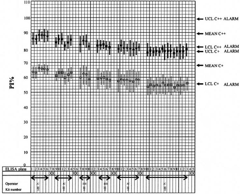
Figure 9 shows an enlarged graph of the DDD chart with Cm data plotted. The data from the five plates examined above are plotted as mean and ¡À2 ¡Á SD from the mean Cm OD values. Note that the operator is indicated in the lower
Page 367
Fig. 16.
Illustrative DDD chart for Cm OD values showing downward trend.
left-hand corner. This is important when tracing any problems (identifying specific problems to particular operators). Note also that this space should be used to indicate the date (to identify when the test was made). Similar considerations are shown in Figs. 10 and 11, in which the PI% values are shown. The limit values are also shown.
4¡ª
Summary Data Charts (SDC)
The DDD charts are plotted as an accurate reference of the test performance on each plate. The assessment of the whole test performed on a day-to-day, week-to-week, month-to-month, and year-to-year basis is examined by plotting data on SDC charts.
The SDC charts differ fundamentally from the DDD charts in that the data plotted represent the mean and variation from all plates used in an assay treated as a group. Thus, if only 1 plate is used on a particular day, then the data are used to plot the SDC chart points for that day. If 5 plates are used, then these will be used to obtain the SDC data for that day. If 35 plates are used, they will
Page 368
Fig. 17.
Illustrative DDD chart for C++ and C+ PI% data showing downward trend.
collectively give the SDC chart data for that day. If two series of tests are made on the same day, representing 5 and 6 plates, respectively, then the data from all 11 plates are processed to give the SDC data.
4.1¡ª
Data Processing for SDC Charts

Printouts from software packages or by-hand calculations give the PI% values for the various control sera used for each plate. Thus, we have PI% values for Cm, C++, C+, C¨C, and Cc. The SDC data are obtained by taking all the given mean values for any of the control sera and calculating the mean and SD of that data. The Cm OD data are also plotted on an SDC. The mean of all the Cm values for a set of plates is calculated and the SD from this mean is plotted.
4.1.1¡ª Example
We may have made a test on five plates. The mean PI% values on each plate are as given in Table 7. Calculate the mean and SD for each column (see Table 8).
Page 369
Fig. 18.
Illustrative DDD chart for C++ and C+ PI% data showing upward trand for C+ and constant acceptable limits for C++.
4.2¡ª Plotting Data

The values shown in Table 8 are plotted on the SDC charts. As with the DDD, the plotting is split into different charts to cover the controls. The main idea here is to plot the summary data in real time.
The charts each have 31 d, so that the actual day in the month when the test is performed can be plotted:
1.Plot Cm data on one chart as summary OD values.
2.Plot C++ and C+ data on one chart as summary PI% values.
3.Plot Cc and C¨C data on one chart as summary PI% values.
The data are plotted on a calendar chart that measures the exact date when tests are performed. These data are first plotted on the example charts as shown. Each chart can plot data from d 1 of any particular month.
Page 370
Fig. 19.
Illustrative SDC chart for C++ and C+ PI% data showing effect of different operators.
5¡ª
Interpretation of Charts