

II Reading
Exercise 6. Read and translate the text A:
Text a Color theory
|
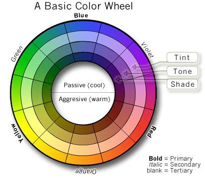
Color theory was originally formulated in terms of three "primary" or "primitive" colors—red, yellow and blue (RYB)—because these colors were believed capable of mixing all other colors. This color mixing behavior had long been known to printers, dyers and painters.
The foundations of pre-20th-century color theory were built around "pure" or ideal colors, characterized by sensory experiences rather than attributes of the physical world. This has led to a number of inaccuracies in traditional color theory principles that are not always remedied in modern formulations.
The most important problem has been confusion between the behavior of light mixtures, called additive color, and the behavior of paint or ink or dye or pigment mixtures, called subtractive color. This problem arises because the absorption of light by material substances follows different rules from the perception of light by the eye.
A second problem has been the failure to describe the very important effects of strong luminance (lightness) contrasts in the appearance of colors reflected from a surface (such as paints or inks) as opposed to colors of light; "colors" such as browns or ochre cannot appear in mixtures of light. Thus, a strong lightness contrast between a mid-valued yellow paint and a surrounding bright white makes the yellow appear to be green or brown, while a strong brightness contrast between a rainbow and the surrounding sky makes the yellow in a rainbow appear to be a fainter yellow, or white.
A third problem has been the tendency to describe color effects holistically or categorically, for example as a contrast between "yellow" and "blue" conceived as generic colors, when most color effects are due to contrasts on three relative attributes that define all colors:
lightness (light vs. dark, or white vs. black),
saturation (intense vs. dull),
hue (e.g., red, orange, yellow, green, blue or purple).
Thus, the visual impact of "yellow" vs. "blue" hues in visual design depends on the relative lightness and intensity of the hues.
These confusions are partly historical, and arose in scientific uncertainty about color perception that was not resolved until the late 19th century, when the artistic notions were already entrenched.
Many historical "color theorists" have assumed that three "pure" primary colors can mix all possible colors, and that any failure of specific paints or inks to match this ideal performance is due to the impurity or imperfection of the colorants. In reality, only imaginary "primary colors" used in colorimetry can "mix" or quantify all visible colors; but to do this, these imaginary primaries are defined as lying outside the range of visible colors; i.e., they cannot be seen. Any three real "primary" colors of light, paint or ink can mix only a limited range of colors, called a gamut, which is always smaller (contains fewer colors) than the full range of colors humans can perceive.