


Chapter
13 Spatial analysis
13.0 Spatial patterns
|
The analysis of spatial patterns is of prime interest to ecologists because most |
|
ecological phenomena investigated by sampling geographic space are structured by |
|
forces that have spatial components. Spatial patterns are studied through surveys |
Experiment |
(called mensurative experiments by Hurlbert, 1984), whereas underlying processes can |
|
be studied by manipulative experiments (Subsection 10.2.3). Ecological processes may |
|
give rise to spatially recognizable structures which may display spatial patterns and be |
|
the subject of spatial analysis. Most ecological patterns may be described as either |
Gradient |
patches (such as tree groves, phytoplankton patches, and animal herds) or gradients. |
Patch |
The latter may be linear or not. |
|
Ecologists examine the spatial patterns of species or assemblages in order to |
|
understand the mechanisms that control species distributions. Patchiness is found at all |
|
spatial scales — from micrometres to continent and ocean-wide scales. Displaying the |
|
spatial variation of an ecological variable in the form of a map shows whether the |
|
structure is smoothly continuous or marked by sharp discontinuities. Most field studies |
|
cover only a part of any variable’s spatial structure. So, gradients or patches displayed |
|
by maps may only be interpreted with respect to the scale of the sampling programme, |
|
which should be compared to the scale of the phenomenon under study. |
|
It is now understood that species distributions result from the combined action of |
|
several forces, some of which are external whereas others are intrinsic to the |
|
community. According to the environmental control model (Whittaker, 1956; Bray & |
|
Curtis, 1957; Hutchinson, 1957), environmental characteristics are the external forces |
|
which control species distributions. The internal forces relate to population dynamics |
|
or to top-down or bottom-up biotic interactions within the community (Lindeman, |
|
1942; Southwood, 1987). Both types of forces generate spatial patterns within species |
Historical |
or communities. Historical events (Sousa, 1979; Pickett & White, 1985; Reynolds, |
events |
1987) are other possible sources of spatial patterns; examples are given in |
|
Subsection 13.5.2. The mechanisms that create spatial structures and, hence, |
|
autocorrelation in the data, have been briefly discussed in Section 1.1. |


 Grain size
Spatial patterns |
709 |
|
|
occur in a variety of circumstances where a map is divided into contiguous “picture Pixel cells” or pixels, which include satellite data, video analysis of a transect, and modelling. The linear measurement of grain size is equal to the sampling interval in
such a case. The same thing may happen with time series.
The spatial scale of patterns or processes is described as follows:
•How big is a unit object, or how much space is disturbed by a unit process? This amount of space, which is equivalent to grain size, is called the ecological neighbourhood (Addicott et al., 1987) or the area of resolution of individuals (Wiens, 1989). Unit objects may be individual plants or animals, bacterial colonies, etc. Examples of measurable structures resulting from unit processes are: the neighbourhood occupied by a territorial animal, the width of the wetland zone along a stream or of a tidal sand flat, the size of the patch of soil modified by the root system of a plant, and the size of phytoplankton patches which result from the combined action of primary production and diffusion (see Ecological applications 3.2d and 3.3a).
•What is the average distance between unit objects or processes? This distance is equivalent to the sampling interval.
•Over how much space does this type of object, or this process, occur? This amount of space is equivalent to the extent. For some processes, the extent may be an ocean or the whole planet.
The same notions may be applied to temporally occurring patterns or processes. While they are readily applicable to patterns that concern the distribution of objects, they may sometimes be applied as well to processes.
Sampling The scale of the sampling design should follow from what is known (e.g. from a design pilot study) about the scale of the pattern or process, and from the ecological question being addressed. A well-focused question generally reduces the difficulty of choosing the type (simple random, systematic, stratified, etc.) as well as the scale components
(grain, interval, extent) of the sampling design.
•The sampling grain should be larger than a unit object (e.g. an individual organism) and the same as, or preferably smaller than, the structures resulting from a unit process (e.g. a patch) which is to be detected by the sampling design.
•The sampling interval should be smaller than the average distance between the structures resulting from a unit process to be detected by the sampling design.
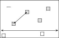
•The sampling extent may, in some cases, be the same as the total area covered by the type of objects or by the process under study. In other cases, it is limited to a smaller area, determined by the total allowable effort (n) and the maximum interval that one wishes to maintain between adjacent sampling units. For constant n, the sampling extent can be maximized by turning the sampling area into a transect (see Ecological application 13.1b).


Structure functions |
717 |
|
|
Readers who are familiar with correlograms in time series analysis will be reassured to know that, when a problem involves equispaced observations along a single physical dimension, as in Fig. 13.3, calculating Moran’s I for the different distance classes is nearly the same as computing the autocorrelation coefficient of time series analysis (Fig. 12.5, eq. 12.6); a small numeric difference results from the divisions by (n – k – 1) and (n – 1), respectively, in the numerator and denominator of eq. 12.6, whereas division is by (n – k ) and (n ), respectively, in the numerator and denominator of Moran’s I formula (eq. 13.1).
Geary’s c coefficient is a distance-type function; it varies from 0 to some unspecified value larger than 1. Its numerator sums the squared differences between values found at the various pairs of sites being compared. A Geary’s c correlogram varies as the reverse of a Moran’s I correlogram; strong autocorrelation produces high values of I and low values of c (Fig. 13.3). Positive autocorrelation translates in values of c between 0 and 1 whereas negative autocorrelation produces values larger than 1. Hence, the reference ‘no correlation’ value is c = 1 in Geary’s correlograms.
For sites lying on a surface or in a volume, geographic distances do not naturally fall into a small number of values; this is true for regular grids as well as random or other forms of irregular sampling designs. Distance values must be grouped into distance classes; in this way, each spatial autocorrelation coefficient can be computed using several comparisons of sampling sites.
Numerical example. In Fig. 13.4 (artificial data), 10 sites have been located at random into a 1-km2 sampling area. Euclidean (geographic) distances were computed among sites. The number of classes is arbitrary and left to the user’s decision. A compromise has to be made between resolution of the correlogram (more resolution when there are more, narrower classes) and power of the test (more power when there are more pairs in a distance class). Sturge’s rule is often used to decide about the number of classes in histograms; it was used here and gave:
Number of classes = 1 + 3.3log10(m) = 1 + 3.3log10(45) = 6.46 |
(13.3) |
where m is, in the present case, the number of distances in the upper (or lower) triangular matrix; the number was rounded to the nearest integer (i.e. 6). The distance matrix was thus recoded into 6 classes, ascribing the class number (1 to 6) to all distances within a class of the histogram.
An alternative to distance classes with equal widths would be to create distance classes containing the same number of pairs (notwithstanding tied values); distance classes formed in this way are of unequal widths. The advantage is that the tests of significance have the same power across all distance classes because they are based upon the same number of pairs of observations. The disadvantages are that limits of the distance classes are more difficult to find and correlograms are harder to draw.
Spatial autocorrelation coefficients can be tested for significance and confidence intervals can be computed. With proper correction for multiple testing, one can determine whether a significant spatial structure is present in the data and what are the distance classes showing significant positive or negative autocorrelation. Tests of significance require, however, that certain conditions specified below be fulfilled.
Structure functions |
719 |
|
|
a region which is half plain and half mountains; such a region should be divided in two subregions in which the variable “altitude” could be modelled by separate autocorrelation functions. This condition must always be met when variograms or correlograms (including multivariate Mantel correlograms) are computed, even for descriptive purpose.
Cliff & Ord (1981) describe how to compute confidence intervals and test the significance of spatial autocorrelation coefficients. For any normally distributed statistic Stat, a confidence interval at significance level α is obtained as follows:
Pr (Stat – zα ⁄ 2 Var (Stat) < Stat < Stat + zα ⁄ 2 Var (Stat) ) = 1 – α |
(13.4) |
For significance testing with large samples, a one-tailed critical value Statα at significance level α is obtained as follows:
Statα = zα Var (Stat) + Expected value of Stat under H0 |
(13.5) |
It is possible to use this approach because both I and c are asymptotically normally distributed for data sets of moderate to large sizes (Cliff & Ord, 1981). Values zα/2 or zα are found in a table of standard normal deviates. Under the hypothesis (H0) of random spatial distribution of the observed values yi , the expected values (E) of Moran’s I and Geary’s c are:
E(I) = –(n – 1)–1 and E(c) = 1 |
(13.6) |
Under the null hypothesis, the expected value of Moran’s I approaches 0 as n increases. The variances are computed as follows under a randomization assumption, which simply states that, under H0, the observations yi are independent of their positions in space and, thus, are exchangeable:
Var ( I) |
= E ( I2) |
– [ E ( I) ] 2 |
|
(13.7) |
Var ( I) |
n [ ( n2 |
– 3n + 3) S1 – nS2 + 3W2] – b2 [ ( n2 – n) S1 – 2nS2 + 6W2] |
– |
1 |
= ------------------ |
---------------------------------(---n----–-----1---)----(---n----–-----2---)----(---n-----–----3---)----W-----2--------------------------------------------------- |
- ( - --n-----–----1---)----2 |
||
|
|
|
||
Var ( c) |
( n – 1) S1 [ n2 – 3n + 3 – ( n – 1) b2] |
|
(13.8) |
|
= ----------------- |
----n----(---n----–-----2---)----(---n----–-----3---)---W------2--------------------- |
|
||
|
|
|
|
|
– 0.25 ( n – 1) S2 [ n2 + 3n – 6 – ( n2 – n + 2) b2] + W2 [ n2 – 3 + ( – ( n – 1) 2) b2] + ----------------------------------------------------------------------------------------------------------------------------------------------------------------------------------------------------
n ( n – 2) ( n – 3) W2
720 |
|
|
|
|
|
|
|
|
|
|
|
Spatial analysis |
||
|
|
|
|
|
|
|
|
|
||||||
In these equations, |
|
|
|
|
|
|
|
|
||||||
|
|
|
1 |
n |
n |
|
|
|
|
|
2 |
|
|
|
• |
S1 |
= |
2 |
∑ ∑ |
(whi |
+ wih) (there is a term of this sum for each cell of matrix W); |
||||||||
-- |
|
|
|
|||||||||||
|
|
|
|
h = 1 i = 1 |
|
|
|
|
|
|
|
|
||
|
|
|
|
n |
|
|
|
|
|
|
|
|
|
|
• S2 |
= |
∑ (wi+ |
+ w+i) 2 |
|
where wi+ and w+i are respectively the sums of row i and |
|||||||||
|
|
|
i = 1 |
|
|
|
|
|
column i of matrix W; |
|||||
|
|
|
|
n |
|
|
|
|
|
n |
|
|
|
2 |
• |
b2 = n ∑ ( yi |
– y) 4 ⁄ |
|
∑ |
( yi – y) 2 |
|
measures the kurtosis of the distribution; |
|||||||
|
|
|
|
i = 1 |
|
|
|
|
|
i = 1 |
|
|
|
|
|
|
|
|
|
|
|
|
|
|
|
|
|
||
• W is as defined in eqs. 13.1 and 13.2.
In most cases in ecology, tests of spatial autocorrelation are one-tailed because the sign of autocorrelation is stated in the ecological hypothesis; for instance, contagious biological processes such as growth, reproduction, and dispersal, all suggest that ecological variables are positively autocorrelated at short distances. To carry out an approximate test of significance, select a value of α (e.g. α = 0.05) and find zα in a table of the standard normal distribution (e.g. z0.05 = +1.6452). Critical values are found as in eq. 13.5, with a correction factor that becomes important when n is small:
• Iα = zα |
Var ( I) –kα (n – 1) –1 in all cases, using the value in the upper tail of the z |
distribution |
when testing for positive autocorrelation (e.g. z0.05 = +1.6452) and the |
value in the lower tail in the opposite case (e.g. z0.05 = –1.6452). |
|
• cα = zα |
Var (c) + 1 when c < 1 (positive autocorrelation), using the value in the |
lower tail of the z distribution (e.g. z0.05 = –1.6452). |
|
• cα = zα |
Var (c) + 1–kα (n – 1) –1 when c > 1 (negative autocorrelation), using |
the value in the upper tail of the z distribution (e.g. z0.05 = +1.6452).
The value taken by the correction factor kα depends on the values of n and W. If
4 (n – n) < W ≤ 4 (2n – 3 n + 1) , then kα = 10α ; otherwise, kα = 1. If the test is two-tailed, use α* = α/2 to find zα* and kα* before computing critical values. These
corrections are based upon simulations reported by Cliff & Ord (1981, section 2.5).
Other formulas are found in Cliff & Ord (1981) for conducting a test under the assumption of normality, where one assumes that the yi’s result from n independent draws from a normal population. When n is very small, tests of I and c should be conducted by randomization (Section 1.2).
Moran’s I and Geary’s c are sensitive to extreme values and, in general, to asymmetry in the data distributions, as are the related Pearson’s r and Euclidean distance coefficients. Asymmetry increases the variance of the data. It also increases the kurtosis and hence the variance of the I and c coefficients (eqs. 13.7 and 13.8); this
724 |
Spatial analysis |
|
|
|
significant positive and negative values along the correlograms. The first spatial autocorrelation |
|
coefficient, which is above 0 in Moran’s correlogram and below 1 in Geary’s, indicates positive |
|
spatial autocorrelation in the first distance class; the first class contains the 420 pairs of points |
|
that are at distance 1 of each other on the grid (i.e. the first neighbours in the N-S or E-W |
|
directions of the map). Positive and significant spatial autocorrelation in the first distance class |
|
confirms that the distance between first neighbours is smaller than the patch size; if the distance |
|
between first neighbours in this example was larger than the patch size, first neighbours would |
|
be dissimilar in values and autocorrelation would be negative for the first distance class. The |
|
next peaking positive autocorrelation value (which is smaller than 1 in Geary’s correlogram) |
|
occurs at distance class 5, which includes distances from 4.95 to 6.19 in grid units; this |
|
corresponds to positive autocorrelation between points located at similar positions on |
|
neighbouring bumps, or neighbouring troughs; distances between successive peaks are 5 grid |
|
units in the E-W or N-S directions. The next peaking positive autocorrelation value occurs at |
|
distance class 9 (distances from 9.90 to 11.14 in grid units); it includes value 10, which is the |
|
distance between second-neighbour bumps in the N-S and E-W directions. Peaking negative |
|
autocorrelation values (which are larger than 1 in Geary’s correlogram) are interpreted in a |
|
similar way. The first such value occurs at distance class 3 (distances from 2.48 to 3.71 in grid |
|
units); it includes value 2.5, which is the distance between peaks and troughs in the N-S and E- |
|
W directions on the map. If the bumps were unevenly spaced, the correlograms would be similar |
|
for the small distance classes, but there would be no other significant values afterwards. |
|
The main problem with all-directional correlograms is that the diagonal comparisons are |
|
included in the same calculations as the N-S and E-W comparisons. As distances become larger, |
|
diagonal comparisons between, say, points located near the top of the nine bumps tend to fall in |
|
different distance classes than comparable N-S or E-W comparisons. This blurs the signal and |
|
makes the spatial autocorrelation coefficients for larger distance classes less significant and |
|
interpretable. |
|
• Wave (Fig. 13.5b) — Each crest was generated as a normal curve. Crests were separated by |
|
five grid units; the surface was constructed in this way to make it comparable to Fig. 13.5a. The |
|
correlograms are nearly indistinguishable from those of the nine bumps. All-directional |
|
correlograms alone cannot tell apart regular bumps from regular waves; directional |
|
correlograms or maps are required. |
|
• Single bump (Fig. 13.5c) — One of the normal curves of Fig. 13.5a was plotted alone at the |
|
centre of the study area. Significant negative autocorrelation, which reaches distance classes 6 or |
|
7, delimits the extent of the “range of influence” of this single bump, which covers half the study |
|
area. It is not limited here by the rise of adjacent bumps, as this was the case in (a). |
|
• Linear gradient (Fig. 13.5d) — The correlogram is monotonic decreasing. Nearly all |
|
autocorrelation values in the correlograms are significant. |
True, false |
There are actually two kinds of gradients (Legendre, 1993). “True gradients”, on the one |
gradient |
hand, are deterministic structures. They correspond to generating model 2 of Subsection 1.1.1 |
|
(eq. 1.2) and can be modelled using trend-surface analysis (Subsection 13.2.1). The observed |
|
values have independent error terms, i.e. error terms which are not autocorrelated. “False |
|
gradients”, on the other hand, are structures that may look like gradients, but actually correspond |
|
to autocorrelation generated by some spatial process (model 1 of Subsection 1.1.1; eq. 1.1). |
|
When the sampling area is small relative to the range of influence of the generating process, the |
|
data generated by such a process may look like a gradient. |
Structure functions |
725 |
|
|
In the case of “true gradients”, spatial autocorrelation coefficients should not be tested for significance because the condition of second-order stationarity is not satisfied (definition in previous Subsection); the expected value of the mean is not the same over the whole study area. In the case of “false gradients”, however, tests of significance are warranted. For descriptive purposes, correlograms may still be computed for “true gradients” (without tests of significance) because the intrinsic assumption is satisfied. One may also choose to extract a “true gradient” using trend-surface analysis, compute residuals, and look for spatial autocorrelation among the residuals. This is equivalent to trend extraction prior to time series analysis (Section 12.2).
How does one know whether a gradient is “true” or “false”? This is a moot point. When the process generating the observed structure is known, one may decide whether it is likely to have generated spatial autocorrelation in the observed data, or not. Otherwise, one may empirically look at the target population of the study. In the case of a spatial study, this is the population of potential sites in the larger area into which the study area is embedded, the study area representing the statistical population about which inference can be made. Even from sparse or indirect data, a researcher may form an opinion as to whether the observed gradient is deterministic (“true gradient”) or is part of a landscape displaying autocorrelation at broader spatial scale (“false gradient”).
•Step (Fig. 13.5e) — A step between two flat surfaces is enough to produce a correlogram which is indistinguishable, for all practical purposes, from that of a gradient. Correlograms alone cannot tell apart regular gradients from steps; maps are required. As in the case of gradients, there are “true steps” (deterministic) and “false steps” (resulting from an autocorrelated process), although the latter is rare. The presence of a sharp discontinuity in a surface generally indicates that the two parts should be subjected to separate analyses. The methods of boundary detection and constrained clustering (Section 13.3) may help detect such discontinuities and delimit homogeneous areas prior to spatial autocorrelation analysis.
•Random values (Fig. 13.5h) — Random numbers, drawn from a standard normal distribution, were generated for each point of the grid and used as the variable to be analysed. Random data are said to represent a “pure nugget effect” in geostatistics. The autocorrelation coefficients were small and non-significant at the 5% level. Only the Geary correlogram is presented.
Sokal (1979) and Cliff & Ord (1981) describe, in general terms, where to expect significant values in correlograms, for some spatial structures such as gradients and large or small patches. Their summary tables are in agreement with the test examples above. The absence of significant coefficients in a correlogram must be interpreted with caution, however:
• It may indicate that the surface under study is free of spatial autocorrelation at the study scale. Beware: this conclusion is subject to type II (or β) error. Type II error depends on the power of the test which is a function of (1) the α significance level,
(2)the size of effect (i.e. the minimum amount of autocorrelation) one wants to detect,
(3)the number of observations (n), and (4) the variance of the sample (Cohen, 1988):
Power = (1 – β) = f(α, size of effect, n, sx )
Is the test powerful enough to warrant such a conclusion? Are there enough observations to reach significance? The easiest way to increase the power of a test, for a given variable and fixed α, is to increase n.
726 |
Spatial analysis |
|
|
• It may indicate that the sampling design is inadequate to detect the spatial autocorrelation that may exist in the system. Are the grain size, extent and sampling interval (Section 13.0) adequate to detect the type of autocorrelation one can hypothesize from knowledge about the biological or ecological process under study?
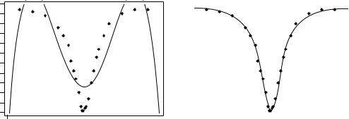
Ecologists can often formulate hypotheses about the mechanism or process that may have generated a spatial phenomenon and deduct the shape that the resulting surface should have. When the model specifies a value for each geographic position (e.g. a spatial gradient), data and model can be compared by correlation analysis. In other instances, the biological or ecological model only specifies process generating the spatial autocorrelation, not the exact geographic position of each resulting value. Correlograms may be used to support or reject the biological or ecological hypothesis. As in the examples of Fig. 13.5, one can construct an artificial model-surface corresponding to the hypothesis, compute a correlogram of that surface, and compare the correlograms of the real and model data. For instance, Sokal et al. (1997a) generated data corresponding to several gene dispersion mechanisms in populations and showed the kind of spatial correlogram that may be expected from each model. Another application concerning phylogenetic patterns of human evolution in Eurasia and Africa (space-time model) is found in Sokal et al. (1997b).
Bjørnstad & Falck (1997) and Bjørnstad et al. (1998) proposed a spline correlogram which provides a continuous and model-free function for the spatial covariance. The spline correlogram may be seen as a modification of the nonparametric covariance function of Hall and co-workers (Hall & Patil, 1994; Hall et al., 1994). A bootstrap algorithm estimates the confidence envelope of the entire correlogram or derived statistics. This method allows the statistical testing of the similarity between correlograms of real and simulated (i.e. model) data.
Ecological application 13.1a
During a study of the factors potentially responsible for the choice of settling sites of Balanus crenatus larvae (Cirripedia) in the St. Lawrence Estuary (Hudon et al., 1983), plates of artificial substrate (plastic laminate) were subjected to colonization in the infralittoral zone. Plates were positioned vertically, parallel to one another. A picture was taken of one of the plates after a 3- month immersion at a depth of 5 m below low tide, during the summer 1978. The picture was divided into a (10 15) grid, for a total of 150 pixels of 1.7 1.7 cm. Barnacles were counted by C. Hudon and P. Legendre for the present Ecological application (Fig. 13.6a; unpublished in op. cit.). The hypothesis to be tested is that barnacles have a patchy distribution. Barnacles are gregarious animals; their larvae are chemically attracted to settling sites by arthropodine secreted by settled adults (Gabbott & Larman, 1971).
A gradient in larval concentration was expected in the top-to-bottom direction of the plate because of the known negative phototropism of barnacle larvae at the time of settlement (Visscher, 1928). Some kind of border effect was also expected because access to the centre of the plates located in the middle of the pack was more limited than to the fringe. These largescale effects create violations to the condition of second-order stationarity. A trend-surface equation (Subsection 13.2.1) was computed to account for it, using only the Y coordinate (top-
|
|
|
|
|
|
|
|
Structure functions |
|
|
|
|
|
|
729 |
|||
|
|
8 |
|
|
|
|
|
|
|
|
|
|
|
|
|
|
|
|
|
) |
7 |
|
|
|
|
|
|
|
|
|
|
|
|
|
|
|
|
|
|
|
|
|
|
|
|
|
|
|
|
|
|
|
|
|
|
|
|
γ(d |
6 |
|
|
|
|
|
|
|
|
|
|
|
|
|
|
|
|
|
variance-Semi |
5 |
|
|
|
|
|
|
|
|
|
|
C1 |
|
|
|
|
|
|
|
|
|
|
|
|
|
|
|
|
|
|
|
|
|
|
||
|
|
4 |
|
|
|
|
|
|
|
|
|
|
|
|
|
|
|
|
|
|
|
|
|
|
|
|
|
|
|
|
|
|
|
|
|
|
|
|
|
3 |
|
|
|
|
|
|
|
|
|
|
|
Sill (C) |
|
|
||
|
|
2 |
|
|
|
Range (a) |
|
|
|
|
C0 |
|
|
|
|
|
||
|
|
1 |
|
|
|
|
|
|
|
|
|
|
|
|
||||
|
|
|
|
|
|
|
|
|
|
|
|
|
|
|
|
|
|
|
|
|
0 |
|
|
|
|
|
|
|
|
|
|
|
|
|
|
|
|
|
|
|
0 |
1 |
2 |
3 |
4 |
5 |
6 |
7 |
8 |
9 |
10 |
11 |
12 |
13 |
14 |
15 |
|
|
|
|
|
|
|
|
|
|
Distance |
|
|
|
|
|
|
|
|
Figure 13.7 |
Spherical |
variogram |
model showing characteristic features: nugget effect |
(C0 = 2 |
in |
this |
||||||||||||
|
example), spatially structured component (C1 = 4), sill (C = C0 + C1 = 6), and range (a = 8). |
|||||||||||||||||
Both of these expressions mean that pairs of values are selected to be at distance d of each other; there are W(d) such pairs for any given distance class d. The condition dhi ≈ d means that distances may be grouped into distance classes, placing in class d the individual distances dhi that are approximately equal to d. In directional variograms (below), d is a directional measure of distance, i.e. taken in a specified direction only. The semi-variance function is often called the variogram in the geostatistical literature. When computing a variogram, one assumes that the autocorrelation function applies to the entire surface under study (intrinsic hypothesis, Subsection 13.1.1).
Generally, variograms tend to level off at a sill which is equal to the variance of the variable (Fig. 13.7); the presence of a sill implies that the data are second-order stationary. The distance at which the variance levels off is referred to as the range (parameter a); beyond that distance, the sampling units are not spatially correlated. The discontinuity at the origin (non–zero intercept) is called the nugget effect; the geostatistical origin of the method transpires in that name. It corresponds to the local variation occurring at scales finer than the sampling interval, such as sampling error, fine-scale spatial variability, and measurement error. The nugget effect is represented by the error term εij in spatial structure model 1b of Subsection 1.1.1. It describes a portion of variation which is not autocorrelated, or is autocorrelated at a scale finer than can be detected by the sampling design. The parameter for the nugget effect is C0 and the spatially structured component is represented by C1; the sill, C, is equal to
C0 + C1. The relative nugget effect is C0/(C0 + C1).
|
|
Structure functions |
731 |
|
|
|
|
|
|
|
• Linear model: γ (d) |
= C0 + bd |
where b is the slope of the variogram model. A |
|
|
linear model with sill is obtained by adding the specification: γ (d) |
= C if d ≥ a. |
||
|
• Pure nugget effect model: γ (d) |
= C0 if d > 0; γ (d) = 0 if d = 0. The second part |
||
|
applies to a point estimate. In practice, observations have the size of the sampling grain |
|||
|
(Section 13.0); the error at that scale is always larger than 0. |
|
||
|
Other less-frequently encountered models are described in geostatistics textbooks. A |
|||
|
model is usually chosen on the basis of the known or assumed process having |
|||
|
generated the spatial structure. Several models may be added up to fit any particular |
|||
|
sample variogram. Parameters are fitted by weighted least squares; the weights are |
|||
|
function of the distance and the number of pairs in each distance class (Cressie, 1991). |
|||
Anisotropy |
As mentioned at the beginning of Subsection 2, anisotropy is present in data when |
|||
|
the autocorrelation function is not the same for all geographic directions considered |
|||
|
(David, 1977; Isaaks & Srivastava, 1989). In geometric anisotropy, the variation to be |
|||
|
expected between two sites distant by d in one direction is equivalent to the variation |
|||
|
expected between two sites distant by b d in another direction. The range of the |
|||
|
variogram changes with direction while the sill remains constant. In a river for |
|||
|
instance, the kind of variation expected in phytoplankton concentration between two |
|||
|
sites 5 m apart across the current may be the same as the variation expected between |
|||
|
two sites 50 m apart along the current even though the variation can be modelled by |
|||
|
spherical variograms with the same sill in the two directions. Constant b is called the |
|||
|
anisotropy ratio (b = 50/5 = 10 in the river example). This is equivalent to a change in |
|||
|
distance units along one of the axes. The anisotropy ratio may be represented by an |
|||
|
ellipse or a more complex figure on a map, its axes being proportional to the variation |
|||
|
expected in each direction. In zonal anisotropy, the sill of the variogram changes with |
|||
|
direction while the range remains constant. An extreme case is offered by a strip of |
|||
|
land. If the long axis of the strip is oriented in the direction of a major environmental |
|||
|
gradient, the variogram may correspond to a linear model (always increasing) or to a |
|||
|
spherical model with a sill larger than the nugget effect, whereas the variogram in the |
|||
|
direction perpendicular to it may show only random variation without spatial structure |
|||
|
with a sill equal to the nugget effect. |
|
||
|
Directional variograms and correlograms may be used to determine whether |
|||
Directional |
anisotropy (defined in Subsection 2) is present in the data; they may also be used to |
|||
variogram |
describe anisotropic |
surfaces |
or to account for anisotropy in kriging |
|
and |
(Subsection 13.2.2). A direction of space is chosen (i.e. an angle θ, usually by |
|||
correlogram |
reference to the geographic north) and a search is launched for the pairs of points that |
|||
|
are within a given distance class d in that direction. There may be few such pairs |
|||
|
perfectly aligned in the aiming direction, or none at all, especially when the observed |
|||
|
sites are not regularly spaced on the map. More pairs can usually be found by looking |
|||
|
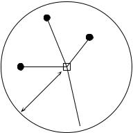
within a small neighbourhood around the aiming line (Fig. 13.9). The neighbourhood |
|||
|
is determined by an angular tolerance parameter ϕ and a parameter κ that sets the |
|||
|
tolerance for distance classes along the aiming line. For each observed point Øh in |
|||
|
turn, one looks for other points Øi |
that are at distance d ± κ from it. All points found |
||

Structure functions |
735 |
|
|
Consider the formula for Geary’s c (eq. 13.2), which is the semi-variance divided by the overall variance. The following derivation:
c (d) = |
--------------------γ (d) |
= |
C---------------------------------(0) – C (d) |
= 1 – |
C-------------(d) |
= 1 – r (d) |
|
Var [ yi] |
|
C (0) |
|
C (0) |
|
leads to the conclusion that Geary’s c is one minus the coefficient of spatial (auto)correlation. In a graph, the semi-variance and Geary’s c coefficient have exactly the same shape (e.g. Figs. 13.10b and d); only the ordinate scales may differ. An autocorrelogram plotted using r(d) has the exact reverse shape as a Geary correlogram. An important conclusion is that the plots of semi-variance, covariance, Geary’s c coefficient, and r(d), are equivalent to characterize spatial structures under the hypothesis of second-order stationarity (Bellehumeur & Legendre, 1998).
Cross-covariances may also be computed from eq. 13.12, using values of two different variables observed at locations distant by d (Isaaks & Srivastava, 1989). Eq. 13.17 leads to a formula for cross-correlation which may be used to plot crosscorrelograms; the construction of the correlation statistic is the same as for time series (eq. 12.10). With transect data, the result is similar to that of eq. 12.10. However, the programs designed to compute spatial cross-correlograms do not require the data to be equispaced, contrary to programs for time-series analysis. The theory is presented by Rossi et al. (1992), as well as applications to ecology.
Ecological application 13.1b
A survey was conducted on a homogeneous sandflat in the Manukau Harbour, New Zealand, to identify the scales at which spatial heterogeneity could be detected in the distribution of adult and juvenile bivalves (Macomona liliana and Austrovenus stutchburyi), as well as indications of adult-juvenile interactions within and between species. The results were reported by Hewitt et al. (1997); see also Ecological application 13.2. Sampling was conducted along transects established at three sites located within a 1-km2 area; there were two transects at each site, forming a cross. Sediment cores (10 cm diam., 13 cm deep) were collected using a nested sampling design; the basic design was a series of cores 5 m apart, but additional cores were taken 1 m from each of the 5-m-distant cores. This design provided several comparison in the short distance classes (1, 4, 5, and 6 m). Using transects instead of rectangular areas allowed relatively large distances (150 m) to be studied, given the allowable sampling effort. Nested sampling designs have also been advocated by Fortin et al. (1989) and by Bellehumeur & Legendre (1998).
Spatial correlograms were used to identify scales of variation in bivalve concentrations. The Moran correlogram for juvenile Austrovenus, computed for the three transects perpendicular to the direction of tidal flow, displayed significant spatial autocorrelation at distances of 1 and 5 m (Fig. 13.11a). The same pattern was found in the transects parallel to tidal flow. Figure 13.11a also indicates that the range of influence of autocorrelation was about 15 m. This was confirmed by plotting bivalve concentrations along the transects: LOWESS smoothing of the graphs (Subsection 10.3.8) showed patches of about 25-30 m in diameter (Hewitt et al., 1997, Figs. 3 and 4).
|
|
|
|
|
|
|
|
|
|
|
|
Structure functions |
|
|
|
|
|
|
|
737 |
|||
|
1.00 0.56 |
0.35 |
0.55 |
0.71 |
0.76 |
0.39 0.40 |
0.29 |
0.75 |
|
|
— |
|
|
|
|
rM1 = 0.53847 |
|
||||||
|
0.56 1.00 |
0.71 |
0.48 |
0.75 |
0.37 |
0.55 0.79 |
0.38 |
0.54 |
|
|
0 |
— |
|
|
|
|
|
||||||
|
0.35 0.71 |
1.00 |
0.47 |
0.63 |
0.15 |
0.38 0.65 |
0.34 |
0.44 |
|
|
0 |
0 |
— |
|
|
|
|
|
|
|
|||
|
0.55 0.48 |
0.47 |
1.00 |
0.69 |
0.43 |
0.31 0.34 |
0.46 |
0.73 |
|
|
1 |
0 |
0 |
— |
|
|
|
|
|
|
|||
S = |
0.71 0.75 |
0.63 |
0.69 |
1.00 |
0.50 |
0.43 0.56 |
0.39 |
0.78 |
|
X1 = |
0 |
0 |
0 |
1 |
— |
|
|
|
|
|
|||
0.76 0.37 0.15 0.43 0.50 |
1.00 0.36 0.25 |
0.27 0.56 |
|
0 |
0 |
0 |
0 |
0 |
— |
|
|
|
|||||||||||
|
0.39 0.55 |
0.38 |
0.31 |
0.43 |
0.36 |
1.00 0.65 |
0.60 |
0.27 |
|
|
0 |
0 |
0 |
0 |
0 |
0 |
— |
|
|
|
|||
|
0.40 0.79 |
0.65 |
0.34 |
0.56 |
0.25 |
0.65 1.00 |
0.41 |
0.35 |
|
|
0 |
1 |
0 |
0 |
0 |
0 |
0 |
— |
|
|
|||
|
0.29 0.38 |
0.34 |
0.46 |
0.39 |
0.27 |
0.60 0.41 |
1.00 |
0.29 |
|
|
0 |
0 |
0 |
0 |
0 |
0 |
1 |
0 |
— |
|
|||
|
0.75 0.54 |
0.44 |
0.73 |
0.78 |
0.56 |
0.27 0.35 |
0.29 |
1.00 |
|
|
1 |
0 |
0 |
1 |
1 |
0 |
0 |
0 |
0 |
— |
|||
|
— |
|
|
|
|
|
|
|
|
|
|
|
|
— |
|
|
|
|
rM2 = 0.42007 |
|
|||
|
3 |
— |
|
|
|
|
|
|
|
|
|
|
|
0 |
— |
|
|
|
|
|
|||
|
5 |
2 |
— |
|
|
|
|
|
|
|
|
|
|
0 |
2 |
— |
|
|
|
|
|
|
|
|
1 |
2 |
4 |
— |
|
|
|
|
|
|
|
|
|
0 |
2 |
0 |
— |
|
|
|
|
|
|
D = |
2 |
2 |
3 |
1 |
— |
|
|
|
|
|
|
|
X2 = |
2 |
2 |
0 |
0 |
— |
|
|
|
|
|
2 |
5 |
6 |
3 |
4 |
|
— |
|
|
|
|
|
2 |
0 |
0 |
0 |
0 |
— |
|
|
|
|||
|
5 |
3 |
5 |
5 |
4 |
|
5 |
— |
|
|
|
|
|
0 |
0 |
0 |
0 |
0 |
0 |
— |
|
|
|
|
5 |
1 |
2 |
4 |
3 |
|
6 |
2 |
— |
|
|
|
|
0 |
0 |
2 |
0 |
0 |
0 |
2 |
— |
|
|
|
4 |
3 |
4 |
4 |
4 |
|
4 |
1 |
2 |
— |
|
|
|
0 |
0 |
0 |
0 |
0 |
0 |
0 |
2 |
— |
|
|
1 |
3 |
4 |
1 |
1 |
|
3 |
6 |
5 |
5 |
— |
|
|
0 |
0 |
0 |
0 |
0 |
0 |
0 |
0 |
0 |
— |
|
|
|
|
|
|
|
|
|
|
|
|
|
|
|
|
|
|
etc. |
|
|
|
|
|
|
|
|
|
|
|
|
1.0 |
|
|
|
|
|
|
|
|
|
|
|
|
|
|
|
|
|
|
|
|
|
) |
|
0.8 |
|
|
|
|
|
|
|
|
|
|
|
|
|
|
|
|
|
|
|
|
|
M |
0.6 |
|
|
|
|
|
|
|
|
|
|
|
|
|
|
|
||
|
|
|
|
|
(r |
|
|
|
|
|
|
|
|
|
|
|
|
|
|
|
|
||
|
|
|
|
|
|
0.4 |
|
|
|
|
|
|
|
|
|
|
|
|
|
|
|
||
|
|
|
|
|
stat. |
|
|
|
|
|
|
|
|
|
|
|
|
|
|
|
|
||
|
|
|
|
|
|
0.0 |
|
|
|
|
|
|
|
|
|
|
|
|
|
|
|
||
|
|
|
|
|
|
|
0.2 |
|
|
|
|
|
|
|
|
|
|
|
|
|
|
|
|
|
|
|
|
|
Mantel |
|
–0.2 |
|
|
|
|
|
|
|
|
|
|
|
|
|
|
|
|
|
|
|
|
|
|
–0.4 |
|
|
|
|
|
|
|
|
|
|
|
|
|
|
|
||
|
|
|
|
|
|
|
|
|
|
|
|
|
|
|
|
|
|
|
|
|
|
||
|
|
|
|
|
|
|
–0.6 |
|
|
|
|
|
|
|
|
|
|
|
|
|
|
|
|
|
|
|
|
|
|
|
–0.8 |
|
|
|
|
|
|
|
|
|
|
|
|
|
|
|
|
|
|
|
|
|
|
|
–1.0 |
|
|
|
|
|
|
|
|
|
|
|
|
|
|
|
|
|
|
|
|
|
|
|
|
0 |
|
1 |
2 |
3 |
4 |
|
5 |
6 |
|
7 |
|
|
|
|
|
Distance classes
Figure 13.12 Construction of a Mantel correlogram for a similarity matrix S (n = 10 sites). The matrix of geographic distance classes D, from Fig. 13.4, gives rise to model matrices X1, X2, etc. for the various distance classes d. These are compared, in turn, to matrix Y = S using standardized Mantel statistics (rMd). Dark symbols in the correlogram: Mantel statistics that are significant after progressive Bonferroni correction (α = 0.05).
for pairs that are in the given distance class, or the code value for that distance class (d), or any other value different from zero; all coding methods lead to the same value of the normalized Mantel statistic rM.
The Mantel statistics, plotted against distance classes, produce a multivariate correlogram. Each value is tested for significance in the usual way, using either
738 |
Spatial analysis |
|
|
permutations or Mantel’s normal approximation (Box 10.2). Computation of standardized Mantel statistics assumes second-order stationarity. As in the case of univariate correlograms (above), one is advised to use some form of correction for multiple testing before interpreting Mantel correlograms.
Numerical example. Consider again the 10 sampling sites of Fig. 13.4. Assume that species assemblage data were available and produced similarity matrix S of Fig. 13.12. Matrix S played here the role of Y in the computation of Mantel statistics. Were the species data autocorrelated? Distance matrix D, already divided into 6 classes in Fig. 13.4, was recoded into a series of model matrices Xd (d = 1, 2, etc.). In each of these, the pairs of sites that were in the given distance class received the value d, whereas all other pairs received the value 0. Mantel statistics were computed between S and each of the Xd matrices in turn; positive and significant Mantel statistics indicate positive autocorrelation in the present case. The statistics were tested for significance using 999 permutations and plotted against distance classes d to form the Mantel correlogram. The progressive Bonferroni method was used to account for multiple testing because interest was primarily in detecting autocorrelation in the first distance classes.
Before computing the Mantel correlogram, one must assume that the condition of secondorder stationarity is satisfied. This condition is more difficult to explain in the case of multivariate data; it means essentially that the surface is uniform in (multivariate) mean and variance at broad scale. The correlogram illustrated in Fig. 13.12 suggests the presence of a gradient. If the condition of second-order-stationarity is satisfied, this means that the gradient detected by this analysis is a part of a larger, autocorrelated spatial structure. This was called a “false gradient” in the numerical example of Subsection 2, above.
When Y is a similarity matrix and distance classes are coded as described above, positive Mantel statistics correspond to positive autocorrelation; this is the case in the numerical example. When the values in Y are distances instead of similarities, or if the 1's and 0's are interchanged in matrix X, the signs of all Mantel statistics are changed. One should always specify whether positive autocorrelation is expressed by positive or negative values of the Mantel statistics when presenting Mantel correlograms. The method was applied to vegetation data by Legendre & Fortin (1989).
13.2 Maps
The most basic step in spatial pattern analysis is the production of maps displaying the spatial distributions of values of the variable(s) of interest. Furthermore, maps are essential to help interpret spatial structure functions (Section 13.1).
Several methods are available in mapping programs. The final product of modern computer programs may be a contour map, a mesh map (such as Figs. 13.13b and 13.16b), a raised contour map, a shaded relief map, and so on. The present Section is not concerned with the graphic representation of maps but instead with the way the mapped values are obtained. Spatial interpolation methods have been reviewed by Lam (1983).
Maps |
741 |
|
|
•Compute the multiple regression equation. The model obtained using all 9 regressors had R2 = 0.87, but several of the partial regression coefficients were not significant.
•Remove nonsignificant terms. The linear terms may be important to express a linear gradient; the quadratic and cubic terms may be important to model more complex surfaces. Nonsignificant terms should not be left in the model, however, except when they are required for comparison purpose. Nonsignificant terms were removed one by one (backward elimination,
Subsection 10.3.3) until all terms (monomials) in the polynomial equation were significant. The resulting trend-surface equation was highly significant (R2 = 0.81, p < 0.0001):
yˆ = 8.13 – 0.16 XY – 0.09 Y2 + 0.04 X2Y + 0.14 XY2 + 0.10 Y3
Remember, however, that tests of significance are too liberal with autocorrelated data, due to the non-independence of residuals (Subsection 1.1.1).
• Lay out a regular grid of points (X', Y') and, using the regression equation, compute forecasted values ( yˆ' ) for these points. Plot a map (Fig. 13.13b) using the file with (X', Y', and yˆ' ). Values estimated by a trend-surface equation at the observed study sites do not coincide with the values observed at these sites; regression is not an exact interpolator, contrary to kriging (Subsection 2).
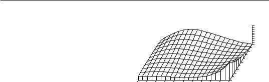
Different features could be displayed by rotating the Figure. The orientation chosen in Fig. 13.13b does not clearly show that the values along the long axis of the Thau lagoon are smaller near the centre than at the ends. It displays, however, the wavy structure of the data from the lower left-hand to the upper right-hand corner, which is roughly the south-to-north direction. The Figure also clearly indicates that one should refrain from interpreting extrapolated data values, i.e. values located outside the area that has actually been sampled. In the present example, the values forecasted by the model in the lower left-hand and the upper right-hand corners (–99 and +53, respectively) are meaningless for log bacterial concentrations. Within the area where real data are available, however, the trend-surface model provides a good visual representation of the broad-scale spatial variation of the response variable.
Examination of the residuals is essential to make sure that the model is not missing some salient feature of the data. If the trend-surface model has extracted all the spatially-structured variation of the data, given the scale of the study, residuals should look random when plotted on a map and a correlogram of residuals should be non-significant. With the present data, residuals were small and did not display any recognizable spatial pattern.
A cubic trend-surface model is often appropriate with ecological data. Consider an ecological phenomenon which starts at the mean value of the response variable y at the left-hand border of the sampled area, increases to a maximum, then goes down to a minimum, and comes back to the mean value at the right-hand border. The amount of space required for the phenomenon to complete a full cycle — whatever the shape it may take — is its extent (Section 13.0). Using trend-surface analysis, such a phenomenon would be correctly modelled by a third-degree trend surface equation. A polynomial equation is a more flexible mathematical model than sines or cosines, in that it does not require symmetry or strict periodicity.
The degree of the polynomial which is appropriate to model a phenomenon is predictable to a certain extent. If the extent is of the same order as the size of the study
742 |
Spatial analysis |
|
|
area (say, in the X direction), the phenomenon will be correctly modelled by a polynomial of degree 3 which has two extreme values, a minimum and a maximum. If the extent is larger than the study area, a polynomial of degree less than 3 is sufficient; degree 2 if there is only one maximum, or one minimum, in the sampling window; and degree 1 if the study area is limited to the increasing, or decreasing, portion of the phenomenon. Conversely, if the scale of the phenomenon controlling the variable is smaller than the study area, more than two extreme values (minima and maxima) will be found, and a polynomial of order larger than 3 is required to model it correctly. The same reasoning applies to the X and Y directions when using a polynomial combining the X and Y geographic coordinates. So, using a polynomial of degree 3 acts as a filter: it is a way of looking for phenomena that are of the same extent, or larger, than the study area.
An assumption must be made when using the method of trend-surface analysis: that all observations form a single statistical population, subjected to one and the same generating process, and can consequently be modelled using a single polynomial equation of the geographic coordinates. Evidence to that effect may be available prior to the analysis. When this is not the case, the hypothesis of homogeneity may be supported by examining the regression residuals (Subsection 10.3.1). When there are indications that values in different regions of the geographic space obey different processes (e.g. different geology, action of currents or wind, or influence of other physical variables), the study area should be divided into regions, to be modelled by separate trend-surface equations.
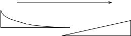
Polynomial regression, used in the numerical example above, is a good first approach to fitting a model to a surface when the shape to be modelled is unknown, or known to be simple. In some instances, however, it may not provide a good fit to the data; trend-surface analysis must then be conducted using nonlinear regression (Subsection 10.3.6), which requires that an appropriate numerical model be provided to the estimation program. Consider the example of the effect of some humangenerated environmental disturbance at a site, the indicator variable being the number of species. The response, in this case, is expected to be stronger near the impacted site, tapering off as one gets farther away from it. Assume that data were collected along a transect (a single geographic coordinate X) and that the impacted site is near the centre of the transect. A polynomial equation would not be appropriate to model an inverse- squared-distance diffusion process (Fig. 13.14a), whereas an equation of the form:
yˆ |
= |
b0 |
b1X2 |
+ --------------------- |
|||
|
|
|
b2X2 + 1 |
would provide a much better fit (Fig. 13.14b). The minimum of this equation is b0; it is obtained when X = 0. The maximum, b1/b2, is reached asymptotically as X becomes large in either the positive or negative direction. For data collected in different directions around the impacted site, a nonlinear trend-surface equation with similar properties would be of the form:
Maps |
745 |
|
|
MS1/MS2 = 1.29358/0.87199 = 1.48348. The reference value was F0.05(28, 24) = 1.952. The probability associated with the F ratio, p = 0.1651, indicated that this model still fitted the data,
which were constructed to contain a linear term (2.5X in the construction equation) as well as a quadratic trend (term –0.3X2), but the fit was poorer than with the quadratic polynomial model which was capable of accounting for both the linear and quadratic trends.
This numerical example shows that trend-surface analysis may be applied to data collected along a transect; the “trend surface” is one-dimensional in that case. The numerical example at the end of Subsection 10.3.4 is another example of a trendsurface analysis of a dependent variable, salinity, with respect to a single geographic axis (Fig. 10.9). Trend-surface analysis may also be used to model data in threedimensional geographic space (geographic coordinates X, Y and Z, where Z is either altitude or depth) or with one of the dimensions representing time. Section 13.5 will show how the analysis may be extended to a multivariate dependent data matrix Y.
Haining (1987) described alternative methods for estimating the parameters of a trend-surface model when the residuals are spatially autocorrelated; in that case, leastsquares estimation of the parameters is inefficient and standard errors as well as tests of significance are biased. Haining’s methods allow one to recognize three components of spatial variation corresponding to the site, local, and regional scales.
Ecological application 13.2
A survey was conducted at 200 locations within a fairly homogeneous 12.5 ha rectangular sandflat area in Manukau Harbour, New Zealand, to identify factors that control the spatial distributions of the two dominant bivalves, Macomona liliana Iredale and Austrovenus stutchburyi (Gray), and to look for evidence of adult-juvenile interactions within and between species. Results are reported in Legendre et al. (1997). Most of the broad-scale spatial structure detected in the bivalve counts (two species, several size classes) was explained by the physical and biological variables. Results of principal component analysis and spatial regression modelling suggested that different factors controlled the spatial distributions of adults and juveniles. Larger size classes of both species displayed significant spatial structures, with physical variables explaining some but not all of this variation; the spatial patterns of the two species differed, though. Smaller organisms were less strongly spatially structured; virtually all of their spatial structure was explained by physical variables.
Highly significant trend-surface equations were found for all bivalve species and size classes (log-transformed data), indicating that the spatial distributions of the organisms were not random, but highly organised at the scale of the study site. The trend-surface models for smaller animals had much smaller coefficients of determination (10-20%) than for larger animals (3055%). The best models, i.e. the models with the highest coefficients of determination (R2), were for the Macomona > 15 mm and Austrovenus > 10 mm. The coefficients of determination were consistently higher for Austrovenus than for Macomona, despite the fact that Macomona were usually far more numerous than Austrovenus. A map illustrating the trend-surface equation is presented for the largest Macomona size class (Fig. 13.16); the field counts are also given for comparison.
746 |
Spatial analysis |
|
|
|
|
(a) |
|
|
|
35 41 37 48 52 68 64 51 52 19 50 48 46 50 40 33 27 29 32 39 |
(b) |
Macomona 65 |
|
|
|
|
|
57 |
|
22 47 46 33 51 71 54 71 44 56 63 50 30 49 46 41 43 40 29 32 |
|
49 |
|
|
45 66 58 60 27 59 50 52 41 40 54 39 41 46 47 19 24 30 20 28 |
|
41 |
|
|
|
33 |
|
||
|
|
|
25 |
250 |
41 56 33 60 59 60 53 52 26 39 31 33 29 54 37 18 36 42 27 29
48 36 38 34 41 55 42 67 53 57 34 34 42 33 32 46 33 18 27 32 |
|
|
|
|
|
|
|
|
|
200 |
|
|
|
|
|
|
|
|
|
|
|
41 32 41 35 48 52 40 56 40 44 41 43 44 41 43 32 22 34 30 32 |
|
|
|
|
|
|
|
|
|
150 |
|
|
|
|
|
|
|
|
|
|
|
17 29 50 67 35 52 28 44 45 28 30 35 30 28 35 37 20 28 50 31 |
|
|
|
|
|
|
|
|
|
100 |
|
|
|
|
|
|
|
|
|
|
|
27 43 38 44 29 44 35 39 44 38 40 24 37 43 35 31 38 48 50 37 |
|
|
|
|
|
|
|
|
|
50 |
27 42 36 36 29 46 39 38 29 37 38 35 35 38 25 38 39 54 50 44 |
|
|
|
|
|
|
|
|
|
0 m |
0 |
50 |
100 |
150 |
200 |
250 |
300 |
350 |
400 |
450 |
500 m |
52 41 32 41 42 28 47 22 24 17 37 31 38 29 41 38 36 46 38 52 |
|
|
|
Grid coordinates |
|
|
|
|
||
|
|
|
|
|
|
|
|
|||
Figure 13.16 Macomona > 15 mm at 200 sites in Manukau Harbour, New Zealand, on 22 January 1994.
(a) Actual counts at sampling sites in 200 regular grid cells; in the field, sites were not perfectly equispaced. (b) Map of the trend-surface equation explaining 32% of the spatial variation in the data. The values estimated from the trend-surface equation (log-transformed data) were backtransformed to raw counts before plotting. Modified from Legendre et al. (1997).
2 — Interpolated maps
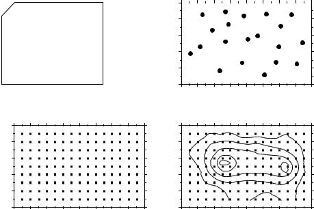
In this family of methods, the value of the variable at a point location on a map is estimated by local interpolation, using only the observations available in the vicinity of the point of interest. In this respect, interpolation mapping differs from trend surface analysis (Subsection 1), where estimates of the variable at given locations were not obtained by interpolation, as in the present Subsection, but through a statistical model calibrated over the entire study area. Fig. 13.17 illustrates the principle of interpolation mapping. A regular grid of nodes (Fig. 13.17c) is defined over the area that contains the study sites Øi (Fig. 13.17a, b). Interpolation assigns a value to each point of that grid. This is the single most important step in mapping. Following that, results may be represented in the form of contours (Fig. 13.17d) with or without colours or shades, or three-dimensional constructs such as Fig. 13.16b.
Assigning a value to each grid node may be done in different ways. Different interpolation methods may produce maps that look different; this is also the case when using different parameters with a same method (e.g. different exponents in inversedistance weighting).
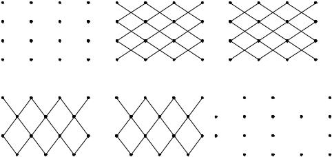
The most simple rule would be to give, to each node of the grid, the value of the observation which is the closest to it. The end result is a division of the map into Voronoï polygons (Subsection 13.3.1) displaying a “zone of influence” drawn around each observation. Another simple solution consists in dividing the map into Delaunay triangles (Subsection 13.3.1). There is an observed value yi at each site Øi . A triangular portion of plane, adjusted to the points Øi that form the apices (corners) of a Delaunay triangle, provides interpolated values for all points lying within the triangle. Maps obtained using these solutions are shown in Chapter 11 of Isaaks & Srivastava (1989).

Maps |
749 |
|
|
Kriging • Kriging — This is the mapping tool in the toolbox of geostatisticians. The method was named by Matheron after the South African geostatistician D. G. Krige, who was the first to develop formal solutions to the problem of estimating ore reserves from sampling (core) data (Krige, 1952, 1966). Geostatistics was developed by Matheron (1962, 1965, 1970, 1971, 1973) and co-workers at the Centre de morphologie mathématique of the École des Mines de Paris. Geostatistics comprises the estimation of variograms (Subsection 13.1.6), kriging, validation methods for kriging estimates, and simulations methods for geographically distributed (“regionalized”) data. Major textbooks have been written by former students of Matheron: David (1977) and Journel & Huijbregts (1978). Other useful references are Clark (1979), Rendu (1981), Verly et al. (1984), Armstrong (1989), Isaaks & Srivastava (1989), and Cressie (1991). Applications to environmental sciences and ecology have been discussed by Gilbert & Simpson (1985), Robertson (1987), Armstrong et al. (1989), Legendre & Fortin (1989), Soares et al. (1992), and Rossi et al. (1992). Geostatistical methods can be implemented using the software library of Deutsch & Journel (1992).
As in inverse-distance weighting (eq. 13.19), the estimated value for any grid node is computed as:
yˆ Node = ∑wi yi
i
The chief difference with inverse-distance weighting is that, in kriging, the weights wi applied to the points Øi used in the estimation are not standardized inverses of the distances to some power k. Instead, the weights are based upon the covariances (semivariances, eq. 13.9 and 13.10) read on a variogram model (Subsection 13.1.6). They are found by linear estimation, using the equation:
|
|
C |
|
· w |
= |
d |
|
|
|
|
|
|
|
|
|
|
|
c11 |
… c1n 1 |
|
w1 |
|
d1 |
|
||
. |
… . |
1 |
|
. |
= |
. |
|
|
. |
… . |
1 |
|
. |
. |
(13.21) |
||
cn1 … cnn |
1 |
|
wn |
|
dn |
|
||
|
1 |
… 1 |
0 |
|
λ |
|
1 |
|
|
|
|
|
|
|
|
|
|
where C is the covariance matrix among the n points Øi used in the estimation, i.e. the semi-variances corresponding to the distances separating the various pair of points, as read on the variogram model; w is the vector of weights to be estimated (with the constraint that the sum of weights must be 1); and d is a vector containing the covariances between the various points Øi and the grid node to be estimated. This is where a variogram model becomes essential; it provides the weighting function for the entire map and is used to construct matrix C and vector d for each grid node to be estimated. λ is a Lagrange parameter (as in Section 4.4) introduced to minimize the
750 |
Spatial analysis |
|
|
variance of the estimates under the constraint Σwi = 1 (unbiasedness condition). The solution to this linear system is obtained by matrix inversion (Section 2.8):
w = C–1 d |
(13.22) |
Vector d plays a role similar to the weights in inverse-distance weighting since the covariances in vector d decrease with distance. Using covariances, the weights are statistical in nature instead of geometrical.
Kriging takes into account the grouping of observed points Øi on the map. When two points Øi are close to each other, the value of the corresponding coefficient cij in matrix C is high; this contributes to lowering their respective weights wi. In this way, the redundancy of information introduced by dense groups of sampling sites is taken into account.
When anisotropy is present, kriging can use two, four, or more variogram models computed for different geographic directions and combine their estimates when calculating the covariances in matrix C and vector d. In the same way, when estimation is performed for sampling sites in a volume, a separate variogram can be used to describe the vertical spatial variation. Kriging is the best interpolation method for data that are not on a regular grid or display anisotropy. The price to pay is increased mathematical complexity during interpolation.
Among the interpolation methods, kriging is the only one that provides a measure of the error variance for each value estimated at a grid node. For each grid node, the error variance, called ordinary kriging variance (s2OK ), is calculated as follows (Isaaks & Srivastava, 1989), using vectors w and d from eq. 13.21:
sOK2 = Var [ yi] – w–1d |
(13.23) |
where Var[yi] is the maximum-likelihood estimate of the variance of the observed values yi (eq. 13.14). Equation 13.23 shows that s2OK only depends on the variogram model and the local density of points, and not on the values observed at points Øi . The ordinary kriging variance may be used to construct confidence intervals around the grid node estimates at some significance level α, using eq. 13.4. It may also be mapped directly. Regions of the map with large values s2OK indicate that more observations should be made because sampling intensity was too low.
Kriging, as described above, provides point estimates at grid nodes. Each estimate actually applies to a “point” whose size is the same as the grain of the observed data. The geostatistical literature also describes how block kriging may be used to obtain estimates for blocks (i.e. surfaces or volumes) of various sizes. Blocks may be small, or cover the whole map if one wishes to estimate a resource over a whole area. As mentioned in the introductory remarks of the present Section, additive variables only may be used in block kriging. Block kriging programs always assume that the variable is intensive, e.g. the concentration of organisms (Subsection 1.4.2). For extensive

Patches and boundaries |
751 |
|
|
variables, such as the number of individual trees, one must multiply the block estimate by the ratio (block size / grain size of the original data).
3 — Measures of fit
Different measures of fit may be used to determine how well an interpolated map represents the observed data. With most methods, some measure may be constructed of the closeness of the estimated (i.e. interpolated) values yˆ i to the values yi observed at sites Øi. Four easy-to-use measures are:
|
1 |
∑ |
|
yi |
– yˆ i |
|
|
|
|
|
|
|
|||||
|
n |
|
|
|
||||
• The mean absolute error: MAE = -- |
|
|
|
|
|
|||
|
|
i |
|
|
|
|
|
|
|
1 |
|
|
|
|
|
|
2 |
• The mean squared error: MSE = |
n∑ |
( yi |
– yˆ i) |
|
||||
-- |
|
|
||||||
|
|
i |
|
|
|
|
|
|
• The Euclidean distance: D1 = |
∑ ( yi – yˆ i) 2 |
|
||||||
|
i |
|
|
|
|
|
|
|
• The correlation coefficient (r) between values yi and yˆ i (eq. 4.7). In the case of a trend-surface model, the square of this correlation coefficient is the coefficient of determination of the model.
In the case of kriging, the above measures of fit cannot be used because the estimated and observed values are equal, at all observed sites Øi. The technique of cross-validation may be used instead (Isaaks & Srivastava, 1989, Chapter 15). One observation, say Ø1, is removed from the data set and its value is estimated using the remaining points Ø2 to Øn. The procedure is repeated for Ø2, Ø3, …, Øn. One of the measures of fit described above may be used to measure the closeness of the estimated to the observed values. If replicated observations are available at each sampling site (a situation which does not often occur), the test of goodness-of-fit described in Subsection 1 can be used with all interpolation methods.
13.3 Patches and boundaries
Multivariate data may be condensed into spatially-constrained clusters. These may be displayed on maps, using different colours or shades. The present Section explains how clustering algorithms can be constrained to produce groups of spatially contiguous sites; study of the boundaries between homogeneous zones is also discussed. Prior to clustering, one must state unambiguously which sites are neighbours in space; the most common solutions to this are presented in Subsection 1.
Patches and boundaries |
753 |
|
|
|
|
Point |
Coordinates |
|
|
|
|
|
|
|
identifiers |
X |
Y |
2 |
|
5 |
9 |
A |
B |
|
|
|
|
|
|
|
1 |
0 |
3 |
|
|
|
|
||
|
|
|
|
|
|
|||
|
|
2 |
1 |
5 |
1 |
|
|
8 |
|
|
3 |
2 |
2 |
|
|
|
|
|
|
|
|
|
|
|||
|
|
4 |
2 |
1 |
|
3 |
|
|
|
|
5 |
4 |
4 |
|
|
|
|
|
|
|
|
|
|
|||
|
|
6 |
5 |
2 |
|
|
|
6 |
C |
|
7 |
8 |
0 |
|
|
|
|
|
8 |
7.5 |
3 |
|
4 |
|
7 |
|
|
|
9 |
8 |
5 |
|
|
||
|
|
|
|
|
||||
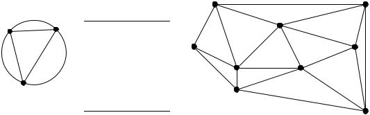
19 edges form the Delaunay triangulation:
1–2 |
1–3 |
1–4 |
2–3 |
2–5 |
2–9 |
3–4 |
3–5 |
3–6 |
4–6 |
4–7 |
5–6 |
5–8 |
5–9 |
6–7 |
6–8 |
7–8 |
7–9 |
8–9 |
|
|
Figure 13.20 Construction of a Delaunay triangulation.
if and only if the circumscribed circle (i.e. the circle passing through the three points; on the left in the Figure) includes no other point. For example, the file of coordinates shown in the central part of the Figure gives rise to the triangulation on the right. The triangulation is fully described by a list of pairs of points corresponding to its edges; this is how the information can be passed on to a computer program for constrained clustering (Subsection 2).
Long edges may be created at the outskirts of a set of points, simply because there is no other point located farther away in the sampling design; this is called a border effect. For example, edges 2–9 and 7–9 might have been removed from the triangulation in Fig. 13.20 by the presence of other points in the circumscribed circles of triangles (2, 5, 9) and (7, 8, 9) had the sampling extent been broader. Long peripheral edges may be removed by hand or by the computer algorithm.
Gabriel • Gabriel graph — The Gabriel graph criterion (Gabriel & Sokal, 1969) differs from graph that of the Delaunay triangulation (Fig. 13.21a). Draw a line between two points A and B. This line is part of the Gabriel graph if and only if no other point C lies inside the circle whose diameter is that line. In other words, the edge between A and B is part of the Gabriel graph if D2(A, B) < D2(A, C) + D2(B, C) for all other points C in the study, where D2(A, B) is the square of the geographic distance between points A and B.
Another way of expressing this criterion is the following: if CENTRE represents the middle point between A and B, the edge connecting A to B is part of the Gabriel graph if D(A, B)/2 < D(CENTRE, C) for any other point C in the study.

|
Patches and boundaries |
755 |
|
|
|
|
criterion (which have for diameters the edges A–B, B–C and A–C) may contain, in the |
|
|
shadowed areas outside the Delaunay circle (white inner circle), some points that the |
|
|
Delaunay criterion circle does not exclude. This is why some edges that are authorized |
|
|
by the Delaunay criterion are excluded from the Gabriel graph. |
|
Relative |
• Relative neighbourhood graph — The relative neighbourhood criterion is as follows |
|
neighbour- |
(Toussaint, 1980; Fig. 13.21b). Draw a line between two points A and B. Draw a first |
|
hood graph |
circle centred over A and a second one centred over B, each one having the line from A |
|
|
to B as its radius. This line is part of the graph if no other point C in the study lies |
|
|
inside the intersection of the two circles. In other words, the edge from A to B is part of |
|
|
the relative neighbourhood graph if and only if D(A, B) ≤ max [D(A, C), D(B, C)] for |
|
|
all other points C in the study. For points forming an equilateral triangle, for instance, |
|
|
the three edges are included in the relative neighbourhood graph. |
|
|
The relative neighbourhood graph in Fig. 13.21b is constructed for the same set of |
|
|
points as in Figs. 13.20 and 13.21a. The number of edges in a relative neighbourhood |
|
|
graph is (n – 1). The 8 edges forming the relative neighbourhood graph are a subset of |
|
|
the 12 edges of the Gabriel graph. Indeed, as shown by the sketch on the left of the |
|
|
Figure, the exclusion zone at the intersection of the two circles corresponding to the |
|
|
relative neighbourhood criterion (which have for radius the edge A–B) may contain, in |
|
|
the shadowed zone outside the Gabriel circle (white inner circle), some points that the |
|
|
Gabriel criterion circle does not exclude. This is why some edges authorized by the |
|
|
Gabriel criterion are excluded from the relative neighbourhood graph. |
|
Minimum |
• Minimum spanning tree — In this tree, which connects all points of a study, the sum |
|
spanning |
of the edge lengths is minimum. Its construction is described at the end of Section 8.2; |
|
tree |
one way of obtaining it is to list the edges forming the primary connections of a single- |
|
|
linkage dendrogram. For points forming an equilateral triangle, for example, only two |
|
|
of the edges are included in the minimum spanning tree, whereas the three edges are |
|
|
included in a relative neighbourhood graph; the choice of the edge to leave out is |
|
arbitrary. The edges of a minimum spanning tree are either the same as, or a subset of, the edges of a relative neighbourhood graph of the same points. For the example data set, the edges that form the minimum spanning tree are the same as those of the relative neighbourhood graph of Fig. 13.21b.
Another approach is to select a distance threshold and connect all points that are within that distance of each other. One possible criterion to choose the distance threshold is to make it equal to the range of a variogram model (Fig. 13.7).
The list of connecting edges (Figs. 13.20 and 13.21) may be written out to a file. The file may be modified to take into account other information that researchers may have about the study area. For example, one may wish to eliminate edges that do not make sense in terms of gene flow because they cross unsuitable areas (e.g. a sea or a mountain range, in the case of terrestrial mammals). Or, one may wish to add connections that are potentially of interest although they do not imply first neighbours; for example, plants or animals may cross water bodies (lake, sea) and settle in non-
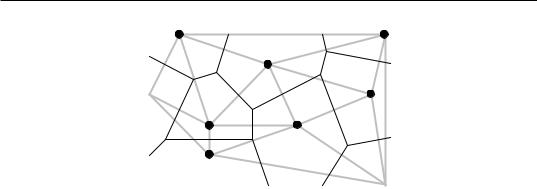
756 |
Spatial analysis |
2 |
9 |
5
8
1
3 |
6 |
|
4 |
 7
7
Figure 13.22 Delaunay triangulation (grey lines) and influence polygons (black lines) for the nine points of Fig. 13.20.
contiguous sites, which should nevertheless be considered contiguous because there is a direct path between them. Users of constrained clustering methods should not hesitate to modify lists of connections obtained from geometric criteria such as described above, to make the list of edges a better description of potential flow among sites, given the problem under study.
Influence |
It may be interesting to determine the geometric zone of influence of each point on |
polygon |
a map. The zone of influence of a point A includes all the other points of the surface |
|
that are closer to A than to any other point in the study. The zones of influence so |
|
defined have the shape of polygons, also called tiles, tessellae, or tesserae (singular: |
|
tessella or tessera). The resulting picture is called a mosaic or tessellation (adjective: |
|
tessellated); it may be referred to as a Dirichlet tessellation (1850), Voronoï polygons |
|
(1909), or Thiessen polygons (1911), from the names of the authors who first described |
|
these mathematical structures. |
Polygons are easily constructed from a Delaunay triangulation (Fig. 13.22). Draw the perpendicular bisector of each segment in the triangulation; the crossing points of the bisectors delimit the polygons (tiles). Computer algorithms may be used to calculate the surface area of each polygon, at least those that are closed; peripheral tiles may be open. Upton & Fingleton (1985) and Isaaks & Srivastava (1989) propose various applications of tessellations to spatial analysis.
2 — Constrained clustering
The delineation of clusters of contiguous objects has been discussed in Section 12.6 for time series and spatial transects. The method of chronological clustering, in particular, was described in Subsection 12.6.4; it proceeds by imposing to a clustering algorithm a constraint of contiguity along the time series. Constraints of contiguity have been applied to spatial clustering by several authors, including Lefkovitch (1978,
Patches and boundaries |
757 |
|
|
1980), Monestiez (1978), Lebart (1978), Roche (1978), Perruchet (1981) and Legendre & Legendre (1984c). In the present Subsection, it is generalized to twoor three-dimensional spatial data and to spatio-temporal data.
Constrained clustering differs from its unconstrained counterpart in the following way.
•Unconstrained clustering methods (Chapter 8) only use the information in the similarity or distance matrix computed among the objects. In hierarchical methods, a local criterion is optimized at each step; in all methods included in the Lance and Williams general model, for instance, the objects or groups clustered at each step are those with the largest fusion similarity or the smallest fusion distance. In partitioning methods, a global criterion is optimized; in K-means, for instance, the algorithm looks for K groups that feature the smallest sum of within-group sums-of-squares EK .
•Constrained clustering methods take into account more information than the unconstrained approaches. In the case of spatial or temporal contiguity, the only admissible clusters are those that obey the contiguity relationship. Spatial contiguity may be described by one of the connecting schemes of Subsection 1. The criterion to be optimized during clustering is relaxed to give priority to the constraint of spatial contiguity. It is no surprise, then, that a constrained solution may be less optimal than
its unconstrained counterpart in terms of the clustering criterion, e.g. EK . This is balanced by the fact that the solution is likely to more readily interpretable.
It is fairly easy to modify clustering algorithms to incorporate a constraint of spatial contiguity (Fig. 13.23). As an example, consider the clustering methods included in the Lance and Williams general clustering model (Subsection 8.5.9). At the beginning of the clustering process, the vector of group membership has each object as a different group. Proceed as follows:
1.Compute a similarity matrix among objects, using the non-geographic information.
2.Choose a connecting scheme (Subsection 1) and produce a list of connection edges as in Figs. 13.20 and 13.21. Read in the file of edges and transform it into a contiguity matrix containing 1’s for connected sites and 0’s elsewhere.
3.Compute the Hadamard product of these two matrices. The Hadamard product of two matrices is the product element by element. The resulting matrix contains similarity values in the cells where the contiguity matrix contained 1’s, and 0’s elsewhere.
4.The largest similarity value in the matrix resulting from step 3 determines the next pair of objects or groups (h and i) to be clustered. Modify the vector of group membership (right of the Figure), giving the same group label to all members of former groups h and i.
5.Update the similarity matrix using eq. 8.11.
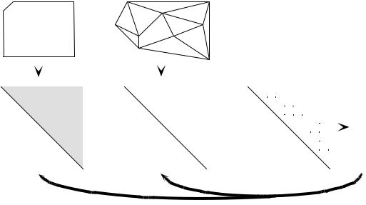
758 |
|
|
|
|
|
|
|
|
|
|
|
|
|
|
|
|
|
|
|
|
|
|
|
|
|
Spatial analysis |
|
|
|
|
|
|
|
|
|
|
|
|
|
|
|
||||||
|
|
|
|
|
|
|
|
|
|
|
|
|
|
|
|
|
|
|
|
|
|
|
|
|
|
|
|
|
|
|
|
|
|
|
|
|
|
|
|||||||||
|
|
|
|
Data file |
|
|
|
|
|
Delaunay triangulation |
|
|
|
|
|
|
|
|
|
|
|
|
|
|
|
|
|
|
|
||||||||||||||||||
|
|
|
Sites |
|
|
Descriptors |
|
|
|
|
2 |
|
|
|
|
|
5 |
|
|
|
|
|
9 |
|
|
|
|
|
|
|
|
|
|
|
|
|
|
|
|
|
|||||||
|
|
|
1 |
|
|
|
|
|
|
|
|
|
|
|
|
|
|
|
|
|
|
|
|
|
|
|
|
|
|
|
|
|
|
|
|
|
|
|
|
|
|
|
|
|
|
||
|
|
|
--- |
--- |
|
|
--- |
|
--- |
--- |
--- |
|
|
|
|
|
|
|
|
|
|
|
|
|
|
|
|
|
|
|
|
|
|
|
|
|
|
|
|
|
|
|
|
|
|
|
|
|
|
|
2 |
--- |
--- |
|
|
--- |
--- |
--- |
--- |
|
|
|
|
|
|
|
|
|
|
|
|
|
|
|
|
|
8 |
|
|
|
|
|
|
|
|
|
|
|
|
|
|
|
|
|
|
|
|
|
3 |
--- |
--- |
|
|
--- |
--- |
--- |
--- |
|
|
|
1 |
|
|
|
|
|
|
|
|
|
|
|
|
|
|
|
|
|
|
|
|
|
|
|
|
|
|
|
|
|
|
|
|
|
|
|
4 |
|
|
|
|
|
|
|
|
|
|
|
|
|
|
|
|
|
|
|
|
|
|
|
|
|
|
|
|
|
|
|
|
|
|
|
|
|
|
|
|
|
|
|
|
|
|
|
--- |
--- |
|
|
--- |
--- |
--- |
--- |
|
|
|
|
|
|
|
|
|
|
|
|
|
|
|
|
|
|
|
|
|
|
|
|
|
|
|
|
|
|
|
|
|
|
|
|
|
|
|
|
5 |
--- |
--- |
|
|
--- |
--- |
--- |
--- |
|
|
|
|
|
3 |
|
|
|
|
|
|
|
|
|
|
|
|
|
|
|
|
|
|
|
|
|
|
|
|
|
|
|
|
|
|
|
|
|
6 |
--- |
--- |
|
|
--- |
--- |
--- |
--- |
|
|
|
|
|
|
|
|
|
|
|
|
|
|
|
|
|
|
|
|
|
|
|
|
|
|
|
|
|
|
|
|
|
|
|
|
|
|
|
|
|
|
|
|
|
|
|
|
|
|
|
|
|
|
|
|
|
|
|
|
6 |
|
|
|
|
|
|
|
|
|
|
|
|
|
|
|
|
|
|
|
|
|
||
|
|
|
7 |
--- |
--- |
|
|
--- |
--- |
--- |
--- |
|
|
|
|
|
|
|
|
|
|
|
|
|
|
|
|
|
|
|
|
|
|
|
|
|
|
|
|
|
|
|
|
|
|
||
|
|
|
8 |
--- |
--- |
|
|
--- |
--- |
--- |
--- |
|
|
|
|
|
|
|
|
|
|
|
|
|
|
|
|
|
|
|
|
|
|
|
|
|
|
|
|
|
|
|
|
|
|
|
|
|
|
|
9 |
--- |
--- |
|
|
--- |
--- |
--- |
--- |
|
|
|
|
|
4 |
|
|
|
|
|
|
|
|
|
|
7 |
|
|
|
|
|
|
|
|
|
|
|
|
|
|
|
|
|
|
|
|
|
|
|
|
|
|
|
|
|
|
|
|
|
|
|
|
|
|
|
|
|
|
|
|
|
|
|
|
|
|
|
|
|
|
|
|
|
|
|
|
|
|
|
|
|
|
|
|
|
|
|
|
|
|
|
|
|
|
|
|
|
|
|
|
|
|
|
|
|
|
|
|
|
|
|
|
|
|
|
|
|
|
|
|
|
|
|
|
|
|
|
|
|
Group |
|
|
|
|
|
|
|
|
|
|
|
|
|
|
|
|
|
|
|
|
|
|
|
|
|
|
|
|
|
|
|
|
|
|
|
|
|
|
|
|
|
|
|
|
|
|
|
||
|
|
|
|
|
|
|
|
|
|
|
|
|
|
|
|
|
|
|
|
|
|
|
|
|
|
|
|
|
|
|
|
|
|
|
|
|
|
|
|
|
|
|
|
|
|
||
|
|
|
|
|
|
|
|
|
|
|
|
|
|
|
|
|
|
|
|
|
|
|
|
|
|
|
|
|
|
|
|
|
|
|
|
|
|
|
|
|
|
||||||
|
|
|
|
|
|
|
|
|
|
|
|
|
|
|
|
|
|
|
|
|
|
|
|
|
|
|
|
|
|
|
|
|
|
|
|
|
|
|
|
|
|
|
|
|
membership |
||
|
|
1 |
2 |
3 |
4 |
5 |
6 |
7 |
8 |
9 |
|
|
1 |
2 |
3 |
4 |
5 |
6 |
7 |
8 |
9 |
|
|
|
1 |
2 |
3 |
4 |
5 |
6 |
7 |
8 |
9 |
|
|
|
|
|
|
||||||||
1 |
|
|
|
|
|
|
|
|
|
|
|
|
|
|
1 |
|
1 |
1 |
1 |
0 |
0 |
0 |
0 |
0 |
|
|
1 |
|
1 |
1 |
1 |
0 |
0 |
0 |
0 |
0 |
|
|
|
|
1 |
|
|||||
2 |
|
|
|
|
|
|
|
|
|
|
|
|
|
|
2 |
|
|
|
1 |
0 |
1 |
0 |
0 |
0 |
1 |
|
|
2 |
|
|
1 |
0 |
1 |
0 |
0 |
0 |
1 |
|
|
|
|
2 |
|
||||
3 |
|
|
|
|
|
|
|
|
|
|
|
|
|
Hadamard |
3 |
|
|
|
|
1 |
1 |
1 |
0 |
0 |
0 |
|
|
3 |
|
|
|
1 |
1 |
1 |
0 |
0 |
0 |
|
|
|
|
3 |
|
||||
4 |
|
|
|
|
|
|
|
|
|
|
|
|
|
product |
4 |
|
|
|
|
|
|
0 |
1 |
1 |
0 |
0 |
|
|
4 |
|
|
|
|
0 |
1 |
1 |
0 |
0 |
|
|
|
|
4 |
|
|||
5 |
|
|
|
|
|
|
|
|
|
|
|
|
|
* |
5 |
|
|
|
|
|
|
|
|
|
1 |
0 |
1 |
1 |
|
= |
5 |
|
|
|
|
|
1 |
0 |
1 |
1 |
|
|
|
|
5 |
|
|
|
|
|
|
|
|
|
|
|
|
|
|
|
|
|
|
|
|
|
|
|
|
|
|
|
|
|
|
|
|
|
|
|
|
|
|||||||||||||
6 |
|
|
|
|
|
|
|
|
|
|
|
|
|
|
6 |
|
|
|
|
|
|
|
|
|
|
|
1 |
1 |
0 |
|
|
6 |
|
|
|
|
|
|
1 |
1 |
0 |
|
|
|
|
6 |
|
7 |
|
|
|
|
|
|
|
|
|
|
|
|
|
|
7 |
|
|
|
|
|
|
|
|
|
|
|
|
1 |
1 |
|
|
7 |
|
|
|
|
|
|
|
1 |
1 |
|
|
|
|
7 |
|
8 |
|
Similarity matrix |
|
|
|
|
|
8 |
Contiguity matrix |
|
|
|
|
1 |
|
|
8 |
Similarity matrix used |
|
|
1 |
|
|
|
|
8 |
|
||||||||||||||||||||
|
|
|
|
|
|
|
|
|
|
|
|
|
|
|
|
|
|
|
|
|
|
|
|
|
|
|
|
|
for constrained clustering |
|
|
|
|
|
|
||||||||||||
9 |
|
|
|
|
|
|
|
|
|
|
|
|
|
|
9 |
|
|
|
|
|
|
|
|
|
|
|
|
|
|
|
|
9 |
|
|
|
|
|
|
9 |
|
|||||||
|
|
|
|
|
|
|
|
|
|
|
|
|
|
|
|
|
|
|
|
|
|
|
|
|
|
|
|
|
|
|
|
|
|
|
|
|
|
|
|
|
|
|
|
||||
|
|
|
|
|
|
|
|
|
|
|
|
|
|
|
|
|
|
|
|
|
|
|
|
|
|
|
|
|
|
|
|
|
|
|
|
|
|
|
|
|
|
|
|
|
|
||
|
|
|
|
|
|
|
|
|
|
|
|
Update |
|
|
|
|
|
|
|
|
|
|
|
|
|
Update |
|
|
|
|
|
|
|
|
|
|
|
|
|
|
|
|
|
||||
Figure 13.23 Summary of the spatially-constrained clustering procedure for methods included in the Lance and Williams general clustering model. The vector of group membership is represented at the start of the clustering iterations; see text. Locations of the points are the same as in Fig. 13.20.
6.Update also the contiguity matrix. All objects that were neighbours to h are now also neighbours to i and vice versa.
7.Go back to step 3. Iterate until all objects are members of a single group.
Ferligoj & Batagelj (1982) have shown, however, that the introduction of relational constraints (e.g. spatial contiguity) may occasionally produce reversals with any of the hierarchical clustering methods included in the Lance & Williams algorithm (Subsection 8.5.9], except complete linkage. Additional constraints may be added to the algorithm, for example to limit the size or composition of any group (Gordon, 1996c). K-means partitioning algorithms (Section 8.8) may also be constrained by the contiguity matrix shown in Fig. 13.23.
Spatially constrained clustering is useful in a variety of situations. Here are some examples.
• In many studies, there are compelling reasons to force the clusters to be composed of contiguous sites; for instance, when delineating ecological regions, political voting units, or resource distribution networks.
Patches and boundaries |
759 |
|
|
•One may wish to relate the results of clustering to geographically-located potential causal factors that are known to be spatially autocorrelated, e.g. geological data.
•One may wish to cluster sites based upon physical variables, using a constraint of spatial contiguity, in order to design a stratified biological sampling program to study community composition.
•To test the hypothesis that neighbouring sites are ecologically similar, one may compare unconstrained and constrained clustering solutions using the modified Rand index (Subsection 8.11.2). De Soete et al. (1987) give other examples where such comparisons may help test hypotheses in the fields of molecular evolution, psycholinguistics, cognitive psychology, and evolution of languages.
•Constrained solutions are less variable than unconstrained clustering results, which may differ in major ways among clustering methods. Indeed, the constraint of spatial contiguity reduces the number of possible solutions and forces different clustering algorithms to converge onto largely similar clusters (Legendre et al., 1985).
Constrained clustering may also be used for three-dimensional or spatio-temporal sampling designs (e.g. Planes et al., 1993). As long as the three-dimensional or spatiotemporal contiguity of the observations can be accurately described as a file of edges as in Figs. 13.20 and 13.21, constrained clustering programs have no difficulty in computing the solution; the only difficulty is the representation of the results as threedimensional or spatio-temporal maps. Higher-dimensional extensions of the geometric connecting schemes presented in Subsection 1 are available if required.
Legendre (1987b) suggested a way of introducing spatial proximity into clustering algorithms which is less stringent than the methods described above. The method consists in weighting the values in the ecological similarity or distance matrix by some function of the geographic distances among points, before clustering. The idea was taken up by Bourgault et al. (1992) who proposed to use a multivariate variogram or covariogram as spatial weighting function prior to clustering. Large ecological distances between sites that are close in space are downweighted to some extent by this procedure. It is then easier for clustering algorithms to incorporate somewhat diverging sites into neighbourhood clusters. Oliver & Webster (1989) suggested to use a univariate variogram for the same purpose.
Constrained classification methods have recently been reviewed by Gordon (1996c). Formal aspects have been discussed by Ferligoj & Batagelj (1982, 1983). Algorithms have been surveyed by Murtagh (1985). Generalized forms of constrained clustering have been described by De Soete et al. (1987).
Numerical example. An artificial set of 16 sites was constructed to represent staggered-row sampling of a distribution with two peaks. From the geographic positions of the sites, a Delaunay triangulation (35 edges) was computed (Fig. 13.24a). A single variable was attributed to the sites. For three groups, the unconstrained K-means solution has a sum of within-group sums-of-squares EK = 53 (Fig. 13.24b). The constrained K-means solution, for three groups,
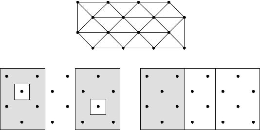
760 |
Spatial analysis |
|
|
(a) Delaunay triangulation
(b) Unconstrained K-means solution |
(c) Constrained K-means solution |
||||||
41 |
42 |
25 |
38 |
41 |
42 |
25 |
38 |
50 |
30 |
41 |
43 |
50 |
30 |
41 |
43 |
43 |
41 |
30 |
50 |
43 |
41 |
30 |
50 |
38 |
25 |
42 |
41 |
38 |
25 |
42 |
41 |
Figure 13.24 Numerical example showing the difference between the unconstrained (b) and constrained (c) clustering solutions. (a) Delaunay triangulation with 35 edges; they were used as constraint in
(c). The values of the artificial variable are given in panels (b) and (c); the three groups obtained by unconstrained and constrained K-means are identified by shadings.
has a value EK = 188 (Fig. 13.24c) which is higher than that of the unconstrained solution, for reasons explained above. The two partitions are interesting in different ways. The unconstrained solution identifies sites with similar values, whereas the constrained solution brings out the two peaks plus a region of lower values forming a valley between the peaks.
Spatially constrained clustering has been applied to a variety of ecological situations. Some applications to two-dimensional map data are: Legendre & Legendre (1984c), Legendre & Fortin (1989), Legendre et al. (1989), and Lapointe & Legendre (1994). Applications to transect data and paleoecology (stratigraphic data) have been listed in Subsection 12.6.4.
3 — Ecological boundaries
Detection of boundaries is a complementary problem to the detection of homogeneous regions of space. Boundaries appear on maps as a by-product of constrained clustering, for instance. Most methods of clustering delineate groups even in gradient situations; a boundary between groups does not have to correspond to a sharp discontinuity in the data. In any case, boundaries detected by clustering may be partly interpolated. Other
Patches and boundaries |
761 |
|
|
methods have been developed that focus on boundary elements; they do not pretend to completely isolate regions of space, however.
For univariate or multivariate transect data, boundaries may be detected using one of the methods described in Section 12.6 (especially Subsection 12.6.3). Detection of boundaries of various sorts on maps is more complex. This is a well-studied topic in the field of image analysis; it has been reviewed by Davis (1975), Peli & Malah (1982) and Huang & Tseng (1988); see also Hobbs & Mooney (1990). The present Section briefly summarizes the efforts made to detect boundaries in ecological data sets, using a technique called wombling, and to statistically assess their significance.
Wombling is a technique for detecting zones of rapid spatial change in a set of regionalized variables. It was developed by Womble (1951) and Barbujani et al. (1989) for gene frequencies and morphological measurements, and refined by Fortin and co-authors (Oden et al., 1993; Fortin, 1994, 1997; Fortin & Drapeau, 1995; Fortin et al., 1996) with emphasis on ecological data. The original form of wombling (lattice wombling) could only be applied to quantitative variables observed at sites forming a regular, rectangular grid of points. Recent developments include categorical wombling for qualitative variables (Oden et al., 1993) and triangulation wombling for sites linked by a Delaunay triangulation which do not necessarily correspond to a regular sampling grid (Fortin, 1994). The latter is a common situation in ecology.
A boundary is defined as a set of spatially adjacent locations where the variable under study shows high rates of change (Fortin, 1994). Triangulation wombling proceeds as follows:
•Link the observed sites by a Delaunay triangulation (Subsection 13.3.1).
•Consider a quantitative variable measured at three sites Øi forming a Delaunay triangle. Each site has geographic coordinates (Xi , Yi) and an observed value yi. The plane to be fitted to these points is a linear function y = f(X, Y) = b0 + b1X + b2Y whose parameters are calculated by matrix inversion (Section 2.8):
|
|
|
|
|
–1 |
|
|
b0 |
|
1 X1 |
Y1 |
|
y1 |
||
b1 |
= |
1 X2 |
Y2 |
|
y2 |
||
b2 |
|
1 X3 |
Y3 |
|
y3 |
||
|
|
|
|
|
|
|
|
• Find the direction of maximum slope of the triangle. The slope varies with the direction considered (arrows in Fig. 13.25a). Using the b coefficients calculated above, the maximum slope of the triangle is:
m = |
------------------------∂ f ( X , Y ) 2 |
+ |
------------------------∂ f ( X, Y) 2 |
= b12 + b22 |
(13.24) |
|
∂ X |
|
∂Y |
|
|
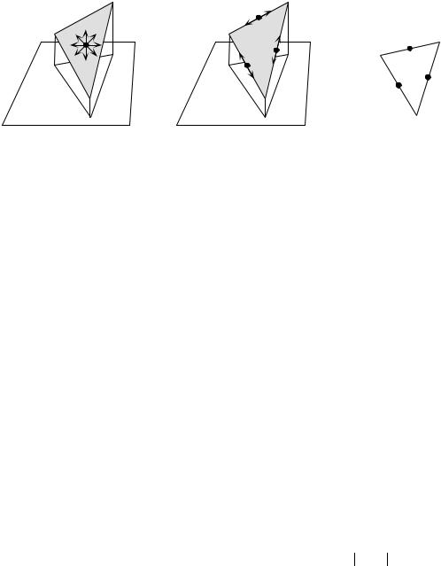
762 |
Spatial analysis |
|
|
|
|
|
|
Ø2 |
Match |
|
Ø1 |
|
Ø1 |
|
Ø1 |
|
|
y1 = 1 |
|
|
|
y2 = 1 |
|
|
|||
|
Ø2 |
|
Ø2 |
|
|
|
Mismatch |
|
|
|
|
Mismatch |
|
|
|
|
|
|
|
|
|
|
|
(a) |
Ø3 |
(b) |
Ø3 |
(c) |
|
Ø3 |
|
y |
|
= 0 |
|||||
|
|
|
|
||||
|
|
|
|
|
3 |
|
|
Figure 13.25 Boundary detection methods. Consider three sites Øi , with coordinates (Xi, Yi), forming a Delaunay triangle. (a, b) Variable y measured at sites Øi is quantitative (values shown as heights). (a) Find the direction of maximum slope of the triangle; allocate this slope value to the triangle centroid (dot). (b) Compute slopes along the edges connecting adjacent sites; allocate the values to the edge centres (dots). (c) For a qualitative variable y (with 2 states in this example), comparison between adjacent sites is made in terms of matches (0-0 or 1-1) or mismatches (0-1); allocate the matches and mismatches to the edge centres (dots).
Allocate this value of slope (m) to the centroid of the triangle, which is the point with coordinates:
[X, Y] |
|
= |
|
X1 + X2 + X3 |
Y1 |
+ Y2 |
+ Y3 |
|
(13.25) |
|
|
|
|||||||
centroid |
|
--------------------------------3 |
, -------------------------------- |
|
|||||
|
|
|
3 |
|
|
|
|||
• If several variables are considered (i.e. several species), calculate the mean slope (m ) of the variables at the centroid of each Delaunay triangle.
• Create an ordered list of the slope values. Starting at the top of the list (highest slopes), mark the corresponding triangle centroids on the map; they become boundary elements. Going down the list, mark a pre-determined proportion of the slopes (e.g. 10%), or go down to a preselected value of slope. Other strategies are possible, e.g. going down the list to the value of the mean plus one or two standard deviations.
Boundary • A boundary is defined as any set of one or more contiguous boundary elements.
An alternative would be to compute the slopes of the edges between adjacent sites (Fig. 13.25b). For univariate data, the rate of change would simply be the absolute value of the difference between values at sites Øh and Øi : yh – yi . For multivariate data, any of the distance functions of Chapter 7 could be used. The disadvantage of this method is that slopes calculated along the edges of the Delaunay triangle do not have the same value as the maximum slope of the triangle, which is computed by eq. 13.24. To alleviate this problem, Dufrêne & Legendre (1991) calculated
Patches and boundaries |
763 |
|
|
multivariate distances in four directions between pixels of a map; for each pixel, they used the largest of the distances to delineate boundaries.
Computation of statistics along the edges between adjacent sites is the option used in categorical wombling which is appropriate for species presence-absence data. The basic statistic is to record a match or a mismatch between adjacent observed sites (Fig. 13.25c). For multivariate qualitative data, one may count both the positive and negative matches and embed this number into one of the symmetrical binary coefficients of Subsection 7.3.1 (e.g. the simple matching coefficient); for species presence-absence data, one may count the positive matches only and embed this number into one of the asymmetrical binary coefficients of Subsection 7.3.2 (e.g. the Jaccard coefficient).
Tests of significance, based on permutations (Section 1.2), have been proposed by Fortin and co-authors (Oden et al., 1993; Fortin, 1994, 1997; Fortin & Drapeau, 1995; Fortin et al., 1996) to answer the following questions:
•Are the boundaries found by this analysis similar to random boundaries in terms of the number of separate boundaries, their maximum or mean lengths, or other boundary or graph-theoretic statistics?
•Are the boundaries found by wombling the same as borders stated by hypothesis, or found by clustering methods, or obtained using different data for the same locations?
These papers also present applications of the method to real and simulated data. A computer program for wombling is commercially available (GBAS, Table 13.4).
4 — Dispersal
Individuals, populations, and communities may cross ecological boundaries; these crossings occur on different time scales. The routes taken by species when they invade a territory after a perturbation event (long-term: e.g. glaciation; short term: e.g. pollution) is a question of interest in biogeographic analysis. Dispersal routes may be easier to identify if, as a first step in the analysis, one delineates regions that are largely homogeneous in species composition. Regions may be delimited using prior hypotheses, by unconstrained or constrained cluster analysis, or using boundary detection methods.
Legendre & Legendre (1984c) have developed coefficients to measure the likelihood of species dispersal between geographically contiguous regions, for species presence-absence as well as abundance data. The assumptions of these coefficients are that the species arrived by migration and that past dispersal has left traces in presentday distributions. For presence-absence data, adjacent regions x1 and x2 can be compared using the same quantities a, b, and c as in the similarity coefficients of Subsection 7.3.1 and 7.3.2: a is the number of species that two regions have in common; b is the number of species found in x1 but not in x2; c is the number of
764 |
Spatial analysis |
|
|
species found in x2 but not in x1. The combination of the following indications is evidence for species dispersal from region x1 to x2 :
•The number of species common to the two zones is high, i.e. a is large.
•b is substantially larger than c; c larger than b would support the hypothesis of dispersal from x2 to x1.
The basic form of the coefficient of species dispersal direction (DD) is thus a(b – c). To make the values of the coefficient comparable for faunas of different richness, each term is standardized by dividing it by the richness of the fauna or flora of the two regions combined:
DD1 (x1 → x2) |
= |
a |
( b – c ) |
(13.26) |
|
---------------------------( a + b + c) ---------------------------(a + b + c) |
|||||
|
|
|
|||
This coefficient is signed. It measures the likelihood that species have dispersed from x1 to x2. A negative sign indicates that, if dispersal occurred, species have migrated from x2 to x1 instead.
The asymmetric portion of this coefficient may be tested for significance using a McNemar test. Under the null hypothesis of no asymmetry (H0: b = c), the test statistic
XP2 = |
--------------------( b – c ) 2 |
|
( b + c ) |
is distributed as χ2 with one degree of freedom. The test may be one-tailed if one has specific hypotheses about the direction of dispersal; otherwise, use a two-tailed test. The log-linear form of this statistic is:
|
XW2 = 2 {b lnb + c lnc – (b + c) ln [ (b + c) ⁄ 2] } |
If any of |
the values b or c is 0, the corresponding term (x lnx) is 0 since |
lim x ln x |
= 0 . |
x → 0 |
|
The first portion of DD1 is easily recognized as the Jaccard coefficient of similarity (eq. 7.10). One may prefer to give double weight to the common species, as in the coefficient of Sørensen (eq. 7.11):
DD2 (x1 → x2) |
= |
2a |
( b – c ) |
(13.27) |
|
-------------------------------( 2 a + b + c) ---------------------------(a + b + c) |
|||||
|
|
|
|||
Unconstrained and constrained ordination maps |
765 |
|
|
Two other forms of the coefficient use species abundance data instead of presenceabsence:
|
DD3 (x1 → x2) = |
|
W ( A – B) |
(13.28) |
||
|
----------------------------------( A + B – W) 2 |
|||||
|
|
|
|
|||
and |
DD4 (x1 → x2) |
= |
2W |
( A – B) |
(13.29) |
|
+ B) -------------------------------( A + B – W) |
||||||
|
|
|
|
|||
where W, A, and B are as in the Steinhaus similarity coefficient (eq. 7.24). Coefficient DD4 gives double weight to the abundances of the species in common and is thus the counterpart of DD2, whereas DD3 gives these species single weight, as in DD1. These two coefficients take the following indications as evidence for dispersal from x1 to x2 :
•The number of species common to the two zones and their abundances are high, i.e. W is large.
•A is substantially larger than B; B larger than A would produce a negative coefficient, supporting the hypothesis of dispersal from x2 to x1.
Legendre & Legendre (1984c) used the above coefficients and tests of significance to reconstruct plausible routes taken by freshwater fishes to reinvade the Québec peninsula after the last glaciation. Borcard et al. (1995) used the same method in a finer-scale study, showing possible patterns of migration of Oribatid mites between zones of an exploited peat bog in the Swiss Jura.
13.4 Unconstrained and constrained ordination maps
Section 13.3 has shown how clustering methods may help produce maps for multivariate data; these maps consist of discontinuous areas. For continuous variables, however, maps can only be produced for single variables, using the techniques of Section 13.2. The present Section shows how continuously-varying maps can be produced for multivariate data sets, through various types of ordination methods. The relationship between univariate or multivariate structure functions (Section 13.1) and maps has been stressed in the introductory paragraph of Section 13.2.
The simplest method consists in analysing a data table, using one of the ordination methods of Chapter 9, and map the first few ordination axes. For example:
•Decompose the variation of a (sites species) presence-absence or abundance table into successive ordination axes, using principal coordinate or correspondence analysis.
•Consider the ordination of sites along the first axis. This axis is a new, synthetic quantitative variable for the variation among sites. Associate it to a table of the (X, Y)
766 |
Spatial analysis |
|
|
geographic coordinates of the sites. Produce a map using one of the methods in Section 13.2. An example of such a map is given in Fig. 9.19 for correspondence analysis axis I of a vegetation data table.
• Repeat the operation, producing maps for ordination axes II, III, etc. as long as interesting or significant spatial variation can be detected. The R2 of trend surface analysis (Subsection 13.2.1) may be used as criterion for deciding which of the ordination axes should be mapped.
Simple ordination analysis leaves it to chance to find spatially-structured components of variation. One may decide instead to look directly for such components, by forcing the analysis to bring out axes of variation that are related to the X and Y coordinates, or combinations of X and Y into a spatial polynomial equation. The spatial polynomial is constructed as in Subsection 13.2.1. Ordination analysis of a species data table, constrained to be related to a spatial polynomial, can be done by canonical analysis (Chapter 11), as suggested by Legendre (1990). Canonical analysis then becomes an extension to multivariate data tables of the method of trend surface analysis. The method will be described with the help of a numerical example. Another example (vegetation data) is found in Legendre (1990).
Numerical example. Data from the Thau lagoon are used again here (Tables 10.5 and 13.2). To facilitate mapping, the X and Y geographic coordinates of the sampling sites were rotated by principal component analysis (PCA using the covariance matrix; the eigenvectors were normalized to lengths 1); Table 13.2 shows the rotated coordinates. A third-degree spatial polynomial of these new X and Y coordinates was created (Subsection 13.2.1) and subjected to the “forward selection of environmental variables” procedure of program CANOCO; in this procedure, variables from the matrix containing the spatial monomials were selected one by one, in a stepwise manner, for their capacity to significantly contribute to the explanation of the “species data” (here, the Bna and Ma bacterial variables). The following five terms of the spatial polynomial were retained by the selection procedure: X2, X3, X2Y, XY2, and Y3.
Redundancy analysis (Section 11.1) produced two canonical axes (λ1 = 0.622, λ2 = 0.111), as expected from Table 11.1 for two dependent variables (Bna, Ma). The canonical relationship accounted for 73.4% of the variation in the bacterial data; it was globally significant (p = 0.001 after 999 permutations of residuals under the full model, using CANOCO); so was the first canonical eigenvalue (62% of the variance in the bacterial variables; p = 0.001). 81% of the variance of Ma was expressed along axis I, but only 7% of the variance of Bna. The second canonical eigenvalue (11% of the variance of the two bacterial variables) did not reach significance at α = 0.05 (p = 0.076) although 42% of the variance of Bna was expressed on this axis. There are two non-canonical axes representing the non-spatially-structured variation of the response variables; they represent 16% and 10% of the variation of matrix Y, respectively. Canonical axis I differs from the first principal component of matrix Y, which would express the variation in the response variables (Bna, Ma) without the constraint of being a linear combination of the spatial variables.
For axis I, the “site scores” and the “fitted site scores” (“site scores that are linear combinations of the environmental variables” in program CANOCO) were mapped (Fig. 13.26). Maps were obtained by kriging (Subsection 13.2.2) using program OKB2D of the GSLIB

Unconstrained and constrained ordination maps |
767 |
|
|
Table 13.2 Data from Table 10.5. There are two dependent variables (Bna and Ma, forming matrix Y) and three environmental variables (NH4, phaeopigments, and bacterial production, forming matrix X). Five spatial variables (X2, X3, X2Y, XY2, and Y3, included in matrix W) were derived from the X and Y coordinates, reported in the Table, that were obtained by PCA rotation of the geographic coordinates of Table 10.5. The variables are further described in Numerical example 1 of Subsection 10.3.5.
Station |
Bna |
Ma |
NH4 |
Phaeo. a |
Prod. |
X |
Y |
No. |
y1 |
y2 |
x1 |
x2 |
x3 |
after PCA rotation |
|
1 |
4.615 |
10.003 |
0.307 |
0.184 |
0.274 |
–9.4173 |
–1.2516 |
2 |
5.226 |
9.999 |
0.207 |
0.212 |
0.213 |
–7.1865 |
–1.0985 |
3 |
5.081 |
9.636 |
0.140 |
0.229 |
0.134 |
–5.8174 |
–1.4528 |
4 |
5.278 |
8.331 |
1.371 |
0.287 |
0.177 |
–6.8322 |
0.2706 |
5 |
5.756 |
8.929 |
1.447 |
0.242 |
0.091 |
–4.6014 |
0.4238 |
6 |
5.328 |
8.839 |
0.668 |
0.531 |
0.272 |
–4.2471 |
1.7929 |
7 |
4.263 |
7.784 |
0.300 |
0.948 |
0.460 |
–1.8632 |
–0.2848 |
8 |
5.442 |
8.023 |
0.329 |
1.389 |
0.253 |
–0.4940 |
–0.6391 |
9 |
5.328 |
8.294 |
0.207 |
0.765 |
0.235 |
0.8751 |
–0.9934 |
10 |
4.663 |
7.883 |
0.223 |
0.737 |
0.362 |
–0.1398 |
0.7300 |
11 |
6.775 |
9.741 |
0.788 |
0.454 |
0.824 |
–1.1546 |
2.4534 |
12 |
5.442 |
8.657 |
1.112 |
0.395 |
0.419 |
0.2145 |
2.0992 |
13 |
5.421 |
8.117 |
1.273 |
0.247 |
0.398 |
4.9824 |
–2.0562 |
14 |
5.602 |
8.117 |
0.956 |
0.449 |
0.172 |
3.9676 |
–0.3328 |
15 |
5.442 |
8.487 |
0.708 |
0.457 |
0.141 |
3.4602 |
0.5289 |
16 |
5.303 |
7.955 |
0.637 |
0.386 |
0.360 |
6.3515 |
–2.4105 |
17 |
5.602 |
10.545 |
0.519 |
0.481 |
0.261 |
5.8441 |
–1.5488 |
18 |
5.505 |
9.687 |
0.247 |
0.468 |
0.450 |
4.8293 |
0.1746 |
19 |
6.019 |
8.700 |
1.664 |
0.321 |
0.287 |
4.6762 |
2.4054 |
20 |
5.464 |
10.240 |
0.182 |
0.380 |
0.510 |
6.5527 |
1.1894 |
|
|
|
|
|
|
|
|
library (Deutsch & Journel, 1992); all-directional spherical variogram models were fitted to the empirical variograms prior to kriging (Subsection 13.1.3). Figure 13.26a shows the “site scores” expressing the point-by-point variation of the original data (matrix Y of bacterial variables) projected onto axis I (eq. 11.12). Figure 13.26b maps the “fitted site scores” which are the fitted
values of the multiple regressions (matrix ˆ ) projected onto canonical axis I (eq. 11.13). The
Y
data projected onto axis I in Fig. 13.26a are with residuals ( = ˆ + ; Fig. 11.2) whereas
Y Y Yres
the residuals are excluded in Fig. 13.26b. The trend surface equation that produced the “fitted
site scores” for the 20 sampling stations (Fig. 13.26b) is written out by program CANOCO under the heading “Regression/canonical coefficients for standardized variables”:
Axis I = 1.0526X2 + 1.1881X3 – 0.5225X2Y – 0.7674XY2 + 0.7167Y3
The spatial variables were standardized before computing this equation.
768 |
|
|
|
Spatial analysis |
|
|
|
|
(a) |
0.0 |
|
0.0 |
0.2 |
|
|
|
|
|
|
|
|
|
|
0.6 |
||
|
0.2 |
|
–0.2 |
|
0.0 |
0.2 |
||
|
|
|
|
|
|
|||
|
|
|
|
–0.4 |
|
|
|
|
|
|
|
|
|
|
0.4 |
|
|
|
0.4 |
|
|
|
|
|
|
|
|
|
|
–0.6 |
|
|
|
|
|
|
|
|
|
|
|
|
|
|
|
|
|
|
|
|
|
|
0.8 |
|
0.6 |
|
|
|
|
|
|
|
|
|
0.8 |
|
–0.6 |
|
|
|
|
|
|
|
|
|
|
|
|
|
|
|
|
|
–0.8 |
–0.6 |
–0.6 |
|
|
|
|
|
|
|
|
|
||
(b) |
0.2 |
0.2 |
0.2 |
0.4 |
–0.2 |
|
|
|
|
|
|
|
|
||||
|
|
|
|
|
0.0 |
|
||
|
|
|
0.0 |
|
|
|
|
|
|
0.4 |
|
|
–0.4 |
|
|
|
|
|
|
–0.2 |
|
|
|
|
||
|
|
|
–0.6 |
|
|
|
|
|
|
|
|
|
–0.6 |
|
|
|
|
|
|
|
–0.4 |
–0.8 |
|
|
0.8 |
|
|
|
|
|
|
|
|||
|
0.6 |
|
|
|
|
|
0.2 |
0.6 |
|
|
|
|
|
|
|
0.4 |
|
|
0.8 |
|
|
|
|
|
|
|
|
|
|
|
|
|
|
|
|
Figure 13.26 Map of the first canonical axis of the Thau lagoon bacterial variables constrained by the spatial polynomial. (a) Site scores. (b) Fitted site scores. Dots represent the 20 sampling sites. The north-south direction is nearly parallel to the vertical axis of the maps; compare the point positions with Fig. 13.13.
Interpretation of the maps is rather simple in this example: examination of Table 13.2 shows that the sites with the highest scores along canonical axis I (i.e. sites 1-3, 11, 17-20; grey areas in Fig. 13.26) possessed the highest concentrations of aerobic heterotrophic bacteria growing on marine agar (variable Ma); in the canonical analysis output, Ma was also identified as the variable dominating canonical axis I.
Thioulouse et al. (1995) proposed a different approach to mapping, which combines connection networks, decomposition of the variation into local and global components, eigenvalue decomposition, and mapping. The neighbouring relationships among sites are represented by some appropriate connection network (e.g. Delaunay triangulation for a homogeneous two-dimensional sampling area, or neighbouring relationships for sites along a river network) which is translated into a contiguity matrix M (Fig. 13.23). M is standardized to P by division by the total number of pairs of neighbours. A diagonal matrix D describes the degree of connectedness of the sites. Using matrices P and D, the authors define principal component and correspondence
Causal modelling: partial canonical analysis |
769 |
|
|
analysis for the total, local, or global components of variation; each fraction is decomposed into orthogonal axes, which may be mapped to facilitate interpretation. The paper presents applications to simulated and real ecological data (bird survey).
13.5 Causal modelling: partial canonical analysis
The significance of spatial heterogeneity for the functioning of ecosystems was discussed in Section 1.1. Models of ecosystem processes may fall short of being optimal unless they include the spatial organization of the players — populations and communities — among the predictor variables. Although this type of modelling is still in its infancy, two main approaches have been proposed. The first one, described in the present Section, consists in modelling the spatial variation of the variables of interest as a linear combination of the environmental variables and the geographic coordinates of the sites. This approach makes use of methods discussed in previous Chapters and Sections: partial regression analysis (univariate: Subsection 10.3.5) and partial canonical analysis (multivariate: Section 11.3) on the one hand; trend surface analysis (univariate: Subsection 13.2.1) and constrained ordination mapping (multivariate: Section 13.4) on the other. In the second approach (Section 13.6), the spatial structure is conveniently represented by a matrix of geographic distances among sites.
In both Sections, the analysis considers three data sets, as in partial regression modelling: Y contains the response variables; X is the set of explanatory environmental variables; W is the set of explanatory spatial variables (based on the spatial coordinates of the sampling sites, transformed in various ways as described below). There are two motivations for analysing data in this way:
• Spatial structures are a major source of false correlations, which are not indicative of causal relationships. Spatial autocorrelation may cause correlations to appear between autocorrelated variables, due to spatial structures that are generated by the autocorrelation in the data; examples of such structures are the “false gradients” described in Subsection 13.1.2. The question is the following: is there a significant amount of correlation between the response and explanatory variables, besides some common spatial structure which may be non-causal? The interest here is in fraction [a] of Figs. 10.10 and 13.27, which corresponds to the “explanation” (in the sense of Subsection 10.2.1) of the response data (Y) by the explanatory environmental variables (X) after the common spatial structure (fraction [b]) has been controlled for. If the analysis of the spatial structure of Y is also of interest, it should be carried out independently of that of X. If fraction [b] is large, the hypothesis that it indicates false correlations between autocorrelated variables in matrices Y and X is supported if new data, obtained by sampling at a different spatial scale, fail to produce a large fraction [b]. Nested sampling designs, as used for instance in Ecological application 13.1b, are a way of obtaining data sets for modelling at more than one spatial scale.

770 |
|
|
Spatial analysis |
|
|
|||
|
|
|
|
|
|
|
|
|
|
[a] |
[b] |
|
[c] |
[d] |
|||
|
|
|
|
|
|
|
|
|
|
Explained by X (environmental) |
|
|
|
|
Unexplained |
||
|
|
|
|
|
||||
|
|
|
|
|
|
|
|
|
|
|
Explained by W (spatial) |
|
|
variation |
|||
|
|
|
||||||
|
|
|
|
|
|
|
|
|
Figure 13.27 Partition of the variation of a response matrix Y between environmental (matrix X) and spatial (matrix W) explanatory variables. The length of the horizontal line corresponds to 100% of the variation in Y. Compare to Fig. 10.10. (Adapted from Borcard et al., 1992, and Legendre, 1993).
• If both the spatial and non-spatial structures of the explanatory variables are assumed to be causal to the spatial variation of Y, fraction [a + b] (instead of fraction [a] alone, as above) empirically measures the support to the hypothesis of causal relationship between the response and explanatory variables. One may or may not be interested in breaking it down into a purely environmental fraction ([a] in Fig. 10.10 and 13.27) and a spatially-structured environmental effect (fraction [b]). One may be interested, however, in determining whether the response data (Y) have some spatial structure of their own (fraction [c]) which is not explained by the explanatory variables in the model. If such a structure is found, reasons for its existence are worth investigating. It may be caused by environmental variables that have not been included in the analysis, by historical events, or by population or community dynamic processes that may be masked by some dominant environmental effect (Borcard & Legendre, 1994). In this approach, any spatial structure identified in the response data set is considered an indication of the presence of some process generating it. Mapping fraction [c] of the variation may help generate hypotheses about the processes responsible for the observed residual spatial pattern.
It is important to note that the approaches described above are essentially correlative, like regression analysis. They differ from the analysis of variance, which estimates the variation associated with well-defined effects in structured sampling or manipulative experiments. In the initial stages of ecological research, correlative methods are routinely used to sort out hypotheses centring on broad correlative patterns among groups of variables, before specific hypotheses can be experimentally tested. In particular, the analyses presented in this Section allow researchers to consider different groups of explanatory variables (environmental, spatial, or temporal) and examine their capacity to explain patterns in the multivariate response variables (species or others) that are of interest in a study; they further allow one to measure the degree of overlap that exists among these groups of explanatory variables with regard to that capacity (Anderson & Gribble, 1998). The correlations brought out by the analyses are only interpretable insofar as hypotheses can be formulated about the processes that may have generated the observed patterns. This approach is related to regression (Section 10.3) and path analysis (Section 10.4), in which a large number of plausible relationships may be hypothesized and sorted out by statistical analysis.
Causal modelling: partial canonical analysis |
771 |
|
|
1 — Partitioning method
A method for implementing the approach described above was proposed by Borcard et al. (1992). It consists in partitioning the variation of a response matrix Y between the environmental (X) and spatial (W) matrices of explanatory variables, in the way described in Subsection 10.3.5. Partial RDA or CCA are used if Y contains several response variables, or partial linear regression if there is a single variable in Y and a linear relationship is assumed between Y and the variables in X and W. Calculation of the fractions of variation ([a] to [c] in Fig. 10.10 and 13.27) is described in Subsection 10.3.5. Estimation of the vectors corresponding to the fractions of variation is also described in that Subsection; these vectors may be used to produce maps.
If matrix Y is multivariate, the variation in Y is decomposed using partial canonical analysis (Section 11.3). Borcard et al. (1992) applied this decomposition to three ecological data sets: soil mites, forest vegetation, and aquatic heterotrophic bacteria. The decomposition may be carried out in many different ways, which are equivalent, using three of the five following analyses:
(1)A simple RDA (redundancy analysis: Section 11.1) or CCA (canonical correspondence analysis: Section 11.2) of the matrix of response variables Y, constrained by matrix X, extracts fraction [a + b].
(2)A simple RDA or CCA of matrix Y, constrained by matrix W, extracts fraction [b + c].
(3)A simple RDA or CCA of matrix Y, constrained by a matrix combining the variables of matrices X and W, extracts fraction [a + b + c]. The residual variation corresponds to fraction [d].
(4)A partial RDA or CCA (Section 11.3) of matrix Y, constrained by matrix X and using W as the matrix of covariates, extracts fraction [a].
(5)A partial RDA or CCA of matrix Y, constrained by matrix W and using X as the matrix of covariates, extracts fraction [c].
For each of these analyses, the sum of all canonical eigenvalues, divided by the sum of all (unconstrained) eigenvalues, gives the corresponding fraction of the variation explained by the analysis. The sum of the (unconstrained) eigenvalues in Y is the sum of all the eigenvalues of a regular PCA (principal component analysis, Section 9.1) of matrix Y if RDA is used for the decomposition, or the sum of all the eigenvalues of a regular CA (correspondence analysis, Section 9.4) of matrix Y if the decomposition is obtained by CCA. The sum of all canonical eigenvalues of an analysis can be tested for significance (Subsection 11.3.2). Each analysis decomposes the canonical variation into canonical axes, and each axis may be tested for significance. For each significant axis, either the “site scores” or the “fitted site scores” may be used to produce maps as in Fig. 13.26.
772 |
Spatial analysis |
|
|
Analyses (4) and (5) must be carried out only if one is interested in estimating the vectors of fitted values corresponding to fractions [a] and [c], so as to map them for instance. Otherwise, fraction [a] can be obtained from the results of analyses (2) and
(3) which are simpler to carry out. Indeed, because the fractions of variation are additive (Subsection 10.3.5), it follows that:
[a] = [a + b + c] – [b + c]
where [a] represents the fraction of variation of Y, explained by the environmental variables, which is not spatially structured. In the same way, fraction [c] may be obtained from analyses (1) and (3):
[c] = [a + b + c] – [a + b]
where [c] is the spatially-structured fraction of variation of Y which is not explained by the environmental variables.
[b] is the fraction of variation of Y, explained by the environmental variables, which is spatially structured. It may be equally attributed to the environmental variables X or the spatial variables W. It can only be obtained by subtraction:
|
[b] = [a + b] + [b + c] – [a + b + c] |
or |
[b] = [a + b] – [a] |
or |
[b] = [b + c] – [c] |
or |
[b] = [a + b + c] – [a] – [c] |
No combination of simple or partial canonical analyses can produce fraction [b]; it is not a fitted variance component, but the difference between the variances explained by two models which have no structural relationship to each other. As a result, the measured quantity cannot be described as variance explained by a specific linear model of some predictors. Interpretation of fraction [b] remains interesting, however, as explained in Subsection 10.3.5. The estimation of vectors of site scores corresponding approximately to fraction [b] is a difficult problem; some solutions have been proposed by Méot et al. (1998).
Fraction [d] is the residual variation of analysis (3). It can be calculated as:
[d] = 1 – [a + b + c]
The amount of variation associated with fraction [d] is the residual sum of squares (RSS) in the denominator of the F statistics (eq. 11.19) used to test the overall significance of the simple and partial canonical analyses described above, or the significance of particular canonical axes (eq. 11.20).
The broad-scale spatial variation in matrix Y may be modelled by a polynomial of the geographic coordinates of the sampling sites, as in trend surface analysis
Causal modelling: partial canonical analysis |
773 |
|
|
(Subsection 13.2.1) and constrained ordination mapping (Section 13.4); in that case, component [a] of the variation corresponds to the more regional or local variation, as well as the non-spatially-structured environmental variation. Alternatively, more local spatial variation can be captured using a nearest-neighbour autocorrelation model (Legendre and Borcard, 1994); an example is given by He et al. (1994), who applied this method to explain the spatial variation of tree density, species richness and Shannon diversity in a tropical rain forest.
Numerical example. The data from Table 13.2 (Thau lagoon) are reanalysed here. In the numerical example of Section 13.4, the variable selection procedure retained the following terms of the spatial polynomial: X2, X3, X2Y, XY2, and Y3; the same terms are used in the present example. The five analyses described above were carried out to obtain the fractions of variation:
Fractions |
Proportion of |
Probability |
Canonical |
Probability |
of variation |
variation of Y |
(999 perm.) |
λ1 |
(999 perm.) |
[a + b] |
0.450 |
0.005* |
0.359 |
0.025* |
|
|
|
|
|
[b + c] |
0.734 |
0.001* |
0.622 |
0.001* |
|
|
|
|
|
[a + b + c] |
0.784 |
0.001* |
0.632 |
0.001* |
|
|
|
|
|
[a] |
0.051 |
0.549 |
0.042 |
0.561 |
|
|
|
|
|
[b] |
0.399 |
----- |
----- |
----- |
|
|
|
|
|
[c] |
0.334 |
0.011* |
0.304 |
0.004* |
|
|
|
|
|
[d] |
0.216 |
----- |
----- |
----- |
|
|
|
|
|
[a + b + c + d] |
1.0000 |
|
|
|
|
|
|
|
|
Significant fractions are identified by asterisks (α = 0.05). Eigenvalues of the first canonical axis (canonical λ1) are reported as fractions of the total variance in Y. The second canonical axis was never significant; since each analysis only produced two canonical eigenvalues in this example, the portions of variation corresponding to λ1 are the differences between columns 2 and 4 from the left. Fraction [b] is not an independently-calculated component of the variation; hence, it cannot be tested for significance nor decomposed into canonical axes (see Méot et al., 1998, for alternative solutions).
The analysis decomposed the total explained variation [a + b + c] into a significant environmental component [a + b] and a significant component [c] which estimates the spatiallystructured variation of Y not explained by the environmental variables. The table shows that [a + b], which is the variation of Y explained by the environmental variables, is mostly spatially structured since [b] represents 89% of [a + b] and [a] is not significant.
Figure 13.28 shows maps of the “fitted site scores” of the first canonical axis of fraction [a + b + c] and of its two components, [a + b] and [c]. These maps were obtained by kriging (Subsection 13.2.2) using program OKB2D of the GSLIB library (Deutsch & Journel, 1992); all-directional spherical variogram models were fitted to the empirical variograms prior to kriging (Subsection 13.1.3). While the proportions of variation of [a + b] and [c] add up to that of [a + b + c] (0.450 + 0.334 = 0.784), this is not the case for the proportions of variation represented by the first canonical axes: λ1[a + b] + λ1[c] ≠ λ1[a + b + c]. This is because the partition
774 |
|
|
Spatial analysis |
|
|
|
||
[a+b+c] 0.2 |
0.2 |
|
0.2 |
|
|
|
|
0.8 |
|
|
|
|
|
|
|
0.2 |
|
|
|
|
|
|
|
0.0 |
|
|
0.4 |
0.0 |
–0.2 |
|
|
|
|
0.6 |
|
|
|
–0.4 |
–0.6 |
|
–0.2 |
|
0.4 |
|
0.6 |
|
|
–0.8 |
|
|
|||
|
|
|
|
|
|
1.0 |
||
|
|
|
|
|
|
–0.4 |
|
|
0.8 |
|
|
|
|
|
–0.6 |
|
|
|
|
|
|
|
–0.8 |
|
|
|
1.0 |
|
|
|
|
|
|
|
|
|
|
|
|
|
|
–1.0 |
|
|
1.2 |
|
|
|
|
–1.2 |
–1.0 |
|
|
|
|
|
|
|
|
|
|
|
[a+b] |
0.0 |
|
|
|
|
|
|
|
|
|
|
|
|
|
|
|
|
|
|
|
|
0.0 |
|
|
–0.4 |
|
|
0.2 |
0.0 |
|
–0.2 |
|
|
|
|
|
–0.2 |
–0.4 |
|
|
|
|
||
|
0.4 |
|
|
|
|
|
0.6 |
|
|
|
|
–0.6 |
|
|
|
||
|
0.6 |
|
|
|
|
|
||
|
|
|
–0.8 |
–0.6 |
–0.4 |
–0.2 |
0.0 |
|
|
0.8 |
|
|
|
|
|
|
0.4 |
|
|
|
|
|
|
|
|
|
|
1.0 |
|
|
|
|
|
|
0.2 |
|
|
1.2 |
|
|
|
|
|
|
|
|
|
|
–1.0 |
|
|
|
|
|
|
1.4 |
|
|
|
|
|
|
[c] |
0.4 |
0.6 |
|
|
0.8 |
|
0.2 |
|
|||
|
|
|
|
0.6 |
|
|
0.0 |
|
|
|
|
|
0.2 |
|
|
|
|
|
|
|
|
0.4 |
|
|
|
0.0 |
–0.6 |
|
|
–0.2 |
|
|
0.2 |
||
|
–0.2 |
–0.6 |
0.0 |
0.8 |
|
|
|
|
|||
0.0 |
|
|
–0.4 |
–0.2 |
|
|
–0.2 |
–0.2 |
|
|
|
|
|
–0.4 |
|
||
|
|
|
|
|
|
|
|
–0.2 |
–0.6 |
–0.6 |
–0.8 |
|
|
|
|
|
Sea water
Figure 13.28 Bacterial variables: map of the “fitted site scores” of the first canonical axes of three fractions of the variation: top [a + b + c], middle [a + b], bottom [c]. Dots represent the 20 sampling sites. North is nearly parallel to the vertical axis of the maps. Compare with Fig. 13.26b which represents fraction [b + c]. Arrows at the base of map [c], labelled “sea water”, indicate the positions of connections of the Thau lagoon with the Mediterranean Sea.
of fraction [a + b + c] into canonical axes is done independently of the partitions of [a + b] or [c]. As a consequence, maps of a given axis of variation (e.g. axis I of the various fractions, mapped in Fig. 13.28) do not exactly add up with this method; they only add up approximately.

Causal modelling: partial canonical analysis |
775 |
|
|
Fraction [b + c] (73.4% of the variation in the bacterial data) is the one extracted by the canonical analysis, for the same data, in the numerical example of Section 13.4; Fig. 13.26 presents two maps of this fraction of the variation. In this example, the maps of axis I of fraction [b + c] (Fig. 13.26) are very similar to the map of axis I of [a + b + c] (Fig. 13.28) because [a] is very small.
Before mapping, all signs of axis I of fractions [a + b] and [c] were reversed to make them agree with the signs of the site scores of axis I of [a + b + c]; signs obtained in unconstrained or constrained ordination analyses are arbitrary. With signs reversed, axis I of [a + b], which is the fraction extracted by the environmental variables, is negatively correlated to variables NH4 and phaeopigments.
The map of axis I of fraction [a + b + c] (63% of the variation in the response bacterial variables) and [a + b] (36%) are quite similar, whereas the map of axis I of fraction [c] (33% of the variation) is quite different. The trend surface equation that produced the “fitted site scores” for the 20 sampling stations is written out by program CANOCO under the heading “Regression/canonical coefficients for standardized variables”:
Axis I of [c] = 1.8017X2 + 2.2817X3 – 1.0809X2Y – 1.3064XY2 + 1.5563Y3
In this equation, the spatial variables are residuals of the standardized terms of the spatial polynomial after controlling for the effect of the three environmental variables. Examination of the map of fraction [c] suggests a hypothesis for the origin of this fraction of variation: that of a marine influence, which had not been included among the explanatory variables in the analysis. Indeed, the negative values on the map form a plume originating at the connections of the Thau lagoon with the sea and extending westwards. To “explain away” fraction [c], i.e. to make it become non-significant, another analysis could be conducted that would include variables quantifying the marine influence on the stations of the lagoon among the environmental variables. Such variables could be derived from a hydrodynamic model of the lagoon.
Applications of this method cover a wide range of ecological problems. Here is a selected list of fields and papers: palaeoecology (Zeeb et al., 1994; see also Ecological application 10.3), vegetation (Heikkinen & Birks, 1996), periphyton (Cattaneo et al., 1993), protozoa (Buttler et al., 1996), zooplankton (Pinel-Alloul, 1995), aquatic macroinvertebrates (Pinel-Alloul et al., 1996), fish (Rodríguez & Magnan, 1995), and birds (Bersier & Meyer, 1994).
Variation partitioning has been applied to more than two explanatory data sets.
(1) Pinel-Alloul et al. (1995) tested the hypothesis that biotic and abiotic factors, as well as spatial structuring, explain together the broad-scale spatial heterogeneity of zooplankton assemblages among lakes. The explanatory variables comprised abiotic (physics and chemistry, morphometry) and biotic factors (phytoplankton and fish assemblages); these factors were analysed separately and together, using four approaches described in the paper. (2) Quinghong & Bråkenhielm (1995) explained the spatial patterns of epiphytic green algae and lichens using climatic, pollution, and geographic variables. They showed how to isolate the seven components of variation resulting from crossing three sets of explanatory variables. (3) Anderson & Gribble (1998) extended the variation partitioning method to three matrices of explanatory variables representing the environmental, spatial and temporal components,
776 |
Spatial analysis |
|
|
respectively. They also showed how to isolate the seven components of variation. Using this approach, they were able to resolve the confounding of space and time which is often encountered when sampling is conducted over an extensive period, because of the large size of the area to be surveyed.
2 — Interpretation of the fractions
In simple regression or canonical analysis modelling, one is interested in the variation of the response data (vector y or matrix Y) which is accounted for by the explanatory variables (matrix X) according to a model of causal relationships, vague or precise, stated prior to the analysis. The fraction of variation explained by the model is measured by the coefficient of determination (R2, eq. 10.19) in multiple regression and by the ratio [sum of all canonical eigenvalues/trace of matrix Y] in canonical analysis (Subsection 11.3.2). The residual variance is assumed to be a random error component.
In the introduction to Section 13.5, two motivations were discussed for the decomposition of the variation of a multivariate response matrix Y into the additive components estimated in Subsection 1.
•If the spatial structure is considered to be a source of false correlations which are not indicative of causal relationships, fraction [b] measures the interference of the spatial variables with the analysis of the relationship between Y and X. Fractions [b] and [c] should not be interpreted separately, although one may still be interested in modelling the spatial structure of Y (fraction [b + c]) separately from X.
•If both the spatial and non-spatial structures of the explanatory variables are considered causal to the spatial variation of Y, fraction [a + b] estimates the amount of variation of Y explained by X. In such a case, the residuals of the analysis of Y by X are assumed to contain two identifiable fractions: [c] which is spatially structured and
[d] which is the random error component. A test of significance allows one to determine, at some confidence level α, whether fraction [c] may be attributed to random variation. If this is not the case, one should try to interpret fraction [c]. The next step is to “explain away” fraction [c], if possible. In other words, one should try to make fraction [c] disappear by adding variables to matrix X and recomputing the model. The numerical example of the previous Subsection has shown how maps of the site scores for the significant canonical axes of fraction [c] may help identify the processes responsible for this fraction of variation. Borcard & Legendre (1994) developed an application showing how fraction [c] may be explained away by adding environmental variables in a stepwise manner to the set of explanatory variables.
In statistical analysis, causality, if invoked, resides in the hypotheses of the researcher. This point has been stated repeatedly throughout the book. The objective of causal statistical modelling is to verify how much of the observed variation can be explained by a consistent body of hypotheses (i.e. a set of compatible hypotheses). Problems of interpretation may occur, however, when important causal factors are left out of the model. The amount of variation of Y explained by the model may be reduced
Causal modelling: partial canonical analysis |
777 |
|
|
and, if these factors are causally anterior to both the variables in Y and some of the variables in set X, false correlations may appear in the model; this is also the case in path analysis (Section 10.4).
In community analysis, researchers are faced with a multiplicity of potential causal agents acting at a variety of spatial and temporal scales, thus creating a network of interactions that may be difficult to untangle. Section 13.0 mentioned three general models often invoked to explain community variation: the environmental control model (ECM), the biotic control model (BCM), and historical dynamics (HD). The latter refers to past natural events, such as isolation by geographic barriers and disturbances of various kinds (storms, forest fires, volcanic eruptions, landfalls, etc.), and to anthropogenic causes such as agriculture, logging, constructions of various sizes, etc. They are usually not explicitly represented by variables in matrix X. Some of these events may be traced by researchers (e.g. tornadoes, forest fires, logging, past agricultural plots) and explicitly included in a second round of modelling, while others cannot and may only be invoked in general terms to account for community variation. Table 13.3 summarizes the interpretation of the various fractions of variation of Fig. 13.27. Examples follow of factors that may intervene to explain community variation in a temperate forest; they illustrate the statements in Table 13.3.
[a]The environmental and biotic factors that are explicitly represented by variables in matrix X usually have fine-scale variation. They may explain part of the local variation of the forest community which is not taken into account by the broader-scale spatial polynomial model. Besides these factors, local variation in unobserved soil chemistry variables or other factors may be responsible for part of the variation in the community structure (matrix Y) and in the explanatory variables included in X, a case which would lead to covariation between X and Y (false correlation). For example, localized infestation by pest insects may have occurred in the past, leaving variation at some sites in the forest that persisted throughout the years; such a historical event may also have left traces in the variables of matrix X, leading to causal or non-causal correlations.
[b]The environmental and biotic factors that are explicitly represented by variables in matrix X often have broad-scale variation, detectable by the spatial polynomial model, which may explain part of the variation of the forest community. Besides these factors, broad-scale variation in unobserved environmental factors may be responsible for part of the variation in the community structure (matrix Y) and in the explanatory variables included in X, a case which would lead to covariation between X and Y (false correlation). For example, past occupation of the territory under study by agriculture may have left spatially-structured variation in the forest community; it may also have left traces in the measured soil variables of matrix X, leading to causal or non-causal correlations. Autocorrelation in both the response and explanatory variables may cause covariation between matrices Y and X, hence inflating fraction [b].
[c]Part of the spatial structure of the community may be caused by environmental or biotic factors that were not included in the analysis; for instance, a humidity gradient
 C
C C
C
 C
C
Causal modelling: partial Mantel analysis |
779 |
|
|
major source of spatial autocorrelation, which is responsible for part of the observed spatially-structured variation observed in communities although it cannot be explained by external factors.
[d] This fraction represents the unexplained variation of matrix Y which does not have broad-scale spatial structure. Perhaps some of it could be explained by the fine-scale component of additional factors that have not been included in the analysis; for instance, local patches of grazers. The rest is random variation and sampling error.
These examples illustrate the fact that, in some cases, it is of no use to try to increase the fraction of explained variation by incorporating more environmental variables into the model. Fraction [c], which may represent an important proportion of the unexplained variation, may often only be explained by population or communitybased spatial processes (autocorrelation, biotic interactions) or by past events that may sometimes be documented, but often cannot.
Partitioning the spatial variation of communities into components, and mapping them, allows researchers to find interesting correlations supporting models of causal relationships. It also allows one to quantify and map fraction [c] which measures by how much preconceived models may fall short of accounting for the observed data. The same type of analysis may be conducted on time series. Ecologists may use insights obtained by analysing fraction [c] to formulate better ecological models, before going back to the field.
13.6 Causal modelling: partial Mantel analysis
In parallel with causal modelling by partial canonical analysis (Section 13.5), another approach has been proposed to include spatial relationships as predictors in statistical models on an equal footing with the set of explanatory environmental variables. The spatial structure may be represented by a matrix of geographic distances among sampling sites — or some modification of such a matrix, for instance some kind of contiguity matrix (e.g. Fig. 13.23). In the typical case, geographic (Euclidean) distances are computed for all pairs of sampling stations, from their geographic coordinates, and assembled into a “spatial distance” matrix. Similarly, resemblance matrices may be computed for the response (matrix Y) and the explanatory variables (matrix X) using appropriate similarity or distance measures (Chapter 7).
1 — Partial Mantel correlations
Legendre & Troussellier (1988) proposed to apply to resemblance matrix modelling the predictions made about the values of simple and partial correlations for causal models involving three variables (Subsection 4.5.5; Fig. 4.11). This led to causal modelling on resemblance matrices, mentioned in Subsection 10.5.2. Calculations involve a resemblance matrix describing community structure or some other set of
780 |
Spatial analysis |
|
|
response variables (Y), a matrix of ecological distances computed for the environmental variables (X), and a matrix of geographic distances (W). Using the approach of Subsection 4.5.5 is straightforward because the computations of simple and partial Mantel statistics (Subsection 10.5.1 and 10.5.2) are identical to those of simple and partial Pearson correlation coefficients. The algebra is the same; the only difference is that the values involved in the calculations come from resemblance matrices instead of vectors. Remember, however, that a correlation between two distance matrices is not equivalent to the correlation between two data tables; a Mantel correlation rM(AB) between matrices A and B measures the extent to which the variations in the similarities or distances of A correspond to the variations in B.
Ecological applications of causal modelling on resemblance matrices to models that include geographic distances are found in Burgman (1987), Legendre & Troussellier (1988), Villeneuve et al. (1991), Legendre & Fortin (1989), Nantel & Neumann (1992), Fromentin et al. (1993), Leduc et al. (1992), Mandrak (1995), and Bjørnstad et al. (1995). Other interesting applications of the partial Mantel test to anthropology and population genetics are found in Sokal (1986) and Sokal et al. (1987). Let us examine two ecological applications.
Ecological application 13.6a
In the paper of Legendre & Troussellier (1988), the question was whether the well-established relationship (model 1 of Fig. 4.11) between aquatic heterotrophic bacteria and phytoplankton biomass (estimated by chlorophyll a, variable Chl a) held for two identifiable components of the bacterial heterotrophic community of a marine lagoon: the aerobic heterotrophs growing on lowsalinity medium (variable Bna), which were presumably of continental origin, and the aerobic heterotrophs growing on high-salinity medium (variable Ma), expected to be mostly of marine origin; see the numerical example of Subsection 10.3.5 for a more detailed description of the bacterial variables. The two bacterial variables were well correlated to Chl a, but this pattern could be the result of a common spatial structure created by currents (model 2 of Fig. 4.11). The question thus belonged to the first type mentioned in the introduction of Section 13.5: was there a significant correlation between the response variables (Bna, Ma) and the explanatory variable (Chl a), besides some common spatial structure?
The spatial structure was represented by a matrix of geographic (i.e. Euclidean) distances among the 63 sampling sites, called SPACE. Each biological variable was turned into a distance matrix by computing Euclidean distances among the sites, thus producing matrices BNA, MA and CHL A; abbreviations are as in the original publication. The Mantel and partial Mantel statistics, computed to decide between the two models, are reported in Fig. 13.29. The nonsignificant partial Mantel relationship between BNA and CHL A, when the effect of SPACE is controlled for, points to model 2 in Fig. 4.11, which contradicts the hypothesis of control of the variation of continental heterotrophs by phytoplankton variation. In contrast, the nonsignificant partial Mantel relationship between MA and SPACE, when CHL A is held constant, points to model 1, which supports the hypothesis of control of the variation of marine heterotrophs by phytoplankton.
|
|
|
Causal modelling: partial Mantel analysis |
781 |
||||||||
|
|
|
|
|
|
|
|
|
|
|
||
(a) Analysis of the BNA-CHL A-SPACE relationships |
|
|
|
|
|
|
|
|||||
|
|
BNA |
CHL A |
SPACE |
|
|
|
|
|
|
|
|
|
|
|
|
|
|
|
|
|
|
|||
|
|
|
|
|
|
SPACE |
|
|
CHL A |
|||
BNA |
---- |
0.258* |
0.521* |
|
|
|
||||||
|
|
|||||||||||
CHL A |
–0.006 |
----- |
0.505* |
|
|
|
|
|
|
|
|
|
SPACE |
0.468* |
0.449* |
----- |
|
|
|
|
|
|
|
|
|
|
|
|
|
|
|
BNA |
|
|
|
|
||
(b) Analysis of the MA-CHL A-SPACE relationships |
|
|
|
|
||||||||
|
|
|
|
|
|
|
||||||
|
|
MA |
CHL A |
SPACE |
|
|
|
|
|
|
|
|
|
|
|
|
|
|
|
|
|
|
|||
|
|
|
|
|
|
SPACE |
|
|
|
CHL A |
||
MA |
---- |
0.325* |
0.223* |
|
||||||||
|
|
|
|
|||||||||
|
|
|
|
|
|
|
|
|||||
|
|
|
|
|
|
|
|
|||||
CHL A |
0.252* |
----- |
0.505* |
|
|
|
|
|
|
|
|
|
|
|
|
|
|
|
|
|
|||||
SPACE |
0.073 |
0.469* |
----- |
|
|
|
|
|
|
MA |
||
|
|
|
|
|
|
|
|
|
|
|
||
Figure 13.29 Mantel analysis of the relationships between matrices representing bacterial variables (a: BNA, b: MA, in matrix form), CHL A, and SPACE. Left tables, above the diagonals: simple Mantel statistics; below: partial Mantel statistics controlling for the effect of the third matrix. Asterisks
(*) indicate significance (α = 0.05); tests of significance are one-tailed. Right: causal models supported by the results. Adapted from Legendre & Troussellier (1988).
Ecological application 13.6b
Leduc et al. (1992) analysed the relationship between environmental conditions and the spatial distributions of adult trees and saplings, for 12 tree species in 198 vegetation quadrats from a 0.5 km2 forested area. Distance matrices were computed for the adults and saplings of each species separately. A matrix of geographic distances (“Space”) was also computed among sites. “Environment” is a matrix computed among sites for the 6 drainage, soil and geomorphology variables, using the Estabrook-Rogers coefficient (S16, Chapter 7). Partial Mantel tests were used in conjunction with path analysis computed from the Mantel statistics, as in Ecological application 10.4b. The question here belonged to the second type mentioned in the introduction of Section 13.5: does the spatial structure of the environmental variables fully explain the spatial structure of the vegetation, or is there a part of the spatial structure of the vegetation which is not explained by the environmental variables in the model?
After analysing each species separately, the authors found that the spatial patterns of species associated with hydric conditions were largely explained by the spatial distributions of the environmental variables (Fig.13.30c, d), whereas mesic-site species still displayed significant spatial patterns after controlling for the environmental variables (Fig. 13.30a, b). Past events (disturbances) and forest cover dynamics were suggested as explanations for the latter.
Residual distance matrices, as computed in partial Mantel analysis, provide the basis for interesting illustrations of the relationships among sites, using ordination by principal coordinate analysis (PCoA, Section 9.2) or nonmetric multidimensional scaling (MDS, Sections 9.3).
782 |
|
|
|
Spatial analysis |
|
|
|
|
|
|
|
|
|
|
Space |
(a) |
|
Space |
||
|
|
|
||||
|
|
|
Basswood |
|
|
(b) |
|
|
|
|
|
||
|
|
|
Sugar maple |
|
|
|
Environment |
|
Trees |
Environment |
|
Trees |
|
|
Red maple |
|
||||
|
|
|
|
|
Oldfield birch |
|
|
|
|
White pine |
|
|
|
|
|
|
|
|
|
|
|
Saplings |
Hemlock |
|
Saplings |
||
|
Beech |
|
||||
|
|
|
|
|
|
|
|
Space |
(c) |
|
Space |
||
|
|
|
|
|
|
|
Environment |
|
Trees |
American elm |
|
|
(d) |
|
Environment |
|
Trees |
|||
|
White cedar |
|
||||
|
|
|
|
|
Quaking aspen |
|
|
|
|
Yellow birch |
|
|
|
|
|
|
|
|
|
|
|
Saplings |
Black ash |
|
Saplings |
||
|
|
|
||||
Figure 13.30 Models of relationships derived from partial Mantel tests for each tree species. (a, b) Species associated with mesic sites (i.e. moderate moisture conditions); (c, d) species associated with hydric conditions. Dashed lines indicate that, for some species in the group, the relationship, although high, did not reach the Bonferroni-corrected significance level. Species pertaining to group (a) are: basswood (Tilia americana), sugar maple (Acer saccharum), red maple (Acer rubrum), white pine (Pinus strobus), hemlock (Tsuga canadensis), American beech (Fagus grandifolia); group (b): oldfield birch (Betula populifolia); group (c): American elm (Ulmus americana), white cedar (Thuja occidentalis), yellow birch (Betula alleghaniensis), black ash (Fraxinus nigra); group (d): aspen (Populus tremuloides). Modified from Leduc et al. (1992).
•On the one hand, the matrix of residuals RY W obtained by partialling out the effect of the geographic distances (W) from the matrix of community similarities or distances (Y) may be used as the basis for an ordination. It could be interesting to compare it to an ordination of the original matrix Y. Alternatively, the site scores along
the various ordination axes could be mapped as in Fig. 13.28. Matrix RY W is analogous to fraction [a + d] of the partial canonical analysis approach.
•On the other hand, the matrix of residuals RY X obtained by partialling out the effect of the environmental variables (resemblance matrix X) from the matrix of ecological similarities or distances (Y) may be used for ordination. This approach has been used by Fromentin et al. (1993, Fig. 13). Alternatively, the site scores for the various
ordination axes could be mapped as in Fig. 13.28. Matrix RY X is analogous to fraction [c + d] of the partial canonical analysis approach.
There is still progress to be made in this elementary form of modelling. Spatial relationships can be construed in other ways than a Euclidean distance matrix. Transformations such as the inverse of the Euclidean distance, or the inverse of its square, have been used; they give more importance to the small distances (Jumars et al., 1977). In order to limit the effect of large distances on Mantel correlations, Leduc et al. (1992) truncated their geographic distance matrix; all distances larger than the range of the variogram were made equal to that distance. Other authors prefer to use
Causal modelling: partial Mantel analysis |
783 |
|
|
distances along connection schemes such as rook’s or king’s connections for regular grids of points, instead of regular or transformed Euclidean distances, and Gabriel graphs or Delaunay triangulations for irregularly spaced points (Subsection 13.3.1).
2 — Multiple regression approach
In several instances, ecological distances are not linearly, nor even monotonically related to the geographic distances. Multiple regression on resemblance matrices
(Subsection 10.5.2; Fig. 10.21) would allow one to take such nonlinear relationships into account in modelling. This method is as an extension of partial Mantel analysis to cases involving several explanatory matrices. The method is briefly outlined as follows:
•From the matrix of geographic distances among sites, create a set of model matrices corresponding to distance classes, X1, X2, …, as in Fig. 13.12.
•Regress the matrix of ecological distances Y on the set of model matrices, using multiple regression on resemblance matrices. The regression model is:
ˆ |
+ b1X1 |
+ b2X2 + … |
(13.30) |
Y = b0 |
• Other matrices of environmental variables W1, W2, … may also be incorporated into the analytical model:
ˆ |
+ b1X1 + b2X2 + … + bk + 1W1 + bk + 2W2 + … |
(13.31) |
Y = b0 |
This approach looks promising for studying complex models involving spatial or temporal structures in connection with different groups of environmental variables, especially when the response variables naturally come in the form of similarity or distance matrices. No ecological application of this method has been published yet.
3 — Comparison of methods
Both the partial canonical analysis (Section 13.5) and matrix approaches (partial Mantel analysis and multiple regression; present Section) have been successful in enriching our understanding of spatial processes in ecosystems. Which one should be preferred? At least three aspects may be considered.
• Resemblance matrix — The only resemblance measures available in the partial canonical analysis approach are the Euclidean distance (in partial RDA) and the chisquare distance (in partial CCA). The matrix approach is certainly to be preferred when some other resemblance measure (Chapter 7) is justified, or when the dependent data naturally present themselves in the form of a resemblance or proximity matrix (e.g. genetic distances obtained by DNA or RNA pairing; preference or dominance data in behaviour studies, serology). Resemblance coefficients often provide greater
Computer programs |
785 |
|
|
flexibility for handling mixed-type data. This was the case in Ecological application 13.6b, where the environmental data matrix was computed from a mixture of ordered and nonordered variables. Ecological application 13.6a could just as well have used the partial canonical analysis approach.
The partial canonical analysis approach may actually be used even in situations where a resemblance function other than Euclidean or chi-square is preferred for either the response or the explanatory data. In order to do so, (1) the resemblance matrix is transformed back into a table of quantitative axes using principal coordinate analysis (PCoA, Section 9.2) or nonmetric multidimensional scaling (MDS, Sections 9.3), and
(2) partial canonical analysis is computed using the matrix of ordination scores.
•Statistical testing — The partial canonical analysis approach (Section 13.5) allows for statistical testing and provides estimates of the contributions of the explanatory and response variables to the canonical axes. The matrix approach, at its present stage of development, focuses on statistical testing and largely disregards parameter estimation. Multiple regression on resemblance matrices (Subsection 2), however, offers a way of estimating the importance of the contributions of various subsets of the explanatory data to the explanation of the response matrix Y.
•Scale — Partial Mantel analysis focuses on the broad-scale spatial structure (i.e. trend). Following a decomposition of the geographic distances into distance classes, multiple regression on distance matrices allows one to model both the finescale (i.e. autocorrelation) and broad-scale (i.e. trend) spatial structures. The partial canonical analysis approach, as developed so far, is mostly used to model trends. Finescale spatial autocorrelation can also be modelled with this method (He et al., 1994; Legendre & Borcard, 1994), but the analysis becomes quite cumbersome when there are many response variables.
13.7Computer programs
Most of the methods described in this Chapter cannot be implemented using the major statistical packages available in 1998. Table 13.4 lists computer programs available either commercially or from researchers. The list is not exhaustive.
This Page Intentionally Left Blank