

ielts_writing
.pdfSample task
You should spend about 20 minutes on this task.
Write a report for a university lecturer describing the information in the graph below.
You should write at least 150 words.
|
|
|
|
Per 1,000 People |
|
|
||
700 |
|
|
|
|
|
|
|
|
600 |
|
|
|
|
|
|
|
|
500 |
|
|
|
|
|
|
|
Men |
400 |
|
|
|
|
|
|
|
|
|
|
|
|
|
|
|
Women |
|
300 |
|
|
|
|
|
|
|
|
|
|
|
|
|
|
|
|
|
200 |
|
|
|
|
|
|
|
|
100 |
|
|
|
|
|
|
|
|
0 |
|
|
|
|
|
|
|
|
1960 |
1965 |
1970 |
1975 |
1980 |
1985 |
1990 |
1995 |
2000 |
|
Rates of smoking in Someland - men and women |
|
||||||
Your task
Complete the task one report writing exercise above. Spend only 20 minutes. Then look at the guidelines and the sample answer below.
Guidelines for a good answer
Does the report have a suitable structure?
♦Does it have an introduction, body and conclusion?
♦Does it include connective words to make the writing cohesive within sentences and paragraphs?
Does the report use suitable grammar and vocabulary?
♦Does it include a variety of sentence structures?
♦Does it include a range of appropriate vocabulary?
Does the report meet the requirements of the task?
♦Does it meet the word limit requirements?
♦Does it describe the whole graph adequately?
♦Does it focus on the important trends presented in the graphic information?
Now read sample answer one. How well does it follow the guidelines?
© 1999 Holmesglen Institute of TAFE |
11 |

Sample answer one
The graph shows the rate of smoking in Someland.
In 1960, 600 men in every 1,000 was smoking. This number decreased gradually to 500 by 1974 and continued to decrease but more steeply to 300 in 1995. In contrast the rate of women smokers in 1960 was very low at only 80 in every 1,000. This number increased to 170 by 1968 and increased again but more steeply to 320 in 1977. The rate of female smokers then remained stable at 320 until 1984 at which point the figures began to decline and had dropped to 250 by 1995.
Teacher's comments on sample answer one
Here is what an IELTS teacher said about this sample answer:
The report structure lacks a clear introduction giving the parameters of the graph (should include who and when) and lacks a statement summing up the main trends. The report also lacks any conclusion.
The candidate uses a variety of grammatical structures and vocabulary so that the writing is not repetitive.
In terms of task requirements, the report is short because the introduction and conclusion sections are missing.
However, the body of the report does describe the graph well.
© 1999 Holmesglen Institute of TAFE |
12 |

Sample answer two
Now look at a better answer to this task. Notice how it follows the guidelines.
The graph compares the rate of smoking in men and women in Someland between the years 1960 and 2000. It can be clearly seen that the rate of smoking for both men and women is currently declining and that fewer women have smoked throughout the period.
In 1960, 600 men in every 1,000 was smoking. This number decreased gradually to 500 by 1974 and continued to decrease but more steeply to 250 in 2000. In contrast, the rate of smoking in women in 1960 was very low at only 80 in every 1,000. By 1968 this increased to 170, and increased again but more steeply to 320 in 1977. The rate of female smokers then remained stable at 320 until 1984 at which point the figures began to decline and had dropped to 200 by 2000.
In conclusion we can see that the rate of smoking in men dropped throughout the whole period but was always at a higher level than the female figures. The rate of smoking in women increased until 1977 but then decreased for the rest of the period.
Strategies for improving your IELTS score
Selecting information
In completing this task it is important that you describe the whole graph fully. However, this does not mean that you should note every detail. In most cases there will be too much information for you to mention each figure. You will therefore need to summarise the graph in meaningful segments, as we saw in the section on single line graphs.
Report structure
Like the single line graph, your report should be structured simply with an introduction, body and conclusion. Tenses should be used appropriately.
© 1999 Holmesglen Institute of TAFE |
13 |

Use two standard opening sentences to introduce the graph and your report. These opening sentences should make up the first paragraph.
Sentence one should define what the graph is about, that is the date, location, what is being described in the graph etc. For example:
The graph compares the rate of smoking between men and women in Someland between the years 1960 and 2000.
Notice that in the single line graph we said that ‘the graph shows … ’but with two lines we can more accurately say ‘the graph compares … ’
Notice the tense used. Even though it describes information from the past, the graph shows the information in the present time.
Notice that the sample opening sentence does not simply copy the words used on the graphic material. Copied sentences will not be assessed by the examiner and so you waste your time including them.
Sentence two (and possibly three) might sum up the overall trend. For example:
It can be clearly seen that the rate of smoking for both men and women is currently declining and that fewer women had smoked throughout the period.
Notice that the Present perfect tense is used. Here we are talking about the rate of smoking in the past and up to the present.
The body of the report will describe the graph or graphs in detail. You will need to decide on the most clear and logical order to present the material. Line graphs generally present information in chronological order and so the most logical order for you to write up the information would also, most probably, be from earliest to latest. Bar graphs, pie charts, etc are organised in different ways and so you need to decide on the organisation of each one.
Your report should end with one or two sentences which summarise your report or draw a relevant conclusion
© 1999 Holmesglen Institute of TAFE |
14 |

Writing task one: bar graphs
Task description
You will be given one or more bar graphs. Your task is to describe the information given in the graph by writing a 150 word report. You are not asked to give your opinion.
You should spend around 20 minutes on the task.
What is being tested is your ability to:
♦objectively describe some graphic information
♦compare and contrast
♦report on an impersonal topic without the use of opinion
♦use the language of graph description
Sample task
You should spend about 20 minutes on this task.
Write a report for a university lecturer describing the information in the graphs below.
You should write at least 150 words.
Deaths in Someland 1990 (millions)
TB
Malaria
Diarrhoea
Tropical Diseases
Leprosy
AIDS
0 |
0.2 |
0.4 |
0.6 |
0.8 |
1 |
1.2 |
1.4 |
1.6 |
1.8 |
2 |
© 1999 Holmesglen Institute of TAFE |
15 |

Medical research funding in Someland (millions)
TB
Malaria
Diarrhoea
Tropical Diseases
Leprosy
AIDS
0 |
20 |
40 |
60 |
80 |
100 |
120 |
140 |
160 |
180 |
200 |
Your task
Complete the Task One report exercise above. Spend only 20 minutes. Then look at the guidelines and the sample answer below.
Guidelines for a good answer
Does the report have a suitable structure?
♦Does it have an introduction, body and conclusion?
♦Does it include connective words to make the writing cohesive within sentences and paragraphs?
Does the report use suitable grammar and vocabulary?
♦Does it include a variety of sentence structures?
♦Does it include a range of appropriate vocabulary?
Does the report meet the requirements of the task?
♦Does it meet the word limit requirements?
♦Does it describe the graphs adequately?
♦Does it focus on the important trends presented in the graphic information?
© 1999 Holmesglen Institute of TAFE |
16 |

Sample answer one
The graphs compare the number of deaths caused by six diseases in Someland in 1990 with the amount of research funding allocated to each of those diseases. It can be clearly seen that the amount of research funding in many cases did not correlate with the seriousness of the disease in terms of numbers of deaths.
In 1990 there were around 0.2 million deaths from AIDS, 0.1 million deaths from leprosy, 0.3 million deaths from tropical diseases, 0.5 million deaths from diarrhoea, 0.4 million deaths from malaria and 1.8 million deaths from TB. These figures can be contrasted with the amount of funding allocated for each disease. In 1990 AIDS received 180 million dollars in research funding, leprosy 80 million dollars in research funding, tropical diseases 79 million dollars in research funding, diarrhoea 60 million dollars in research funding, malaria 50 million dollars and TB 20 million dollars in research funding.
In conclusion it is clear that funding allocation for disease research in Someland is not wholly determined by the number of deaths for which each disease is responsible in a given year.
Strategies for improving your IELTS score
Selecting information
In completing this task, it is important that you fully describe all of the graphic information given. However, this does not mean that you should note every detail. In most cases there will be too much information for you to mention each figure. You will therefore need to summarise the graph in meaningful segments. In other words, you will describe the significant trends in your report.
Report structure
Like the line graphs, your report should be structured simply with an introduction, body and conclusion. Tenses should be used appropriately.
© 1999 Holmesglen Institute of TAFE |
17 |

Use two standard opening sentences to introduce the graph and your report. These opening sentences should make up the first paragraph.
Sentence one should define what the graph is about, that is, the date, location, what is being described in the graph etc. For example:
The graphs compare the number of deaths caused by six diseases in Someland in 1990 with the amount of research funding allocated to each of those diseases.
Notice that in the single line graph we said that ‘the graph shows… but with two bar graphs we can more accurately say ‘the graphs compare … ’.
Notice that the Simple Past tense used. Even though it describes information from the past, the graph shows the information in the present time.
Notice that the sample opening sentence does not simply copy the words used on the graphic material. Copied sentences will not be assessed by the examiner and so you waste your time including them.
Sentence two (and possibly three) might sum up the overall trend. For example:
It can be clearly seen that the amount of research funding in many cases did not correlate with the seriousness of the disease in terms of numbers of deaths.
Notice the tense used. Here we are talking about 1990.
The body of the report will describe the graph or graphs in detail. You will need to decide on the most clear and logical order to present the material.
In this case it might be best to work through the diseases one by one.
Ideally your report should end with one or two sentences which summarise your report or draw a relevant conclusion.
Grammar and vocabulary
You will receive a higher mark if your writing uses a range of structures and vocabulary correctly rather than a limited number.
© 1999 Holmesglen Institute of TAFE |
18 |
When describing some bar graphs you will sometimes use the same language as the line graphs. This will be the case if one axis of the bar graph gives a time scale. In that case, your report will generally describe the information in terms of time from the earliest event to the latest. For example:
In 1990 X fell.
In 1990 there was a rise in X.
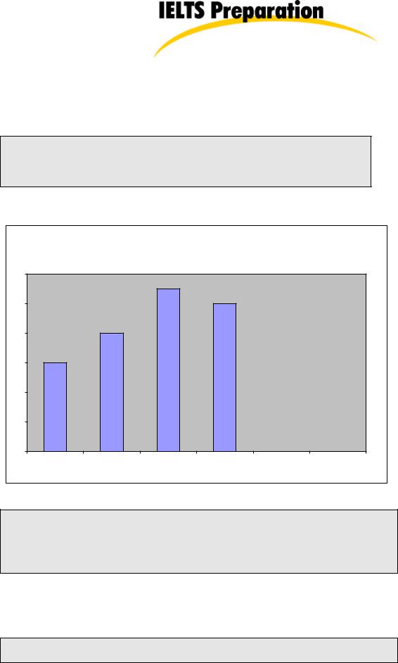
Look at the following graph and read the description.
Television sales (millions)
12
10
8
6
4
2
0
1996 |
1997 |
1998 |
1999 |
In this graph of Electro Inc’s television sales between 1996 and 1999, we can see that purchases of televisions went up in 1996 and continued to rise steadily until 1998 when they dropped slightly.
In some cases, however, it will not be appropriate to describe the bar graphs in terms of time and different language will need to be used. For example, in the following graph we could not say:
In 1990 there was a rise in holiday makers from Indonesia.
because the word ‘rise’implies that the graph also shows a lower number of holiday makers at an earlier time, which in fact it doesn’t.
© 1999 Holmesglen Institute of TAFE |
19 |

Destinations of holiday makers from Indonesia
1,200,000
1,000,000
800,000
600,000
400,000
200,000
0
Australia Someland |
Korea |
Japan |
Pakistan |
Sri Lanka |
In this case we can say:
Someland was the most popular destination for holiday makers from Indonesia.
Writing task one: pie charts
Task description
You will be given one or more pie charts. You task is to describe the information given in the graph by writing a 150 word report. You are not asked to give your opinion. You should spend around 20 minutes on the task.
What is being tested is your ability to:
♦objectively describe some graphic information
♦compare and contrast
♦report on an impersonal topic without the use of opinion
♦use the language of graph description
© 1999 Holmesglen Institute of TAFE |
20 |