

Примеры брендбуков / sharp
.pdfSharp Electronics Corporation
Corporate Identity Guidelines
November 7, 2001
Version 1.3
1
Our Brand Identity
The Sharp “be sharp” corporate identity represents an important evolutionary step for our company. Our goal is to change perceptions of Sharp from solely an electronics manufacturer to a consumer oriented company whose surprising innovations unlock the inspiration in people.
Our corporate identity is multi-layered and completely integrated, incorporating advertising, media information, collateral materials, Internet – even our corporate stationery and business cards. This guide is designed to help you adapt the Sharp corporate message into all product category and local dealer/retailer marketing communications programs.
Table of Contents
Our Brand Identity |
1 |
Corporate Brand Advertising |
2 |
Logo and Tagline Combinations |
3 |
Anchor Format |
3 |
“Bookend” Format |
4 |
Sharp-only Format |
4 |
“Flip” Format |
4 |
Combination Logo: Display Size |
5 |
Logo Size Guidelines |
5 |
Combination Logo: Surrounding Space |
6 |
Combination Logo: Background Guideline |
7 |
“Sharp-only” Logo Usage Consideration |
|
Important Points When Using the Combination Logo |
8 |
Corporate Message/Tagline Usage Restrictions |
9 |
Strategic Brand Platform Versus Brand Message |
10 |
Web Usage |
11 |
The Sharp Internet Site URL |
11 |
Sharp Domain Name Policy |
11 |
Colors for the Digital Sharp Logo |
11 |
“Sharp/be sharp” Guidelines: Digital Display Size |
12 |
Minimum Display size |
12 |
Other Applications |
13 |
2
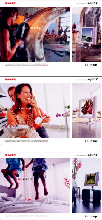
Corporate Brand Advertising
Here are some examples of corporate brand advertising. The role of these ads is to change the overall perception of the Sharp brand by showing how Sharp’s surprising innovations “unlock the inspiration in you.” Attractive lifestyle scenarios are accompanied by headlines such as “be spirited,” “be inspired,” “be passionate,” etc. In each case, Sharp products supply the inspiration, inviting consumers to “be sharp.”
Important note:
Only at the corporate level will the detached “be xxxxx. be sharp” composition be used in advertising and other related communications materials. In order to maintain a consistent brand message, product groups, dealers, retailers and all agencies may not create their own “be xxxxx. be sharp” messages in their advertisements. (see: Tagline Usage Considerations.)
3
Logo and Tagline Combinations
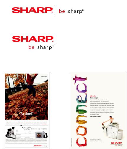
Sharp corporate brand advertising will be used to launch and reinforce the concept of “be sharp”. This is the only instance where “be sharp” will be used as part of the central message of the ad. However, the “be sharp” concept will be reinforced at product level and local level by its usage as the new Sharp tagline. The “be sharp” tagline replaces all usage of “From Sharp Minds, Come Sharp Products” tagline.
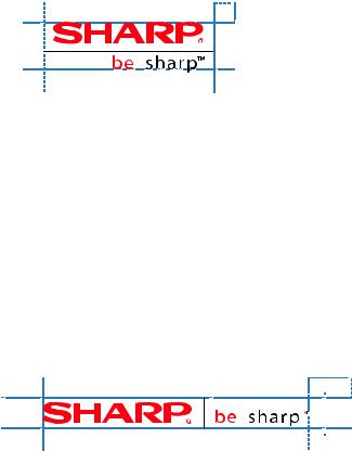
The Sharp logo and “be sharp” tagline should be used in all communication materials, including collateral, point of purchase, trade show/event graphics, video, film and interactive. The registered mark (®) must always accompany the Sharp logo and the trademark (™) must always accompany the “be sharp” tagline.
For all advertising and communications purposes, the logo and tagline combination may only be used in four ways (see appropriate diagrams):
>Anchor Format:
For most non-corporate print advertising, display materials, interactive designs, collateral, outdoor boards, signage and kiosks, the logo and tagline should appear together in either the horizontal or stacked version.
Horizontal Combination Logo >
Vertical Combination Logo >
Example of use >
4
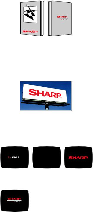
>“Bookend” Format:
In print, web-delivered or interactive CD product and sales support materials, it is acceptable for the Sharp logo to initially appear without the tagline. However, the anchor format must appear at least once in all materials, preferably at the end.
FRONT |
BACK |
>Sharp-only Format:
The Sharp logo may also be used without the tagline, if the tagline is not appropriate to the medium. (Examples: large venue stadium signage and trade show graphics, etc.).
>“Flip” Format:
This format may be used in interactive, video and web applications. In this case, the tagline may appear on screen first, then disappear, to be replaced by the logo.
Alternately, the anchor format may be used depending on time constraints.
5
Combination Logo: Display Size
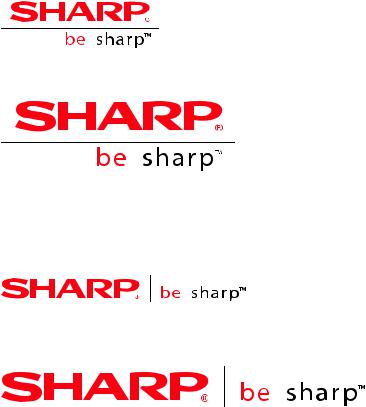
The “SHARP/be sharp” combination logo elements should not be altered in any way. The space between “SHARP” and “be sharp” logos and the line, the kerning, the proportions and the relationships between all elements should never be altered.
Logo Size Guidelines
Use the minimum size logo when logo must be displayed at a small size due to space limitations. The minimum size logo can be proportionally increased up to two inches wide, if space allows. When the logo needs to be above two inches wide use the large logo.
< Minimum size of the vertical logo, to be used when space is limiting
< Large size of the vertical logo,
to be used when space dictates larger size logo
< Minimum size of the horizontal logo, to be used when space is limiting
< Large size of the horizontal logo,
to be used when space dictates larger size logo
6
Combination Logo: Surrounding Space
Logo Surrounding Space Guidelines
All “Sharp/be sharp” logos must be displayed with an amount of empty space surrounding. Use the logo formula to proportionally adjust size of minimum space around the logo. The space guideline formula is in proportion to the size of the logo.
>The formula for the minimum allowed space around a vertical combination logo:
The height of the SHARP logo is = to the horizontal empty space required by the logo. The height of the SHARP logo is = to the vertical empty space required by the logo.
1 X H of |
SHARP |
< |
|
< 1 X H of
SHARP
<
Example of the surrounding empty space required by the minimum size of the verical logo
>The formula for the minimum allowed space around a horizontal combination logo:
The height of the SHARP logo is = to twice the horizontal empty space required by the logo. The height of the SHARP logo is = to the vertical empty space required by the logo.
2 X H of |
SHARP |
< |
|
< 1 X H of
SHARP
<
Example of the surrounding empty space
required by the minimum size of the horizontal logo
7
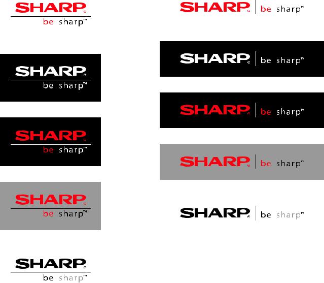
Combination Logo: Background Guidelines
The “SHARP/be sharp” logo can only be used on white, grey (40% of black or less), and black.
When treating “SHARP/be sharp” logo in black, the word “sharp” and divider line should appear as 40% of black. All other elements print 100% black.
Examples of proper use of “SHARP/be sharp” logos with their required surrounding empty space.
8
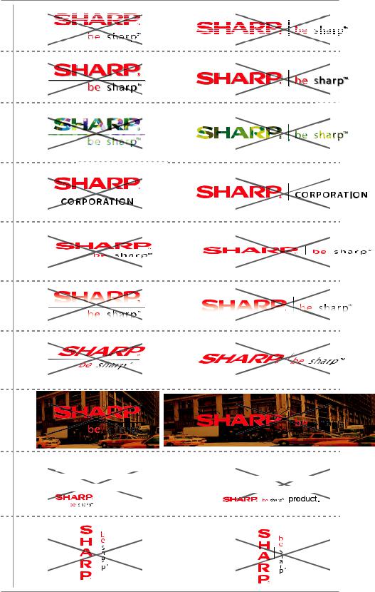
“Sharp-only” Logo Usage Considerations:
Important Points When Using the Combination Logos
Do not split the letters in the logo.
Do not add a shadow to the logo.
Do not fill the logo outline with a pattern.
Do not use other anchors or nicknames in combination with the logo.
Do not stretch or distort the logo.
Do not ghost the logo.
Do not skew the logo.
Do not place the logo over a patterned background.
Do not embed the logo in a body of text.
Do not place the logo in a vertical orientation.
|
Read chapter four of this |
Read ch |
|
|
|
|
|||||||
|
|
|
|
|
|
|
|
|
|
|
|||
|
|
|
|
|
on |
|
|
|
|
||||
|
|
anual for instructio |
|
|
|
|
|
||||||
|
or instructions o |
||||||||||||
|
|
|
|
|
|
|
|
||||||
|
|
|
|
|
|
|
|||||||
|
|
|
to care for yo |
how |
|
|
|
|
|||||
are for your new |
|||||||||||||
|
|
|
|
||||||||||
|
|
|
|
product. |
|
|
|
|
|
||||
|
|
|
|
|
|
|
|
|
|||||
|
|
|
|
|
|
|
|
|
|||||
NOTE: Please see the logo sheet for specifics on display size and color of the logos.
9
Corporate Message/Tagline Usage Restrictions
The “be sharp” message is an integral part of our corporate brand identity. Through its use as our new tagline, it will come to be associated with all the positive things Sharp can deliver.
It is critical that the strategic meaning/benefit of “be sharp” be carefully communicated to our consumers through the corporate brand advertising and other select corporate venues. Consumers must clearly understand that Sharp (as a company and brand) can help “unlock the inspiration in you”.
For Sharp to get the full benefit of the new marketing positioning, consumers must see “be sharp” as the essence of our brand image, not as a product attribute. If “be sharp” is linked to specific product claims (“be colorful”, “be fast”, “be clean”, “be digital”), the Sharp brand message will be viewed as just another selling line since it is more about the product than the consumer. Rather, all “be” word associations will describe a “feeling” of the Sharp brand rather than a product line benefit or feature. All “be” words will be aspiring in nature and will closely link to our brand promise of surprising innovations.
To maintain the integrity of the corporate identity, it is essential that it not be altered or diluted in any way. Therefore, please follow these usage guidelines when creating advertising or collateral materials:
>Never use the tagline in a headline or copy:
e.g.: If you want to “be sharp,” you better “be quick.”
>Never echo the structure of the tagline to promote a product benefit: e.g.: “be colorful” with Sharp color copiers.
>Never use any other “be” phrase in conjunction with the tagline: e.g.: “be successful. be sharp.”
>Never use more than one word connected to “be”: e.g.: “be in touch”
In short, the detached “be xxxxxx”. “be sharp.” form may only be used in SEC’s corporate communications programs and campaigns. Usage beyond these two areas is at the discretion of SMCD only.
SMCD should be contacted for advice and guideline interpretation.