

Jankowitcz D. - Easy Guide to Repertory Grids (2004)(en)
.pdfANALYSING RELATIONSHIPS WITHIN A SINGLE GRID 129
Table 6.14 Percentage of variance accounted for by each component of Table 6.13
Component 1 |
Component 2 |
Component 3 |
Component 4 |
|
|
|
|
64.84 |
30.67 |
4.22 |
0.27 |
|
|
|
|
Two dotted lines stand for the first two components; by convention, the horizontal line represents the first component and the vertical line the second. They’re vertical and horizontal, set at right angles to each other, because they represent maximally distinct patterns in the data. The constructs are plotted as straight lines whose angle with respect to each component reflects the extent to which the construct is represented by the component, and whose length reflects the amount of variance in the ratings on that construct.
In other words, each component is a statistical invention, whose purpose is to represent, or stand for, as straightforwardly as possible, one of the different patterns in the grid. The whole thing represents, in graphical terms, the intuitive feeling we had when we looked at Table 6.13 and thought we recognised two distinct patterns of variability – two sets of ratings with rather differing variances. And as you can see in Figure 6.3, there are indeed two groupings of lines representing constructs. Constructs A and B lie close to the horizontal component line, which represents the pattern of variance which we recognised in the first two rows of Table 6.13; constructs C, D, E, and F, lie very close to the vertical line reflecting the pattern of variance in the bottom four rows of Table 6.13.
Figure 6.3 Principal components analysis graph for the data in Table 6.13

130 THE EASY GUIDE TO REPERTORY GRIDS
Because each component ‘stands for’ several constructs, the elements can be positioned along each component, in place of their original position along each construct; and there they are, plotted in Figure 6.3.
Now, because the resulting plot is a graphical representation, in which the lengths of lines and the positions of points reflect the original ratings – because the whole graph is a picture of patterns of similarity – distances matter and can be meaningfully interpreted.
Constructs and Components
(a)The angle between any two construct lines reflects the extent to which the ratings of elements on those constructs are correlated: the smaller the angle, the more similar the ratings.
(b)The angle between a group of construct lines and the lines representing the components reflects the extent to which the component can be taken to represent the grouping of constructs in question: the smaller the angle, the greater the extent.
In Figure 6.3, for example, the first (horizontal) component represents construct A and construct B very well; it represents the remaining constructs very poorly. The vertical component, on the other hand, stands for constructs C, D, E, and F very well (they form a tight ‘fan’ angled very closely to the vertical component).
Elements and Components
(a)The position of each element with respect to each component is exactly like the position of a point on a graph: so far along the x-axis (first component) and so far up or down the y-axis (second component). Of itself, this doesn’t mean a lot; but what is enormously useful is that it gives us a way of talking about:
(b)Relationships between elements – that is, the distance between any two elements reflects the ratings each element received on all the constructs. Any two elements which are close together in the graph received similar ratings, any which are printed far apart would tend to show rather different ratings in the original grid.
Look at the third and fourth columns in Table 6.13. They received identical ratings. Now look at elements 3 and 4 in Figure 6.3: they are plotted in the same position on the graph (in fact, I had to move the ‘element 3’ label in preparing

ANALYSING RELATIONSHIPS WITHIN A SINGLE GRID 131
Figure 6.3, since the computer printout from which this figure was prepared printed it directly on top of the ‘element 4’ label).
This property of a principal components analysis is particularly useful when the differences between elements carry special meaning for us; for example, when we want to compare how closely we construe ‘myself as I am’ and ‘myself as I wish to be’; any element and an ‘ideal’ supplied element; and so on. We ask how far away from each other the two elements are, in the plot; we draw inferences from what might need to change if ‘myself as I am’ were to become more like ‘myself as I wish to be’. Along which constructs would movement have to occur? That is, on which constructs would the ratings have to be different for ‘myself as I am’ to move towards ‘myself as I wish to be’?
Finally, you need to know that a principal components analysis provides you with plots showing the relationship between all the components, not just the first two. You would examine these using the same approach as you used in addressing Figure 6.3. As a rule of thumb, you ought to examine the plots for all of the components that, between them, account for 80% of the variance. Remember that distances matter, so that the horizontal and vertical components within any graph are ‘to scale’, so far as variance goes.
Get a feeling for principal components by doing
Exercise 6.6.
6.3.2 Procedure for Interpretation of Principal Components Analysis
The preceding rationale has been rather abstract. In Exercise 6.6, you were looking at patterns in numbers, without knowing just what those numbers stand for. No element names, just labels 1 to 6; no idea of what meanings the constructs carry, just the blank and austere construct labels, each end of constructs A to F. (Though, hopefully, things warmed up a little for you when you addressed the last question of the exercise.)
Brr! You, the reader, have my sympathy! And you also have my congratulations.What you’ve done is a necessary first step in understanding a principal components analysis plot, but it’s the only step which is statistically faithful to the ratings provided by your interviewee.
As soon as you start interpreting the principal components analysis any further
.by looking at what the actual elements are and where they lie with respect to the principal components

132 THE EASY GUIDE TO REPERTORY GRIDS
.by looking at how the constructs are grouped and which components seem to underlie them,
(all of which are essential if you’re to get the benefits of the analysis), you move away from the direct meaning offered to you by the interviewee, and into a realm in which your own interpretations condition, influence, and possibly distort the information in the original grid.
This becomes particularly important when you try to interpret the principal components in terms of the constructs. What sort of component ‘underlies’ the constructs? This sort of question is often resolved by trying to find a name for the component: a label which reflects the meaning in common between the constructs which lie closest to that component ^ as at step 3 in the procedure below. And that act of naming reflects your own judgement.
Like any complex analysis, such as the cluster analysis we examined in Section 6.2, principal components analysis requires you to make assumptions when you interpret the original grid. Unlike cluster analysis, though, these assumptions are less visible. They are less easily described to your interviewee in terms of comfortable analogies like ‘cutting up the grid with a pair of scissors’, and, unless the interviewee has some grounding in statistics, your interpretations take on the flavour of ‘because I, the expert, say so’. When this happens, you have less scope for negotiating a meaning with your interviewee (and especially, for checking your understanding of the interviewee), and, accordingly, it’s worth being rather cautious in the interpretations you make using this analysis procedure. Be careful how you name the components. Do so collaboratively if the interviewee understands the procedure. Don’t play the guru.
Point taken. And the following procedural guide seeks to take these comments into account.
Let’s do it by moving right away from abstraction and looking at a familiar grid. This is the one shown in Table 6.4, which we cluster-analysed in Section 6.2 with the results which appeared as Figure 6.2. We know a lot about it already, which will help us to make sense of it using the present analysis. The original grid is on the left, the table of variance accounted for on the right, and the plot of the first two principal components at the lower right.
As always, the procedure starts with a familiarisation with the original grid: a process analysis and the first three steps of an eyeball analysis. (1. What is the interviewee thinking about? 2. How has the interviewee represented the topic? and 3. How does s/he think?, as outlined in Section 5.3.2.)
Quite so. To avoid excessive overinterpretation, stick to the original grid as your bedrock; that means reminding yourself of what the interviewee actually said, and the circumstances in which s/he said it!
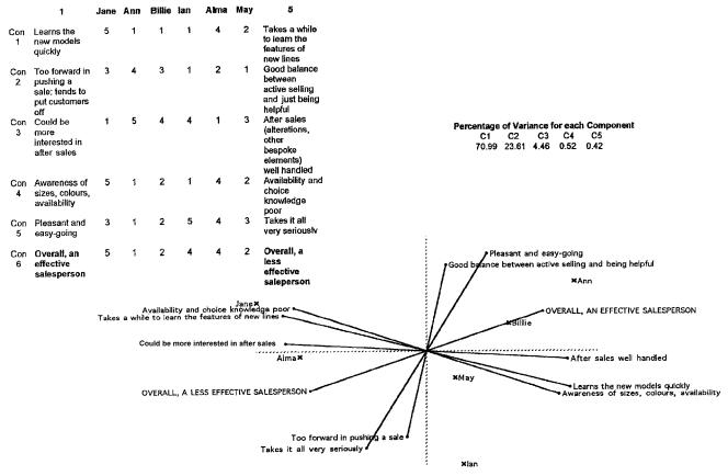
Figure 6.4 Store manager’s grid, variance accounted for, and plot of first two components

134 THE EASY GUIDE TO REPERTORY GRIDS
(1)Determine how many components you’ll need to work with. How many components in the percentage variance table of Figure 6.4 do you need to look at, to cover 80% of the variance? Here, the first two components account for 70.99 + 23.62 = 94% of the variance, so you can safely rely on just the one plot: that of the first component against the second. (If you’d decided you needed to look at the first three principal components, you’d need to work with the other plots which the software has provided: the plot of component 1 against component 2 as in this case, but also of component 1 against component 3, and component 2 against component 3, teasing out the relationships for each plot as follows.)
(2)Examine the shape of the lines representing the constructs: how tightly are they spread? Are they well differentiated, or do they spread evenly all round the plot like the spokes of a bicycle wheel? Here, the constructs differentiate into two sheaves or fans of lines. The first consists of
.construct 3, ‘could be more interested in after sales – after sales well handled’
.construct 1, ‘takes a while to learn the features of new lines – learns the new models quickly’
.construct 4, ‘availability and choice knowledge poor – awareness of sizes, colours, and availability’.
The second consists of
. construct 5, ‘takes it all very seriously – pleasant and easy-going’
.construct 2, ‘too forward in pushing a sale – good balance between active selling and being helpful’.
(Notice how the supplied ‘overall effectiveness’ construct lies between these two sheaves.)
(3) Identify any similarities in the meaning of these constructs:
.by inspection: does there appear to be any shared meaning? You’re very tentatively ‘naming the components’. In Figure 6.4, the first grouping seems to relate to product knowledge and interest in using that knowledge to make a complete sale, while the second grouping appears to describe the salesperson’s personal style while dealing with a customer.
.by examining their relationship to any supplied construct which might be helpful in this respect. Here, construct 6, the ‘overall effectiveness’ construct,

ANALYSING RELATIONSHIPS WITHIN A SINGLE GRID 135
aligns neither with the first grouping nor the second. No single construct or group of constructs is particularly associated with effectiveness in a welldefined way. In fact, you’d be tempted to argue, from the position of the ‘overall effectiveness’ construct, lying between the two groupings, that being an effective salesperson depends neither on product knowledge nor on personal style alone, but more or less equally on both.
(4) Note the position of any meaningful groupings with respect to the two principal components: the vertical axis and the horizontal axis. So far, we’ve almost ignored the components themselves, but they tell us something very important. You’ll recall that components are derived sequentially, and in a way which seeks to maximise their independence. So any sheaves or groupings of constructs which lie near to one of the principal component axes can be interpreted as, in some sense, independent of sheaves or groupings which lie near to the other principal component axis. Can you find a meaning for the groups of constructs based on this characteristic of the analysis?
In our own case, the position of the ‘product knowledge’ grouping near to the first principal component, and the ‘style with customers’ grouping near to the second, suggests that these are indeed two independent sets of constructs.
The psychologist might label this a ‘cognitive versus affective’ distinction, while the trainer might think of this as indicative of two distinct sets of skills to be learnt. A job analyst might view it as a statement about the structure of the competency framework that pertains to this job, while someone interested in knowledge management would view it as a statement reflecting the interviewee’s experience and expertise in running a fashion section of the department store.
It follows that you can’t decide, on the information present in the grid, which of these is in any way definitive! That depends on your purpose, and the context in which the grid interview was conducted. If you’re doing this grid analysis in a research context as part of a dissertation, your supervisor will be asking you about the analytic framework which underlies your use of the repertory grid as a research technique! (Remember constructive alternativism?!)
Finally, be careful about overinterpretation. The two groups don’t sit squarely on top of their components; they’re rotated through some 20 degrees clockwise. This suggests that whatever these components are, while they’re statistically independent of each other (they’re plotted at right angles), their meaning isn’t completely separate. (There are further procedures in multivariate statistics which might possibly clarify this, but these lie beyond the scope of this guide.)
(5) Check your interpretations with the interviewee. Resist the temptation to pronounce about them. For, example, if you’d decided in Figure 6.4 that the first

136 THE EASY GUIDE TO REPERTORY GRIDS
principal component is a ‘product knowledge and interest’ component and the second is a ‘customer relations’ component, do not tell the interviewee that that’s what they are. All you’ve done is to construe the interviewee’s construing, and until you check it out, it has the status of a useful fiction, regardless of the impressive statistical manipulations on which it’s based. Instead, explore the links which you feel you’ve identified between the constructs by asking questions to check whether those links make sense to the interviewee.
Exactly. You’ll notice that we’ve both ganged up on you to reinforce the point. A repertory grid isn’t a horoscope or a psychometric test, both of which depend on something resembling a priest-and-peasant relationship between expert interviewer and client. If your interview technique has been a good one, your interviewee will be hanging on your every word, you’ll have noticed, and the temptation might be there! But remember that the whole point of the interview is to work collaboratively, and that’s as important in the analysis as in the original construct elicitation.
Useful questions at this point might look like the following (with reference to Figure 6.4):
.‘D’you see those three lines labelled ‘‘availability and choice knowledge poor’’; ‘‘takes a while to learn the features of new lines’’; ‘‘could be more interested in after sales’’? They hang together so they look like they have something in common. How do they differ from the other two (‘‘takes it all very seriously’’ and ‘‘too forward in pushing a sale’’)? What is each set saying about sales staff?’
.‘Ann and Billie are overall the most effective; that’s how you rated them originally. And d’you see where they lie along the line marked ‘‘overall a less effective salesperson’’ and ‘‘overall an effective salesperson’’? Jane, on the other hand, is a long way away from them on the graph. What would need to change to move her along closer to Billie and Ann?’
This would be to encourage the interviewee to recognise that the position along each of the lines representing constructs is related to the original ratings, and that ‘movement along’ each of the lines is a way of interpreting the need for change. One sort of answer to this last question, for example, might be, ‘Well, she’d need to improve her after sales, and show a lot more interest in learning the various product lines. That’s more of an issue than getting her to be relaxed and pleasant with the customers.’
This kind of exploration is particularly useful if you are trying to make the interviewee’s tacit knowledge about the job explicit, asking her to think about the way she views job expertise in a reflective way.

ANALYSING RELATIONSHIPS WITHIN A SINGLE GRID 137
Convey your wisdoms and insights gently, check them, and build on them! This can sometimes be difficult to do, since principal components analysis does require some complicated statistical knowledge which it’s difficult to share neatly and elegantly with the other person in the course of your interview. That’s why my own choice of analysis technique is cluster analysis as described in Section 6.2 above: the inferences it affords are more easily explained to people who don’t have a grounding in statistics.
6.4 CONCLUDING IMAGES
You’ll have noticed that the results of both techniques, cluster analysis and principal components analysis, are compatible with each other in the examples we’ve looked at. And so they should be. They’re simply two different ways of doing the same thing, which is to say something about the relationships between the ratings in the grid, and thereby to suggest something about the way in which the elements and constructs are structured in the system the interviewee uses to make sense of the topic in question.
I find the following analogy helpful. Think of the elements of a grid as being like stars in the night sky (see Figure 6.5). You can make statements about the position of the stars by pointing out that they group into constellations. That’s like a cluster analysis. Or you could, as an alternative, describe the same position with reference to two lines at right angles to each other which you mentally project onto the heavens. This is exactly what astronomers do, and the lines in question are called the vernal equinox and the celestial equator. The position of a star is then given in terms of its right ascension and its declination, which are units ‘along’ these lines. And that’s like a principal components analysis. (Well, -ish. Not quite as close an analogy, as any statistician will tell you. Or maybe they’re both rather baggy similes. But never mind, they get us away from numbers for a moment of relaxed and fuzzy contemplation.)
Perhaps the main point to remember is that both constellations and the vernal equinox/celestial equator are useful inventions. Depending on rather more complex social agreements about observational and analytic conventions than those which underlie the simple initial observation of the stars themselves, they don’t exist in quite the same way that the stars do. They exist in the minds of the beholders, as they gaze at the night sky and make sense of the grand sweep of the heavens. So it is with clusters and principal components, as ways of understanding the relationships between elements and constructs which the interviewee has presented.
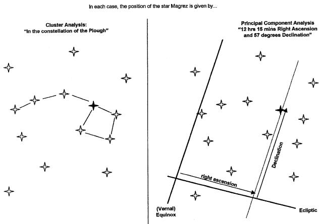
Figure 6.5 Two systems for showing star positions