

Oxford_English_for_Information_Technology / Text / unit14
.pdf
|
UNIT 14 |
|
Websites |
STARTER |
What features make a good website? Make a list of the key |
|
features you look for. Then compare your list with others in your |
|
group. |
|
Study these seven points for evaluating websites. What |
|
questions would you ask to evaluate a website on each point? |
1Design
2Navigation
3Ease of use
4Accuracy
5Up to date
6Helpful graphics
7Compatibility
READING |
Understanding the writer's purpose Knowing who the writer |
|
is, what their purpose is and who they are writing for can help us to |
|
understand a text. |
|
Study these extracts from a text. Decide: |
|
1 What special expertise does the author have in this field? |
|
2 Who are the intended readers? |
|
3 What is the author's purpose? |
Title:
Help Web-farers find their way.
Subtitle:
Here are nine ways to make it easy for visitors to navigate your website.
Author information:
Matt Micklewicz offers advice and useful links for Webmasters at his Webmaster Resources site (www. webmaster-resources. com).
Source:
Windows Magazine, E-Business section
First paragraph:
Your website may be chock full of information about your company and its products, but if visitors to the site can't easily find their way around its pages they may never return. Besides content, the most important aspect of a website is its navigation scheme. Unfortunately, that may also be the most commonly neglected design consideration. These nine site-design pointers will help you build an effective navigation system.
Work in groups of 3, A, B and C. Summarise the advice in each text you read in one sentence.
Student A Read texts 1 to 3
Student B Read texts 4 to 6
Student C Read texts 7 to 9
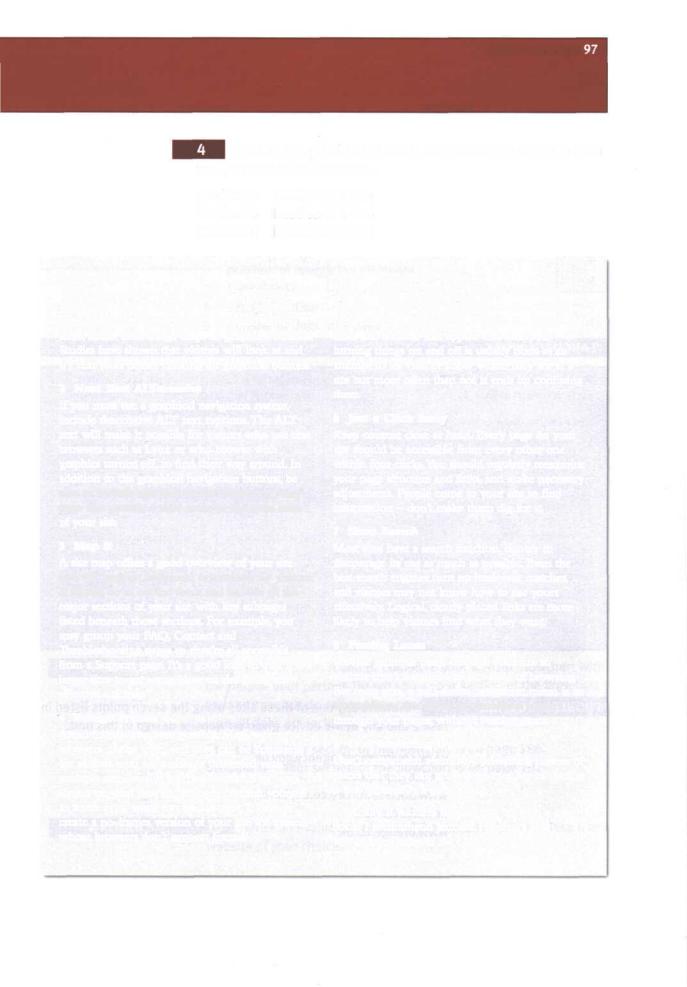
1 Trust Text
It's tempting to spice up pages with graphics — but sometimes even a little is too much. If possible your navigation system should be based on text links, rather than image maps or graphical buttons. Studies have shown that visitors will look at and try text links before clicking on graphical buttons.
2 Next Best AlTernative
If you must use a graphical navigation system, include descriptive ALT text captions. The ALT text will make it possible for visitors who use text browsers such as Lynx or who browse with graphics turned off, to find their way around. In addition to the graphical navigation buttons, be sure to include text links at the bottom of every page that provide a clear route to the main areas of your site.
3 Map It
A site map offers a good overview of your site and will provide additional orientation for visitors. It should be in outline form and include all the major sections of your site with key subpages listed beneath those sections. For example, you may group your FAQ, Contact and Troubleshooting pages so they're all accessible from a Support page. It's a good idea to visit a few larger sites to get some ideas on designing an effective site map.
4 Forego Frames
Avoid frames wherever possible. Most veteran browsers dislike them and they can be confusing for visitors who are suddenly presented with multiple scrollbars. If you're committed to using frames on your site, you'd better commit yourself to some extra work too, because you'll have to create a no-frames version of your site for visitors whose browsers don't support frames.
5 Consistency Counts
Don't change the location of your navigation elements, or the color of visited and not-visited links from page to page. And don't get clever with links and buttons that appear and disappear: turning things on and off is usually done as an attempt to let visitors know where they are at a site but more often than not it ends up confusing them.
6 Just a Click Away
Keep content close at hand. Every page on your site should be accessible from every other one within four clicks. You should regularly reexamine your page structure and links, and make necessary adjustments. People come to your site to find information — don't make them dig for it.
7 Shun Search
Most sites have a search function, but try to discourage its use as much as possible. Even the best search engines turn up irrelevant matches, and visitors may not know how to use yours effectively. Logical, clearly placed links are more likely to help visitors find what they want.
8 Passing Lanes
Provide multiple paths through your site so visitors aren't restricted to one style of browsing. For most sites, a pull-down navigation menu is an easy addition that offers an alternative route through your pages, without wasting space.
9 Overwhelming Options
Don't overwhelm visitors by presenting dozens of places that they can go. A large number of choices is not necessarily a good thing.
Finally, if you feel like curling up with a good book, I recommend Jennifer Fleming's Web
Navigation: Designing the User Experience from O'Reilly & Associates.
98 UNIT 14 Websites
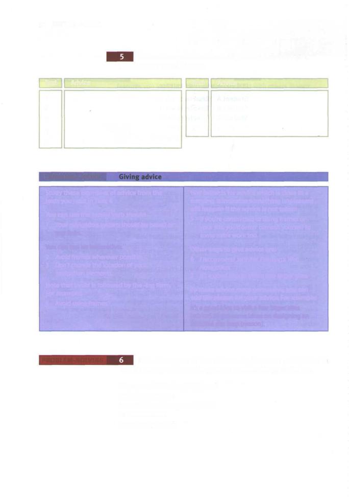
Now exchange information orally to complete this table
|
|
summarising the whole text. |
|
Text |
Advice |
Text |
Advice |
1 |
|
6 |
|
2 |
|
7 |
|
3 |
|
8 |
|
4 |
|
9 |
|
5 |
|
|
|
LANGUAGEWORK
Study these examples of advice from the texts you read in Task 4.
You can use the modal verb should:
1 Your navigation system should be based on text links.
Youcan usean imperative:
2Avoid frames wherever possible.
3Don't change the location of your navigation elements.
Note that avoid is followed by the -ing form. For example:
4 Avoid using frames.
Had better is for advice which is close to a warning. It indicates something unpleasant will happen if the advice is not taken:
5If you're committed to using frames on your site, you'd better commit yourself to some extra work too.
Other ways to give advice are:
6/ recommend Jennifer Fleming's Web Navigation.
7It's a good idea to visit a few larger sites.
To make advice more persuasive, you can add the reason for your advice. For example:
It's a good idea to visit a few larger sites [advice] to get some ideas on designing an effective site map [reason].
PROBLEM-SOLVING |
Evaluate any one of these sites using the seven points listed in |
|
Task 2 and any of the advice given on website design in this unit. |
|
www.environment-agency.gov.uk |
|
www.compaq.com |
|
www.abcissa.force9.co.uk/birds |
|
news.bbc.co.uk |
|
www.orange.co.uk |
UNIT 14 Websites 99
With. the help of the texts summarised in Task 5, give advice on these aspects of navigation design. Use a variety of ways. Add reasons for your advice where possible.
1text links
2graphical buttons
3ALT text captions
4site map
5frames
6position of navigation elements
7logical links
8search function
9number of links on a page
With the help of Unit 12, Task 6, give advice on these features of free Internet Service Providers.
1Sign up software on CD-ROM
2Local call rates for online time
3National call rates for online time
4Initial set-up fee
5Web-based mail
6POP3 email
7Free Web space
8Access to newsgroups
9Customer support
10Reliable service
11Multiple ISP accounts
SPEAKING |
Work in pairs, A and B. Complete your website flowchart with |
|
the help of your partner. Do not show your section of the flowchart to |
|
your partner but do answer any questions your partner asks. Make |
|
sure all links are included in your completed chart. |
|
Student A Your section of the flowchart is on page 186. |
|
Student B Your section of the flowchart is on page 192. |
WRITING |
Write an evaluation of one of the websites listed in Task 6 or a |
|
website of your choice. |

