
Step 1. Finding the main idea.
One of the most important things to do is get the main idea of the graph.
First, identify the main features of the graph. What is happening? What are the biggest numbers? If it is a time or comparison graph, what are the biggest changes? What are the trends?
∙In time graphs you have to describe changes over time.
∙In comparison graphs you have to compare different items – countries, people, products, places, etc.
∙The vocabulary for each kind of graph is different:
∙In time graphs you use time vocabulary to describe change: rose, fell, declined, shot up, increased, remained steady, etc.
∙In comparison graphs you compare: twice as much as, more than, less than, the same amount, both X and Y have the same figure, etc.
Ideally you need to find one main idea and, if possible, one or two more smaller ideas.
∙Don’t have too much information
∙Don’t analyze or explain everything in the graph
∙Don’t go from left to right, explaining everything. Instead pick the main ideas.
∙Use the biggest and next biggest – don’t mention everything in between.
∙Don’t mention the small or unimportant stuff
∙Pick an idea and find information that supports it
Have a look at the example!
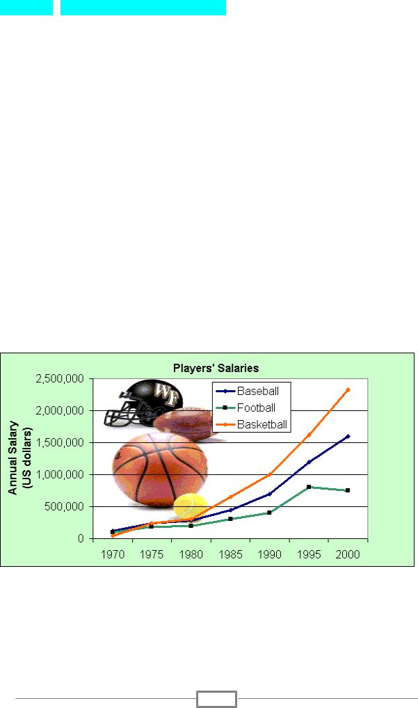
Study the graph below. Print it out. Write on it. Circle the important points – beginnings, endings, sudden changes, low points, high points, trends, averages, differences between lines, differences over time.
The graph shows US sports players’ salaries in dollars. In 1970, baseballers earned $125,000 a year, footballers’ salaries averaged $99,000 a year, and basketball players earned about $43,000 annually.
Main ideas
∙All salaries increased
1

∙Big differences between 1970 and 2000 for all sports
∙Basketball was biggest in 2000, followed by baseball
∙In 1970, basketball was the lowest, baseball was the highest
∙There was a sudden rise beginning in 1980
∙There was another sharp rise for all sports in 1990
∙Salaries in football began to level off or even fall from 1995 onwards
Step 2. Grouping the information (if needed)
Sometimes there is just too much information in a graph. Don’t describe the X and Y axis. Give the information.
You may need to group information. Grouping information means putting two or three similar or related things together.
This makes it easier for the reader to understand. It is also less work for you, because you can put more than one piece of information in a sentence.
For example, you might be able to divide a list into three groups. Often there is one group at the top, one in the middle, and one at the bottom.
Look at the graph below, which shows the number of Internet users in European countries in 2000.
Possible groups could be
∙Top: Finland, Sweden, Netherlands, and Denmark (about 40 users per hundred)
∙Group 2: Germany, Austria, UK (about 20 to 25 users per hundred)
∙Group 3: Ireland, Belgium, France and Italy (14-16 users)
∙Group 4: Spain, Portugal, Greece (less than 10% Internet users)
Step 3. Using the proper vocabulary and grammar constructions.
!!! DO NOT REPEAT THE SAME WORDS!!!
Your description must be not more than 150 words! Mind it!
Movement (Verbs): Up |
|
|
|
∙ |
Rose |
∙ |
Shot up |
∙ |
Went up |
∙ |
Surged |
∙ |
Increased |
∙ |
Rocketed |
∙Grew
Movement (Verbs): Down |
|
∙ Fell |
∙ Declined |
2

∙ |
Dropped |
∙ |
Plunged |
∙ |
Decreased |
∙ |
Plummeted |
∙ |
Sank |
∙ |
Trailed off |
∙Went down
Prepositions
∙ |
Between 1995 and 2000 |
∙ |
Sales fell to 150 in March |
∙ |
From 1995 to 2000 |
∙ |
Sales fell by 50% |
∙Sales rose from 200 to 250
Adverbs and intensifiers
∙ |
slightly |
∙ |
steeply |
∙ |
a little |
∙ |
gradually |
∙ |
a lot |
∙ |
gently |
∙ |
sharply |
∙ |
steadily |
∙suddenly
No Movement: (Verbs with Adjectives, Verbs)
∙ |
remained steady |
∙ |
remained constant |
∙ |
were unchanged |
∙ |
remained stable |
∙ |
did not change |
∙ |
stabilized |
Tops and Bottoms
∙ |
reached a peak |
∙ fell to a low |
|
∙ |
peaked |
∙ |
sank to a trough |
∙ reached their highest level |
∙ |
reached a bottom |
|
3
