

Pro Visual C++-CLI And The .NET 2.0 Platform (2006) [eng]-1
.pdf
388 C H A P T E R 1 0 ■ A D V A N C E D W I N D O W S F O R M S A P P L I C A T I O N S
•ShowPlusMinus is a Boolean that represents whether the expand (+) and contract (–) buttons are displayed for nodes that have child nodes. The default is true, which means that they will be displayed.
•ShowRootLines is a Boolean that represents whether lines will be displayed between nodes that are at the root of the tree. The default is true, which means that lines will be displayed.
The key to working with the TreeView, like any other control, is to know which event to handle (see Table 10-1). All the events of the TreeView have default handlers, but if you want the control to do anything other than expand and contract, you need to handle the events yourself.
Table 10-1. Common TreeView Events
Event |
Description |
AfterCheck |
Occurs after a check box is checked |
AfterCollapse |
Occurs after a node is collapsed |
AfterExpand |
Occurs after a node is expanded |
AfterLabelEdit |
Occurs after a label is edited |
AfterSelect |
Occurs after a node is selected |
BeforeCheck |
Occurs before a check box is checked |
BeforeCollapse |
Occurs before a node is collapsed |
BeforeExpand |
Occurs before a node is expanded |
BeforeLabelEdit |
Occurs before a label is edited |
BeforeSelect |
Occurs before a node is selected |
|
|
The basic building block of a tree hierarchy is the TreeNode. There is always at least one root node and from it sprouts (possibly many) subnodes. A subnode in turn is also a TreeNode, which can sprout its own TreeNodes.
There are several constructors for the TreeNode, but you’ll probably deal with two of them at any one time, unless you create the tree at design time (then you won’t have to deal with them at all). Which two you use will depend on whether you have images associated with the tree nodes.
If you are not using images, then the first constructor of the pair takes as a parameter a String as the label for the TreeNode, and the second constructor takes a String label as well as an array of child TreeNodes. The second constructor allows for a node to have one or more child nodes. To make a node with only one child, you need to assign to the second parameter an array of child TreeNodes containing only one node.
//Constructor for a node with no children or images TreeNode^ rtnA = gcnew TreeNode("Root Node A");
//Constructor for a node with children but no images array<TreeNode^>^ tnodes= gcnew array<TreeNode^> {
gcnew TreeNode("Node A"), gcnew TreeNode("Node B")
};
TreeNode^ rtnB = gcnew TreeNode("Root Node A", tnodes);
C H A P T E R 1 0 ■ A D V A N C E D W I N D O W S F O R M S A P P L I C A T I O N S |
389 |
If you are using images, on the other hand, then the first constructor of the pair takes a String parameter and an integer value representing indexes into the ImageList that you assigned to the TreeView. The second constructor takes these three parameters but also an array of child TreeNodes. Just like the constructor that didn’t take image indexes, the second constructor allows for a node to have one or more child nodes.
//Constructor for a node with no children but with images TreeNode^ rtnA = gcnew TreeNode("Root Node A", 0, 1);
//Constructor for a node with children and images array<TreeNode^>^ tnodes= gcnew array<TreeNode^> {
gcnew TreeNode("Node A", 2, 3), gcnew TreeNode("Node B", 2, 3)
};
TreeNode^ rtnB = gcnew TreeNode("Root Node A", 0, 1, tnodes);
The TreeNode has a number of properties to handle its functionality. Many of the properties are used in navigating the tree. Here are some of the more common TreeNode properties:
•Checked is a Boolean that represents whether the current node is checked. The default is false.
•FirstNode is the first TreeNode in the Nodes collection of the current node in the TreeView. If the current node has no child nodes, then the property returns a null value.
•FullPath is a String containing the entire path from the root to the current node delimited by backslashes (\). The path is all the nodes that need to be navigated to get to the current node.
•ImageIndex is a zero-based Int32 index to the TreeView::ImageList associated with the current node that represents the position of the unselected image for the node. The default is the same value as is specified in the TreeView::ImageIndex associated with the current node.
•Index is a zero-based Int32 index that represents the index of the current node within the
TreeView’s Nodes collection.
•LastNode is the last TreeNode in the Nodes collection of the current node in the TreeView. If the current node has no child nodes, then the property returns a nullptr value.
•NextNode is the next sibling TreeNode in the Nodes collection of the current node in the TreeView. If the current node has no next sibling node, then the property returns a nullptr value.
•Nodes is a TreeNodeCollection that represents all the children nodes that make up the current tree node.
•Parent is a TreeNode that represents the parent node of the current tree node.
•PrevNode is the previous sibling TreeNode in the Nodes collection of the current node in the TreeView. If the current node has no previous sibling node, then the property returns a nullptr value.
•SelectedImageIndex is a zero-based Int32 index to the TreeView::ImageList associated with the current node that represents the position of the selected image for the node. The default is the same value as is specified in the TreeView::ImageIndex associated with the current node.
•Text is a String that represents the text label of the current tree node.
•TreeView is the parent TreeView object that the TreeNode is a member of.
Listing 10-2 shows how to build a tree hierarchy at runtime as opposed to prebuilding it statically. This example builds a new tree hierarchy every time it runs as it generates its node information randomly.
390 C H A P T E R 1 0 ■ A D V A N C E D W I N D O W S F O R M S A P P L I C A T I O N S
Listing 10-2. Random Tree Builder
#pragma once
namespace |
TreeViewEx |
{ |
|
using |
namespace System; |
using |
namespace System::ComponentModel; |
using |
namespace System::Collections; |
using |
namespace System::Windows::Forms; |
using |
namespace System::Data; |
using |
namespace System::Drawing; |
public ref class Form1 : public System::Windows::Forms::Form
{
public:
Form1(void)
{
InitializeComponent();
}
protected:
~Form1()
{
if (components)
{
delete components;
}
}
private:
System::Windows::Forms::TreeView^ tView; System::Windows::Forms::ImageList^ imFolders; System::ComponentModel::IContainer^ components;
#pragma region Windows Form Designer generated code
///<summary>
///Required method for Designer support - do not modify
///the contents of this method with the code editor.
///</summary>
void InitializeComponent(void)
{
this->components = (gcnew System::ComponentModel::Container()); System::Windows::Forms::TreeNode^ treeNode1 =
(gcnew System::Windows::Forms::TreeNode(L"<holder>")); System::Windows::Forms::TreeNode^ treeNode2 =
(gcnew System::Windows::Forms::TreeNode( L"Root Node A", 0, 1,
gcnew cli::array< System::Windows::Forms::TreeNode^ >(1) {treeNode1}));
System::Windows::Forms::TreeNode^ treeNode3 =
(gcnew System::Windows::Forms::TreeNode(L"<holder>"));
C H A P T E R 1 0 ■ A D V A N C E D W I N D O W S F O R M S A P P L I C A T I O N S |
391 |
System::Windows::Forms::TreeNode^ treeNode4 = (gcnew System::Windows::Forms::TreeNode(
L"Root Node B", 0, 1,
gcnew cli::array< System::Windows::Forms::TreeNode^ >(1) {treeNode3}));
System::ComponentModel::ComponentResourceManager^ resources = (gcnew System::ComponentModel::ComponentResourceManager(Form1::typeid));
this->tView = (gcnew System::Windows::Forms::TreeView()); this->imFolders =
(gcnew System::Windows::Forms::ImageList(this->components)); this->SuspendLayout();
//
// tView
//
this->tView->Dock = System::Windows::Forms::DockStyle::Fill; this->tView->ImageIndex = 0;
this->tView->ImageList = this->imFolders; this->tView->LabelEdit = true;
this->tView->Location = System::Drawing::Point(0, 0); this->tView->Name = L"tView";
treeNode1->Name = L"Node1"; treeNode1->Text = L"<holder>"; treeNode2->ImageIndex = 0; treeNode2->Name = L"Node0"; treeNode2->SelectedImageIndex = 1; treeNode2->Text = L"Root Node A"; treeNode3->Name = L"Node3"; treeNode3->Text = L"<holder>"; treeNode4->ImageIndex = 0; treeNode4->Name = L"Node2"; treeNode4->SelectedImageIndex = 1; treeNode4->Text = L"Root Node B"; this->tView->Nodes->AddRange(
gcnew cli::array< System::Windows::Forms::TreeNode^ >(2) {treeNode2, treeNode4});
this->tView->SelectedImageIndex = 1; this->tView->Size = System::Drawing::Size(194, 481); this->tView->TabIndex = 0;
this->tView->BeforeExpand +=
gcnew System::Windows::Forms::TreeViewCancelEventHandler(this, &Form1::tView_BeforeExpand);
//
//imFolders
this->imFolders->ImageStream = (cli::safe_cast<System::Windows::Forms::ImageListStreamer^ > (resources->GetObject(L"imFolders.ImageStream")));
this->imFolders->Images->SetKeyName(0, L"CLSDFOLD.ICO"); this->imFolders->Images->SetKeyName(1, L"OPENFOLD.ICO");
//Form1
392 C H A P T E R 1 0 ■ A D V A N C E D W I N D O W S F O R M S A P P L I C A T I O N S
//
this->AutoScaleDimensions = System::Drawing::SizeF(6, 13); this->AutoScaleMode = System::Windows::Forms::AutoScaleMode::Font; this->ClientSize = System::Drawing::Size(194, 481); this->Controls->Add(this->tView);
this->Name = L"Form1";
this->Text = L"Tree View Example"; this->ResumeLayout(false);
}
#pragma endregion private:
System::Void tView_BeforeExpand(System::Object^ sender, System::Windows::Forms::TreeViewCancelEventArgs^ e)
{
// Already expanded before?
if (e->Node->Nodes->Count > 1) return; // Already expanded
else if (e->Node->Nodes->Count == 1)
{
if (e->Node->Nodes[0]->Text->Equals("<holder>")) e->Node->Nodes->RemoveAt(0); // Node ready for expanding
else
return; // Already expanded but only one sub node
}
// Randomly expand the node Random ^rand = gcnew Random(); int rnd = rand->Next(1,5);
for (int i = 0; i < rnd; i++) // Randon number of subnodes
{
TreeNode ^stn =
gcnew TreeNode(String::Format("Sub Node {0}", i+1), 0, 1); e->Node->Nodes->Add(stn);
if (rand->Next(2) == 1) // Has sub sub-nodes stn->Nodes->Add(gcnew TreeNode("<holder>", 0, 1));
}
}
};
}
The first steps, as with every other control, are to create the TreeView, configure it using properties, and then add it to the Form.
this->tView = gcnew TreeView();
this->tView->Dock = System::Windows::Forms::DockStyle::Fill; this->tView->LabelEdit = true;
this->tView->Size = System::Drawing::Size(200, 450); this->tView->BeforeExpand +=
gcnew TreeViewCancelEventHandler(this, &Form1::tView_BeforeExpand); this->Controls->Add(this->tView);
Because in this example you’re building a tree hierarchy on the fly, you need to handle an event that occurs just before the tree node is expanded. The BeforeExpand event fits the bill. The BeforeExpand event takes as a handler TreeViewCancelEventHandler. You might note that the handler
C H A P T E R 1 0 ■ A D V A N C E D W I N D O W S F O R M S A P P L I C A T I O N S |
393 |
has the word “Cancel” in it, which means that it’s triggered before the expansion of the node and it’s possible to have the code cancel the expansion.
Now that you have a tree, you need to add one or more root TreeNodes. You also have to add a holder sub-TreeNode or the expansion box will not be generated. The following code was auto-generated (I added the comments for readability, but be aware that comments and code in the Visual Studio 2005–generated areas will be deleted on recompile or when new components are added by the design tool):
//holder node System::Windows::Forms::TreeNode^ treeNode1 =
gcnew System::Windows::Forms::TreeNode(L"<holder>");
//root node which take the above holder node as a child System::Windows::Forms::TreeNode^ treeNode2 =
gcnew System::Windows::Forms::TreeNode(L"Root Node A", 0, 1, gcnew array<System::Windows::Forms::TreeNode^>(1) {treeNode1});
At this point, if you were to execute the program (assuming you created a stub for the BeforeExpand event handler), you would get a TreeView with a root TreeNode and a sub-TreeNode. The sub-TreeNode would have the label <holder>.
The last thing you need to do is replace the holder TreeNode when the expansion box is clicked with its own, randomly generated TreeNode hierarchy. Before you replace the holder TreeNode, you need to make sure that this is the first time the node has been expanded. You do this by looking for the holder TreeNode in the first child (and it should be the only child) of the selected expanded TreeNode. You can find all child nodes in the Nodes property in the Node property. (Look at the code— this is easier to code than explain.)
if (e->Node->Nodes->Count > 1) return; // Already expanded
else if (e->Node->Nodes->Count == 1)
{
if (e->Node->Nodes[0]->Text->Equals(S"<holder>")) e->Node->Nodes->RemoveAt(0); // Holder node ready for expanding
else
return; // Already expanded but only one subnode
}
If the node has been expanded previously, just jump out of the handler and let the TreeView reexpand the node with its original tree. If this is the first time the node has been expanded, then remove the holder and randomly create a new sub-TreeNode. The code to create the sub-TreeNode is virtually the same as that of the root TreeNode, except now you add it to the selected to-be-expanded
TreeNode.
Random ^rand = gcnew Random(); int rnd = rand->Next(1,5);
for (int i = 0; i < rnd; i++) // Random number of subnodes
{
TreeNode ^stn = gcnew TreeNode(String::Format("Sub Node {0}", i+1), 0, 1); e->Node->Nodes->Add(stn);
if (rand->Next(2) == 1) // Has sub subnodes stn->Nodes->Add(gcnew TreeNode("<holder>"));
}
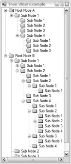
Figure 10-3 shows a sample of what TreeViewEx.exe looks like when you execute it.
394 C H A P T E R 1 0 ■ A D V A N C E D W I N D O W S F O R M S A P P L I C A T I O N S
Figure 10-3. Randomly generated and editable TreeView
Container Controls
You saw two container controls, GroupBox and Panel, in the previous chapter. These controls simply group controls together. In this chapter, you will look at two more powerful controls: SplitContainer and TabControl.
SplitContainer and TabControl provide for a much better use of Windows Forms real estate. You already saw an improved use of real estate with the Panel control, in that it allowed more controls to be placed in a smaller area of the screen by implementing scroll bars. In this section, you’ll see how the TabControl and SplitContainer controls improve on this paradigm.
TabControl
You can think of the TabControl control as several forms or, more accurately, TabPages layered on top of each other. The actual TabPage displayed is determined by which TabPage’s tab is selected. It’s a neat tool to conserve desktop real estate and group common but stand-alone functionality together.
Several properties are associated with the TabControl control, but in most cases you will simply configure the control, assign the appropriate controls to each tab panel, and then forget about it. The internal default functionality of the TabControl is usually good enough that you will not have to interfere with how it works.
The following are some TabControl properties that you might actually work with:
•Alignment is a TagAlignment enum that represents which side (Top, Left, Right, or Bottom) of the control the tabs of the TabPages will be displayed. The default is Top.
•Appearance is a TabAppearance enum that represents the appearance of the control’s tabs. Possible appearances are Buttons, FlatButtons, and Normal. The default is the standard tab appearance of Normal.
C H A P T E R 1 0 ■ A D V A N C E D W I N D O W S F O R M S A P P L I C A T I O N S |
395 |
•HotTrack is a Boolean that represents whether the tab changes color when the mouse passes over it. The default is false, which means that the tab’s color will not change when passed over.
•ImageList is a collection of bitmaps, icons, and metafiles that will be used to display the images on the tab control. If the Image list is null, which is the default, no images are displayed on the control.
•Multiline is a Boolean that represents whether the tabs can be displayed on multiple lines. The default is false, which forces all tabs to be placed on one line.
•SelectedTab is a TabPage that represents the currently selected tab. If no page is selected, null is returned.
•ShowToolTips is a Boolean that represents whether ToolTips are displayed when the mouse passes over the control’s tabs. The default is false, meaning no ToolTips are displayed.
•TabCount is an Int32 that represents the number of tabs found on the control.
•TabPages is a TabPageCollection that represents all the TabPages that make up the control.
You work with a TabPage class in almost the exact same way you do a Form class, as it has many of the same properties. Really the only difference between a Form and a TabPage is that the TabPage provides a few properties to configure how the actual tab of the TabPage is displayed. Here are those properties:
•ImageIndex is a zero-based Int32 index to the TabControl::ImageList associated with the current TabPage that represents the position of the image for the tab.
•Text is a String that represents the text found on the tab.
•ToolTip is a String that represents the text found in the ToolTip for the tab.
Listing 10-3 is a simple two-page TabControl that displays each tab along the left side of the Form, and has HotTrack and ShowToolTips set on. The tab pages themselves have a different color background, and each has a different label displayed within it. I could have used any control(s) I wanted within each tab page, but I didn’t want to cloud the issue of building the TabControl.
Listing 10-3. A Simple TabControl
#pragma once
namespace |
TabControlEx |
{ |
|
using |
namespace System; |
using |
namespace System::ComponentModel; |
using |
namespace System::Collections; |
using |
namespace System::Windows::Forms; |
using |
namespace System::Data; |
using |
namespace System::Drawing; |
public ref class Form1 : public System::Windows::Forms::Form
{
public:
Form1(void)
{
InitializeComponent();
}
396 C H A P T E R 1 0 ■ A D V A N C E D W I N D O W S F O R M S A P P L I C A T I O N S
protected:
~Form1()
{
if (components)
{
delete components;
}
}
private:
System::Windows::Forms::TabControl^ tabControl1; System::Windows::Forms::TabPage^ tabPage1; System::Windows::Forms::Label^ label2; System::Windows::Forms::TabPage^ tabPage2; System::Windows::Forms::Label^ label1;
System::ComponentModel::Container ^components;
#pragma region Windows Form Designer generated code
void InitializeComponent(void)
{
this->tabControl1 = (gcnew System::Windows::Forms::TabControl()); this->tabPage1 = (gcnew System::Windows::Forms::TabPage()); this->label2 = (gcnew System::Windows::Forms::Label()); this->tabPage2 = (gcnew System::Windows::Forms::TabPage()); this->label1 = (gcnew System::Windows::Forms::Label()); this->tabControl1->SuspendLayout(); this->tabPage1->SuspendLayout();
this->tabPage2->SuspendLayout(); this->SuspendLayout();
//
//tabControl1
this->tabControl1->Alignment = System::Windows::Forms::TabAlignment::Bottom;
this->tabControl1->Controls->Add(this->tabPage1); this->tabControl1->Controls->Add(this->tabPage2);
this->tabControl1->Dock = System::Windows::Forms::DockStyle::Fill; this->tabControl1->HotTrack = true;
this->tabControl1->Location = System::Drawing::Point(0, 0); this->tabControl1->Multiline = true;
this->tabControl1->Name = L"tabControl1"; this->tabControl1->SelectedIndex = 0;
this->tabControl1->ShowToolTips = true; this->tabControl1->Size = System::Drawing::Size(215, 129);
this->tabControl1->TabIndex = 1;
//tabPage1
//
this->tabPage1->BackColor = System::Drawing::Color::PaleGreen; this->tabPage1->Controls->Add(this->label2); this->tabPage1->Location = System::Drawing::Point(4, 4); this->tabPage1->Name = L"tabPage1";
C H A P T E R 1 0 ■ A D V A N C E D W I N D O W S F O R M S A P P L I C A T I O N S |
397 |
this->tabPage1->Padding = System::Windows::Forms::Padding(3); this->tabPage1->Size = System::Drawing::Size(207, 103); this->tabPage1->TabIndex = 0;
this->tabPage1->Text = L"Tab One"; this->tabPage1->ToolTipText = L"This is tab one"; this->tabPage1->UseVisualStyleBackColor = false;
//
//label2
this->label2->AutoSize = true;
this->label2->Location = System::Drawing::Point(61, 44); this->label2->Name = L"label2";
this->label2->Size = System::Drawing::Size(78, 13); this->label2->TabIndex = 1;
this->label2->Text = L"This is Tab One";
//tabPage2
//
this->tabPage2->BackColor = System::Drawing::Color::Plum; this->tabPage2->Controls->Add(this->label1); this->tabPage2->Location = System::Drawing::Point(4, 4); this->tabPage2->Name = L"tabPage2";
this->tabPage2->Padding = System::Windows::Forms::Padding(3); this->tabPage2->Size = System::Drawing::Size(207, 103); this->tabPage2->TabIndex = 1;
this->tabPage2->Text = L"Tab Two"; this->tabPage2->ToolTipText = L"This is tab two"; this->tabPage2->UseVisualStyleBackColor = false;
//
//label1
this->label1->AutoSize = true;
this->label1->Location = System::Drawing::Point(61, 44); this->label1->Name = L"label1";
this->label1->Size = System::Drawing::Size(79, 13); this->label1->TabIndex = 0;
this->label1->Text = L"This is Tab Two";
//Form1
//
this->AutoScaleDimensions = System::Drawing::SizeF(6, 13); this->AutoScaleMode = System::Windows::Forms::AutoScaleMode::Font; this->ClientSize = System::Drawing::Size(215, 129); this->Controls->Add(this->tabControl1);
this->Name = L"Form1";
this->Text = L"Tab Control Example"; this->tabControl1->ResumeLayout(false); this->tabPage1->ResumeLayout(false); this->tabPage1->PerformLayout(); this->tabPage2->ResumeLayout(false); this->tabPage2->PerformLayout(); this->ResumeLayout(false);
}