

Pro Visual C++-CLI And The .NET 2.0 Platform (2006) [eng]-1
.pdf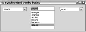
368 C H A P T E R 9 ■ B A S I C W I N D O W S F O R M S A P P L I C A T I O N S
When you are working with Simple or DropDown ComboBoxes, all you usually need to worry about is what is currently in the Text property. This property tells you what the current value is in the ComboBox, and placing the value in it automatically changes the SelectedItem property. On the other hand, when you are working with the DropDownList, it is better to work with the SelectedItem property, because it is more efficient for the control as the editing overhead of the text field goes unused.
Figure 9-16 shows what SyncCombos.exe looks like when you execute it.
Figure 9-16. Synchronized combo boxes
CheckedListBox
The CheckedListBox control provides you a way to group related check boxes in a scrollable and selectable ListBox control. In other words, this control provides the functionality of an array of check boxes and at the same time the functionality of a ListBox, allowing the selection of a checkable item without actually checking the item off.
The CheckedListBox control directly inherits from the ListBox control, so in addition to the functionality provided by the ListBox, the CheckedListBox provides numerous other properties. Some of the more common are as follows:
•CheckedIndices is a CheckedListBox::CheckedIndexCollection that represents the collection of zero-based indices of currently checked or indeterminate state items within the control.
•CheckedItems is a CheckedListBox::CheckedItemCollection that represents the collection of currently checked or indeterminate state items within the control.
•CheckOnClick is a Boolean that represents whether the check box is toggled immediately on the selection of the check box item. The default is false.
•ThreeDCheckBoxes is a Boolean that represents if 3D or flat check boxes are used. The default is false or a flat appearance.
Along with the preceding properties, the CheckListBox control provides several methods. The following methods get access to the checked status of the CheckListBox’s items:
•GetItemChecked() checks (using a specified index) whether an item is checked.
•GetItemCheckState() checks (using a specified index) what the check state of the item is.
•SetItemChecked() checks or unchecks an item at a specified index.
•SetItemCheckState() sets the check status of an item at a specified index.
Working with the CheckedListBox can be a little confusing, as selected and checked items are not the same thing. You can have an item that does not check or uncheck when selected.
To get the selected item (you can only have one, unless you select SelectionMode::None), you use the properties prefixed by “Selected”. Even though there are properties that suggest more than one item can be selected, these properties return a collection of one item. Basically, the difference
C H A P T E R 9 ■ B A S I C W I N D O W S F O R M S A P P L I C A T I O N S |
369 |
between SelectedIndex and SelectedIndices, and SelectedItem and SelectedItems, is that the first returns a single item and the second returns a collection of one item.
To get the checked items from the control, you need to use the properties and methods that contain “Check(ed)” within their name. Note that there are two common ways of getting all the checked items in the CheckedListBox. The first method is to use the default index property of
CheckIndices and CheckItems:
for (int i = 0; i < checkedlistbox->CheckedItems->Count; i++)
{
//...do what you want with:
//checkedlistbox->CheckedItems[i];
}
The second approach is to use the methods GetItemChecked() and GetItemCheckState():
for (int i = 0; i < checkedlistbox->Items->Count; i++)
{
if (checkedlistbox->GetItemChecked(i))
{
//...do what you want with:
//checkedlistbox->Items[i];
}
}
The main difference between the two is that the first approach provides only a list of checked items, whereas the second requires an iteration through all the items and verifies the check status of each.
The example in Listing 9-15 shows how closely the CheckListBox is to an array of Checkboxes and a ListBox. It does this by synchronizing input using these controls.
Listing 9-15. Splitting the CheckedListBox
#pragma once
namespace |
SplitCLB |
{ |
|
using |
namespace System; |
using |
namespace System::ComponentModel; |
using |
namespace System::Collections; |
using |
namespace System::Windows::Forms; |
using |
namespace System::Data; |
using |
namespace System::Drawing; |
public ref class Form1 : public System::Windows::Forms::Form
{
public:
Form1(void)
{
InitializeComponent();
array<Object^>^ |
Items = gcnew array<Object^> { |
||
"Appleman", |
"Challa", |
"Chand", |
"Cornell", |
"Fraser", |
"Gunnerson", |
"Harris", |
"Rammer", |
"Symmonds", |
"Thomsen", |
"Troelsen", |
"Vaughn" |
}; |
|
|
|
370 C H A P T E R 9 ■ B A S I C W I N D O W S F O R M S A P P L I C A T I O N S
clBox->Items->AddRange(Items); lBox->Items->AddRange(Items);
// Create a Check box for each entry in Items array. cBox = gcnew array<CheckBox^>(Items->Length);
int j = cBox->Length/2;
for (int i = 0; i < j; i++)
{
//Build Left Column cBox[i] = gcnew CheckBox();
cBox[i]->Location = Drawing::Point(50, 160+(30*i)); cBox[i]->TabIndex = i+2;
cBox[i]->Text = Items[i]->ToString(); cBox[i]->CheckStateChanged +=
gcnew EventHandler(this, &Form1::cBox_CheckStateChanged);
//Build Right Column
cBox[i+j] = gcnew CheckBox();
cBox[i+j]->Location = Drawing::Point(180, 160+(30*i)); cBox[i+j]->TabIndex = i+j+2;
cBox[i+j]->Text = Items[i+j]->ToString(); cBox[i+j]->CheckStateChanged +=
gcnew EventHandler(this, &Form1::cBox_CheckStateChanged);
}
// Add all CheckBoxes to Form Controls->AddRange(cBox);
}
protected:
~Form1()
{
if (components)
{
delete components;
}
}
private:
System::Windows::Forms::ListBox^ lBox; System::Windows::Forms::CheckedListBox^ clBox;
array<CheckBox^>^ cBox;
System::ComponentModel::Container ^components;
C H A P T E R 9 ■ B A S I C W I N D O W S F O R M S A P P L I C A T I O N S |
371 |
#pragma region Windows Form Designer generated code
void InitializeComponent(void)
{
this->lBox = (gcnew System::Windows::Forms::ListBox()); this->clBox = (gcnew System::Windows::Forms::CheckedListBox()); this->SuspendLayout();
//
// lBox
//
this->lBox->FormattingEnabled = true; this->lBox->Location = System::Drawing::Point(356, 32); this->lBox->Name = L"lBox";
this->lBox->Size = System::Drawing::Size(120, 264); this->lBox->TabIndex = 3; this->lBox->SelectedIndexChanged +=
gcnew System::EventHandler(this, &Form1::lBox_SelectedIndexChanged);
//
// clBox
//
this->clBox->FormattingEnabled = true; this->clBox->Location = System::Drawing::Point(12, 32); this->clBox->MultiColumn = true;
this->clBox->Name = L"clBox";
this->clBox->Size = System::Drawing::Size(323, 79); this->clBox->TabIndex = 2; this->clBox->ThreeDCheckBoxes = true; this->clBox->SelectedIndexChanged +=
gcnew System::EventHandler(this, &Form1::clBox_SelectedIndexChanged);
this->clBox->ItemCheck +=
gcnew System::Windows::Forms::ItemCheckEventHandler(this, &Form1::clBox_ItemCheck);
//
// Form1
//
this->AutoScaleDimensions = System::Drawing::SizeF(6, 13); this->AutoScaleMode = System::Windows::Forms::AutoScaleMode::Font; this->ClientSize = System::Drawing::Size(494, 392); this->Controls->Add(this->lBox);
this->Controls->Add(this->clBox); this->Name = L"Form1";
this->Text = L"Splitting The Check List Box"; this->ResumeLayout(false);
}
372 C H A P T E R 9 ■ B A S I C W I N D O W S F O R M S A P P L I C A T I O N S
#pragma endregion
private:
System::Void clBox_ItemCheck(System::Object^ sender, System::Windows::Forms::ItemCheckEventArgs^ e)
{
//update state of CheckBox with same index as checked CheckedListBox cBox[e->Index]->CheckState = e->NewValue;
}
System::Void clBox_SelectedIndexChanged(System::Object^ sender, System::EventArgs^ e)
{
//update ListBox with same selected item in the CheckedListBox lBox->SelectedItem = clBox->SelectedItem->ToString();
}
System::Void lBox_SelectedIndexChanged(System::Object^ sender, System::EventArgs^ e)
{
//update CheckedListBox with same selected item in the ListBox clBox->SelectedItem = lBox->SelectedItem;
}
void cBox_CheckStateChanged(Object^ sender, EventArgs^ e)
{
//update state of CheckedListBox with same index as checked CheckBox CheckBox^ cb = (CheckBox^)sender; clBox->SetItemCheckState(Array::IndexOf(cBox, cb), cb->CheckState);
}
};
}
The CheckedListBox provides an event to handle the checking of a box within the control. To handle this event, you need to create a method with the template:
ItemCheck(System::Object^ sender, System::Windows::Forms::ItemCheckEventArgs^ e)
Conveniently, the handler provides the parameter of type ItemCheckEventArgs, which among other things provides the index of the box being checked and the current and previous state of the box. I use this information to update the external array of check boxes.
cBox[e->Index]->CheckState = e->NewValue;
One other thing of note in the code is the trick I used to get the index of the CheckBox, which triggered the state change event out of the CheckBox array. The Array class has a neat little static method, Array::IndexOf(), which you pass as arguments to the array containing an entry and the entry itself, with the result being the index to that entry. I used this method by passing it the array of CheckBoxes along with the dynamically cast sender Object.
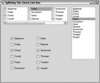
Figure 9-17 shows what SplitCLB.exe looks like when you execute it.
C H A P T E R 9 ■ B A S I C W I N D O W S F O R M S A P P L I C A T I O N S |
373 |
Figure 9-17. Splitting the checklist box
Timers
A few timers are sprinkled throughout the .NET Framework class library. One relevant to this chapter is found in the System::Windows::Forms namespace. Though not a GUI control, the Timer is an important component for scheduling events that occur at discrete user-defined intervals.
Notice I called Timer a “component” and not a “control,” as it inherits from the Component class but not the Control class. This fact is apparent when you implement a Timer in Visual Studio 2005, because when you drag the component to the Win Form it does not get placed on the form. Instead, it gets placed in its own area at the bottom of the designer window. Even though it is placed there, you still work with the Timer the same way you do with a control. You use the Properties view to update the Timer’s properties and events.
The Timer component is easy to use. Just instantiate it in your program:
Timer^ timer = gcnew Timer();
Create an event handler to accept Tick events:
void timer_Tick(Object^ sender, System::EventArgs^ e)
{
//...Process the Tick event
}
And then delegate that event handler:
timer->Tick += gcnew EventHandler(this, &Form1::timer_Tick);
The Timer component provides a few properties to configure and methods to implement the functionality of the control:
•Enabled is a Boolean that represents whether the Timer is enabled or disabled. When enabled, the Timer will trigger Tick events at an interval specified by the Interval property. The default is false, or disabled.
374 C H A P T E R 9 ■ B A S I C W I N D O W S F O R M S A P P L I C A T I O N S
•Interval is an Int32 that represents the discrete interval in milliseconds between triggering Tick events. The default interval is 0, meaning no interval is set.
•Start() is a method that does the same thing as the Enabled property being set to true.
•Stop() is a method that does the same thing as the Enabled property being set to false.
The Timer is such a simple example (see Listing 9-16) that I decided to throw another less frequently used control, the ProgressBar, into the program. You have seen a progress bar whenever you install software (it’s that bar that seems to take forever to slide across). The example is simply a repeating one-minute timer.
Listing 9-16. The One-Minute Timer
#pragma once
namespace |
MinuteTimer |
{ |
|
using |
namespace System; |
using |
namespace System::ComponentModel; |
using |
namespace System::Collections; |
using |
namespace System::Windows::Forms; |
using |
namespace System::Data; |
using |
namespace System::Drawing; |
public ref class Form1 : public System::Windows::Forms::Form
{
public:
Form1(void)
{
InitializeComponent(); seconds = 0;
}
protected:
~Form1()
{
if (components)
{
delete components;
}
}
private:
System::Windows::Forms::ProgressBar^ progressBar; System::Windows::Forms::Label^ lbsecs; System::Windows::Forms::Timer^ timer;
int seconds;
System::ComponentModel::IContainer^ components;
C H A P T E R 9 ■ B A S I C W I N D O W S F O R M S A P P L I C A T I O N S |
375 |
#pragma region Windows Form Designer generated code
void InitializeComponent(void)
{
this->components = (gcnew System::ComponentModel::Container()); this->progressBar = (gcnew System::Windows::Forms::ProgressBar()); this->lbsecs = (gcnew System::Windows::Forms::Label()); this->timer =
(gcnew System::Windows::Forms::Timer(this->components)); this->SuspendLayout();
//
//progressBar
this->progressBar->Location = System::Drawing::Point(61, 16); this->progressBar->Maximum = 60;
this->progressBar->Name = L"progressBar"; this->progressBar->Size = System::Drawing::Size(326, 23);
this->progressBar->TabIndex = 3;
//lbsecs
//
this->lbsecs->AutoSize = true;
this->lbsecs->Location = System::Drawing::Point(19, 25); this->lbsecs->Name = L"lbsecs";
this->lbsecs->Size = System::Drawing::Size(13, 13); this->lbsecs->TabIndex = 2;
this->lbsecs->Text = L"0"; this->lbsecs->TextAlign =
System::Drawing::ContentAlignment::MiddleRight;
//
//timer
this->timer->Enabled = true; this->timer->Tick +=
gcnew System::EventHandler(this, &Form1::timer_Tick);
//Form1
//
this->AutoScaleDimensions = System::Drawing::SizeF(6, 13); this->AutoScaleMode = System::Windows::Forms::AutoScaleMode::Font; this->ClientSize = System::Drawing::Size(407, 55); this->Controls->Add(this->progressBar); this->Controls->Add(this->lbsecs);
this->Name = L"Form1";
this->Text = L"One minute timer"; this->ResumeLayout(false); this->PerformLayout();
}
376 C H A P T E R 9 ■ B A S I C W I N D O W S F O R M S A P P L I C A T I O N S
#pragma endregion
private:
System::Void timer_Tick(System::Object^ sender, System::EventArgs^ e)
{
// Write current tick count (int 10th of second) to label seconds++;
seconds %= 600;
lbsecs->Text = String::Format("{0}.{1}", (seconds/10).ToString(), (seconds%10).ToString());
// Update ProgressBar progressBar->Value = seconds/10;
}
};
}
The ProgressBar simply shows the amount completed of some activity. You specify the starting point (Minimum) and the end point (Maximum) for which you want to monitor the progress, and then you simply update the value of the ProgressBar between these two points. The default start and end values are 0 to 100, representing progress from 0 percent to 100 percent, which is the most common use for the ProgressBar. In this example, because I am representing seconds in a minute, it made more sense to go from 0 to 60. Updating the ProgressBar itself is very simple, as it will move over automatically when the value exceeds the specified step factor.
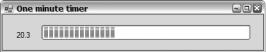
Figure 9-18 shows what MinuteTimer.exe looks like when you execute it.
Figure 9-18. The one-minute timer
Summary
You covered a lot in this chapter. You started with the lowly “Hello World!” form and worked your way up to building fully functional Win Forms. Along the way, you explored a number (most, actually) of the more common simple GUI controls provided by the .NET Framework class library. You should now be able to build a simple Win Form with a high level of confidence.
In the next chapter, you will continue to look at the GUI interface provided by the .NET Framework class library, but this time you look at some of the more advanced Win Form topics such as views, menus, and dialog boxes.

C H A P T E R 1 0
■ ■ ■
Advanced Windows
Forms Applications
In the previous chapter, you got all the basics of Windows Forms applications squared away. It is now time to look at some of the more exciting controls and features provided by the .NET Framework. Even though this chapter covers more advanced Win Forms applications, this does not mean they are more complex or difficult to develop. The main reason is that the .NET Framework uses encapsulation quite extensively in its classes and hides much of the complexities of Win Forms from you. On the other hand, you can still access these complexities if you really want to.
In this chapter, I continue using the approach of covering both manual development and development using the GUI design tool. As I pointed out in the previous chapter, I feel the intimate knowledge of Win Form components, attained by building Win Forms manually, will allow you to build better GUI interfaces to your Windows application.
This chapter covers some of the more powerful GUI controls provided by the .NET Framework. It also looks at three other Win Form development areas: menus, dialog boxes, and the MDI interface.
In Chapter 9, I covered most of the more commonly used data entry controls. Nothing is stopping you from using these controls in a simple form every time you need data from the user. However, doing so is not always the best way to interact with or present information to the user.
Let’s now start a whirlwind tour of some of the remaining controls provided by the .NET Framework class library.
ImageList
Before I can go very much further into the discussions about Windows Forms, I have to make a minor detour. As I’m sure you are aware, Windows applications are fairly graphics intensive. In fact, most of the controls I’m going to cover in this chapter have some graphics capabilities.
Though some of the controls allow you to access image files or image resources directly, usually a Win Form control requires you to place all the images you are using within an ImageList component. (An ImageList inherits from Component but not Control.) Then, using an index to each image in the ImageList, you place the appropriate image in the control’s image type property.
The process of creating an ImageList is extremely easy with Visual Studio 2005, though behind the scenes a lot is taking place. The steps to create an ImageList are as follows:
1.Drag and drop an ImageList to the form you want to place images on.
2.Within the ImageList property, click the ellipses button next to the Images property. This will bring up a dialog box similar to the one shown in Figure 10-1.
377