

Visual CSharp .NET Developer's Handbook (2002) [eng]
.pdf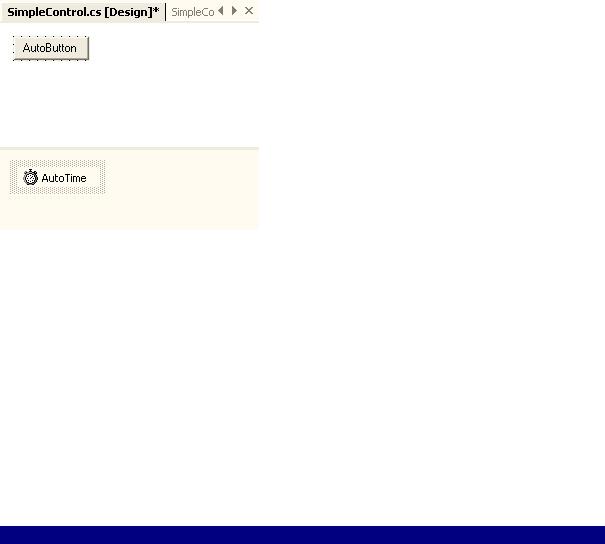
Figure 6.10: The AutoButton control automatically clicks itself if the user doesn't click it within the specified time.
After you create the physical appearance of the control and add any non-visual controls, it's time to code it. One of the problems you'll need to consider is that none of the client control elements are accessible. For example, the AutoButton control requires some means of accessing the Text property on btnAuto or the user won't be able to change it. The same holds true for any events that you want to expose. All events require a new means of access or the user won't be able to interact with them when the control is compiled.
Of course, there are other items to consider. For example, you need to provide access to any new control functionality. User controls can provide more than just a means to bundle existing controls—you can add new functionality as well. Listing 6.4 shows the code you'll need to add to make this control functional.
Listing 6.4: The AutoButton Automatically Clicks When Time Expires
#region Exposed Properties
[Description("The text that appears on the button.")] public String Caption
{
get
{
return btnAuto.Text;
}
set
{
btnAuto.Text = value;
}
}
[Description("The dialog result produced in a modal " + "by clicking the button")]
public DialogResult DialogResult
{
get
{
return btnAuto.DialogResult;
}
set
{
btnAuto.DialogResult = value;

}
}
[Description("The amount of time to wait to press the button " + "automatically in milliseconds.")]
public int TimerValue
{
get
{
return AutoTime.Interval;
}
set
{
AutoTime.Interval = value;
}
}
#endregion
#region "Exposed Events"
[Description("Invoked when the user clicks the button.")] public event EventHandler ButtonClick;
#endregion
#region "Exposed Methods" [Description("Starts the button timer.")] public void StartTimer()
{
AutoTime.Start();
}
[Description("Stops the button timer.")] public void StopTimer()
{
AutoTime.Stop();
}
#endregion
private void btnAuto_Click(object sender, System.EventArgs e)
{
//Reset the timer. AutoTime.Stop(); AutoTime.Start();
//Invoke the ButtonClick event. ButtonClick(this, e);
}
private void AutoTime_Tick(object sender, System.EventArgs e)
{
// Invoke the ButtonClick event. ButtonClick(this, e);
}
The AutoButton control shows how to work with the three control elements: properties, events, and methods. Each element appears within a separate #region pair to make it easier to spot within the code. It's a good idea to use regions within your code to help hide some of the complexity when you want to work on a specific area. In addition, you can hover the mouse
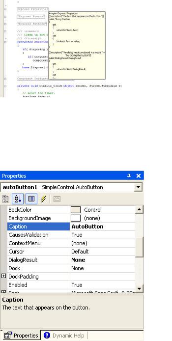
over a region to obtain a quick view of the code it contains without actually opening the region. Figure 6.11 shows an example of a region in use.
Figure 6.11: Placing the mouse over a region shows the code it contains.
The properties include Caption, DialogResult, and TimerValue. Each property has an associated [Description] attribute. Not only does the [Description] attribute document the property for the control developer, it also provides the help text for the property within the Visual Studio IDE, as shown in Figure 6.12. The property code simply exchanges data between the controls used for the AutoButton control and the client.
Figure 6.12: Use the [Description] attribute to self-document properties, events, and methods.
The one property needed for this example is ButtonClick(). As you can see, all you need is a public event EventHandler entry to create the event. The compiler automatically creates a class for you on the same order as it does for the delegate keyword. However, you also need code to fire the event. You'll see how this comes into play later in this section.
The two methods StartTimer() and StopTimer() enable the user to stop and start the internal timer. You have to make methods like this available. Otherwise, the AutoButton will continue to run, even when it isn't needed.
Now that we've looked at the control interface, it's time to look at the code that makes everything work. When a developer places the AutoButton control on a new project, all of the controls that originally appear on the original panel go with it. When the user clicks the AutoButton, the control doesn't generate a Click() event that the client application can trap—it generates a Click() event for the private btnAuto control contained on the panel. This might seem like a nuisance at first, but this technique enables you to trap the event first, and then pass it along to the client.
This use of control events is precisely what happens in the btnAuto_Click() method. The user clicks the button, your control resets its internal time, and then passes the event to the client using the ButtonClick() event. Firing the event makes it available to the client. The AutoTime_Tick() method fires the same event if time runs out before the user clicks the button.
The client works with the AutoButton much as it would any other pushbutton control. The two main requirements are setting the TimerValue property and ensuring the application starts the timer at some point. The code will also need to respond to the ButtonClick() event to gain any value from the AutoButton. The following code shows the code for a test application (also found in the \Chapter 06\UserControl folder on the CD).
private void autoButton1_ButtonClick(object sender, System.EventArgs e)
{
// Display a message.
MessageBox.Show("The AutoButton was clicked.", "Click Alert",
MessageBoxButtons.OK,
MessageBoxIcon.Information);
}
private void FrmMain_Load(object sender, System.EventArgs e)
{
// Start the timer. autoButton1.StartTimer();
}
As you can see, the test application displays a message in response to a button click. The timer starts as soon as the application loads the form. If you want to test the AutoButton feature, start the application and wait 5 seconds (or set some other interval). Whenever you click the AutoButton, the timer resets and waits another 5 seconds before it clicks again.
Debugging Windows Control Library Projects
The methods you use to debug a control depend on the control element of interest. You use different techniques with each control element. A property requires different debugging procedures than a method or event. However, you can generally categorize debugging into three areas: property, method, and event.
Let's begin by looking at a method. All you need to do is place a breakpoint at the method call within the client application. Use the Step Into button to trace into the method code. It helps if you have a copy of the source code (not the entire solution) open in the IDE to make moving between method and client code easier. The debugger will try to find the source code when you step into the method code. One of the biggest problems to check with methods is to ensure the values you send to the method actually arrive in the form you anticipated.
Property checking is only a little more difficult than checking methods. Begin by setting a breakpoint within the control code at the get() or set() method. You might think that changing the property value in the IDE would give you access to the code. However, the debugger isn't active when you make such a change, so there's no process to stop. You need to create code that will exercise both get() and set() methods. Many developers find it easier to create a pushbutton for the task and add appropriate code as shown here.
private void btnDebug_Click(object sender, System.EventArgs e)
{
//Set a breakpoint on the get and set methods for the Caption
//property in the control. Trace into the property code using
//the code shown below. A full check of a property means checking
//both get and set code (when appropriate).
autoButton1.Caption = "AutoButton"; string MyCaption = autoButton1.Caption;
}
Tracing into the two statements (using the Step Into button) enables you to see any problems with the code you create. Obviously, you'll want to use a test application to check for bugs or remove the test code after you check a production application. Make sure you check for unexpected values to ensure range and validation code work as anticipated.
Debugging events can prove troublesome because you have no direct access to the event from the client code. When a user clicks on a pushbutton, the application environment invokes the event handler without making an intervening client code call. In short, you can't set a breakpoint within the client to see the event code.
To debug an event, you must set a breakpoint within the control code at the point where the event is fired. For example, in the AutoButton example, you set the breakpoint within the btnAuto_Click() or the AutoTime_Tick() method at the ButtonClick(this, e) call and trace the event from that point.
Note You can't access the event EventHandler code directly. In most cases, you'll never need to debug this code because the compiler generates it automatically for you.
Web Control Library Overview
The Web Control Library project provides the web browser version of the control you'd create for a desktop application. In fact, you'll find that most of the Microsoft supplied desktop controls have a Web Control equivalent. The idea behind a Web Control is to bring as much of the look and feel of the desktop to the browser. In addition, Web Controls make it easier to build robust browser applications.
Controls generally help you encapsulate generic user interface functionality in a form that many applications can use, and Web Controls are no exception. The following sections show
how to create a Web Control, add it as a web page, and display it in a browser. We'll also discuss some of the problems you'll encounter when debugging Web Controls. For example, there is the problem of creating a remote connection to ensure you can see how the control works in the server environment.
Simple Web Control Example
Web Controls interact with ASP .NET web pages. Creating a Web Control is different from a Windows control because the methods for rendering the control output are completely different. Consequently, little of what you know for creating a Windows control will transfer directly to the Web Control project.
Tip Microsoft is constantly updating Visual Studio .NET components, especially those components that deal with distributed application development, because this area of development is constantly changing. As a developer, you'll want to ensure your development environment is updated before you begin a new project by visiting Microsoft's ASP .NET website at http://www.asp.net/. However, once you begin the project, it's usually a good idea to maintain a stable development environment by maintaining the current level of updates until project completion. Of course, you'll have to make a change if an update affects a critical development area, such as security.
This section of the chapter shows how to create a simple Web Control. In this case, you'll see how to create a switched label. In one mode it outputs Cascading Style Sheet (CSS) code that allows for absolute positioning and everything else that CSS has to offer. In the second mode, the same label will output straight HTML. A control like this is useful for a number of reasons, not the least of which is browser compatibility. A dual mode control could also help your website service the needs of those with accessibility requirements and could even enable those who don't want anything but a plain page to get their wish. The benefit to the developer is that you design the page once. A simple property change modifies the ASP.NET output, making the whole web page construction process easier.
Note The ASP.NET portion of this example relies on a web server connection to open. Because Visual Studio .NET doesn't provide a means for modifying an ASP.NET Web Application project directly, you'll need to re-create the program shell and move the example code to it, or modify the project files found on the CD using a text editor. Replace all occurrences of the "http://WinServer" URL with the URL for your web server. The example is unlikely to open directly from the CD (unless your web server name is the same as mine).
Unlike the Windows control example earlier, you can't simply place controls on a panel to start building a Web Control. This project lacks designer support—you need to code all of the controls contained within the control. Verification of control placement and functionality occurs when you view the control on a web page. Consequently, you'll want to create the project so that you have both the control and the test web page available in the same solution. The following steps will describe how to create the dual project solution required for this example.
1.Open the New Project dialog box shown in Figure 6.13 and choose Web Control Library from the list of C# project templates. Type a name for the project—the example uses MyWebControl. Click OK to create the project.
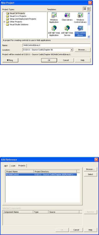
Figure 6.13: Use the New Project dialog box to select the Web Control Library template.
2.Select the File → Add Project → New Project command.
3.Select the ASP.NET Web Application template. Choose a location for this part of the project on your web server. The last part of the URL is the project name—the example uses MyWebControlTest. Click OK to create the project.
4.Change the names of any file within the project by selecting its entry in Solution Explorer and typing a new name in the File Name property. Also change the names of any class by highlighting its entry in Class View and changing the Name property. The example uses the name of SpecialHeader for the Web Control class and MainWebForm for the ASP.NET Web form.
5.Right-click MyWebControlTest and choose Set as Startup Project from the context menu. This ensures you can perform remote debugging of the project.
6.Right-click MyWebControlTest → References and choose Add Reference from the context menu. You'll see the Add Reference dialog box shown in Figure 6.14.
Figure 6.14: Always add a reference to the Web Control in the ASP.NET Web Application.
7.Select the Projects tab. Visual Studio .NET normally places the Web Control project in the list for you, but you can also use the Browse button to locate it. Highlight the

Web Control project entry and click Select. Click OK. Visual Studio .NET will add the reference to the reference list for you.
Now that you have a project shell put together, it's time to add some code to MyWebControl. This example shows how to use attributes, create properties, and render the control on screen. Listing 6.5 contains the sample code. You'll find the complete source in the \Chapter 06\MyWebControl folder on the CD; the ASP.NET Web Application source appears in the \Chapter 06\MyWebControlTest folder.
Listing 6.5: The SpecialHeader Class Provides Extended Label Functionality
[DefaultProperty("Text"), ToolboxData("<{0}:SpecialHeader " +
"Text=\"Sample Header\" HeaderLevel=\"1\"" + "Centered=\"True\" AbsolutePosition=\"False\"" + "runat=server></{0}:SpecialHeader>")]
public class SpecialHeader : System.Web.UI.WebControls.WebControl
{
private string _Text; private int _HeaderLevel; private bool _Centered; private bool _Absolute;
//Heading content.
//Heading level <H?>
//Center the heading?
//Use absolute positioning?
#region Control Properties [Bindable(true),
Category("Appearance"), DefaultValue("Sample Header"),
Description("String displayed by the control.")] public string Text
{
get { return _Text; } set { _Text = value; }
}
[Bindable(true),
Category("Layout"),
DefaultValue("1"),
Description("Header level for the string")] public int HeaderLevel
{
get { return _HeaderLevel; } set
{
// Validate the input range, then set the property. if (value < 1 || value > 6)
value = 1; _HeaderLevel = value;
}
}
[Bindable(true),
Category("Layout"),
DefaultValue("True"),
Description("Center the string when true.")] public bool Centered
{
get { return _Centered; } set { _Centered = value; }
}
[Bindable(true),
Category("Behavior"),
DefaultValue("False"),
Description("Use absolute header positioning when true.")] public bool AbsolutePosition
{
get { return _Absolute; } set { _Absolute = value; }
}
#endregion
///<summary>
///Render this control to the output parameter specified.
///</summary>
///<param name="output"> The HTML writer to write out to </param> protected override void Render(HtmlTextWriter output)
{
if (_Absolute)
{
//Create an enumerator for the WebControl.Style. IEnumerator keys = this.Style.Keys.GetEnumerator();
//Provide the non-CSS output values.
output.Write("<span id=\"" + this.ID + "\" "); output.Write("style=\"WIDTH: " + this.Width);
//Move from one key value to the next until the enumeration
//returns null.
while (keys.MoveNext())
{
//Output a separator output.Write(";");
//Obtain the current key value from the key enumeration. String key = (String)keys.Current;
//Output the key and enumeration value to
//the Web page.
output.Write( key + ": " + this.Style[key]);
}
// Output the font configuration, if any. if (this.Font.Name != null)
output.Write(";font-family: " + this.Font.Name); if (this.Font.Size.ToString() != null)
output.Write(";font-size: " + this.Font.Size.ToString()); if (this.Font.Bold)
output.Write(";font-weight: Bold"); if (this.Font.Italic)
output.Write(";font-style: Italic"); if (this.Font.Overline ||
this.Font.Underline || this.Font.Strikeout)
{
output.Write(";text-decoration:"); if (this.Font.Overline)
output.Write(" Overline"); if (this.Font.Strikeout)
output.Write(" Line-Through"); if (this.Font.Underline)

output.Write(" Underline");
}
// Output the text and closing tag. output.Write("\">" + _Text); output.Write("</span>\r\n");
}
else
{
// Create the standard output, using standard HTML tags. if (_Centered)
output.Write("<CENTER>"); if (this.Font.Name != null)
output.Write("<FONT face=\"" + this.Font.Name + "\">"); if (this.Font.Bold)
output.Write("<STRONG>"); if (this.Font.Italic)
output.Write("<EM>"); if (this.Font.Underline) output.Write("<U>");
output.Write("<H" + _HeaderLevel.ToString() + ">"); output.Write(_Text);
output.Write("</H" + _HeaderLevel.ToString() + ">"); if (this.Font.Underline)
output.Write("</U>"); if (this.Font.Italic)
output.Write("</EM>"); if (this.Font.Bold)
output.Write("</STRONG>"); if (this.Font.Name != null)
output.Write("</FONT>"); if (_Centered)
output.Write("</CENTER>");
output.Write("\r\n");
}
}
}
The first item you should notice in Listing 6.5 is the two attributes immediately before the SpecialHeader class declaration. Both attributes affect how the Visual Studio .NET IDE interacts with the control. The [DefaultProperty] attribute tells the IDE to select the Text property as the first property when the user opens the Properties window. The [ToolBoxData] attribute configures the HTML entry for the control. When someone creates a new control, the HTML code will include a tag, the name of the control, and some default property values.
Creating a property for a Web Control is much like creating a property for a Windows control. An internal private variable keeps track of the property value. The get() and set() methods enable the client to retrieve values. However, a Web Control requires several attributes to ensure it works properly with the website. The [Bindable] attribute ensures the client is notified every time a property change occurs. The [Category] attribute places the property in a specific category in the Properties window. The [DefaultValue] attribute ensures the property has a value, even if the client doesn't assign one. Finally, the [Description] property displays descriptive (help) text about the property in the Properties window.