

312 HOW: The Joy of JavaScript: Browser Compensation
Figure 11.5
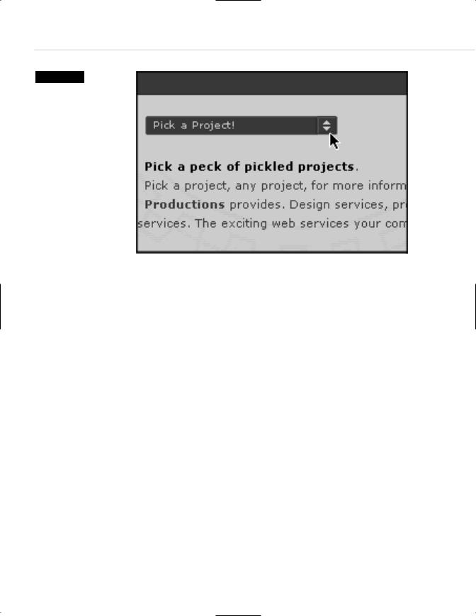
Add JavaScript to a standard HTML <FORM> element, throw in a dash of CSS for style, and you have a tasty alternative to the traditional navigation menu. Instead of the mess of links the client may have demanded, you have a clean, intuitive interface requiring very little
space on the page (www.happycog.com).
BROWSER COMPENSATION
Problem: You want to use particular technology—say, CSS—without causing old browsers to fail.
Solution: Browser detection and redirection.
As we’ve probably boasted 100 times already throughout this book, we publish a weekly online magazine for web designers that the gods call A List Apart (http://www.alistapart.com/). For our 19 January 2001 edition, we decided to create a special issue dedicated to employment problems being experienced in the web design field at that time, due to the collapse of many pre-IPO dot-com businesses in the last quarter of 2000.
In addition to running two articles on the subject, we were also introducing a new site feature: namely, message boards. We figured that the chance to commiserate over business troubles would be a natural inducement to use this new community forum.
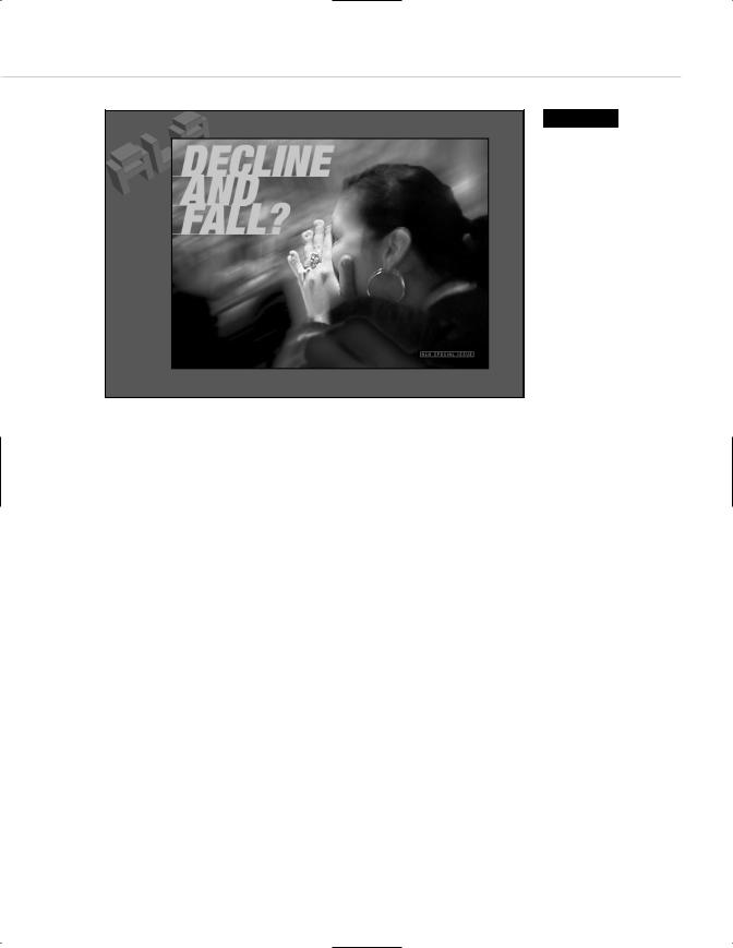
Ordinarily, ALA’s navigational architecture employs a flattened hierarchy: You hit the front page and are immediately presented with that week’s content. But to highlight the special issue—to really alert our readers to the fact that this issue was different—we decided to break with our own convention and launch the issue with a splash page (see Figure 11.6).
Taking Your Talent to the Web |
313 |
We also decided to use CSS to lay out the page, instead of relying on the techniques described in Chapter 10. We did this for several reasons. For one thing, it’s leaner. Instead of an HTML table filled with dozens of image slices, it’s three simple images, one tiny rollover image, and a few lines of standards-friendly code:
<style type=”text/css”> <!--
BODY {margin: 0; background-color: #930; background-image: url(/stories/decline/alatop.gif); background-repeat: no-repeat; background-attachment: scroll; background-position: top left;}
A:link, A:visited, A:active { text-decoration: none; font-weight: bold; color: #f90; } A:hover { color: #cf0; text-decoration: underline; }
#grief {position: absolute; left: 115px; top: 50px; background-image: url(/stories/decline/decline.jpg); background-repeat: no-repeat; background-attachment: scroll; background-position: top left; border: 2px solid black; height: 400px; width: 550px;}
.special {position: relative; left: 425px; top: 365px;} -->
</style>
For another thing, if we had followed the time-honored method of cutting the comp apart in ImageReady, the colors in the photograph might not have matched from one slice to another. And the bandwidth requirements would have been substantially higher.
CSS enabled us to create a page that looked and worked better than tra-
Figure 11.6
This is a splash page for a special issue of A List Apart. Using CSS rather than traditional HTML tables and image slices simplified the design and production, reduced the bandwidth required, and ensured that the photo’s color would remain consistent. But this page did not work in old, buggy browsers. JavaScript browser detection saved the day (http:// www.alistapart.com/ stories/decline/).