- •Book of Vaadin
- •Table of Contents
- •Preface
- •Part I. Introduction
- •1.1. Overview
- •1.2. Example Application Walkthrough
- •1.3. Support for the Eclipse IDE
- •1.4. Goals and Philosophy
- •1.5. Background
- •2.1. Overview
- •2.2. Setting up the Development Environment
- •2.2.1. Installing Java SDK
- •Windows
- •Linux / UNIX
- •2.2.2. Installing Eclipse IDE
- •Windows
- •Linux / OS X / UNIX
- •2.2.3. Installing Apache Tomcat
- •2.2.4. Firefox and Firebug
- •Using Firebug with Vaadin
- •2.3. Overview of Vaadin Libraries
- •2.4. Installing Vaadin Plugin for Eclipse
- •2.4.1. Installing the IvyDE Plugin
- •2.4.2. Installing the Vaadin Plugin
- •2.4.3. Updating the Plugins
- •2.4.4. Updating the Vaadin Libraries
- •2.5. Creating and Running a Project with Eclipse
- •2.5.1. Creating the Project
- •2.5.2. Exploring the Project
- •The UI Class
- •Deployment Descriptor (web.xml)
- •2.5.3. Coding Tips for Eclipse
- •2.5.4. Setting Up and Starting the Web Server
- •2.5.5. Running and Debugging
- •2.6. Using Vaadin with Maven
- •2.6.1. Working from Command-Line
- •2.6.2. Compiling and Running the Application
- •2.6.3. Using Add-ons and Custom Widget Sets
- •2.7. Creating a Project with NetBeans IDE
- •2.7.1. Maven Project from a Vaadin Archetype
- •2.7.2. Regular Web Application Project
- •2.8. Vaadin Installation Package
- •2.8.1. Package Contents
- •2.8.2. Installing the Libraries
- •3.1. Overview
- •3.2. Technological Background
- •3.2.1. HTML and JavaScript
- •3.2.2. Styling with CSS and Sass
- •3.2.3. AJAX
- •3.2.4. Google Web Toolkit
- •3.2.5. Java Servlets
- •3.3. Client-Side Engine
- •3.4. Events and Listeners
- •Part II. Server-Side Framework
- •4.1. Overview
- •4.2. Building the UI
- •4.2.1. Application Architecture
- •4.2.2. Compositing Components
- •4.2.3. View Navigation
- •4.2.4. Layered Architectures
- •4.2.5. Accessing UI, Page, Session, and Service
- •4.3. Handling Events with Listeners
- •4.3.1. Implementing a Listener in a Regular Class
- •4.3.2. Differentiating Between Event Sources
- •4.3.3. The Easy Way: Using Anonymous Classes
- •4.4. Images and Other Resources
- •4.4.1. Resource Interfaces and Classes
- •4.4.2. File Resources
- •4.4.3. Class Loader Resources
- •4.4.4. Theme Resources
- •4.4.5. Stream Resources
- •4.5. Handling Errors
- •4.5.1. Error Indicator and message
- •4.5.2. Customizing System Messages
- •4.5.3. Handling Uncaught Exceptions
- •4.6. Notifications
- •4.6.1. Notification Type
- •4.6.2. Customizing Notifications
- •4.6.3. Styling with CSS
- •4.7. Application Lifecycle
- •4.7.1. Deployment
- •Undeploying and Redeploying
- •Redeployment and Serialization
- •4.7.2. Vaadin Servlet, Portlet, and Service
- •Customization
- •4.7.3. User Session
- •4.7.4. Loading a UI
- •4.7.5. UI Expiration
- •4.7.6. Session Expiration
- •4.7.7. Closing a Session
- •4.8. Deploying an Application
- •4.8.1. Creating Deployable WAR in Eclipse
- •4.8.2. Web Application Contents
- •4.8.3. Deployment Descriptor web.xml
- •Widget Set
- •Servlet Mapping with URL Patterns
- •4.8.4. Other Deployment Parameters
- •Production Mode
- •Custom UI Provider
- •UI Heartbeat
- •Session Timeout After User Inactivity
- •Cross-Site Request Forgery Prevention
- •4.8.5. Deployment Configuration
- •5.1. Overview
- •5.2. Interfaces and Abstractions
- •5.2.1. Component Interface
- •Component Tree Management
- •5.2.2. AbstractComponent
- •5.2.3. Field Components (Field and AbstractField)
- •Field Interface
- •Data Binding and Conversions
- •Handling Field Value Changes
- •AbstractField Base Class
- •5.3. Common Component Features
- •5.3.1. Caption
- •5.3.2. Description and Tooltips
- •5.3.3. Enabled
- •5.3.4. Icon
- •5.3.5. Locale
- •5.3.6. Read-Only
- •5.3.7. Style Name
- •5.3.8. Visible
- •5.3.9. Sizing Components
- •5.3.10. Managing Input Focus
- •5.4. Component Extensions
- •5.5. Label
- •5.5.1. Content Mode
- •5.5.2. Making Use of the HTML Mode
- •5.5.3. Spacing with a Label
- •5.5.4. CSS Style Rules
- •5.6. Link
- •5.7. TextField
- •5.7.1. Data Binding
- •5.7.2. String Length
- •5.7.3. Handling Null Values
- •5.7.4. Text Change Events
- •5.7.5. CSS Style Rules
- •5.8. TextArea
- •5.9. PasswordField
- •5.10. RichTextArea
- •5.11. Date and Time Input with DateField
- •5.11.1. PopupDateField
- •5.11.2. InlineDateField
- •5.11.3. Time Resolution
- •5.11.4. DateField Locale
- •5.12. Button
- •5.13. CheckBox
- •5.14. Selecting Items
- •5.14.1. Binding Selection Components to Data
- •Adding New Items
- •Item Captions
- •Getting and Setting Selection
- •5.14.2. Basic Select Component
- •Filtered Selection
- •5.14.3. ListSelect
- •5.14.4. Native Selection Component NativeSelect
- •5.14.5. Radio Button and Check Box Groups with OptionGroup
- •Disabling Items
- •5.14.6. Twin Column Selection with TwinColSelect
- •5.14.7. Allowing Adding New Items
- •5.14.8. Multiple Selection Mode
- •5.14.9. Other Common Features
- •Item Icons
- •5.15. Table
- •5.15.1. Selecting Items in a Table
- •5.15.2. Table Features
- •Page Length and Scrollbar
- •Resizing Columns
- •Reordering Columns
- •Collapsing Columns
- •Components Inside a Table
- •Iterating Over a Table
- •Filtering Table Contents
- •5.15.3. Editing the Values in a Table
- •Field Factories
- •Navigation in Editable Mode
- •5.15.4. Column Headers and Footers
- •Headers
- •Footers
- •Handling Mouse Clicks on Headers and Footers
- •5.15.5. Generated Table Columns
- •5.15.6. Formatting Table Columns
- •5.15.7. CSS Style Rules
- •Setting Individual Cell Styles
- •5.16. Tree
- •5.17. MenuBar
- •5.18. Embedded Resources
- •5.18.1. Embedded Image
- •Generating and Reloading Images
- •5.18.2. Adobe Flash Graphics
- •5.18.3. BrowserFrame
- •5.18.4. Generic Embedded Objects
- •5.19. Upload
- •5.20. ProgressIndicator
- •5.20.1. Doing Heavy Computation
- •5.21. Slider
- •5.22. Component Composition with CustomComponent
- •5.23. Composite Fields with CustomField
- •6.1. Overview
- •6.2. Window and Panel Content
- •6.3. VerticalLayout and HorizontalLayout
- •6.3.1. Sizing Contained Components
- •6.4. GridLayout
- •6.4.1. Sizing Grid Cells
- •6.5. FormLayout
- •6.6. Panel
- •6.6.1. Scrolling the Panel Content
- •6.7. Sub-Windows
- •6.7.1. Opening and Closing a Sub-Window
- •6.7.2. Window Positioning
- •6.7.3. Scrolling Sub-Window Content
- •6.7.4. Modal Windows
- •6.8. HorizontalSplitPanel and VerticalSplitPanel
- •6.9. TabSheet
- •6.10. Accordion
- •6.11. AbsoluteLayout
- •6.12. CssLayout
- •6.13. Layout Formatting
- •6.13.1. Layout Size
- •Expanding Components
- •6.13.2. Layout Cell Alignment
- •Size of Aligned Components
- •6.13.3. Layout Cell Spacing
- •6.13.4. Layout Margins
- •6.14. Custom Layouts
- •7.1. Overview
- •7.2. Creating a New Composite
- •7.3. Using The Visual Designer
- •7.3.1. Adding New Components
- •7.3.2. Setting Component Properties
- •Basic Properties
- •Layout Properties
- •7.3.3. Editing an AbsoluteLayout
- •7.4. Structure of a Visually Editable Component
- •7.4.1. Sub-Component References
- •7.4.2. Sub-Component Builders
- •7.4.3. The Constructor
- •8.1. Overview
- •8.2. Introduction to Cascading Style Sheets
- •8.2.1. Basic CSS Rules
- •8.2.2. Matching by Element Class
- •8.2.3. Matching by Descendant Relationship
- •8.2.4. Notes on Compatibility
- •8.3. Syntactically Awesome Stylesheets (Sass)
- •8.3.1. Sass Overview
- •Variables
- •Nesting
- •8.3.2. Sass Basics with Vaadin
- •8.3.3. Compiling On the Fly
- •8.3.4. Compiling Sass to CSS
- •8.4. Creating and Using Themes
- •8.4.1. Sass Themes
- •Built-in Themes
- •8.4.2. Plain Old CSS Themes
- •8.4.3. Styling Standard Components
- •8.4.4. Built-in Themes
- •8.4.5. Using Themes in an UI
- •8.4.6. Theme Inheritance
- •8.5. Creating a Theme in Eclipse
- •9.1. Overview
- •9.2. Properties
- •9.2.1. Property Viewers and Editors
- •9.2.2. ObjectProperty Implementation
- •9.2.3. Converting Between Property Type and Representation
- •Basic Use of Converters
- •Implementing a Converter
- •Converter Factory
- •9.2.4. Implementing the Property Interface
- •9.3. Holding properties in Items
- •9.3.1. The PropertysetItem Implementation
- •9.3.2. Wrapping a Bean in a BeanItem
- •Nested Beans
- •9.4. Creating Forms by Binding Fields to Items
- •9.4.1. Simple Binding
- •9.4.2. Using a FieldFactory to Build and Bind Fields
- •9.4.3. Binding Member Fields
- •Encapsulating in CustomComponent
- •9.4.4. Buffering Forms
- •9.4.5. Binding Fields to a Bean
- •9.4.6. Bean Validation
- •Annotations
- •Validating the Beans
- •Locale Setting for Bean Validation
- •9.5. Collecting Items in Containers
- •9.5.1. Basic Use of Containers
- •Default Containers and Delegation
- •Creating and Binding a Container
- •Adding Items and Accessing Properties
- •Adding Items by Given ID
- •9.5.2. Container Subinterfaces
- •9.5.3. IndexedContainer
- •9.5.4. BeanContainer
- •Nested Properties
- •Defining a Bean ID Resolver
- •9.5.5. BeanItemContainer
- •9.5.6. Iterating Over a Container
- •9.5.7. Filterable Containers
- •Atomic and Composite Filters
- •Built-In Filter Types
- •Implementing Custom Filters
- •10.1. Architecture
- •10.2. Getting Started with SQLContainer
- •10.2.1. Creating a connection pool
- •10.2.2. Creating the TableQuery Query Delegate
- •10.2.3. Creating the Container
- •10.3. Filtering and Sorting
- •10.3.1. Filtering
- •10.3.2. Sorting
- •10.4. Editing
- •10.4.1. Adding items
- •10.4.2. Fetching generated row keys
- •10.4.3. Version column requirement
- •10.4.4. Auto-commit mode
- •10.4.5. Modified state
- •10.5. Caching, Paging and Refreshing
- •10.5.1. Container Size
- •10.5.2. Page Length and Cache Size
- •10.5.3. Refreshing the Container
- •10.5.4. Cache Flush Notification Mechanism
- •10.6. Referencing Another SQLContainer
- •10.7. Using FreeformQuery and FreeformStatementDelegate
- •10.8. Non-implemented methods of Vaadin container interfaces
- •10.9. Known Issues and Limitations
- •11.1. Handling Browser Windows
- •11.1.1. Opening Popup Windows
- •The Popup Window UI
- •Popping It Up
- •Popup Window Name (Target)
- •URL and Session
- •11.2. Embedding UIs in Web Pages
- •11.2.1. Embedding Inside a div Element
- •The Head Matter
- •The Body Matter
- •UI Placeholder Element
- •Initializing the UI
- •Summary of Div Embedding
- •11.2.2. Embedding Inside an iframe Element
- •11.2.3. Cross-Site Embedding with the Vaadin XS Add-on
- •11.3. Debug and Production Mode
- •11.3.1. Debug Mode
- •11.3.2. Analyzing Layouts
- •11.3.3. Custom Layouts
- •11.3.4. Debug Functions for Component Developers
- •11.4. Request Handlers
- •11.5. Shortcut Keys
- •11.5.1. Click Shortcuts for Default Buttons
- •11.5.2. Field Focus Shortcuts
- •11.5.3. Generic Shortcut Actions
- •11.5.4. Supported Key Codes and Modifier Keys
- •Supported Key Combinations
- •11.6. Printing
- •11.6.1. Printing the Browser Window
- •11.6.2. Opening a Print Window
- •11.6.3. Printing PDF
- •11.7. Google App Engine Integration
- •11.8. Common Security Issues
- •11.8.1. Sanitizing User Input to Prevent Cross-Site Scripting
- •11.9. Navigating in an Application
- •11.9.1. Setting Up for Navigation
- •View Providers
- •View Change Listeners
- •11.9.2. Implementing a View
- •11.9.3. Handling URI Fragment Path
- •11.10. URI Fragment and History Management with UriFragmentUtility
- •11.11. Drag and Drop
- •11.11.1. Handling Drops
- •11.11.2. Dropping Items On a Tree
- •Accept Criteria for Trees
- •11.11.3. Dropping Items On a Table
- •Accept Criteria for Tables
- •11.11.4. Accepting Drops
- •Client-Side Criteria
- •Server-Side Criteria
- •Accept Indicators
- •11.11.5. Dragging Components
- •11.11.6. Dropping on a Component
- •Target Details for Wrapped Components
- •11.11.7. Dragging Files from Outside the Browser
- •11.12. Logging
- •11.13. JavaScript Interaction
- •11.13.1. Calling JavaScript
- •11.13.2. Handling JavaScript Function Callbacks
- •11.14. Accessing Session-Global Data
- •11.14.1. Passing References Around
- •11.14.2. Overriding attach()
- •11.14.3. ThreadLocal Pattern
- •12.1. Deploying to a Portal
- •12.2. Creating a Portal Application Project in Eclipse
- •12.3. Portlet Deployment Descriptors
- •12.4. Portlet Hello World
- •12.5. Installing Vaadin in Liferay
- •12.5.1. Removing the Bundled Installation
- •12.5.2. Installing Vaadin
- •12.6. Handling Portlet Requests
- •12.7. Handling Portlet Mode Changes
- •12.8. Non-Vaadin Portlet Modes
- •12.9. Vaadin IPC for Liferay
- •12.9.1. Installing the Add-on
- •12.9.2. Basic Communication
- •12.9.3. Considerations
- •Browser Security
- •Efficiency
- •12.9.4. Communication Through Session Attributes
- •12.9.5. Serializing and Encoding Data
- •12.9.6. Communicating with Non-Vaadin Portlets
- •Part III. Client-Side Framework
- •13.1. Overview
- •13.2. Installing the Client-Side Development Environment
- •13.3. Client-Side Module Descriptor
- •13.3.1. Specifying a Stylesheet
- •13.3.2. Limiting Compilation Targets
- •13.4. Compiling a Client-Side Module
- •13.4.1. Vaadin Compiler Overview
- •13.4.2. Compiling in Eclipse
- •13.4.3. Compiling with Ant
- •13.4.4. Compiling with Maven
- •13.5. Creating a Custom Widget
- •13.5.1. A Basic Widget
- •13.5.2. Using the Widget
- •13.6. Debugging Client-Side Code
- •13.6.1. Launching Development Mode
- •13.6.2. Launching SuperDevMode
- •Debugging Java Code in Chrome
- •14.1. Overview
- •14.2. Client-Side Module Entry-Point
- •14.2.1. Module Descriptor
- •14.3. Compiling and Running a Client-Side Application
- •14.4. Loading a Client-Side Application
- •15.1. Overview
- •15.2. GWT Widgets
- •15.3. Vaadin Widgets
- •16.1. Overview
- •16.2. Starting It Simple With Eclipse
- •16.2.1. Creating a Widget
- •16.2.2. Compiling the Widget Set
- •16.3. Creating a Server-Side Component
- •16.3.1. Basic Server-Side Component
- •16.4. Integrating the Two Sides with a Connector
- •16.4.1. A Basic Connector
- •16.4.2. Communication with the Server-Side
- •16.5. Shared State
- •16.5.1. Accessing Shared State on Server-Side
- •16.5.2. Handing Shared State in a Connector
- •16.5.3. Referring to Components in Shared State
- •16.5.4. Sharing Resources
- •16.6.1. RPC Calls to the Server-Side
- •Making a Call
- •Handling a Call
- •16.7. Component and UI Extensions
- •16.7.1. Server-Side Extension API
- •16.7.2. Extension Connectors
- •16.8. Styling a Widget
- •16.8.1. Determining the CSS Class
- •16.8.2. Default Stylesheet
- •16.9. Component Containers
- •16.10. Creating Add-ons
- •16.10.1. Exporting Add-on in Eclipse
- •Configuration and Initialization
- •Compiling the Server-Side
- •Compiling the JavaDoc
- •Packaging the JAR
- •16.11. Migrating from Vaadin 6
- •16.11.1. Quick (and Dirty) Migration
- •16.12. Integrating JavaScript Components and Extensions
- •16.12.1. Example JavaScript Library
- •16.12.2. A Server-Side API for a JavaScript Component
- •Basic Server-Side Component
- •16.12.3. Defining a JavaScript Connector
- •16.12.4. RPC from JavaScript to Server-Side
- •Handling RPC Calls on the Server-Side
- •Making an RPC Call from JavaScript
- •Part IV. Vaadin Add-ons
- •17.1. Overview
- •17.2. Downloading Add-ons from Vaadin Directory
- •17.2.1. Compiling Widget Sets with an Ant Script
- •17.3. Installing Add-ons in Eclipse with Ivy
- •17.4. Using Add-ons in a Maven Project
- •17.4.1. Adding a Dependency
- •17.4.2. Compiling the Project Widget Set
- •Recompiling the Widget Set
- •17.4.3. Enabling Widget Set Compilation
- •17.5. Troubleshooting
- •18.1. Overview
- •18.2. Installing Calendar
- •18.3. Basic Use
- •18.3.1. Setting the Date Range
- •18.3.2. Adding and Managing Events
- •18.3.3. Getting Events from a Container
- •Keeping the Container Ordered
- •Delegation of Event Management
- •18.4. Implementing an Event Provider
- •18.4.1. Custom Events
- •18.4.2. Implementing the Event Provider
- •18.5. Configuring the Appearance
- •18.5.1. Sizing
- •18.5.2. Styling
- •Style for Undefined Size
- •Event Style
- •18.5.3. Visible Hours and Days
- •18.6. Drag and Drop
- •18.7. Using the Context Menu
- •18.8. Localization and Formatting
- •18.8.1. Setting the Locale and Time Zone
- •18.8.2. Time and Date Caption Format
- •18.9. Customizing the Calendar
- •18.9.1. Overview of Handlers
- •18.9.2. Creating a Calendar
- •18.9.3. Backward and Forward Navigation
- •18.9.4. Date Click Handling
- •18.9.5. Handling Week Clicks
- •18.9.6. Handling Event Clicks
- •18.9.7. Event Dragging
- •18.9.8. Handling Drag Selection
- •18.9.9. Resizing Events
- •19.1. Overview
- •19.2. Installing Vaadin Charts
- •19.3. Basic Use
- •19.3.1. Displaying Multiple Series
- •19.3.2. Mixed Type Charts
- •19.3.3. Chart Themes
- •19.4. Chart Types
- •19.4.1. Line and Spline Charts
- •Plot Options
- •19.4.2. Area Charts
- •Plot Options
- •19.4.3. Column and Bar Charts
- •19.4.4. Scatter Charts
- •Data Point Markers
- •Marker Shape Properties
- •Marker Symbols
- •19.4.5. Pie Charts
- •Plot Options
- •Data Model
- •Donut Charts
- •19.4.6. Gauges
- •Gauge Configuration
- •Axis Configuration
- •Setting and Updating Gauge Data
- •19.4.7. Area and Column Range Charts
- •19.4.8. Polar, Wind Rose, and Spiderweb Charts
- •Spiderweb Charts
- •19.5. Chart Configuration
- •19.5.1. Plot Options
- •19.5.2. Axes
- •Categories
- •Labels
- •Axis Range
- •19.5.3. Legend
- •19.6. Chart Data
- •19.6.1. List Series
- •19.6.2. Generic Data Series
- •Adding and Removing Data Items
- •Updating Data Items
- •Range Data
- •19.6.3. Range Series
- •Setting the Data
- •19.6.4. Container Data Series
- •19.7. Advanced Uses
- •19.7.1. Server-Side Rendering and Exporting
- •Using a Remote Export Service
- •Using the SVG Generator
- •20.1. Overview
- •20.2. Using Timeline
- •20.2.1. Data Source Requirements
- •20.2.2. Events and Listeners
- •20.2.3. Configurability
- •20.2.4. Localization
- •20.3. Code example
- •20.3.1. Prerequisites
- •20.3.2. Create the data sources
- •20.3.3. Create the Vaadin Timeline
- •20.3.4. Final Touches
- •21.1. Overview
- •21.2. Installing
- •21.2.1. Downloading the Package
- •21.2.2. Installation Package Content
- •21.2.3. Downloading with Maven
- •Using the Maven Archetype
- •21.2.4. Including Libraries in Your Project
- •21.2.5. Persistence Configuration
- •Persistence XML Schema
- •Defining the Persistence Unit
- •Database Connection
- •Logging Configuration
- •Other Settings
- •21.2.6. Troubleshooting
- •21.3. Defining a Domain Model
- •21.3.1. Persistence Metadata
- •Annotation: @Entity
- •Annotation: @Id
- •Annotation: @OneToOne
- •Annotation: @Embedded
- •Annotation: @OneToMany
- •Annotation: @ElementCollection
- •Annotation: @ManyToOne
- •Annotation: @Transient
- •21.4. Basic Use of JPAContainer
- •21.4.1. Creating JPAContainer with JPAContainerFactory
- •Creating JPAContainer Manually
- •21.4.2. Creating and Accessing Entities
- •Entity Items
- •Refreshing JPAContainer
- •21.4.3. Nested Properties
- •21.4.4. Hierarchical Container
- •Unsupported Hierarchical Features
- •21.5. Entity Providers
- •21.5.1. Built-In Entity Providers
- •LocalEntityProvider
- •MutableLocalEntityProvider
- •BatchableLocalEntityProvider
- •CachingLocalEntityProvider
- •CachingMutableLocalEntityProvider
- •CachingBatchableLocalEntityProvider
- •21.5.2. Using JNDI Entity Providers in JEE6 Environment
- •21.5.3. Entity Providers as Enterprise Beans
- •21.6. Filtering JPAContainer
- •21.7. Querying with the Criteria API
- •21.7.1. Filtering the Query
- •21.7.2. Compatibility
- •21.8. Automatic Form Generation
- •21.8.1. Configuring the Field Factory
- •21.8.2. Using the Field Factory
- •21.8.3. Master-Detail Editor
- •21.9. Using JPAContainer with Hibernate
- •21.9.1. Lazy loading
- •21.9.2. The EntityManager-Per-Request pattern
- •21.9.3. Joins in Hibernate vs EclipseLink
- •22.1. Overview
- •22.2. Considerations Regarding Mobile Browsing
- •22.2.1. Mobile Human Interface
- •22.2.2. Bandwidth
- •22.2.3. Mobile Features
- •22.2.4. Compatibility
- •Back Button
- •22.3. Installing Vaadin TouchKit
- •22.3.1. Installing the Zip Package
- •Library Dependencies
- •22.3.2. Installing in Maven
- •Defining as a Dependency
- •22.3.3. Importing the Vornitologist Demo
- •22.4. Elements of a TouchKit Application
- •22.4.1. Deployment Descriptor
- •22.4.2. Creating a Custom Servlet
- •22.4.3. TouchKit Settings
- •Application Icons
- •Viewport Settings
- •Web App Capability for iOS
- •Cache Manifest
- •22.4.5. Mobile Widget Set
- •22.5. Mobile User Interface Components
- •22.5.1. NavigationView
- •Navigation Bar
- •Toolbar
- •Styling with CSS
- •22.5.2. Toolbar
- •Styling with CSS
- •22.5.3. NavigationManager
- •Handling View Changes
- •Tracking Breadcrumbs
- •22.5.4. NavigationButton
- •Styling with CSS
- •22.5.5. Popover
- •Styling with CSS
- •22.5.6. Switch
- •Styling with CSS
- •22.5.7. VerticalComponentGroup
- •Styling with CSS
- •22.5.8. HorizontalComponentGroup
- •22.5.9. TabBarView
- •Styling with CSS
- •22.5.10. EmailField
- •22.5.11. NumberField
- •22.5.12. UrlField
- •22.6. Advanced Mobile Features
- •22.6.1. Providing a Fallback UI
- •22.6.2. Geolocation
- •Displaying Position on a Map
- •22.7. Offline Mode
- •22.7.1. Enabling the Cache Manifest
- •22.7.2. Enabling Offline Mode
- •22.7.3. The Offline User Interface
- •22.7.4. Sending Data to Server
- •22.7.5. The Offline Theme
- •22.8. Building an Optimized Widget Set
- •22.9. Testing and Debugging on Mobile Devices
- •22.9.1. Debugging
- •23.1. Overview
- •23.2. Installing Vaadin TestBench
- •23.2.1. Test Development Installation
- •23.2.2. A Distributed Testing Environment
- •23.2.3. Downloading and Unpacking the Installation Package
- •23.2.4. Installation Package Contents
- •23.2.5. Example Contents
- •23.2.6. Installing the Recorder
- •23.2.7. Installing Browser Drivers
- •23.2.8. Test Node Configuration
- •Operating system settings
- •Settings for Screenshots
- •23.3. Preparing an Application for Testing
- •23.4. Using Vaadin TestBench Recorder
- •23.4.1. Starting the Recorder
- •23.4.2. Recording
- •23.4.3. Selectors
- •23.4.4. Playing Back Tests
- •23.4.5. Editing Tests
- •23.4.6. Exporting Tests
- •23.4.7. Saving Tests
- •23.5. Developing JUnit Tests
- •23.5.1. Starting From a Stub
- •23.5.2. Finding Elements by Selectors
- •Finding by ID
- •Finding by Vaadin Selector
- •Finding by CSS Class
- •23.5.3. Running JUnit Tests in Eclipse
- •23.5.4. Executing Tests with Ant
- •23.5.5. Executing Tests with Maven
- •Installing TestBench in Local Repository
- •Defining TestBench as a Dependency
- •Running the Tests
- •23.5.6. Test Setup
- •TestBench Parameters
- •23.5.7. Creating and Closing a Web Driver
- •Browser Drivers
- •23.5.8. Basic Test Case Structure
- •23.5.9. Waiting for Vaadin
- •23.5.10. Testing Tooltips
- •23.5.11. Scrolling
- •23.5.12. Testing Notifications
- •23.5.13. Testing Context Menus
- •23.5.14. Profiling Test Execution Time
- •23.6. Taking and Comparing Screenshots
- •23.6.1. Screenshot Parameters
- •23.6.2. Taking Screenshots on Failure
- •23.6.3. Taking Screenshots for Comparison
- •Screenshot Comparison Error Images
- •Reference Images
- •Masking Screenshots
- •Visualization of Differences in Screenshots with Highlighting
- •23.6.4. Practices for Handling Screenshots
- •23.6.5. Known Compatibility Problems
- •23.7. Running Tests in an Distributed Environment
- •23.7.1. Running Tests Remotely
- •23.7.2. Starting the Hub
- •23.7.3. Node Service Configuration
- •Configuration File Format
- •Browser Capabilities
- •Example Configuration
- •23.7.4. Starting a Grid Node
- •Browser Capabilities
- •Browser Driver Parameters
- •23.7.5. Mobile Testing
- •23.8. Known Issues
- •23.8.1. Using assertTextPresent and assertTextNotPresent
- •23.8.2. Exporting Recordings of the Upload Component
- •23.8.3. Running Firefox Tests on Mac OS X
User Interface Components
Figure 5.52. A Table with a Footer
Handling Mouse Clicks on Headers and Footers
Normally, when the user clicks a column header, the table will be sorted by the column, assuming that the data source is Sortable and sorting is not disabled. In some cases, you might want some other functionality when the user clicks the column header, such as selecting the column in some way.
Clicks in the header cause a HeaderClickEvent, which you can handle with a Table.HeaderClickListener. Click events on the table header (and footer) are, like button clicks, sent immediately to server, so there is no need to set setImmediate().
// Handle the header clicks
table.addListener(new Table.HeaderClickListener() { public void headerClick(HeaderClickEvent event) {
String column = (String) event.getPropertyId(); Notification.show("Clicked " + column +
"with " + event.getButtonName());
}
});
// Disable the default sorting behavior table.setSortDisabled(true);
Setting a click handler does not automatically disable the sorting behavior of the header; you need to disable it explicitly with setSortDisabled(true). Header click events are not sent when the user clicks the column resize handlers to drag them.
The HeaderClickEvent object provides the identity of the clicked column with getPropertyId(). The getButton() reports the mouse button with which the click was made: BUTTON_LEFT, BUTTON_RIGHT, or BUTTON_MIDDLE. The getButtonName() a human-readable button name in English: "left", "right", or "middle". The isShiftKey(), isCtrlKey(), etc., methods indicate if the Shift, Ctrl, Alt or other modifier keys were pressed during the click.
Clicks in the footer cause a FooterClickEvent, which you can handle with a Table.FooterClickListener. Footers do not have any default click behavior, like the sorting in the header. Otherwise, handling clicks in the footer is equivalent to handling clicks in the header.
5.15.5. Generated Table Columns
You might want to have a column that has values calculated from other columns. Or you might want to format table columns in some way, for example if you have columns that display currencies. The ColumnGenerator interface allows defining custom generators for such columns.
You add new generated columns to a Table with addGeneratedColumn(). It takes the column identifier as its parameters. Usually you want to have a more user-friendly and possibly interna-
150 |
Generated Table Columns |
User Interface Components
tionalized column header. You can set the header and a possible icon by calling addContainerProperty() before adding the generated column.
// Define table |
columns. |
|
table.addContainerProperty( |
|
|
"date", |
Date.class, null, "Date", |
null, null); |
table.addContainerProperty( |
|
|
"quantity", |
Double.class, null, "Quantity (l)", null, null); |
|
table.addContainerProperty( |
|
|
"price", |
Double.class, null, "Price (e/l)", |
null, null); |
table.addContainerProperty( |
|
|
"total", |
Double.class, null, "Total (e)", |
null, null); |
// Define the generated columns and their generators. table.addGeneratedColumn("date",
new DateColumnGenerator()); table.addGeneratedColumn("quantity",
new ValueColumnGenerator("%.2f l")); table.addGeneratedColumn("price",
new PriceColumnGenerator()); table.addGeneratedColumn("total",
new ValueColumnGenerator("%.2f e"));
Notice that the addGeneratedColumn() always places the generated columns as the last column, even if you defined some other order previously. You will have to set the proper order with setVisibleColumns().
table.setVisibleColumns(new Object[] {"date", "quantity", "price", "total"});
The generators are objects that implement the Table.ColumnGenerator interface and its generateCell() method.The method gets the identity of the item and column as its parameters, in addition to the table object. It has to return a component object.
The following example defines a generator for formatting Double valued fields according to a format string (as in java.util.Formatter).
/** Formats the value in a column containing Double objects. */ class ValueColumnGenerator implements Table.ColumnGenerator {
String format; /* Format string for the Double values. */
/**
*Creates double value column formatter with the given
*format string.
*/
public ValueColumnGenerator(String format) { this.format = format;
}
/**
*Generates the cell containing the Double value.
*The column is irrelevant in this use case.
*/
public Component generateCell(Table source, Object itemId, Object columnId) {
// Get the object stored in the cell as a property Property prop =
source.getItem(itemId).getItemProperty(columnId); if (prop.getType().equals(Double.class)) {
Label label = new Label(String.format(format,
new Object[] { (Double) prop.getValue() }));
//Set styles for the column: one indicating that it's
//a value and a more specific one with the column
//name in it. This assumes that the column name
//is proper for CSS.
Generated Table Columns |
151 |
User Interface Components
label.addStyleName("column-type-value"); label.addStyleName("column-" + (String) columnId); return label;
}
return null;
}
}
The generator is called for all the visible (or more accurately cached) items in a table. If the user scrolls the table to another position in the table, the columns of the new visible rows are generated dynamically. The columns in the visible (cached) rows are also generated always when an item has a value change. It is therefore usually safe to calculate the value of generated cells from the values of different rows (items).
When you set a table as editable, regular fields will change to editing fields. When the user changes the values in the fields, the generated columns will be updated automatically. Putting a table with generated columns in editable mode has a few quirks. The editable mode of Table does not affect generated columns. You have two alternatives: either you generate the editing fields in the generator or, in case of formatter generators, remove the generator in the editable mode. The example below uses the latter approach.
//Have a check box that allows the user
//to make the quantity and total columns editable. final CheckBox editable = new CheckBox(
"Edit the input values - calculated columns are regenerated");
editable.setImmediate(true); editable.addListener(new ClickListener() {
public void buttonClick(ClickEvent event) { table.setEditable(editable.booleanValue());
//The columns may not be generated when we want to
//have them editable.
if (editable.booleanValue()) { table.removeGeneratedColumn("quantity"); table.removeGeneratedColumn("total");
} else { // Not editable
// Show the formatted values. table.addGeneratedColumn("quantity",
new ValueColumnGenerator("%.2f l")); table.addGeneratedColumn("total",
new ValueColumnGenerator("%.2f e"));
}
//The visible columns are affected by removal
//and addition of generated columns so we have
//to redefine them.
table.setVisibleColumns(new Object[] {"date", "quantity", "price", "total", "consumption", "dailycost"});
}
});
You will also have to set the editing fields in immediate mode to have the update occur immediately when an edit field loses the focus. You can set the fields in immediate mode with the a custom TableFieldFactory, such as the one given below, that just extends the default implementation to set the mode:
public class ImmediateFieldFactory extends DefaultFieldFactory { public Field createField(Container container,
Object itemId, Object propertyId,
Component uiContext) {
// Let the DefaultFieldFactory create the fields...
Field field = super.createField(container, itemId,
152 |
Generated Table Columns |
User Interface Components
propertyId, uiContext);
// ...and just set them as immediate. ((AbstractField)field).setImmediate(true);
return field;
}
}
...
table.setTableFieldFactory(new ImmediateFieldFactory());
If you generate the editing fields with the column generator, you avoid having to use such a field factory, but of course have to generate the fields for both normal and editable modes.
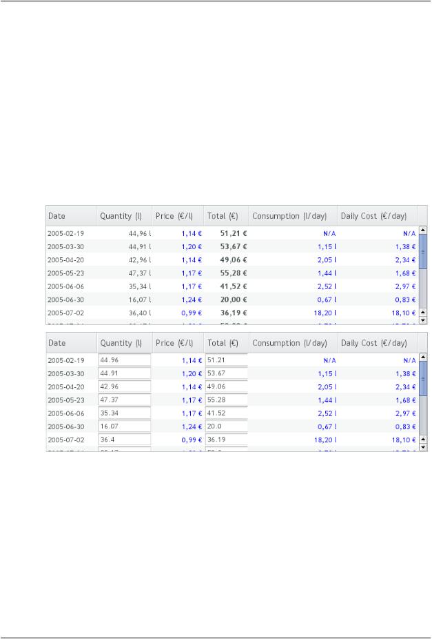
Figure 5.53, “Table with Generated Columns in Normal and Editable Mode” shows a table with columns calculated (blue) and simply formatted (black) with column generators.
Figure 5.53. Table with Generated Columns in Normal and Editable Mode
5.15.6. Formatting Table Columns
The displayed values of properties shown in a table are normally formatted using the toString() method of each property. Customizing the format of a column can be done in several ways:
•Using ColumnGenerator to generate a second column that is formatted. The original column needs to be set invisible. See Section 5.15.5, “Generated Table Columns”.
•Using a PropertyFormatter as a proxy between the table and the data property. This also normally requires using an mediate container in the table.
•Overriding the default formatPropertyValue() in Table.
Formatting Table Columns |
153 |