

The laboratory work 13
.docxThe laboratory work 13
This Matplotlib exercise project helps Python developers learn and practice data visualization using Matplotlib by solving multiple questions and problems.
Matplotlib is a Python 2D plotting library that produces high-quality charts and figures, which helps us visualize extensive data to understand better. Pandas is a handy and useful data-structure tool for analyzing large and complex data.
In this exercise, we are using Pandas and Matplotlib to visualize Company Sales Data.
Use the following CSV file for this exercise. Read this file using Pandas or NumPy or using in-built matplotlib function.
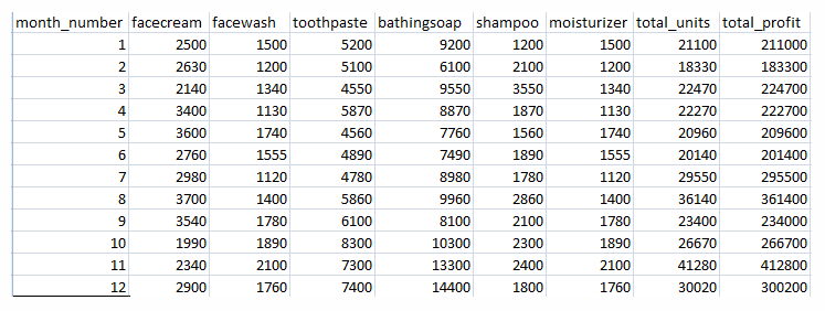
company_sales_data
What included in this Matplotlib Exercise?
This exercise contains ten questions. The solution is provided for each issue. Each question includes a specific Matplotlib topic you need to learn. When you complete each question, you get more familiar with Data data visualization using matplotlib.
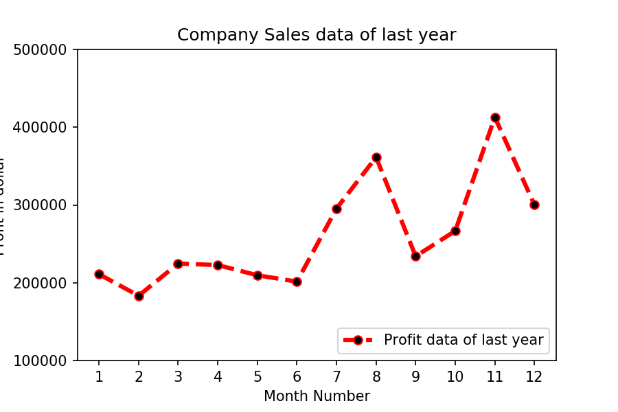
Exercise 1: Read Total profit of all months and show it using a line plot
Total profit data provided for each month. Generated line plot must include the following properties:
X label name = Month Number
Y label name = Total profit
The line plot graph should look like this.

Solution:
Exercise 2: Get total profit of all months and show line plot with the following Style properties
Generated line plot must include following Style properties:
Line Style dotted and Line-color should be red
Show legend at the lower right location.
X label name = Month Number
Y label name = Sold units number
Add a circle marker.
Line marker color as read
Line width should be 3
The line plot graph should look like this.
Solution:

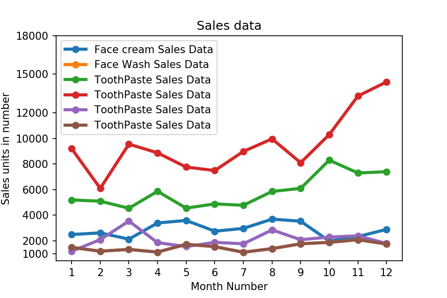
Exercise 3: Read all product sales data and show it using a multiline plot
Display the number of units sold per month for each product using multiline plots. (i.e., Separate Plotline for each product).
The graph should look like this.
Solution:

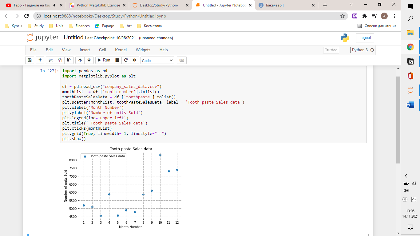
Exercise 4: Read toothpaste sales data of each month and show it using a scatter plot
Also, add a grid in the plot. gridline style should “–“.
The scatter plot should look like this.

Solution:
Exercise 5: Read face cream and facewash product sales data and show it using the bar chart
The bar chart should display the number of units sold per month for each product. Add a separate bar for each product in the same chart.
The bar chart should look like this.
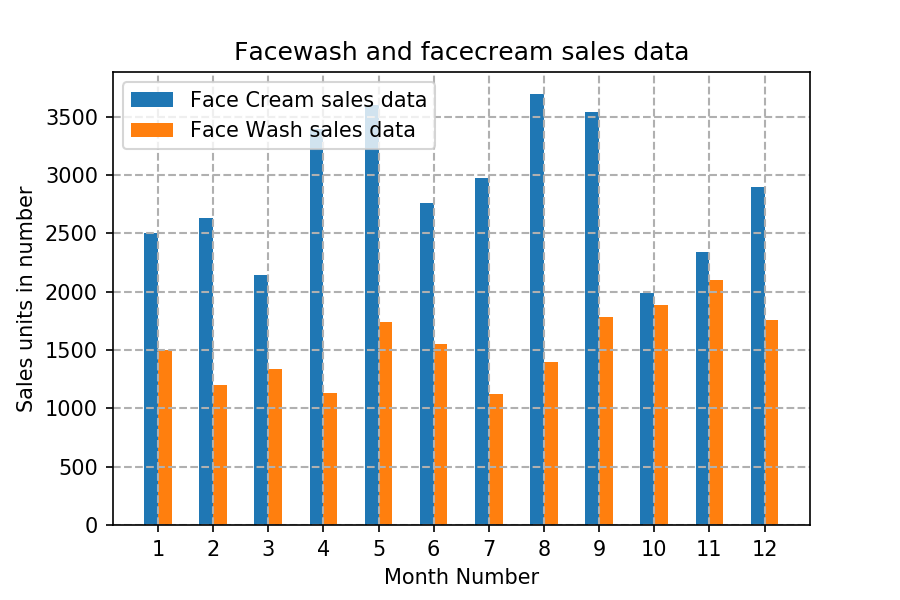
Solution:
