
- •Table of Contents
- •Foreword
- •Chapter 1. A Quick Walk Through
- •Workfile: The Basic EViews Document
- •Viewing an individual series
- •Looking at different samples
- •Generating a new series
- •Looking at a pair of series together
- •Estimating your first regression in EViews
- •Saving your work
- •Forecasting
- •What’s Ahead
- •Chapter 2. EViews—Meet Data
- •The Structure of Data and the Structure of a Workfile
- •Creating a New Workfile
- •Deconstructing the Workfile
- •Time to Type
- •Identity Noncrisis
- •Dated Series
- •The Import Business
- •Adding Data To An Existing Workfile—Or, Being Rectangular Doesn’t Mean Being Inflexible
- •Among the Missing
- •Quick Review
- •Appendix: Having A Good Time With Your Date
- •Chapter 3. Getting the Most from Least Squares
- •A First Regression
- •The Really Important Regression Results
- •The Pretty Important (But Not So Important As the Last Section’s) Regression Results
- •A Multiple Regression Is Simple Too
- •Hypothesis Testing
- •Representing
- •What’s Left After You’ve Gotten the Most Out of Least Squares
- •Quick Review
- •Chapter 4. Data—The Transformational Experience
- •Your Basic Elementary Algebra
- •Simple Sample Says
- •Data Types Plain and Fancy
- •Numbers and Letters
- •Can We Have A Date?
- •What Are Your Values?
- •Relative Exotica
- •Quick Review
- •Chapter 5. Picture This!
- •A Simple Soup-To-Nuts Graphing Example
- •A Graphic Description of the Creative Process
- •Picture One Series
- •Group Graphics
- •Let’s Look At This From Another Angle
- •To Summarize
- •Categorical Graphs
- •Togetherness of the Second Sort
- •Quick Review and Look Ahead
- •Chapter 6. Intimacy With Graphic Objects
- •To Freeze Or Not To Freeze Redux
- •A Touch of Text
- •Shady Areas and No-Worry Lines
- •Templates for Success
- •Point Me The Way
- •Your Data Another Sorta Way
- •Give A Graph A Fair Break
- •Options, Options, Options
- •Quick Review?
- •Chapter 7. Look At Your Data
- •Sorting Things Out
- •Describing Series—Just The Facts Please
- •Describing Series—Picturing the Distribution
- •Tests On Series
- •Describing Groups—Just the Facts—Putting It Together
- •Chapter 8. Forecasting
- •Just Push the Forecast Button
- •Theory of Forecasting
- •Dynamic Versus Static Forecasting
- •Sample Forecast Samples
- •Facing the Unknown
- •Forecast Evaluation
- •Forecasting Beneath the Surface
- •Quick Review—Forecasting
- •Chapter 9. Page After Page After Page
- •Pages Are Easy To Reach
- •Creating New Pages
- •Renaming, Deleting, and Saving Pages
- •Multi-Page Workfiles—The Most Basic Motivation
- •Multiple Frequencies—Multiple Pages
- •Links—The Live Connection
- •Unlinking
- •Have A Match?
- •Matching When The Identifiers Are Really Different
- •Contracted Data
- •Expanded Data
- •Having Contractions
- •Two Hints and A GotchYa
- •Quick Review
- •Chapter 10. Prelude to Panel and Pool
- •Pooled or Paneled Population
- •Nuances
- •So What Are the Benefits of Using Pools and Panels?
- •Quick (P)review
- •Chapter 11. Panel—What’s My Line?
- •What’s So Nifty About Panel Data?
- •Setting Up Panel Data
- •Panel Estimation
- •Pretty Panel Pictures
- •More Panel Estimation Techniques
- •One Dimensional Two-Dimensional Panels
- •Fixed Effects With and Without the Social Contrivance of Panel Structure
- •Quick Review—Panel
- •Chapter 12. Everyone Into the Pool
- •Getting Your Feet Wet
- •Playing in the Pool—Data
- •Getting Out of the Pool
- •More Pool Estimation
- •Getting Data In and Out of the Pool
- •Quick Review—Pools
- •Chapter 13. Serial Correlation—Friend or Foe?
- •Visual Checks
- •Testing for Serial Correlation
- •More General Patterns of Serial Correlation
- •Correcting for Serial Correlation
- •Forecasting
- •ARMA and ARIMA Models
- •Quick Review
- •Chapter 14. A Taste of Advanced Estimation
- •Weighted Least Squares
- •Heteroskedasticity
- •Nonlinear Least Squares
- •Generalized Method of Moments
- •Limited Dependent Variables
- •ARCH, etc.
- •Maximum Likelihood—Rolling Your Own
- •System Estimation
- •Vector Autoregressions—VAR
- •Quick Review?
- •Chapter 15. Super Models
- •Your First Homework—Bam, Taken Up A Notch!
- •Looking At Model Solutions
- •More Model Information
- •Your Second Homework
- •Simulating VARs
- •Rich Super Models
- •Quick Review
- •Chapter 16. Get With the Program
- •I Want To Do It Over and Over Again
- •You Want To Have An Argument
- •Program Variables
- •Loopy
- •Other Program Controls
- •A Rolling Example
- •Quick Review
- •Appendix: Sample Programs
- •Chapter 17. Odds and Ends
- •How Much Data Can EViews Handle?
- •How Long Does It Take To Compute An Estimate?
- •Freeze!
- •A Comment On Tables
- •Saving Tables and Almost Tables
- •Saving Graphs and Almost Graphs
- •Unsubtle Redirection
- •Objects and Commands
- •Workfile Backups
- •Updates—A Small Thing
- •Updates—A Big Thing
- •Ready To Take A Break?
- •Help!
- •Odd Ending
- •Chapter 18. Optional Ending
- •Required Options
- •Option-al Recommendations
- •More Detailed Options
- •Window Behavior
- •Font Options
- •Frequency Conversion
- •Alpha Truncation
- •Spreadsheet Defaults
- •Workfile Storage Defaults
- •Estimation Defaults
- •File Locations
- •Graphics Defaults
- •Quick Review
- •Index
- •Symbols

262—Chapter 9. Page After Page After Page
Contracted Data
What we’ve done is called a contraction, because we’ve mapped many data points into one. We can see that the unionization rate in Arkansas—home of the world’s largest private employer—is about a half percent and the average education level is three-quarters of a year of college. In Washington—where the state bird is the geo- duck—the unionization rate is over three percent and average education is about a year and a half of college.
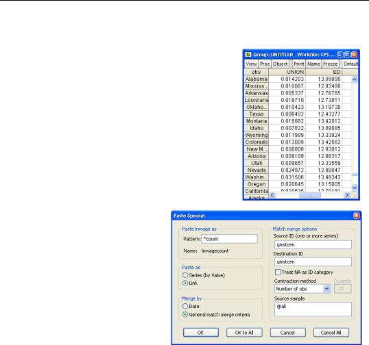
Something’s wrong. Unionization rates aren’t that low. To help investigate, let’s copy the data in using a count merge instead of a mean merge. We click on the tab to return to the Cps page, re-copy the four series, and paste into the ByState page as before, except with two differences. In the Pattern field in the Paste Special dialog we add the suffix “count” to the variable names, so that we don’t write over the state means that we computed previously. In the Contraction
method field, switch to Number of obs to get a count of how many observations are being used for each series.

Contracted Data—263
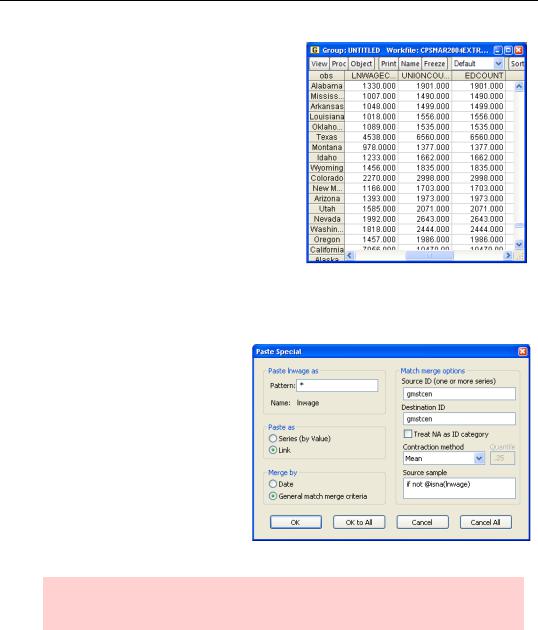
We can see that education and unionization always have the same underlying counts within a state. But the count for LNWAGE is different—and lower—than the count for ED and UNION.
Here’s what happened in the mean merge. The contraction computed the mean for each series separately. The Current Population Survey isn’t limited to workers, so the state-by- state means have been computed as a fraction of the population. We probably wanted only those who are working. What’s more, the variable LNWAGE is coded as NA for anyone who doesn’t report a positive salary, including all non-workers. As a result, the state-by-state
means for LNWAGE were computed using roughly 25 percent fewer observations than the other variables.
We want a common sample to be used for computing the series means for each state. This can be accomplished by specifying an appropriate sample in the Source Sample field in the Paste Special dialog. It happens that in this data set the only difference in the sample for the different series is that LNWAGE has a lot of NAs. Toss out the ByState page we made and make a new one, this time entering “if not @isna(lnwage)” in the
Source Sample field.
Hint: We could have edited the link specifications, but since we had several series, it was faster to just toss the links and start over.

264—Chapter 9. Page After Page After Page
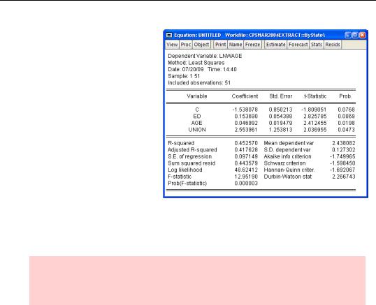
We now have a valid state-by- state dataset. Let’s repeat our earlier regression using statelevel data. The results are basically the same. The estimated effects of both education and age are a little larger than for the individual data. While the coefficients are highly significant, the standard errors are larger than before. That’s what we would expect from the much smaller— 99,991 versus 51 observations— sample.
In the state-by-state regression, the interpretation of the union
coefficient has changed. Because UNION is measured as a fraction, the regression now tells us that for each one percentage point increase in the unionization rate, the average wage rises two and a half percent.
Econometric caution: We’re assuming that unionization drives wage rates. Maybe. Or maybe it’s been easier for unions to survive in high income states. The latter interpretation would mean that our regression results aren’t causal.
Expanded Data
In order to separate out the effect of the average unionization rate from the effect of individual union membership, we need to include both variables in our individual level regression. To accomplish this, we need to expand the 51 state-by-state observations on unionization back into the individual page, linking each individual to the average unionization rate in her state of residence.

Expanded Data—265
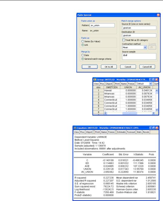
To expand the data, we make a link going in the other direction. Copy UNION from the ByState page and
Paste Special into the Cps page. We’ll change the name of the pasted variable to AV_UNION in order to avoid any confusion with the individual union variable.
The first few observations in the
Cps page are shown to the right. Notice that the fourth and fifth person are both from Connecticut. Even though the fourth person is a union member and the fifth person isn’t, they have the same value of AV_UNION. We’ve succeeded in attaching the state-wide average unionization rate to each individual observation.
And the answer is? Our regression results show that being a union member raises an individual’s wages 23.5 percent. Every additional percentage point of unionization in a state raises everyone’s wages 2.65 percent.