

214—Chapter 7. Look At Your Data
Describing Groups—Just the Facts—Putting It Together
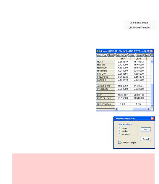
Many of the descriptive features for groups are the same as those for series—except done for each of the series in the group. For example, the descriptive statistics menu for a group offers two
choices: Common Sample, Individual Samples. The choices produce basic descriptive statistics for each series, with two different arrangements for choosing the sample.
If you want the same set of observations to go into computing the statistics for each series in the group, be sure to specify Common Sample. Using Individual Samples, we can see that there were quite a few applicants with valid LSAT scores but not valid GPAs (1707 versus 1638 observations). As a guess, this could reflect applications from undergraduate schools that don’t compute grade point averages.
The Tests of Equality… view for groups checks
whether the mean (or median, or variance) is the same for all the series in the group. (The tests assume that the series are statistically independent.) Here too, you can be sure the same observations are used from each series by picking
Common sample.
Hint: Use Tests For Descriptive Statistics/Simple Hypothesis Tests for each individual series to test for a specific value, say that the mean equals 3.14159. Use Tests For Descriptive Statistics/Equality Tests By Classification… to test that different subpopulations have the same mean for a series. Use Tests of Equality… for groups to see if the mean is equal for different series.
Describing Groups—Just the Facts—Putting It Together—215
Correlations
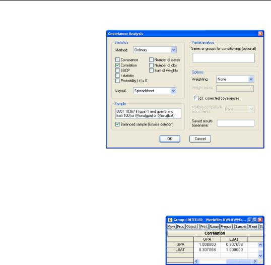
It’s easy to find the covariances or correlations of all the series in a group by choosing the Covariance Analysis... view. By default, EViews will display the covariance matrix for the common samples in the group, but you may instead compute correlations, use individual samples, or compute various other measures of the associations and related test statistics. For example, to compute using individual samples, you
should uncheck the Balanced sample (listwise deletion) box. This setting instructs EViews to compute the covariance or correlation for the first two series using the observations available for both series, then the correlation between series one and series three using the observations available for those two series (in other words, not worrying whether observations are missing for series two), etc.
Here, we see the correlation for the two series in the group. Surprisingly, LSAT and GPA are not all that highly correlated. A correlation of only 0.307 means that the information in LSAT is not redundant with the information in GPA, which is why law schools look at both test scores and grades.
People use correlations a lot more because correla-
tions are unit-free, while the units of covariances depend on the units of the underlying series.

216—Chapter 7. Look At Your Data
Hint: Should one use a common sample or not? EViews requires a choice in several of the procedures we’re looking at in this chapter.
The most common practice is to find a common sample to use for the entire analysis. That way you know that different answers from different parts of the analysis reflect real differences rather than different inputs. On the other hand, restricting the analysis to a common sample can mean ignoring a lot of data. So there’s no absolute right or wrong answer. It’s a judgment call.
Cross-Tabs
Cross-tabulation is a traditional method of looking at the relationship between categorical variables. In the simplest version, we build a table in which rows represent one variable and columns another, and then we count how many observations fall into each box. For fun, we’ve created categorical variables describing grades (4.0 or better, above average but not 4.0, below average) and test scores (above average, below average) with the following commands:
series gradecat = (gpa>=4)*1 + (gpa>3.365 and gpa<4)*2 + (gpa<=3.365)*3
series testcat = (lsat>158)*1 + (lsat<=158)*2
Since GRADECAT is arbitrarily coded as 1, 2, or 3 and TESTCAT is similarly, arbitrarily coded as 1 or 2, we added a value map to each series to make the tables easier to read. See What Are Your Values? in Chapter 4, “Data—The Transformational Experience.”
Describing Groups—Just the Facts—Putting It Together—217
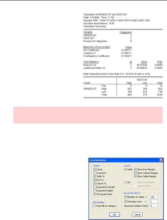
Choosing the N-Way Tabulation… view and accepting the defaults in the Crosstabulation dialog produces the output shown to the right. Let’s begin with the table appearing at the bottom.
Table Facts
The first column of the table gives counts for high test-scoring applicants: 5 had top grades, 552 had high—but not “top”—grades, and 306 had low grades—for a total of 863 applicants with “high” (i.e., above average) test scores. Reading across the first row, 5 of the students with top grades had high LSATs, 5 were below average—so there was a total of 10 students with top grades.
Hint: The intersection of a row and column is called a cell. For example, there are 350 applicants in the High grade/Low test score cell.
The bottom row reports the totals for each column and the right-most column reports the totals for each row. The Total-Total, bottom right, is the number of observations used in the table.
Table Interpretation
In this applicant pool, there were 5 students with perfect grades and below average LSATs. That’s a true fact—but so what? We might be interested in getting counts, but usually what we’re trying to do is find out if one variable is related to another. For the data in hand, the obvious question is “Do high test scores and high grades go together?” To begin to answer this question, we return to the N-Way Tabulation… menu, this time checking
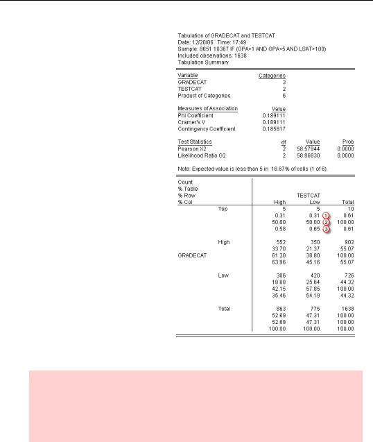
Table %, Row %, and Column % in the Crosstabulation dialog.
218—Chapter 7. Look At Your Data
Take a look at the Top grade/Low test score cell again. The first number in the cell tells us, as before, that five applicants had this combination of grade and LSAT. But now we have three additional numbers. The first new number, marked  , is the Table %, 0.31% (=5/1638), which tells us the fraction of observations falling in this cell out of all the observations in the table. The Row %,
  , tells us what fraction of top grades (the row) also have low test scores (5/10.) Analogously, the last element in the cell,
  , is the Column % (5/775).
In the same way, table, row, and column percentage are given in the Total column at the right and Total row at the bottom. Looking at the right, we see that perfect grades came from 0.61% of all applicants; that 100% of applicants with perfect grades had perfect grades (telling us that everything in the row is in the row, which isn’t very surprising); and that 0.61% of this column had perfect grades (which we already knew from the table % in this cell.)
Hint: The row and column percentages given in the Total column and row are sometimes called marginals because they give the univariate empirical distribution for grade and test score respectively. So the row and column percentages correspond to the marginal probability distributions of the joint probability distribution described by the table as a whole.
Suppose that doing well on the LSAT and having good grades were independent. We’d expect that the percentage of students having both top grades and low test scores would be
roughly the overall percentage having top grades times the overall percentage having low test scores. For our data we’d expect 0.61% × 47.31% = 0.2886% to fall into this cell. In

Describing Groups—Just the Facts—Putting It Together—219
fact 0.31% do fall into this cell—the difference might easily be due to random variation. We could do the same calculation for all the cells and use this as a basis for a formal test of the hypothesis that grades and test scores are independent. That’s exactly what’s done in the lines marked “Test Statistics” which appear above the table. Formally, if the two series were independent, then the reported test statistics would be approximately x2 with the indicated degrees of freedom. The column marked “Prob” gives p-values. So despite what we found in the Top grade/Low test cell, the typical cell percentage is sufficiently different from the product of the marginal percentages that the hypothesis of independence is strongly rejected.
Statistics hint: It’s not uncommon to find many cells containing very few observations. As a rule of thumb, when cells are expected to have fewer than five observations, the use of x2 test statistics gets a little dicey. In such cases EViews prints a warning message, as it’s done here.
N-Way Tabulation with N>2
With two series in a group, the cells are laid out in a two-dimensional rectangle, with the categories for the first series going down and categories for the second series going across. With three series, EViews displays a three-dimensional hyper-rectangle. With four series, the display is a four-dimensional hyper-rectangle, etc.
Fortunately, EViews is very clever at detecting older equipment. If you are still using a display limited to two dimensions, rather than one of the newer Romulan units, EViews splits the hyper-rectangle into a series of two-dimensional slices.
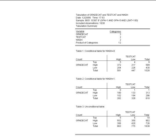
As an example, open a group with GRADECAT, TESTCAT, and WASH to add the effect of in-state residency into the mix. Then choose N-Way Tabulation… (Reporting of test statistics is turned off simply because the output became very long.)
220—Chapter 7. Look At Your Data
The first table shows counts for grades and test scores for non-resi- dents. For example, there were four out-of-state residents with top grades and low test scores. The second table gives the same information for Washington residents. Together, these tables describe the joint distribution of grades and test scores conditional on residency.
The third table gives the joint distribution of grades and test scores, unconditionally with respect to residency. In other words, it’s the same two-way table we saw before.
You can see that with lots of categories, an N-Way tabulation can be really, really long. If our last series had been 50 states instead of just yes/no for Washington, we’d have gotten 50 conditional tables and one unconditional table. You can imagine how much output there would be with a fourth or fifth variable in the cross-tabulation.
Does the order in which the series
appear in the group matter? The answer is “no and yes.” Whatever order you specify, you get all the possible conditional cell counts. Since you get the same information regardless of the order specified, there’s a sense in which the order is irrelevant. (However, which unconditional tables are shown does depend on the order.) However, the series order does affect readability. It generally makes sense to put first the variables you’re most interested in comparing. These will be the ones that show up together on each table.
Another approach to improved readability is to arrange series for the easiest screen display. The two rules are:
•The second series should have sufficiently few categories such that the categories can go across the top of the table without forcing you to scroll horizontally. (If you’re going to print, think about the width of your paper instead of the width of the screen.)
Describing Groups—Just the Facts—Putting It Together—221
•The first series should have as many categories as possible. It’s easier to look at one long table rather than many short tables. This rule is sometimes limited by the desire to get a complete table to fit vertically on a screen or printed page.
Hint: Sometimes you can get a more useful table by printing in landscape rather than portrait mode.
Hint: Sometimes, when there are too many tables to manage visually, you should stop and think about whether there are also too many tables to help you learn anything.
True Story to End the Chapter
When the author was a college student, he worked as a research assistant for a professor from whom he learned a great deal about many things. One incident was particularly memorable. We had turned in a report, including relevant cross-tabulations, to the government agency which had paid for the research project. Shortly thereafter, a somewhat snippy letter came back pointing out that our analysis had covered a dozen (or so) variables and that the contract required cross-tabulations of all the variables, not just those that the research team thought mattered. And that we’d better comply. The letter was turned over to me.
I found my mentor the next day and pointed out that the sponsoring agency was asking for about one million pages of printout. He laughed. Told me to mail them the first thousand pages without comment, and said we’d never hear back. I did, and we didn’t.

222—Chapter 7. Look At Your Data