

Describing Series—Picturing the Distribution—203
Describing Series—Picturing the Distribution
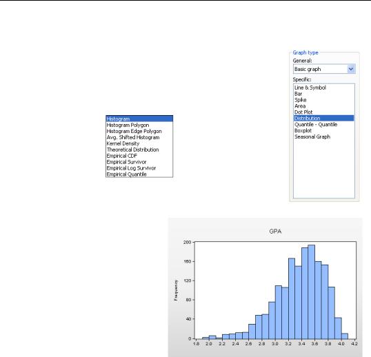
Sometimes a picture is better than a number. Open a series (or group of series) and choose the Graph… view (see Chapter 5, “Picture This!”). While all graphs look at data, the Distribution, Quan- tile-Quantile, and Boxplot options bear directly on understanding how a set of data is distributed. The Distribution option offers a whole set of options, the most familiar one being the Histogram.
Histograms
A histogram is a graphical representation of the distribution of a sample of data. For the GPAs we see lots of applications around 3.4 or 3.5, and very few around 2.0. EViews sets up bins between the lowest and highest observation and then counts the number of observations falling into each bin. The number of bins is chosen in order to make an attractive picture. Clicking the  button leads to the Distribution Plot Customize dialog, where several
customization options are provided. (See the User’s Guide.)
204—Chapter 7. Look At Your Data
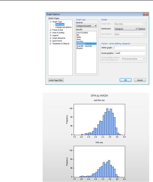
All the features described in Chapter 5, “Picture This!” and in Chapter 6, “Intimacy With Graphic Objects” can be used for playing with histograms. For example, we can make a categorical graph to compare GPAs of Washington State residents to those of non-resi- dents.
Describing Series—Picturing the Distribution—205
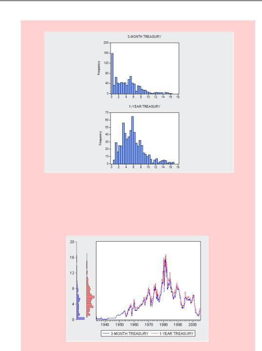
Cautionary hint for graphing multiple series: Individual series in a Group window may have NAs for different observations. As a result distribution graphs may be drawn for different samples. For example, the graph to the right makes it appear that 3-month Treasury rates are much more likely than are 1-year rates to be nearly zero. In fact what’s going on is that our sample includes 3-month, but not 1-year, rates from the Great Depression. Looking at a line graph, with the same histograms on the axis border, it becomes evident that the 1-year rates enter our sample at a later date.
206—Chapter 7. Look At Your Data
Kernel Density Graphs
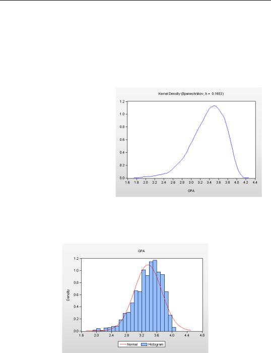
A kernel density graph is, in essence, a smoothed histogram. Often, a histogram looks choppy because the number of observations in a given bin is subject to random variation. This is particularly true when there are relatively few observations. The kernel density graph smooths the variation between nearby bins. The User’s Guide describes the various options for controlling the smoothing.
Using the default choices gives a nice picture for our GPA data.
There’s no law about the best way to accomplish this smoothing, but the default frequently works well. We see again that applicant grades are concentrated around 3.4 or 3.5, and that there is a long lower tail.
Theoretical Distribution
EViews will fit any of a number of theoretical probability distributions to a series, and then plot the probability density. (You can supply the parameters of the distribution if you prefer.) As an example, we’ve superimposed a normal distribution on top of the GPA histogram.
Describing Series—Picturing the Distribution—207
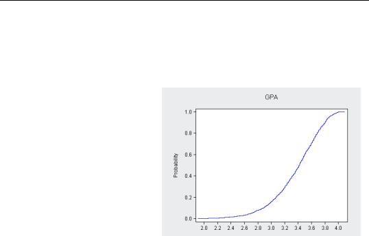
Empirical CDF, Survivor, and Quantile Graphs
Just as a histogram or kernel density plot gives an estimate of the probability density function (PDF), a Cumulative Distribution plot presents an estimate of the cumulative distribution function (CDF).
You may find it useful to think of the histogram and kernel density plots as graphical analogs to the Percent column in the one-way tabulation, shown above in OneWay, and the cumulative distribution plot as the graphical analog to the Cumulative Percent column. Here’s the CDF for GPA.
Survivor and Quantile plots provide alternative ways of looking at cumulative distributions.
The Distribution menu also provides links to a variety of Quan-
tile-Quantile graphs and to a set of Empirical Distribution tests. Quantile-Quantile plots graph the empirical distribution of a series against a variety of theoretical probability distributions (e.g., normal, uniform). Empirical distribution tests provide corresponding formal tests of whether a series is drawn from a particular theoretical probability distribution. For more on these topics, see the User’s Guide—or heck, just click on the relevant menu and see what you get!
208—Chapter 7. Look At Your Data
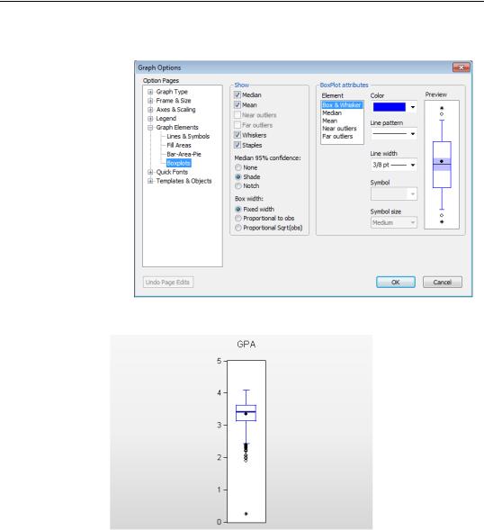
Boxplots
Sometimes a picture is better than a table. Boxplots, also called box and whisker diagrams, pack a lot of information about the distribution of a series into a small space. The variety of options are controlled in the Graph Elements/Boxplots page of the
Graph Options dialog. A boxplot of GPA using EViews’ defaults is shown here.
Opening the boxplot
The top and bottom of the box mark 75th and 25th percentile of the distribution. The distance between the two is called the interquartile range or IQR, because the 75th percentile marks the top quartile (the upper fourth of the data) and the 25th percentile marks the bottom quartile (the bottom fourth of the data).

Describing Series—Picturing the Distribution—209
The width of the box can be set to mean nothing at all (the default) or to be proportional to the number of observations or the square root of the number of observations. (Use the Box width radio buttons in the dialog.)
The mean of the data is marked with a solid, round dot. The median of the data is marked with a solid horizontal line. Shading around the horizontal line is used to compare differences between medians; overlapping shades indicate that the medians do not differ significantly. You can change the shading to a notch, if you prefer, as shown in the example below.
The short horizontal lines are called staples. The upper staple is drawn through the highest data point that is no higher than the top of the box plus and, analogously, the lower staple is drawn through the lowest data point that is no lower than the bottom of the box minus 1.5 × IQR . The vertical lines connecting the staples to the box are called whiskers. Data points outside the staples are called outliers. Near outliers, those no more than
outside the staple, are plotted with open circles, and far outliers, those further outside the staple, are plotted with filled circles.
There Can Be Less Than Meets the Eye Hint: Boxplots tell you a lot about the data, but don’t jump to the conclusion that because a point is labeled an “outlier” that it’s necessarily got some kind of problem. Even when data is drawn from a perfect normal distribution, just over half a percent of the data will be identified as an outlier in a boxplot.