

Chapter 7. Look At Your Data
Data description precedes data analysis. Failure to carefully examine your data can lead to what experienced statisticians describe with the phrase “a boo boo.”
True story. I was involved in a project to analyze admissions data from the University of Washington law school. (An extract of the data, “UWLaw98.wf1”, can be found on the EViews website.) Some of my early results were really, really strange. After hours of frustration I did the sensible thing and went and asked my wife’s advice. She told me:
Look at your data!
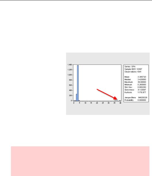
So I quickly pulled up a histogram of the applicants’ grade point averages (GPA). Notice the one little data point all by its lonesome way off to the right? According to the summary table, the highest recorded GPA was 39. Since GPAs in American colleges are generally on a 4.0 scale, it’s a pretty good bet that a decimal point was omitted somewhere.
In this chapter we’ll walk through a number of techniques
for looking at your data. Since the border between describing data and beginning an analysis can be fuzzy, some of the topics covered here are useful in data analysis as well. Our discussion is split into univariate (describing one variable at a time) and multivariate (describing several variables jointly). Maybe it’s easier to think of descriptive views of series and descriptive views of groups.
Hint: Two important data descriptive techniques are covered elsewhere. Graphing techniques are explored in Chapter 5, “Picture This!” And while one of the very best techniques for looking at your data is to open a spreadsheet view and then look at it, this doesn’t require any instructions—so past this reminder-sentence we won’t give any…except for one little trick in the next section.
196—Chapter 7. Look At Your Data
Reminder Hint: Don’t forget that you can hover your cursor over points in a graph to display observation labels and values.
Sorting Things Out
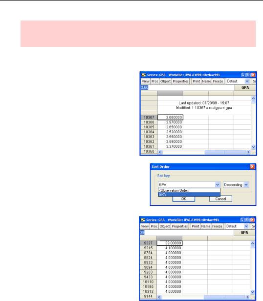
As you know, you can open a spreadsheet view of a series or a group of series to get a visual display. For example, the spreadsheet view of GPA is shown to the right.
Observations appear in order.
Push the  button to bring up the Sort Order dialog, which gives you the option of sorting by either observation number or the value of GPA. You can sort in either Ascending (low-to-high) or Descending (high-to-low) order.
By sorting according to GPA, we can instantly see where the problem value is located.
Describing Series—Just The Facts Please—197
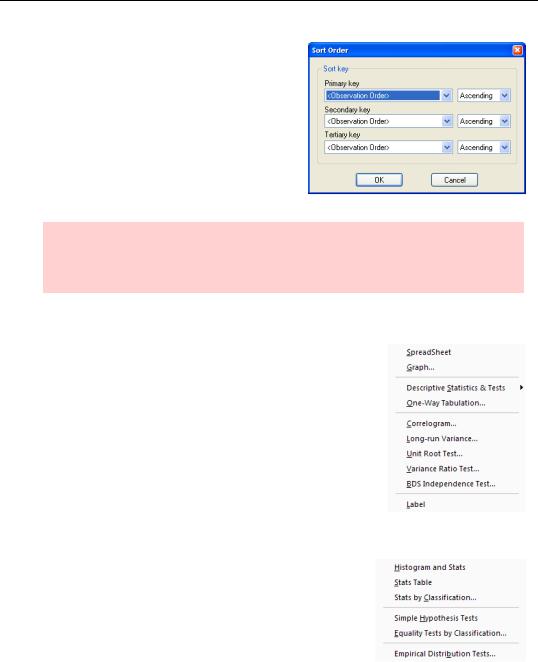
More generally, the Sort Order dialog for groups lets you sort using up to three series to order the observations.
Hint: Sorting changes the order in which the data is visually displayed. The actual order in the workfile remains unchanged, so analysis is not affected. To restore the appearance to its original order, sort using Observation Order and Ascending.
Describing Series—Just The Facts Please
Open a series and click the  button. The dropdown menu shows the tools available for looking at the series. We begin with the basic descriptive statistics.
Stats Panel from Histogram and Stats
Histograms and basic statistics are generated through the
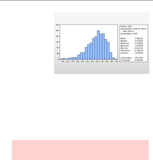
Descriptive Statistics & Tests/Histogram and Stats menu item. The data used for computing descriptive statistics is, as always, restricted to the current sample. Let’s first eliminate reported grades that are almost certainly data errors.
smpl if gpa>1 and gpa<5
198—Chapter 7. Look At Your Data
As you can see, Histogram and Stats produces a histogram on the left and a panel of descriptive statistics on the right. Let’s start with the latter, coming back to the picture part later.
The top of the statistics panel gives the sample in effect when the report was made and the number of observations. If you compare this report with the one at the
beginning of the chapter, you might note that the smpl if command cut out two observations. Comparing the maximum and minimum between the two reports, we can deduce that one GPA of 39 and one GPA of .26 was eliminated.
Was it a good idea to eliminate these two observations? This question can’t be answered by statistical analysis—you need to apply subject area knowledge. In this case, we might have chosen instead to “correct” the data by changing 39 to 3.9 and .26 to 2.6. (Although, one is left with the nagging question of whether there might really have been an applicant with a 0.26 GPA.) When we eliminated two grade observations by changing the sample, we also cut out data for other series for these two individuals. Their state of residence or LSAT scores might still be of interest, for example. There’s no right or wrong about this “side effect.” You just want to be aware that it’s happening.
Hint: If you want to eliminate data errors for one series without affecting which observations are used for other series in an analysis, change the erroneous values to NA instead of cutting them out of the sample.
The remainder of the statistics panel reports characteristics of the data sample, mean, median, etc.
Describing Series—Just The Facts Please—199
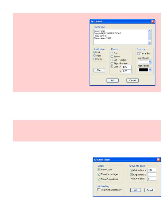
Export Hint: If you double-click on the statistics panel, the Text Labels dialog opens. This is the place to manipulate the text display. (See Chapter 5, “Picture This!”) You can also Edit/Copy the text in the statistics panel and then paste the text into your word processor.
The statistic at the bottom of the panel, the Jarque-Bera, tests the hypothesis that the sample is drawn from a normal distribution. The statistic marked “Probability” is the p-value associated with the Jarque-Bera. In this example, with a p-value of 0.000, the report is that it is extremely unlikely that the data follows a normal distribution.
Hint: There are relatively few places in econometrics where normality of the data is important. In particular, there is no requirement that the variables in a regression be normally distributed. I don’t know where this myth comes from.
One-Way
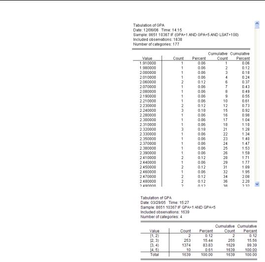
To look at the complete distribution of a series use One-Way Tabulation…, which lets you Tabulate Series. Initially, it’s best to uncheck both Group into bins if checkboxes. Eliminating binning ensures that we see a complete list of every value appearing in the series from low to high, as well as a count and cumulative count of the number of observations taken by each value.
200—Chapter 7. Look At Your Data
Tabulation of GPA provides lots of information. It also illustrates a common problem—too many categories.
This is why the Tabulate Series dialog defaults provides binning control.
Binning Control
The Group into bins if field is a threepart control over grouping individual values into bins. Checking # of values tells EViews to create bins if there are more than the specified number of values and checking Avg. count means to create bins if the average count in a category is less than specified. Max # of bins, not surprisingly, sets the maximum number of bins. Sometimes you need to play around with these options to get the tabulation that best fits your needs.
As an example, here’s a GPA tabula-
tion that shows broad categories. It’s now easy to see that 15 percent of applicants had below a 3.0 average and 10 applicants, 0.61 percent of the applicant pool, did report GPAs above 4.0.
Describing Series—Just The Facts Please—201
Stats Table
The menu Descriptive Statistics/Stats Table creates a table with pretty much the same information as is found in the statistics panel of Histogram and Statistics. This table format has the advantage that it’s easier to copy-and-paste into your word processor or spreadsheet program.
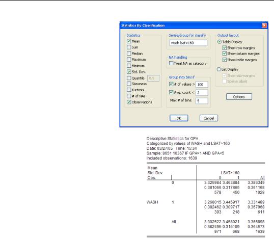
Stats By Classification
A common first step on the road from data description to data analysis is asking whether the basic series statistics differ for sub-groups of the population. Clicking Descriptive Statistics/Stats by Classification… brings up the Statistics By Classification dialog. You’ll see a field called Series/Group for classify smack in the upper center of the dialog. Enter one or more series (or groups) here, hit  , and you get summary
statistics computed for all the distinct combinations of values of the classifying series.
Here’s a simple example. In our workfile, the variable WASH equals one for Washington State residents and zero for everyone else. Using WASH as the classifying variable gives the results shown to the right. About 60 percent of applications (1028 out of 1639) were from out of the state, and the out of state applicants averaged a slightly higher GPA.
202—Chapter 7. Look At Your Data
If we wanted to see the effect of state and having a relatively high LSAT score (Law School Admission Test), we could fill out the
Series/Group for classify field with both WASH and LSAT>160.
Now we get a table showing
mean, standard deviation, and the number of observations for all four combinations of Washington resident/not resident and high/low LSAT. The list of statistics reported appears in the upper left-hand corner of the statistics table so that you’ll have a key handy for reading the results.
The left-hand side of the Statistics By Classification dialog has a series of checkboxes for selecting the statistics you’d like to see. The Output Layout field, on the right-hand side, provides some control over the
appearance of the table and whether you want “margin” statistics— the “All” row and the “All” column.
Looking at statistics by classification makes sense when the classifying variable has a small set of distinct values. When the classifying variable takes on a large number of values, it’s sometimes better to clump together values into a small number of groups or “bins.” The Group into bins if field in the lower center of the dialog lets you instruct EViews to group different values of the classifying variable into a single bin. (See Binning Control, later in this chapter.)