

Options, Options, Options—181
Options, Options, Options
There are lots of options for fine-tuning the appearance of your graphs. The Graph Options dialog has seven sections, each broken into pages filled with their own collection of details you can change. Many of the options are obvious—clicking a button marked  lets you mess with the font, right? In this section, we touch on the most important touch-ups.
The Command Line Option
Every option that can be set through dialogs can also be set by typing commands in the command pane. In general, it’s a lot easier to use the dialogs. The command line approach can be advantageous when you want to set the same options over and over. If the techniques covered in Templates for Success, above, and The Impact of Globalization on Intimate Graphic Activity, below, aren’t powerful enough, take a look at the Command and Programming Reference.
Now, back to our discussion of tweaking–by–dialog.
Graph Type
From the Graph Type section you can change from one type of graph to another. The only graph types that appear are those that are permissible. For example, if you’re looking at a single series you won’t be offered a scatterplot.
Hint: The Basic type page for a frozen graph that has updating off offers a limited set of options, typically far fewer than are available for a graphical view of a series or group.
182—Chapter 6. Intimacy With Graphic Objects
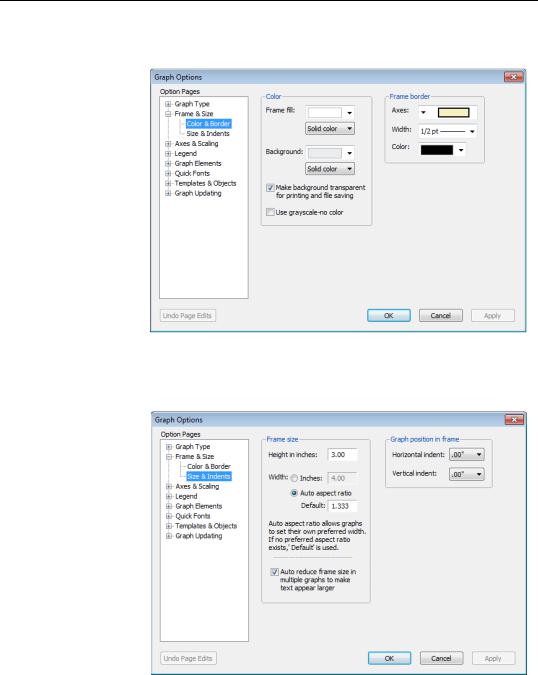
Frame & Size
The Frame & Size section is the place for setting options that are essentially unrelated to the data being graphed. The
Color & Border page lets you set specifications for the frame itself. On the left you can set colors for the area inside the frame (Frame fill:) and the area outside
the frame (Background:). On the right you can set aspects of the frame border, even eliminating the border entirely if you wish.
The Size & Indents page of the Frame & Size section lets you set a margin for the graph inside the frame.
Options, Options, Options—183
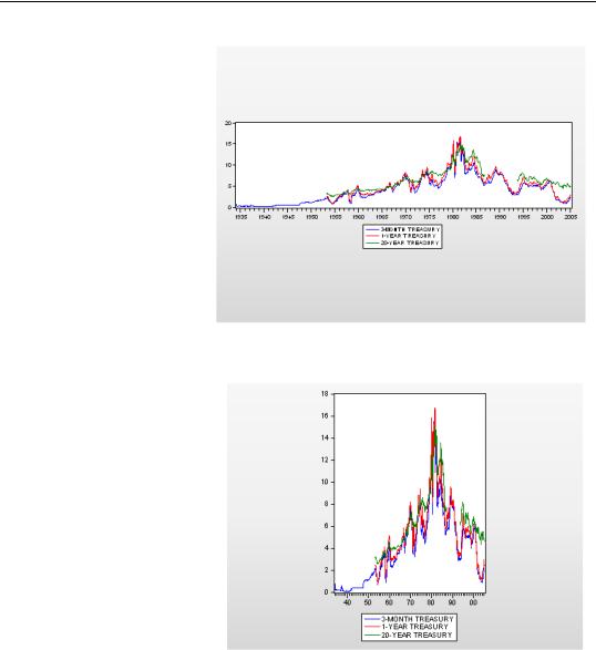
The left side of the Size & Indents page lets you set the Frame size— except that the frame size on the screen doesn’t change. What this field really lets you choose is the shape of the frame (sometimes called the aspect ratio), within the size of the existing window. So if you choose 2 inches high and 8 inches wide, you get a really wide frame. (You can also change the aspect ratio of the graph by
click-and-dragging the bottom or right edges of the graph.)
In contrast, choosing 4 inches high and 3 inches wide gives a high and narrow frame.
The frame shape is measured in “virtual inches.” What’s really being determined is the width-to- height ratio and the font size relative to the frame size. In addition, these virtual inches are used as the units of measurement for placing text, determining margins, etc. So if you
want to “User position” text half way across the frame you specify the x location as 4 inches in a 8″ × 2″ and 1.5 inches in a 3″ × 4″ frame. One consequence of this is that changing the frame size may cause user positioned text to re-locate itself.
184—Chapter 6. Intimacy With Graphic Objects
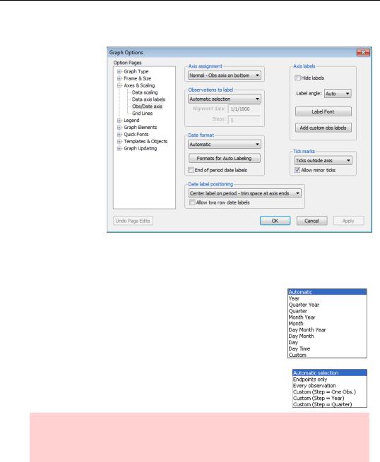
Axes & Scaling
You may find that you visit the
Axes & Scaling section frequently. Its features are both useful and very easy to use.
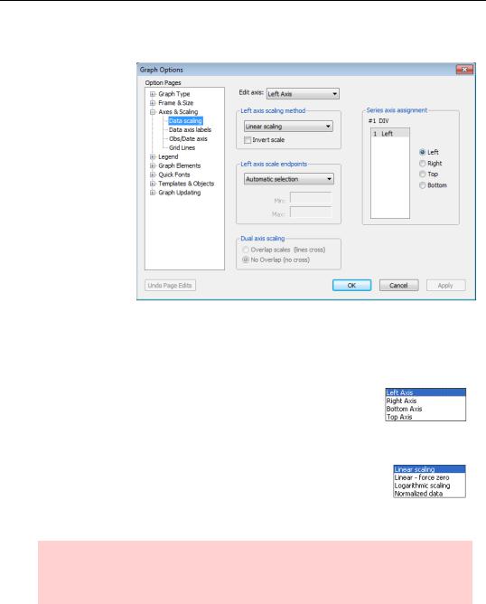
Assigning series to axes
The Series axis assignment field on the Data scaling page lets you assign each series to either the left or right
axis with a radio button click (or to the top and bottom axes for X-Y Graphs). This is especially important when graphing series with different units of measurement. (See “Left and Right Axes in Group Line Graphs” on page 140 in Chapter 5, “Picture This!”)
The Edit axis menu controls whether the fields below apply to the left, right, bottom or top axis. Switching the axis in the menu changes the fields in the dialog.
Left and right axes
For axes scaled numerically, the scaling method dropdown lets you pick between the standard linear scale, a linear scale that’s guaranteed to include zero, a log scale, and normalized data. This last scale marks the mean of the data as zero and makes one vertical unit equivalent to one standard deviation.
Hint: Most often it’s the vertical axes that have numerical scaling, dates being shown on the bottom. But sometimes, scatterplots are an example, numerical scales appear on the x-axis.
Options, Options, Options—185
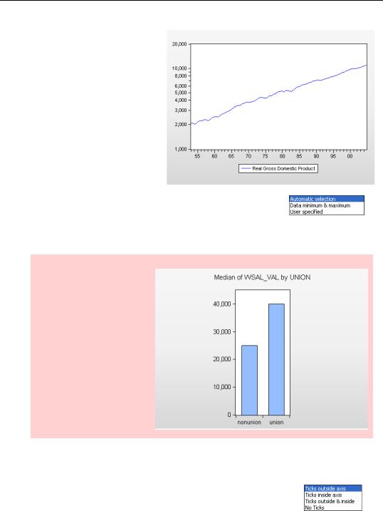
The log scale is especially useful for data that exhibits roughly constant percentage growth. As an example, here’s a plot of U.S. real GDP. By plotting on a log scale, we see a nice, more-or-less straight line.
For the two vertical axes, the
Axis scale endpoints dropdown has choices for automatic, data minimum and maximum, and user specified. Most of the time the automatic choice is fine, but once in a while you may prefer to change the scale.
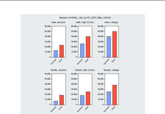
Honest graph alert: In Chapter 5, page 157, we saw a bar graph comparing wages of union and nonunion workers. Automatic selection chose a pretty, but substantively questionable endpoint for the y- axis. Here’s a better version, where we’ve User specified a lower limit of zero.
In addition, on the Data axis labels page, the Data units & label format section allows you to label your axis using scaled units or if you wish to customize the formatting of your labels.
The Ticks dropdown provides the obvious set of choices for display- ing—or not displaying—tick marks on the axes.
186—Chapter 6. Intimacy With Graphic Objects
Top and Bottom Axes
The choices for marking the top and bottom axes vary depending on whether the horizontal scale displays numbers, in which case the choices are essentially the same as the ones we’ve just seen, or if—as is more common— the bottom scale shows dates. In the latter situation, the choices
are the ones appropriate to dates and the exact choices depend on the frequency of the workfile. Options for the date scale can be found on the Obs/Date axis page.
The Date format dropdown provides a variety of fairly selfexplanatory choices, including Custom for when you want to roll your own. (See the User’s Guide.)
Observations to label similarly provides both a selection of builtin and custom options.
Hint: Just as numerical scales sometimes appear on the horizontal axes, dates sometimes appear on the vertical, rotated graphs are a notable example. The appropriate marking options work as you would expect.
You can cause grid lines to be displayed from the Grid Lines page. The Obs/Date axis grid lines field lets you customize the interval of grid lines for the date axis.
Options, Options, Options—187
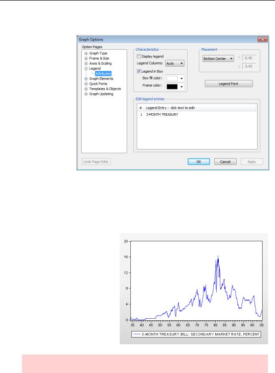
Legend
The Legend section controls a number of options, the most useful of which is editing Legend entries. Generally a series’ Display Name (you can edit the display name from the series label view) is used to identify the series in the legend. If the series doesn’t have a
Display Name,
the series name itself is used. Either way, this is the spot for you to edit the legend text.
On the Attributes page, the Legend Columns entry on the left side determines how many columns are used in the legend. The default “Auto” (automatic) lets EViews use its judgment. Alternatively, select 1, 2, 3, etc. to specify the number of columns.
Legend Aesthetics
Setting the text for the legend sometimes presents a trade-off between aesthetics and information. The longer the text, the more information you can cram in. But shorter legends generally look better. Here’s a graph with a moderately long legend.
Rule of thumb: the legend should be shorter than the frame.
188—Chapter 6. Intimacy With Graphic Objects
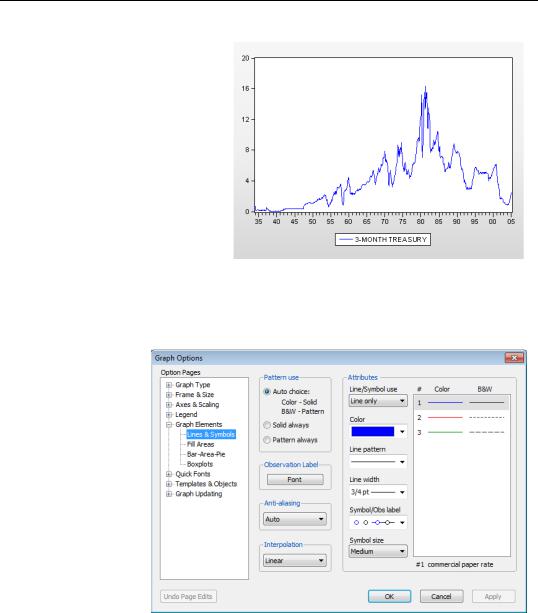
Here’s the same graph with shorter legend text. This graph looks better, at the cost of dropping the information that the rate quotes come from the secondary market. In general, detailed information is probably better in a footnote or figure caption. But the choice, of course, is yours.
Graph Elements
The Graph Elements section contains options for specific graph types.
Lines & Symbols
The Attributes field on the right in the Lines & Symbols page is the place to pick colors and patterns for the lines and symbols for each series. Click on the numbered lines at the far right to select the series to adjust. (Note that the legend label, “3-MONTH TREASURY,” appears at the
bottom of the Attributes field to identify the selected series.) The provided drop down menu lets you choose whether to use a line, a symbol, or both, for each series.
The right-most field displays the representation for each series, showing how the series will be rendered in color and how it will be rendered in black and white. The default pattern uses the colors shown in the Color column of the Attributes field for color rendering and
Options, Options, Options—189
the line patterns shown under B&W for black and white rendering. The Pattern use radio button on the left side of the page specifies whether to use the default (Auto choice:) or force all rendering to solid or all to pattern. (See the discussion under A Little Light Customization in Chapter 5, “Picture This!”)
Two rules to remember:
•Multiple colors are much better than patterns in helping the viewer distinguish different series in a graph.
•Multiple colors are not so great if the graph is printed in black and white.
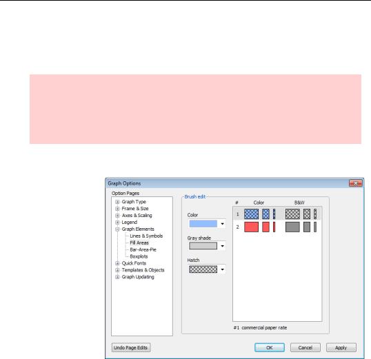
Fill Areas
The Fill Areas page does the same job for filled in areas— in bar graphs for example—that the Lines & Symbols page does for lines.
In addition, the
Bar-Area-Pie page is the place to control labeling, outlining, and spacing of filled areas.
In Distinguishing Factors in the previous chapter we used Within graph category identification to have EViews automatically select visually distinct colors for different graph elements. EViews’ automatic selection produced the graph below.
190—Chapter 6. Intimacy With Graphic Objects
Using the Fill Areas page to set hatching for the first “series” (the dialog says “series,” even though the bars are really categories of a single series) produces the more visually distinctive version shown here.
Options, Options, Options—191
Boxplots
The BoxPlots page offers lots of options for deciding which elements to include in your boxplot, as well as color and other appearance controls for these elements. For a light review of the various elements, see
Boxplots in Chapter 7, “Look At Your Data.”
For more information, see the User’s Guide.
192—Chapter 6. Intimacy With Graphic Objects
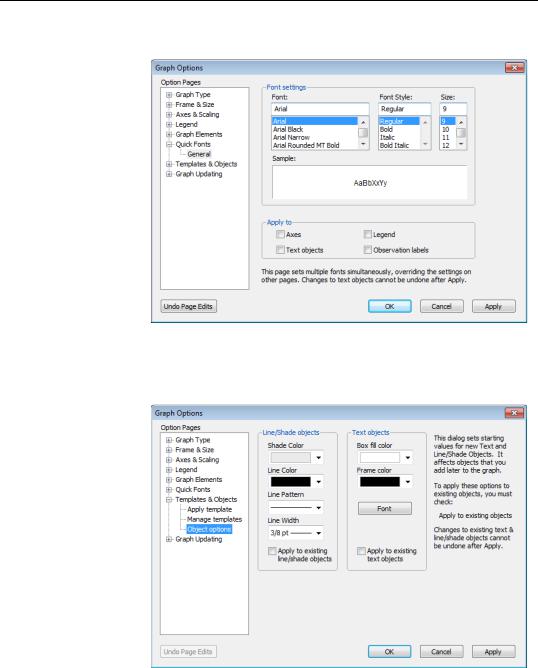
Quick Fonts
In the Quick Fonts page, you can easily set the font and font size globally for all axes, text objects, observation labels, and/or the legend. Use caution with this quick and easy method; it cannot be undone for text objects, so be sure of your edits before clicking Apply.
Objects
The Object options page controls the style, but not the content, for lines, shading, and text objects. You can set the style for a given object directly in the Text Labels and Lines & Shading dialogs. The Object options page lets you set the default styles for any new objects
in the graph at hand. You can also change the styles for existing objects in the graph by checking the relevant Apply to existing box.
The Impact of Globalization on Intimate Graphic Activity—193
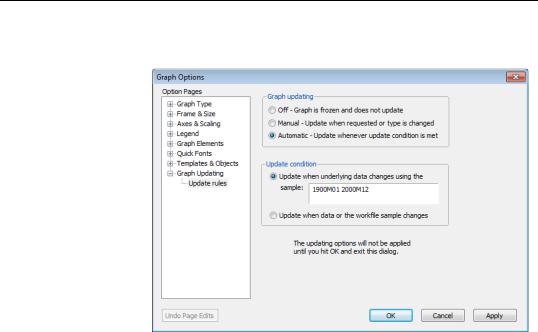
Graph Updating
The Graph Updating section lets you specify if you would like your graph to update with changes in the underlying data. If you select
Manual or Automatic the bottom half of the page becomes active, where you may specify the update sample.
The Impact of
Globalization on Intimate Graphic Activity
If you do lots of similar graphs, you aren’t going to want to set the same options over and over and over and over. Templates help some. You can also set global default options through the menu Options/Graphic Defaults…, which brings up a Graph Options dialog with essentially the same sections we’ve seen already. Changes made here become the initial settings for all future graphs.