

Point Me The Way—177
use the dialog to add the graph to the Predefined templates list. Note that predefined templates don't include text or lines/shades from the original graph.
You can make any template the default for all new graphs by going to the Options/Graphics Defaults… menu and then choosing the desired template from the Apply template page.
Work around hint: Since predefined templates don’t include line/shades, you can’t just add the Recessions graph to the Predefined template list and have recession shading globally available. Hence, the hint on page 174 about copy-and-pasting a graph that you wish to use as a template.
Point Me The Way
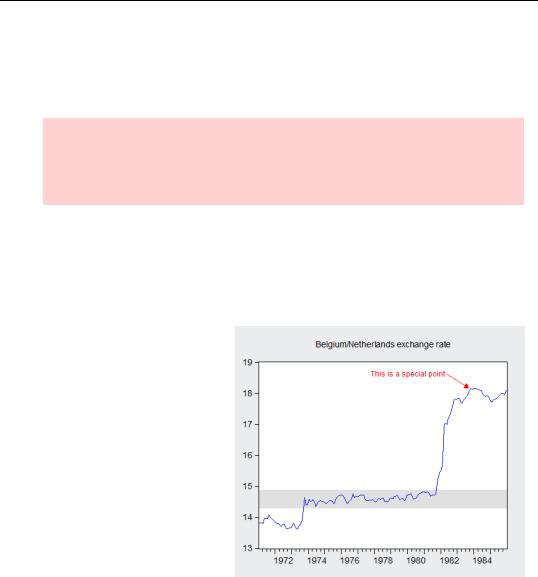
If you’d like to point out a certain observation in your data, you might want to select Draw Arrow from the right-click menu or the Proc button. The mouse cursor will turn into a crosshair. Click at the starting point, and while continuing to hold down the mouse button, drag and release at the arrow endpoint.
You don’t have to be too careful about how you initially draw your arrow, because EViews allows you to change its size and position afterward. Whenever you move your mouse over the arrow, EViews will change the cursor to indicate what action will be taken if you drag. When the cursor is a crosshair, you can drag and relocate the arrow. If your mouse is over the ends of the arrow, the cursor indicates it will resize the arrow if you drag. You can then freely drag the endpoint in any direction, resizing
and reshaping the arrow as you please.
178—Chapter 6. Intimacy With Graphic Objects
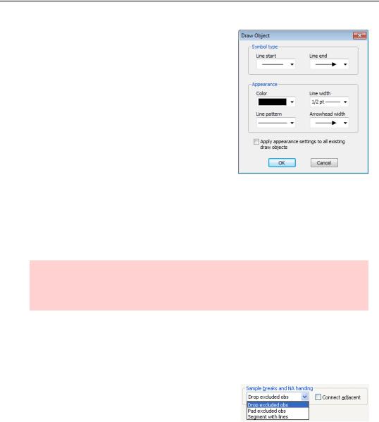
Double click on the arrow to bring up the customization dialog. You can select different endpoints for the arrow: none, filled arrow, hollow arrow, or perpendicular line. You can also set the arrow color, width, and line properties.
To apply the settings to all arrows in the graph, check the box at the bottom of the dialog.
If you’d like to delete an arrow, select it and press the Delete key, just as with other EViews objects.
Your Data Another Sorta Way
You can sort a spreadsheet view. (See Sorting Things Out in Chapter 7, “Look At Your Data.”) You can also sort the data in a frozen graph. Choose Sort… from the  button or the right-click menu.
Hint: As mentioned earlier, you must freeze a graph before you sort it. Sort… rearranges the data, so if you try to sort a histogram or other plot where sorting isn’t sen- sible—EViews sensibly doesn’t do anything.
In addition to being able to sort according to the values in as many as three of your data series, you can sort according the value of observation labels.
Give A Graph A Fair Break
If there’s a break in your sample, how would you like that break to be displayed in a graph? EViews offers three options in the Graph Options dialog. In order to have something simple for an illustration, we’ve created a series 1, 2, 3, 4, 5 and then set the sample
with smpl 1 2 4 5, so the middle observation is missing.
Give A Graph A Fair Break—179
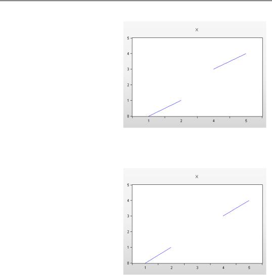
•Drop excluded obs deletes the missing part of the sample from the x-axis. Notice that it looks like the distance between 2 and 4 is the same as the distance between 1 and 2 or 4 and 5. This makes sense if the x- coordinates are ordinal, but isn’t so good if they’re cardinal. In other words, dropping part of the x-axis works if the measurements are things like “strongly agree,” “agree”, “indiffer-
ent,” but doesn’t work so well for measurements like “1 mile from the Eiffel Tower,” “2 miles from the Eiffel Tower,” etc.
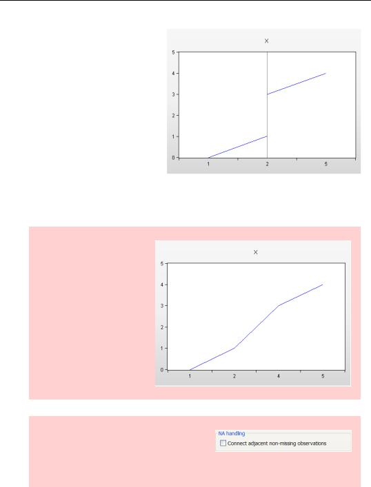
•Pad excluded obs leaves in the part of the x-axis for which data are missing. It’s better for cardinal ordinates.
180—Chapter 6. Intimacy With Graphic Objects
•Segment with lines is a stronger version of Drop excluded, deleting more of the missing x-axis, with an added vertical lines to show the break points. Segment with lines is the most “intellectually honest” display, because it makes sure everyone knows where breaks in the sample occur. The two disadvantages are that it’s not always the most aesthetically pleasing picture (especially if there are
lots of breaks) and that the vertical line draws attention to the sample break, which may or may not be a particularly interesting part of the data.
Hint: Checking Connect adjacent for either of the first two choices connects points on either side of the sample break. This frequently makes for a nicer looking picture, but can be misleading if it appears to report data that isn’t there.
Hint: You control whether lines are connected over NAs with the NA Handling option. You can also use the broken sample options by including not @isna(x) in the if part of your smpl statement.