

Chapter 1. A Quick Walk Through
You and I are going to start our conversation by taking a quick walk through some of EViews’ most used features. To have a concrete example to work through, we’re going to take a look at the volume of trade on the New York Stock Exchange. We’ll view the data as a set of numbers on a spreadsheet and as a graph over time. We’ll look at summary statistics such as mean and median together with a histogram. Then we’ll build a simple regression model and use it for forecasting.
Workfile: The Basic EViews Document
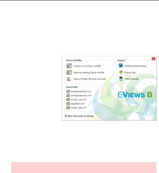
Start up a word processor, and you’re handed a blank page to type on. Start up a spreadsheet program, and a grid of empty rows and columns is provided. Most programs hand you a blank “document” of one sort or another. When you fire up EViews, you get a welcome screen offering you some choices about how you’d like to get started. To get some support before diving
into EViews, you can turn your attention to the section on the right, which offers various tutorials and online help.
Being impatient to get started, let’s take the quick solution and load an existing workfile. If you’re working on the computer while reading, you may want to load the workfile “nysevolume.wf1” by clicking on the Open an existing EViews workfile button. If you have saved the workfile on your computer, navigate to its location and open it.
Hint: All the files used in this book are available on the web at www.eviews.com.
While word processor documents can start life as a generic blank page, EViews docu- ments—called “workfiles”—include information about the structure of your data and therefore are never generic. Consequently, creating an EViews workfile and entering data takes a
4—Chapter 1. A Quick Walk Through
couple of minutes, or at least a couple of seconds, of explanation. In the next chapter we’ll go through all the required steps to set up a workfile from scratch.
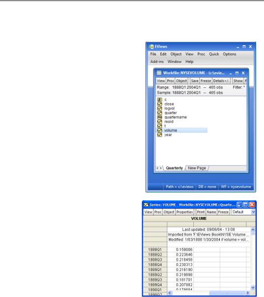
Now that a workfile’s loaded EViews looks like this.
Our workfile contains information about quarterly average daily trading volume on the New York Stock Exchange (NYSE). There’s quite a bit of information, with over 400 observations taken across more than a century. The icon  indicates a data series stored in the workfile.
Viewing an individual series
If you double-click on the series VOLUME in the workfile window you’ll get a first peek at the data.
Right now we’re looking at the spreadsheet view of the series VOLUME. The spreadsheet view shows the numbers stored in the series. On average in the first quarter of 1888, 159,006 shares were traded on the NYSE. (The numbers for VOLUME were recorded in millions.) Interesting, but perhaps a little outdated for understanding today’s market?
Viewing an individual series—5
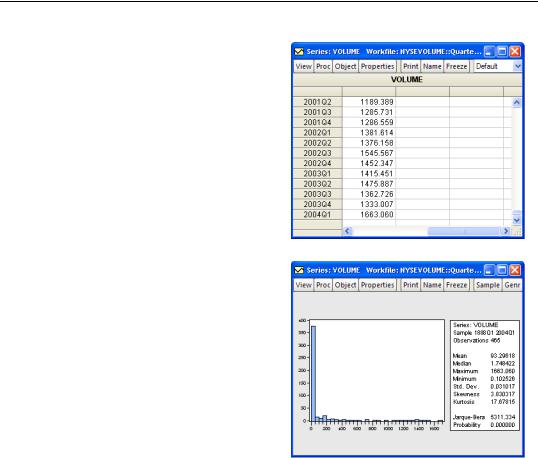
Scroll down to the bottom of the window to see the latest datum in the series. 1.67 billion shares were traded on an average day in the first quarter of 2004. Quite a change!
The more ways we can view our data the better. EViews provides a collection of “Views” for each type of object that can appear in a workfile. (“Object” is a computer science buzz word meaning “thingie”.) The figures above are examples of the spreadsheet view, which lets us see the number for VOLUME at each date.
Another way to think about data is by looking at summary statistics. In fact, some kind of summary statistic is pretty much necessary in this kind of situation; we can’t hope to learn much from staring at raw data when we have 400 plus numbers. To look at summary statistics for a series press the  button and choose Descriptive Statistics & Tests/Histogram and Stats.
Here, we see a histogram, which describes how often different values of VOLUME occurred. Most periods trading is light. Heavy trading volume— say over a billion shares—happened much less frequently.
To the right of the histogram we see a variety of summary statistics for the data. The average (mean) volume was just over 93 million shares, while the median volume was 1.75 million. The largest recorded trading volume was over 1.6 billion and the smallest was just over 100,000.
Now we’ve looked at two different views (Spreadsheet and Histogram and Stats) of a series (VOLUME). We’ve learned that trading volume on the NYSE is enormously variable. Can we say something more systematic, explaining when trading volume is likely to be high versus low? A starting theory for building a model of trading volume is that trading volume grows over time. Underlying this idea of growth over time is some sense that the financial sector of the economy is far larger than it was in the past.
6—Chapter 1. A Quick Walk Through
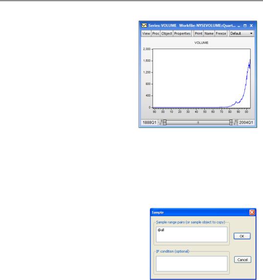
Let’s create a line graph to give us a visual picture of the relation between volume and time. Hit the  button again: this time choosing Graph... and selecting Line & Symbol on the left-hand side of the dialog under Graph Type. EViews graphs the date on the horizontal axis and the value of VOLUME on the vertical. Unsurprisingly perhaps, the most important descriptive aspect of our data is that volume is a heck of a lot bigger than it used to be!
Looking at different samples
We’ve learned that in the early 21st cen-
tury NYSE volume is many orders of magnitude greater than it was at the close of the 19th. In retrospect, the picture isn’t surprising given how much the economy has grown over this period. Trading volume has grown enormously over more than a century; it’s grown so much, in fact, that numbers from the early years are barely visible on the graph. Let’s try a couple of different approaches to getting a clearer picture.
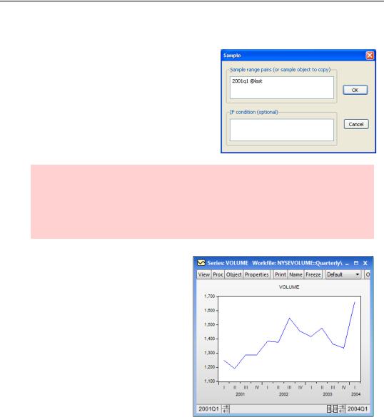
As a first pass, we’ll look at only the last three years or so of data. To limit what we see to this period, we need to change the sample.
Click on the  button to get the dialog box shown to the right. The upper field, marked Sample range pairs (or sample object to copy), indicates that all observations are being used. Replace “@all” with the beginning and ending dates we want. In this case use “2001q1” for the first date, a space to separate
Looking at different samples—7
the dates, and the special code “@last” to pick up the last date available in the workfile. When you’ve changed the Sample dialog as shown in the second figure, hit  .
.
Hint: Ranges of dates in EViews are specified in pairs, so “2001q1 @last” means all dates starting with the first quarter of 2001 and ending with the last date in the workfile. EViews accepts a variety of conventions for writing a particular date. “2001:1” means the first period of 2001 and “2001q1” more specifically means the first quarter of 2001. Since the periods in our data are quarterly, the two are equivalent.
The Line Graph view changes to reflect the new sample. Note how the date scaling on the horizontal axis has changed. Previously we could fit only one label for each decade. This close up view gives a label every quarter. For example, “III” with “2002” below it means year 2002, third quarter, which is to say, July-September 2002. Because the sample is so much more homogenous, we can now see lots of short-run up and down spikes.
We could’ve also changed the sample by resizing and dragging the slider bar at the bottom of the window. Notice
that in the first graph, the slider bar was very wide, extending the width of the entire sample. Now its size and position reflect the new sample, which shows a small portion of the latter part of our data.
Remember: when we changed the sample on the view, we have not changed the underlying data, just the portion of the data that we’re viewing at the moment. The complete set of data remains intact, ready for us to use any time we’d like.